609: quantum of sollazzo
#609: quantum of sollazzo – 3 May 2025
The data newsletter by @puntofisso.

Hello, regular readers and welcome new ones :) This is Quantum of Sollazzo, the newsletter about all things data. I am Giuseppe Sollazzo, or @puntofisso. I've been sending this newsletter since 2012 to be a summary of all the articles with or about data that captured my attention over the previous week. The newsletter is and will always (well, for as long as I can keep going!) be free, but you're welcome to become a friend via the links below.
The most clicked link last week was Visual Capitalist's analysis of beer per capita
AMA – Ask Me Anything! Submit a question via this anonymous Google form. I'll select a few every 4-5 weeks and answer them on here :-) Don't be shy!

The Quantum of Sollazzo grove now has 31 trees. It helps managing this newsletter's carbon footprint. Check it out at Trees for Life.
'till next week,
Giuseppe @puntofisso.bsky.social
🛎️ Things that caught my attention
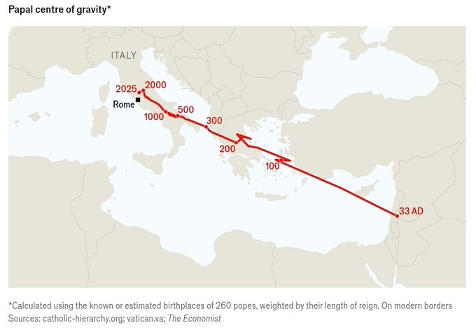
Some truly brilliant charting – The Centre of Gravity of Christianity, and the Centre of Gravity of Popes. By The Economist, with thanks to Peter Wood for flagging it.
Also, I really enjoyed this article called "The Copilot Delusion". It describes Copilot (or coding LLMs more generally) as "a chaos monkey disguised as a teammate. No tests. No profiling. No understanding of side effects or performance impact. Just blind clicking and tapping and typing." But my favourite quotable is "The programming equivalent of punching your TV to make the static stop."
✨ Topical
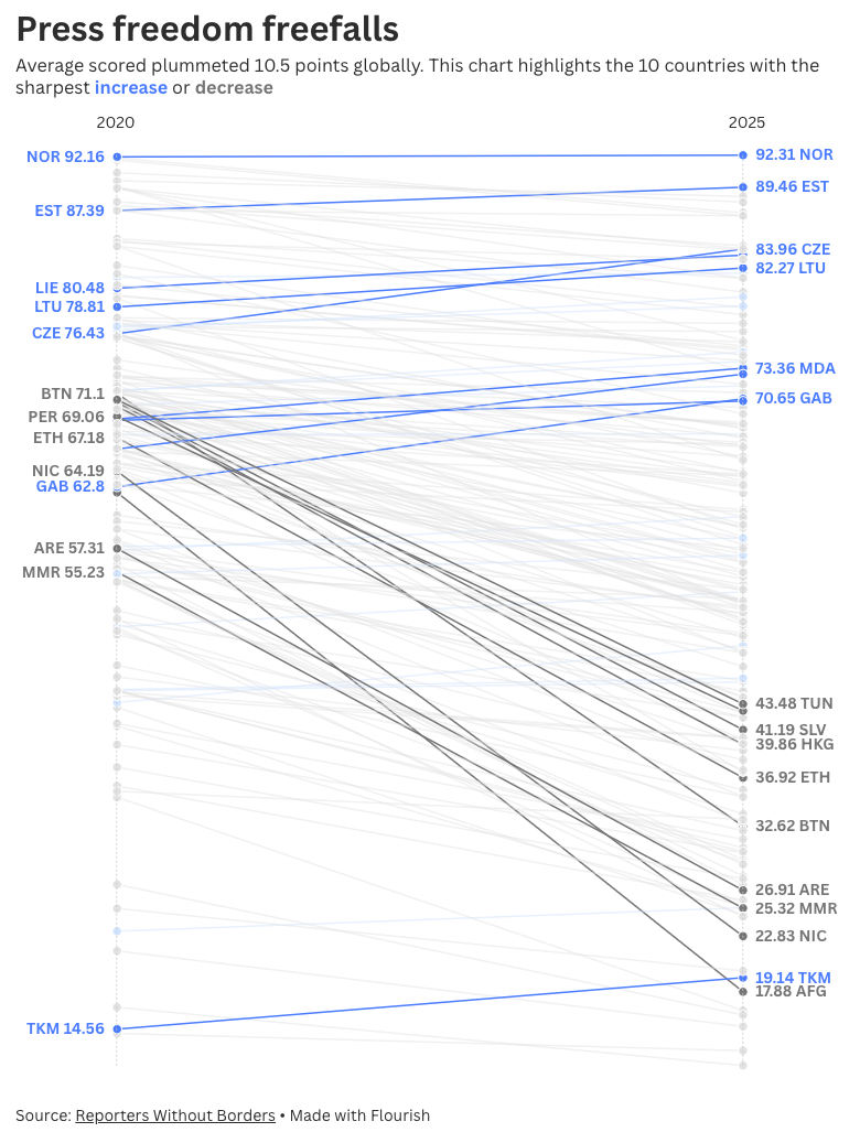
Visualizing press freedom worldwide
"The data tells a troubling story: press freedom is declining across 86% of countries compared to five years ago. Our interactive slope chart makes this complex global trend instantly comprehensible."
From Flourish. It needs an account, but it's free to duplicate and publish.
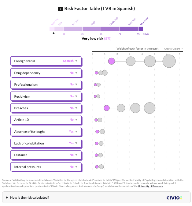
Spanish prisons use a 30-year-old algorithm to decide on temporary releases
"More than 200 court rulings in 2024 cite an algorithm that classifies foreign prisoners without ties as high risk, even if they lack other risk factors."
Good visualization of the features in the algorithm. The critique here is based on the fact that the algorithm is old, although I suppose a slightly different question is what measurements/metrics were used for its evaluation.
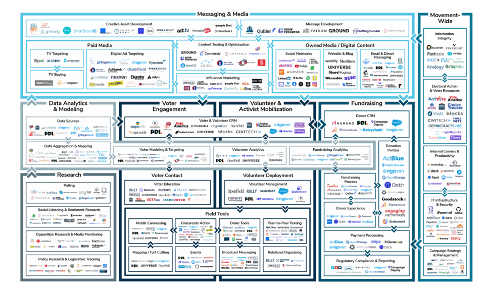
2024 Political Tech Landscape Report
"Each year, we track developments across the political technology space, providing a window into how our ecosystem is evolving—and what it means for Democratic campaigns and progressive infrastructure."
It's a work in progress with open contributions.
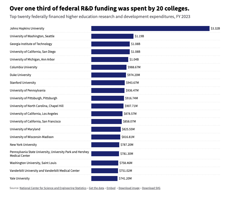
How universities spend billions in government funds
USA Facts: "In FY 2023, the federal government provided nearly $60 billion to support research and development efforts at universities."
Interesting in the context of the current conflicts between the US Administration and universities. Also, to note the massive gap between Johns Hopkins and others.
Also, if you have access to the New York Times, this analysis looks at how many foreign students each university enrolls.
Brain food, delivered daily
Every day we analyze thousands of articles and send you only the best, tailored to your interests. Loved by 505,869 curious minds. Subscribe.

🛠️📖 Tools & Tutorials
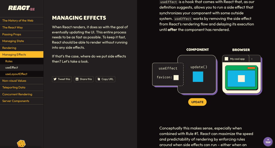
React, visualized
"A visual exploration of core React concepts".
DuckLake is an integrated data lake and catalog format
"DuckLake delivers advanced data lake features without traditional lakehouse complexity by using Parquet files and your SQL database. It's an open, standalone format from the DuckDB team."
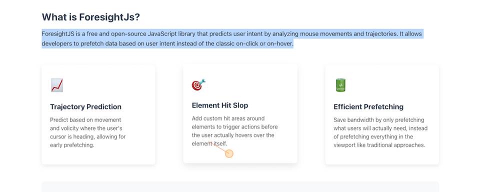
ForesightJS
"What if we could only prefetch data the user actually needs?".
The page is itself a demo of its capabilities, and it's one of the best I've ever seen.
"ForesightJS is a free and open-source JavaScript library that predicts user intent by analyzing mouse movements and trajectories. It allows developers to prefetch data based on user intent instead of the classic on-click or on-hover."
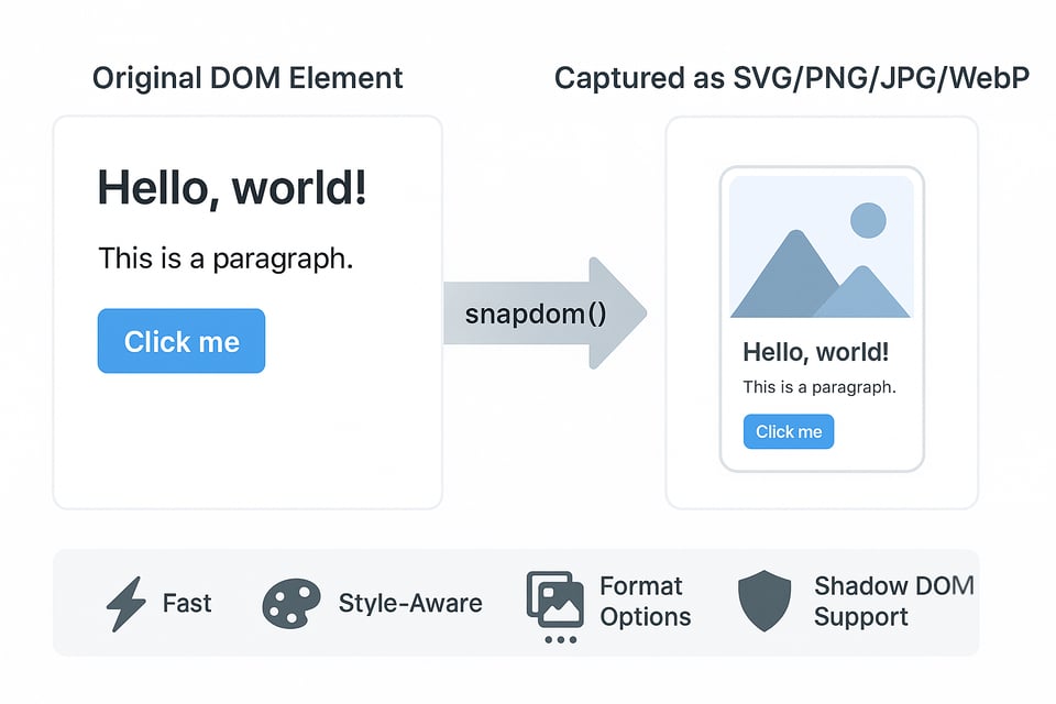
snapDOM
"snapDOM captures HTML elements as images with exceptional speed and accuracy."
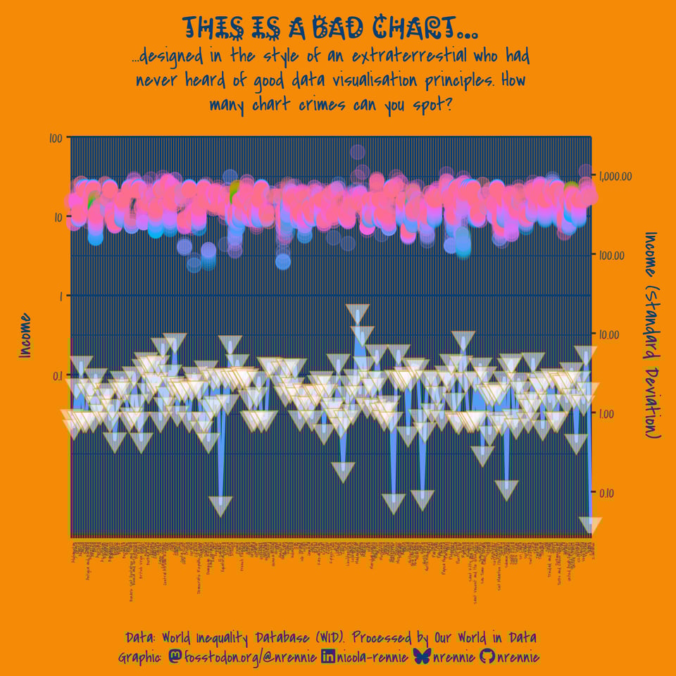
A step-by-step chart makeover
"As part of the 30 Day Chart Challenge in April 2025, I made a (deliberately) bad chart, which didn't follow any data visualisation best practices. In this blog post, we'll go step-by-step through the process of making it better."
The chart below is how it starts, and it's hilariously bad. What you get at the end is considerably different.
🤯 Data thinking
On the objectivity of data-driven decisions
This short blog post argues that it's hard to remove bias, once you have a dataset. It's something I agree with – when I worked in the NHS AI Lab, there was a project that we just couldn't start because the data was too (ethnically) biased at the outset. Instead, we pivoted the project to initiate a data collection that was as unbiased as possible.
"Our raw material is too tilted".
I don't like NumPy
"They say you can’t truly hate someone unless you loved them first. I don’t know if that’s true as a general principle, but it certainly describes my relationship with NumPy."
An entertaining critique: "As far as I can tell, what people actually do is try random variations until one seems to work."
📈Dataviz, Data Analysis, & Interactive
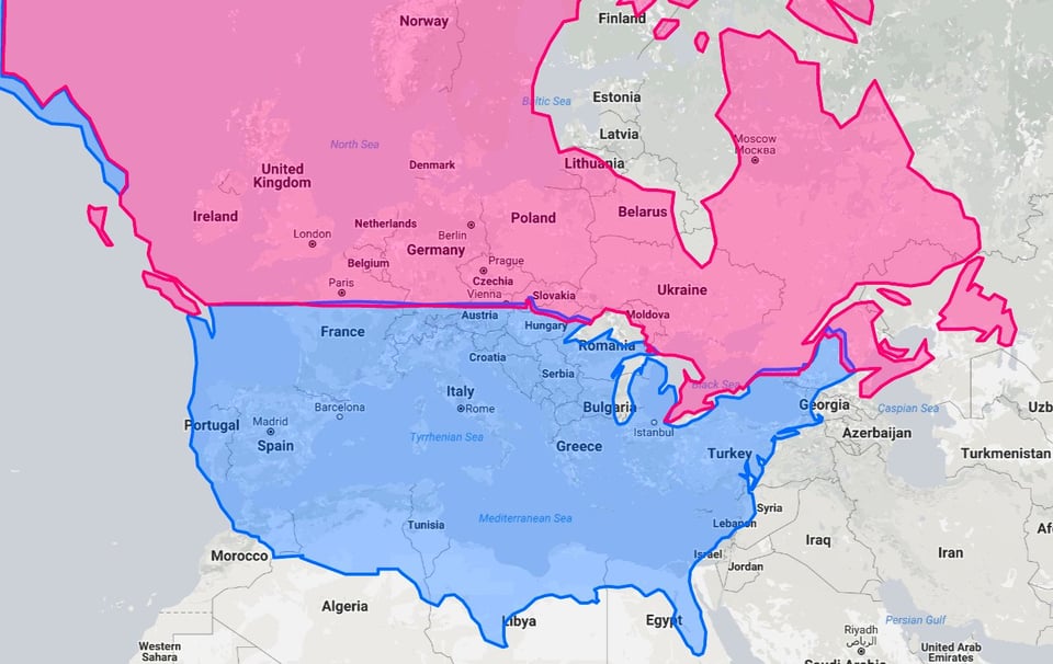
The US and Canada mapped at equivalent European latitudes
For some geoLOLs.
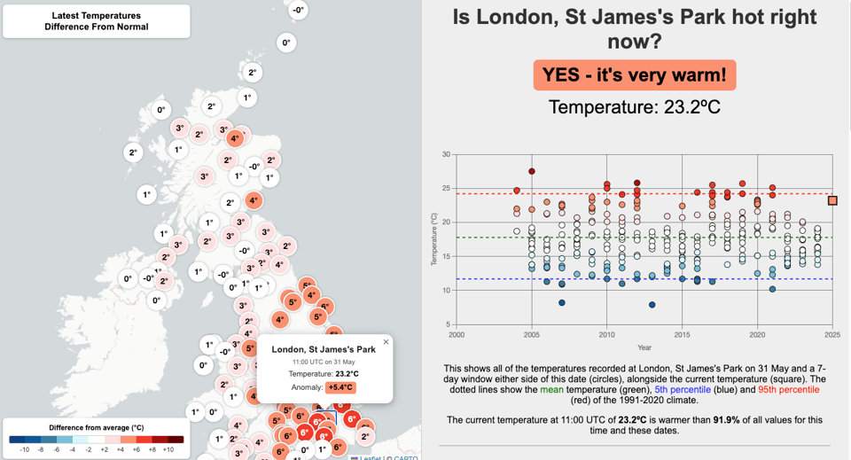
Is the UK hot right now?
"Click on a temperature observation and scroll to see further details". It compares current temperatures with averages.
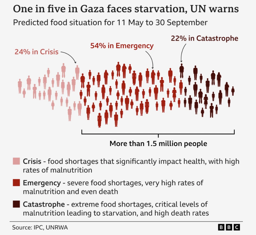
Netanyahu accuses Starmer of being on 'wrong side of humanity' and siding with Hamas
An interesting way to visualize data from the IPC and UNRWA by the BBC.
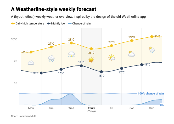
The perfect forecast that left me standing in the rain
Datawrapper's Jonathan Muth: "Do you know that feeling of helplessness mixed with frustration when your favorite indie app gets acquired — and immediately shut down?
For me that app was Weatherline."
🤖 AI
System Card: Claude Opus 4 & Claude Sonnet 4
Simon Willison analyses Claude 4's System Card. As he notes "1/10 attacks getting through is still really bad. In application security, 99% is a failing grade."
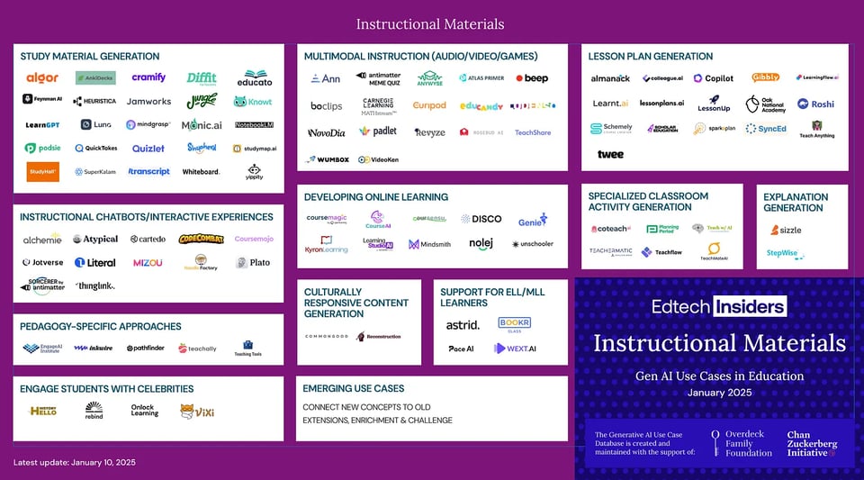
From Theory to Practice: How Generative AI is Redefining Instructional Materials
A summary of AI in EdTech: "Top trends and insights from The Edtech Insiders Generative AI Map research process about how Generative AI is transforming Instructional Materials"
(via Stefano Gatti's La CulturaDelDato)
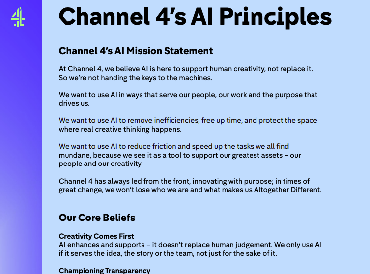
Channel 4’s AI Principles
Really good stuff here.
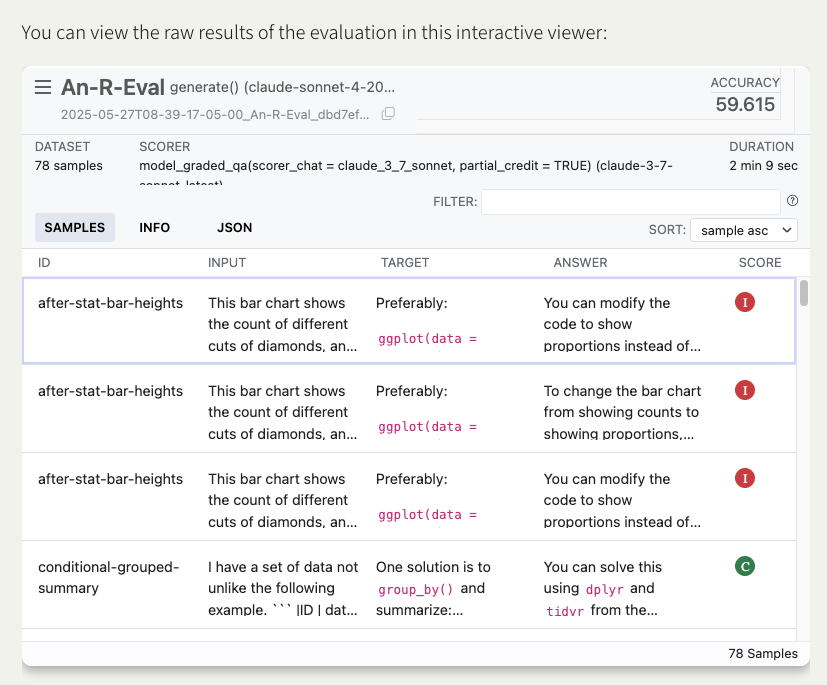
Claude 4 and R Coding
"Evaluating the most recent releases of Claude Sonnet and Opus on challenging R coding problems."
|
DID YOU LIKE THIS ISSUE>? → BUY ME A COFFEE! 
You're receiving this email because you subscribed to Quantum of Sollazzo, a weekly newsletter covering all things data, written by Giuseppe Sollazzo (@puntofisso). If you have a product or service to promote and want to support this newsletter, you can sponsor an issue. |
quantum of sollazzo is also supported by Andy Redwood’s proofreading – if you need high-quality copy editing or proofreading, check out Proof Red. Oh, and he also makes motion graphics animations about climate change.
