602: quantum of sollazzo
#602: quantum of sollazzo – 25 March 2025
The data newsletter by @puntofisso.

Hello, regular readers and welcome new ones :) This is Quantum of Sollazzo, the newsletter about all things data. I am Giuseppe Sollazzo, or @puntofisso. I've been sending this newsletter since 2012 to be a summary of all the articles with or about data that captured my attention over the previous week. The newsletter is and will always (well, for as long as I can keep going!) be free, but you're welcome to become a friend via the links below.
It's AMA o'clock! This is the Quantum of Sollazzo Ask Me Anything section.
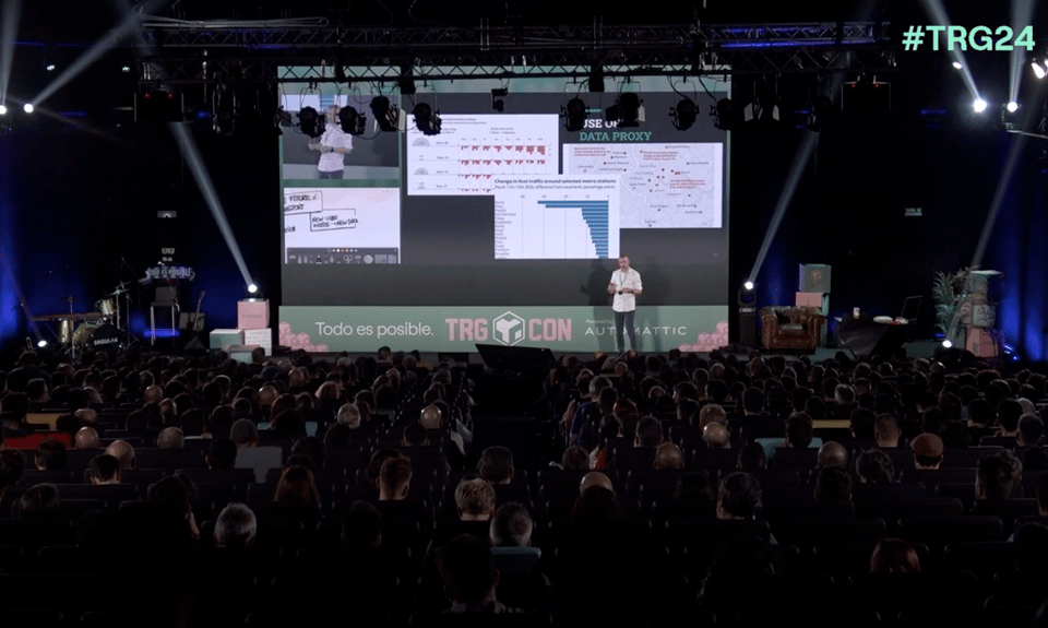
What tips or recommendations do you have for young colleagues who are new to the field of data journalism? This is an easy one and a hard one. Things are in a flurry in the world of data visualization, and there are many challenges in data journalism. So in terms of training: go broad, try and be t-shaped, don't get fixated on one piece of technology, one framework, one way of visualizing things. Try and ask questions, then develop answers to those questions. Doing this will require several steps: finding the data, which might mean accepting that the data might not be quite right, and in turn will make you either change your questions accordingly to some that are answerable, find a good proxy, or become an activist and create or ensure the data you need is available; processing the data;making it visually appealing; and learning how to avoid potential pitfalls. Learn the story of William Du Bois and how he made his own census. I spoke about some of these issues in my talk at TRGCON last year (photo below).
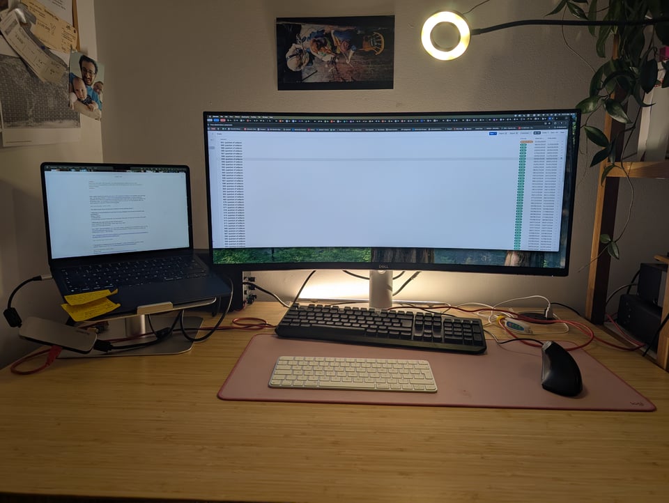
What does your desk setup look like? Any fave tech? I try and be as tidy as I can, and fail. I have an automated fully standing desk with a wide curved monitor, a laptop stand, and two keyboards (a Magic Keyboard for my Mac, and a KLIM Chroma for my work laptop). I have put some backlights behind the screen, but it's just a test for now, I need to get something more professional. I also have a camera light that doubles up as a desk lamp. This is where I write most of my newsletter issues on a Saturday morning, sipping coffee.
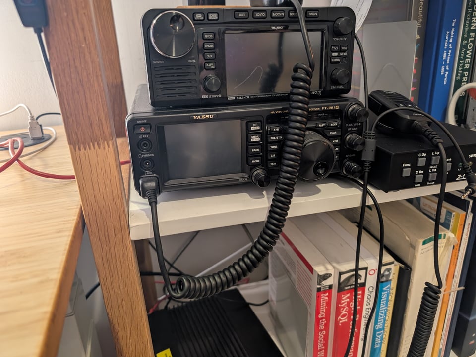
If you're wondering what the red cable is, it's a usb connection from my laptop to my ham radio(s) on the right. I use it when I want to communicate via FT8, a digital radio mode.
The next AMA – Ask Me Anything is in a few weeks. Submit a question via this anonymous Google form. If there are many questions, I'll select a few every 4-5 weeks and answer them on here :-) Don't be shy!

The Quantum of Sollazzo grove now has 25 trees. It helps managing this newsletter's carbon footprint. Check it out at Trees for Life.
'till next week,
Giuseppe @puntofisso.bsky.social
✨ Topical
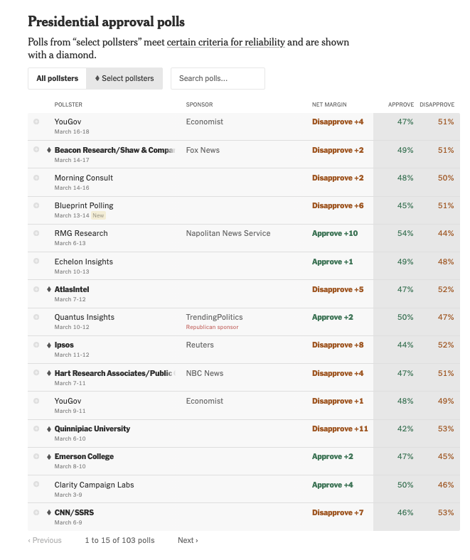
Latest Polls: Do Americans Approve of President Trump?
A new project by the New York Times to track polls. It's work in progress, and they say they will be adding more features. The project is introduced here.
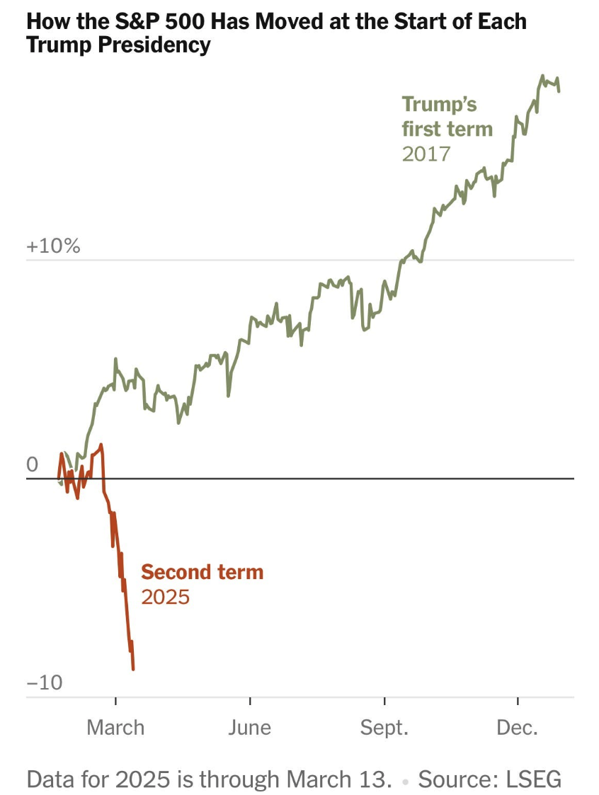
How the S&P 500 Has Moved at the Start of Each Trump Presidency
A captivating chart by investment strategist Joachim Klement.
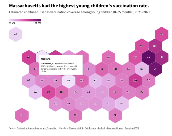
How many kids are vaccinated?
USA Facts: "Seventy-three percent of children born in 2020 and 2021 were fully vaccinated with the CDC-recommended vaccines by age 3."
It varies by state.
Brain food, delivered daily
Every day we analyze thousands of articles and send you only the best, tailored to your interests. Loved by 505,869 curious minds. Subscribe.

🛠️📖 Tools & Tutorials
Life Altering Postgresql Patterns
"There is a set of things that you can do when working with a Postgres database which I have found made my and my coworker's lives much more pleasant. Each one is by itself small, but in aggregate have a noticeable effect."
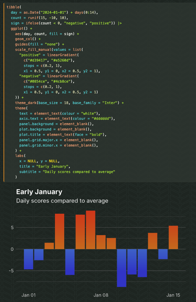
The guide to gradients in R and ggplot2
"Everything from the basics up to beautiful mesh gradients."
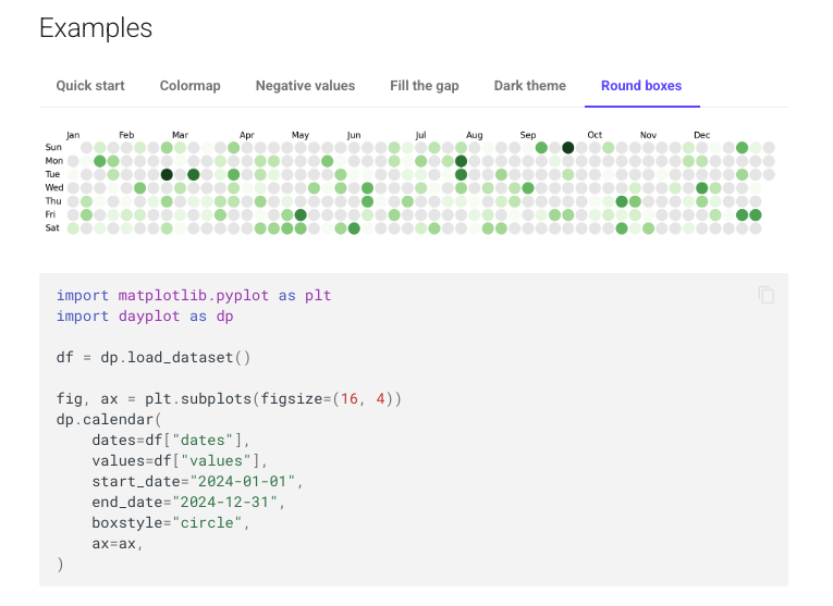
dayplot
"Calendar heatmaps with matplotlib". Also, take a look at the Github repository.
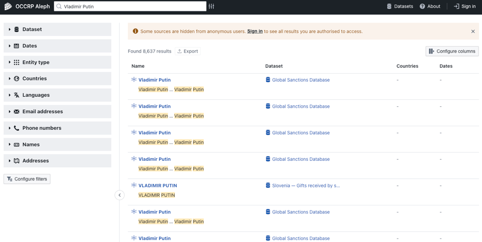
OCCRP Aleph
"The global archive of research material for investigative reporting."
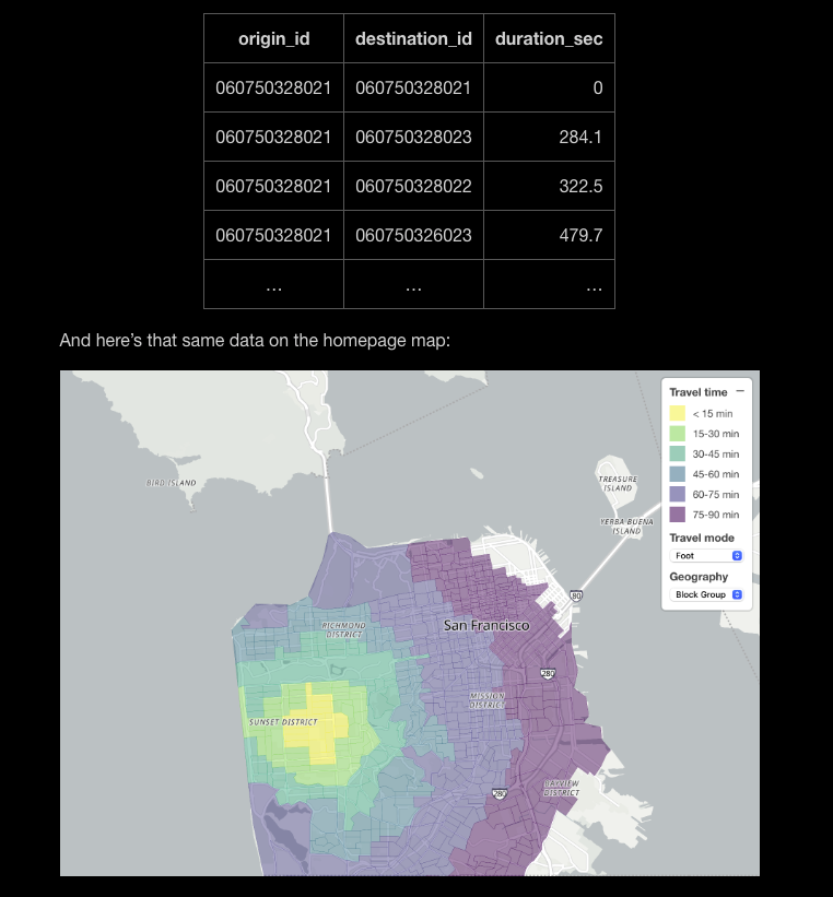
OpenTimes: Free travel times between U.S. Census geographies
Dan Snow: "Today I’m launching OpenTimes, a free database of pre-computed, point-to-point travel times between major U.S. Census geographies. In addition to letting you visualize travel isochrones, OpenTimes also lets you download massive amounts of travel time data for free and with no limits. Visit the dedicated about page to learn more about the project."
Python Developer Tooling Handbook
"This is not a book about programming Python. Instead, the goal of this book is to help you understand the ecosystem of tools used to make Python development easier and more productive."
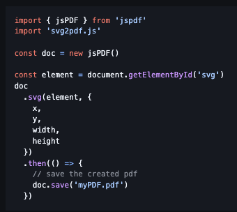
svg2pdf.js
"A javascript-only SVG to PDF conversion utility that runs in the browser."
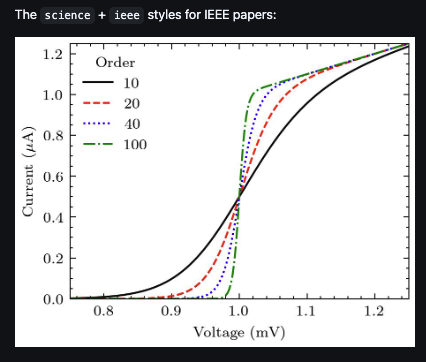
Science Plots
"Matplotlib styles for scientific plotting."
🤯 Data thinking
What killed innovation?
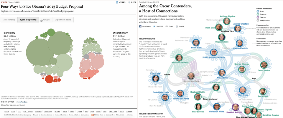
Part of a trilogy on the state of the dataviz industry by Shirley Wu, this article takes a critical look at whether data visualization has reached a creativity plateau. "Fast forward a decade, and it feels like I’m seeing the same polished but predictable formats over and over."
(via Durand D'souza)
The State of Open Humanitarian Data 2025
The United Nations Office for the Coordination of Humanitarian Affairs have published their yearly report on "assessing data availability across humanitarian crises".

Bayes Vs. Frequentism Can Be a Big Deal
"...when these so-called experts do weigh in, their arguments tend to fall into one of four common categories..."
📈Dataviz, Data Analysis, & Interactive
Quantifying Geospatial in the Common Crawl Corpus
Data scientist Ilya Ilyankou et al. have published this intriguing research paper that looks at how widespread a given type of geospatial information is (e.g. longitude/latitude coordinates) in Common Crawl, the big dataset used to train LLMs. As he explained to me: "We know LLMs have decent geospatial knowledge & reasoning but didn't know how widespread geospatial is in the pre-training data (Common Crawl being the most prominent one). Turns out there is a lot! Between 1 in 5 to 1 in 6 web pages contain either coordinates or addresses or both."
He adds: "And there is quite a few annotated GPX tracks which we used to compile into an activity description <> MultiLineString pairings (multimodality at its finest). So CC can be used as a big free source for smaller, higher quality geospatial datasets. Who would have thought."
The code is on Ilya's Github.

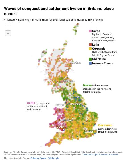
Who decided British place names should be this confusing?
Datawrapper's Jack Goodall asks a very British question and visualises it.
Severance data analysis
"We analyse data from the Severance TV show." Developer Lucy D'Agostino McGowan has developed and used this R package for the purpose.
(via Daniele Marinazzo)

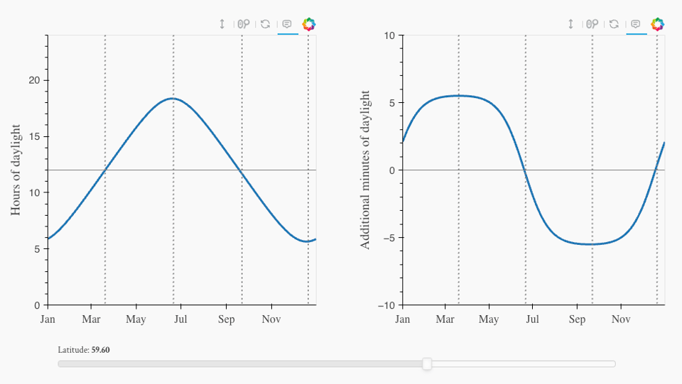
How Fast the Days Are Getting Longer
"But from one meeting to the next, his window went from pitch black to bright. This led me to think about a basic astronomy question I had never given much thought to before — just how fast do the days get longer."
Brilliant article with quite a bit of math that shows how many complications (not the sort of watchmaking complications... but close in meaning) must be taken into account.
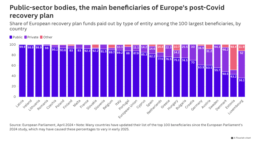
Rail, construction, public works, carmakers, local authorities – who gained from the EU’s post-Covid recovery stimulus?
Aude Martin – Alternatives Economiques (EDJNet) shows how EU COVID Recovery funds have been distributed.
🤖 AI
How soon will AI work a full day?
This is a very good question. It turns out that someone is trying to measure it. Write up by Azeem Azhar of Exponential View.

|
DID YOU LIKE THIS ISSUE>? → BUY ME A COFFEE! 
You're receiving this email because you subscribed to Quantum of Sollazzo, a weekly newsletter covering all things data, written by Giuseppe Sollazzo (@puntofisso). If you have a product or service to promote and want to support this newsletter, you can sponsor an issue. |
quantum of sollazzo is also supported by Andy Redwood’s proofreading – if you need high-quality copy editing or proofreading, check out Proof Red. Oh, and he also makes motion graphics animations about climate change.
