594: quantum of sollazzo
#594: quantum of sollazzo – 28 January 2025
The data newsletter by @puntofisso.

Hello, regular readers and welcome new ones :) This is Quantum of Sollazzo, the newsletter about all things data. I am Giuseppe Sollazzo, or @puntofisso. I've been sending this newsletter since 2012 to be a summary of all the articles with or about data that captured my attention over the previous week. The newsletter is and will always (well, for as long as I can keep going!) be free, but you're welcome to become a friend via the links below.
Excuse this issue's brevity. This one took me some time to write as I'm still recovering from surgery and can't stay sat or stand for long stretches as it gets uncomfortable, but doing very well and I hope to be able to go back to work in a few days. No sports for the next 4 weeks, thought, which means I've been binge-watching the Australian Open on TV and realising how much data now goes into tennis. The linesmen have all disappeared, replaced by electronics. Not sure I like this (given I wanted to get onto a course to become one ahah).
The most clicked link last week was this very useful tutorial on transforming Matplotlib charts into journal-quality graphics.
It's AMA o'clock! This is the Quantum of Sollazzo Ask Me Anything section.
AMA – Ask Me Anything by submitting a question via this anonymous Google form. If there are many questions, I'll select a few every 4-5 weeks and answer them on here :-) Don't be shy!

The Quantum of Sollazzo grove now has 25 trees. It helps managing this newsletter's carbon footprint. Check it out at Trees for Life.
Last but not least, Quantum has a new sponsor for the next few issues! Ed Freyfogle, organiser of geospatial meetup Geomob, co-host of the Geomob podcast, and co-founder of the OpenCage, has offered to introduce a set of points around the topic of geocoding. His first entry starts a few paragraphs below on "Build or Buy? Should you try to create your own geocoder?".
'till next week,
Giuseppe @puntofisso.bsky.social
Announcements
I'll be making some major updates to my app Parli-N-Grams. I've realised there are some relevant datasets that could be added into it, so I've added them to the pipeline. Watch this space!
✨ Topical
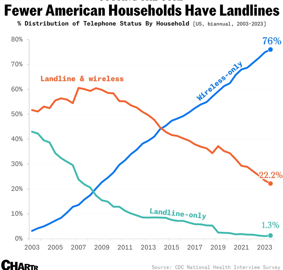
The landline isn’t extinct in America, but it might be by 2030
It's interesting how the data used in this article comes from the CDC, which you would normally associate with health.
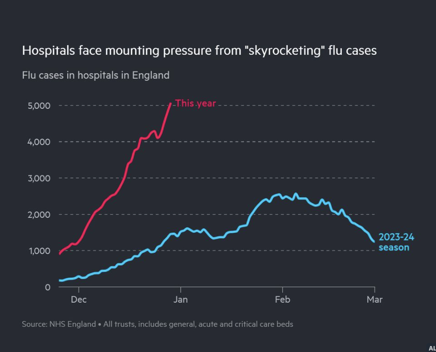
Flu on the rise in England
The Financial Times' Amy Borrett: "Flu cases have quadrupled over the past month in hospitals in England, with NHS leaders warning that “skyrocketing” cases could make this winter “one of the worst we have ever seen”."
This is from Bluesky, where Amy also provides a link to the unlocked FT article.
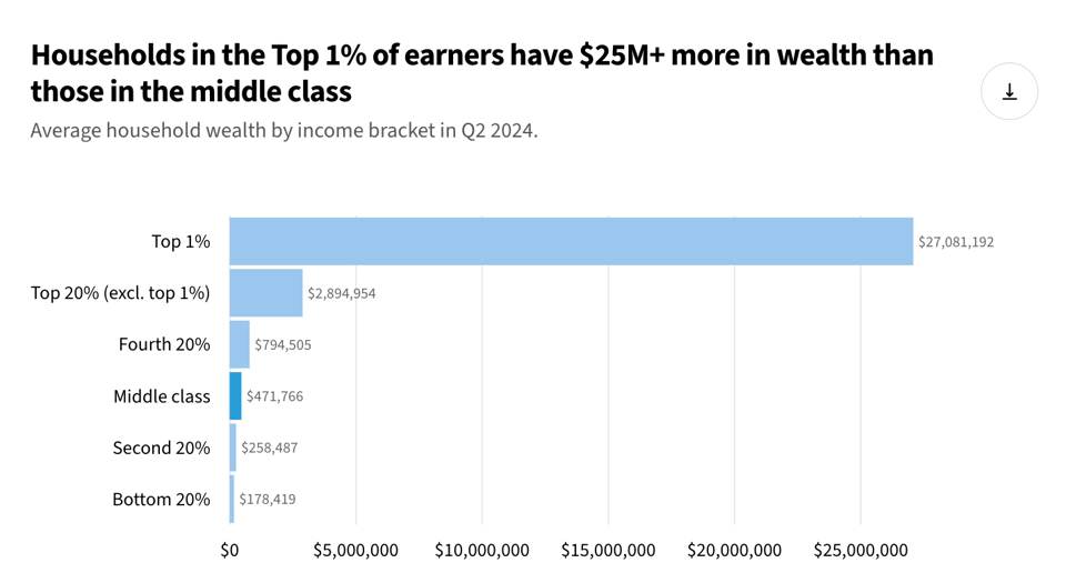
How much wealth does the American middle class have?
Wow at the chart below. From the ever excellent USA Facts.
Build or Buy? Should you try to create your own geocoder?
Welcome to part four of our series on geocoding.
Given freely available opensource software, and open data like OpenStreetMap, should you run your own geocoder? Or should you pay a service like ours to host the geocoding software for you? The whole point of open data is that you can do it yourself, right?
The short answer is that yes, you can run, or even write, your own geocoder. Unqiue technical requirements may mean it makes sense to craft your own custom service, but most people prefer to leave it experts and get on with their real work.
Our geocoding API aggregates many different open data sources and provides enterprise level reliability. One factor we see many people overlook: setting up the software is one thing, keeping the underlying data current is another. Put another way: building is easy, maintaining is hard. OSM alone gets 4-5 million edits per day. Still, as a developer myself and long-time OSM contributor, I understand the inclination to get your hands dirty. Hopefully it helps put you at ease to know that we’re doing our part to give back to the open data and open source geo software community.
Finally, rest easy knowing that if you ever need to the data and code is all there for you to dive into. That’s the real power of open-source and open data.
Have a project that will need geocoding? See our geocoding buyer's guide for an overview of all the factors to consider when choosing between geocoding services.
![]()
🛠️📖 Tools & Tutorials
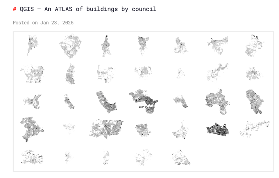
QGIS – An ATLAS of buildings by council
I finally got to publishing something I had started before my surgery: a grid of images of buildings in London by Council area. It uses Atlas on QGIS and I roughly explain the steps required.
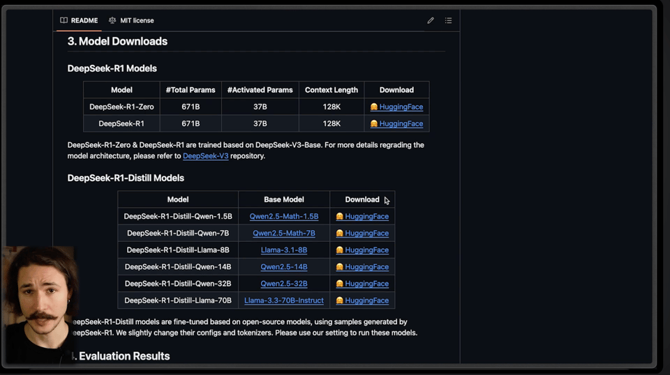
Run DeepSeek R1 Locally (Reasoning LLM) – Here is how
I came across Uncle D at an event a LONG time ago and he was definitely one of the most talented coders I've ever met in my life. He's now started a series of AI-related YouTube tutorials, and they are absolutely outstanding. This is the latest he's published.
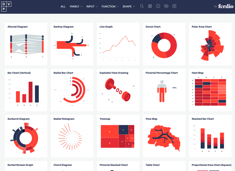
Data Viz Project
Ferdio – an infographic and data visualization agency from Copenhagen, Denmark, is releasing what they aim to make the world’s biggest library of data visualizations. It doesn't have any code attached, so you can use it for inspiration more than to get easy access to template. But it's pretty good at that.
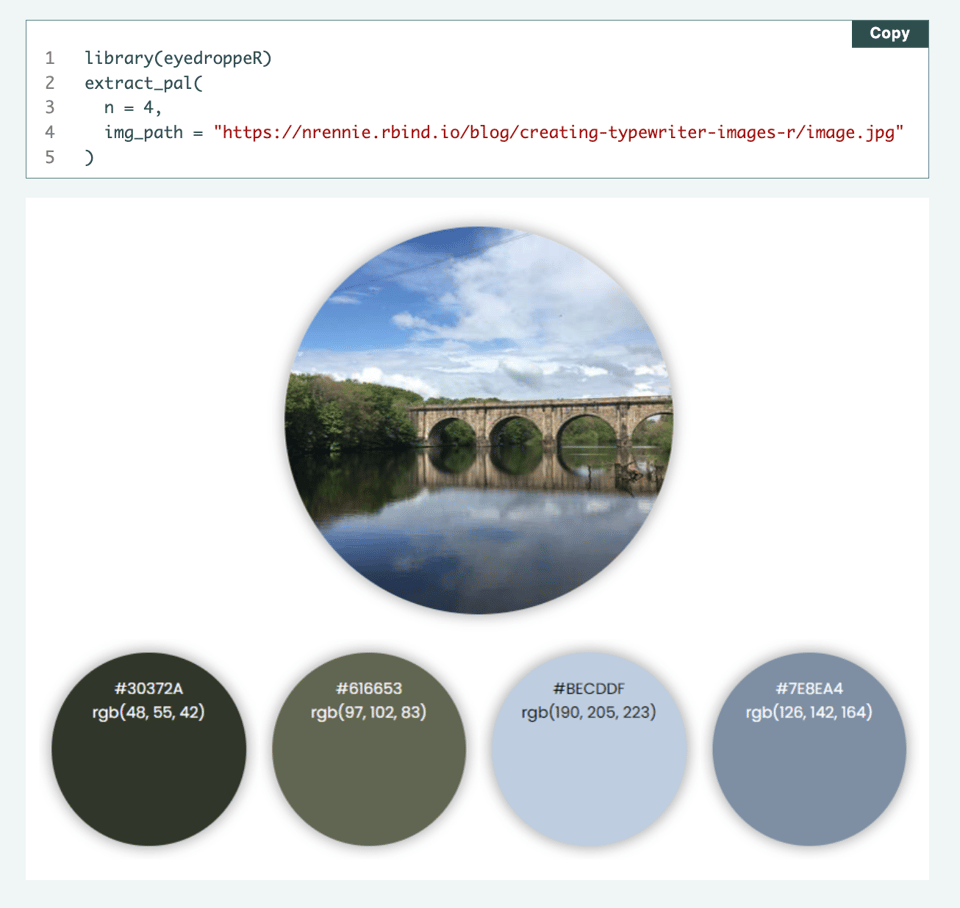
Working with colours in R
"Whether you're building data visualisations or generative art, at some point you will likely need to consider which colours to use in R. This blog post describes different ways to define colours, how to make good choices about colour palettes, and ways to generate your own colour schemes."
Quite a few interesting ideas beyond the basics of setting palettes, including the one below.
Bruin
A tool to "build data pipelines with SQL and Python, ingest data from different sources, add quality checks, and build end-to-end flows. It works with all the major data platforms and runs on your local machine, an EC2 instance, or GitHub Actions."
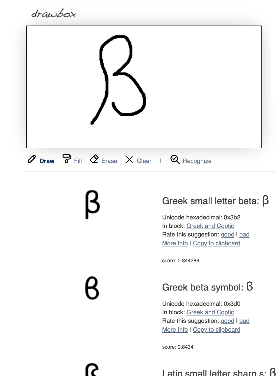
Shapecatcher – Unicode character recognition
A tool that allows you to draw a shape and returns the closest Unicode character. Not (yet) working on the complete Unicode set but "there are 11817 unicode character glyphs in the database. Japanese, Korean and Chinese characters are currently not supported."
📈Dataviz, Data Analysis, & Interactive
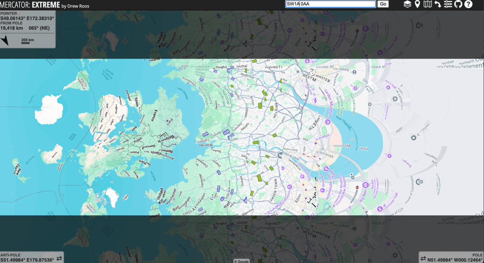
Mercator: extreme
"The map you see is the Mercator projection.
But unlike a standard Mercator projection, you can substitute any point on earth as the "pole". (The initial view shows Boston as the pole point.
Furthermore, this map cuts off much, much closer to the poles than normal, allowing you to see many more orders of magnitude of distortion.
Because this yields a map several times taller than it is wide, it is shown sideways from its usual orientation."
You can set your home address as the pole point and see what happens. The one below is centred on the UK Houses of Parliament. The code is also available.
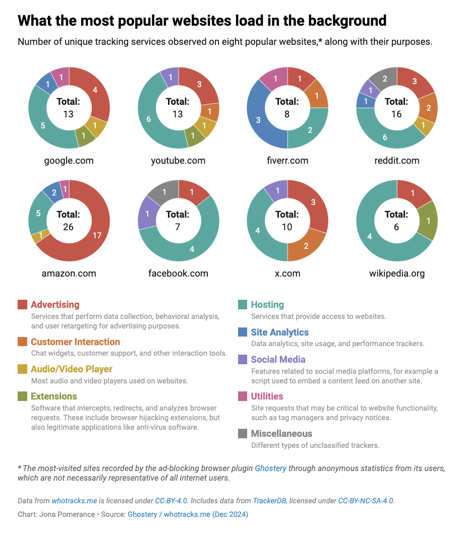
Meet the tracking companies that follow you around the internet
Datawrapper's Jona Pomerance analyses the tracking services that are powering web analytics.
|
DID YOU LIKE THIS ISSUE>? → BUY ME A COFFEE! 
You're receiving this email because you subscribed to Quantum of Sollazzo, a weekly newsletter covering all things data, written by Giuseppe Sollazzo (@puntofisso). If you have a product or service to promote and want to support this newsletter, you can sponsor an issue. |
quantum of sollazzo is also supported by Andy Redwood’s proofreading – if you need high-quality copy editing or proofreading, check out Proof Red. Oh, and he also makes motion graphics animations about climate change.
