593: quantum of sollazzo
#593: quantum of sollazzo – 21 January 2025
The data newsletter by @puntofisso.

Hello, regular readers and welcome new ones :) This is Quantum of Sollazzo, the newsletter about all things data. I am Giuseppe Sollazzo, or @puntofisso. I've been sending this newsletter since 2012 to be a summary of all the articles with or about data that captured my attention over the previous week. The newsletter is and will always (well, for as long as I can keep going!) be free, but you're welcome to become a friend via the links below.
I had some surgery last week, and I'm recovering slowly but well. It was a bit more invasive than expected, but it went ok, and I've got loads to say about it (not just in praise of my amazing local NHS hospital). Maybe in another issue, when my brain is functioning 100%.
The most clicked link last week was that of these intriguing maps showing time instead of space (or, in fact, space warped by time).
It's AMA o'clock! This is the Quantum of Sollazzo Ask Me Anything section.
AMA – Ask Me Anything by submitting a question via this anonymous Google form. If there are many questions, I'll select a few every 4-5 weeks and answer them on here :-) Don't be shy!

The Quantum of Sollazzo grove now has 20 trees. It helps managing this newsletter's carbon footprint. Check it out at Trees for Life.
Last but not least, Quantum has a new sponsor for the next few issues! Ed Freyfogle, organiser of geospatial meetup Geomob, co-host of the Geomob podcast, and co-founder of the OpenCage, has offered to introduce a set of points around the topic of geocoding. His first entry starts a few paragraphs below on "Why is open geodata important? What's the difference between open and closed data?".
'till next week,
Giuseppe @puntofisso
📅 Events
- 13/3 Audio based AI for Respiratory Health Monitoring, Cambridge (UK): the event aims to bring together experts on audio signal processing, AI and clinicians to advance research on respiratory health monitoring.
✨ Topical
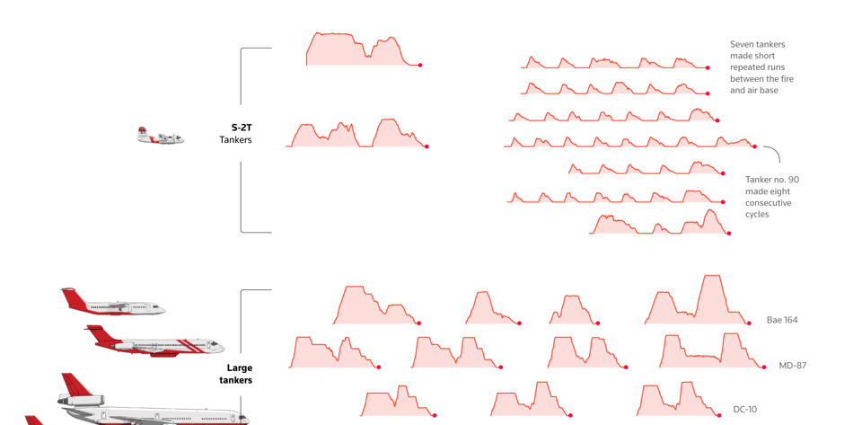
How California fights fires from the skies
Simon Scarr, Vijdan Mohammad Kawoosa and Sudev Kiyada for Reuters: "The specially equipped aircraft can steer or contain a fire’s perimeter, helping fire crews on the ground. We show here the types of aircraft available, from specially converted passenger jets to aircraft that can scoop water from a lake, and their specific roles."
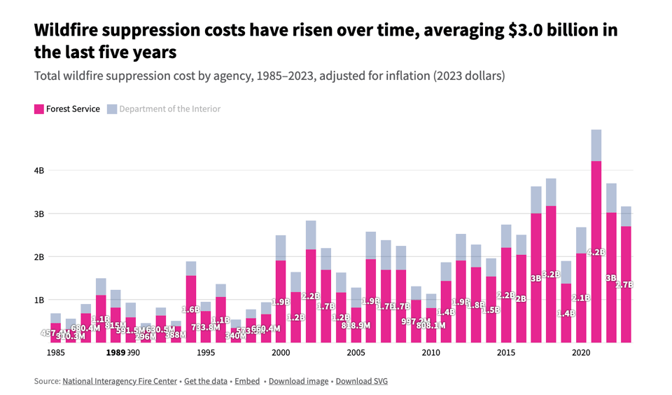
How much land do wildfires burn in the US?
USA Facts: "Wildfire suppression costs have risen in recent decades, averaging $3.0 billion from 2019–2023." On the topic of LA fires, also look at this Guardian article showing maps and images.
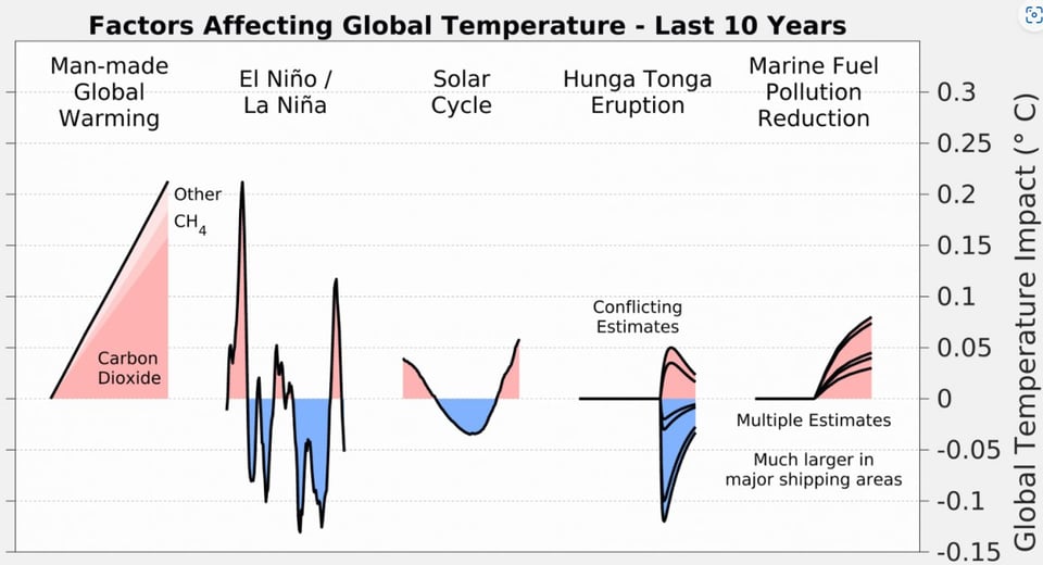
Global Temperature Report for 2024
"Berkeley Earth, a California-based non-profit research organization, has been preparing independent analyses of global mean temperature changes since 2013. The following is our report on global mean temperature during 2024."
There are some pretty good chart in this report, including the brilliant one below.
(via Peter Wood)
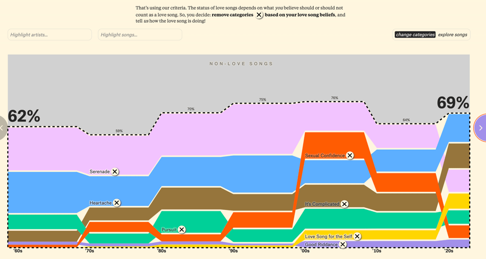
Is the love song dying?
David Mora and Michelle Ji, for The Pudding, look at the evolution of love songs. While there's a remarkable overall decline, tastes seem to be evolving from serenades to tales of heartaches and riddance. I love how interactive and playable this article is.
Nokia Design Archive
"The Nokia Design Archive is a graphic and interactive portal designed by researchers from Aalto University in Finland. It currently hosts over 700 entries, curated from thousands of items donated by Microsoft Mobile Oy and representing over 20 years of Nokia’s design history — both seen and unseen. You can freely explore the archive, learn about designers’ experiences working in Nokia and discover interesting topics surrounding design and mobile technologies."
(via Web Curios)

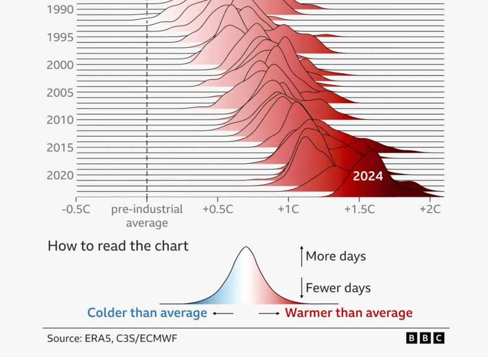
2024 first year to pass 1.5C global warming limit
Mark Poynting, Erwan Rivault and Becky Dale for the BBC: "The planet has moved a major step closer to warming more than 1.5C, new data shows."
Addresses, and why they can be a nightmare.
Good news: Open, global datasets like OpenStreetMap make getting lots geodata easier than ever.
Bad news: Now you have to sort through it, which can be an i18n nightmare.
Example: Given this geodata for a location in Spain - which address would a normal person expect?
"components": {
    "ISO_3166-1_alpha-2": "ES",
    "ISO_3166-1_alpha-3": "ESP",
    "ISO_3166-2": [
        "ES-CT",
        "ES-B"
    ],
    "_category": "building",
    "_normalized_city" : "Barcelona",
    "_type": "building",
    "city": "Barcelona",
    "continent" : "Europe",
    "country" : "Spain",
    "country_code" : "es",
    "county" : "Barcelon\u00e8s",
    "county_code" : "B",
    "house_number" : "66-68",
    "political_union" : "European Union",
    "postcode" : "08017",
    "province" : "Barcelona",
    "quarter" : "les Tres Torres",
    "road" : "Carrer de Calatrava",
    "state" : "Catalonia",
    "state_code" : "CT",
    "suburb" : "Sarri\u00e0 - Sant Gervasi"
},
At OpenCage we’ve open-sourced the templates we use to convert address data into well formatted strings for the 240+ territories around the world, so we know the correct answer is Carrer de Calatrava, 66-68, 08017 Barcelona, Spain. This is just one of many small steps we’ve taken to make developer’s lives easier.
Anyone looking for an entertaining view of the technical complexity of addresses should read “Falsehoods programmers believe about addresses”. Meanwhile, in the category of not sure whether to laugh or cry, we have last year's news of the German town that voted “no” to adopting street names.
If your project calls for well-formatted addresses, give the OpenCage geocoding API a try.

🛠️📖 Tools & Tutorials
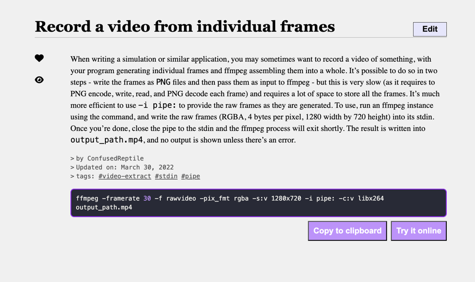
FFmpeg By Example
"FFmpeg By Example is a documentation website to showcase all the unique and different ways to use FFmpeg."
The 2025 AI Engineer Reading List
"We picked 50 paper/models/blogs across 10 fields in AI Eng: LLMs, Benchmarks, Prompting, RAG, Agents, CodeGen, Vision, Voice, Diffusion, Finetuning. If you're starting from scratch, start here."
From Default Python Line Chart to Journal-Quality Infographics
"Transform boring default Matplotlib line charts into stunning, customized visualizations".

Social (and other) networks in Datawrapper
Julian Freyberg shows how to visualize networks in Datawrapper.

100-languages
This is a cool way to get exposure to multiple programming languages: "Solving the first 100 Project Euler problems using 100 different programming languages!". Surprised not to find OCAML on here, but there's the inevitable COBOL.
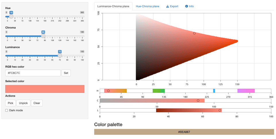
Graphical User Interface to Pick Colors in HCL Space
"The app visualizes colors either along the hue-chroma plane for a given luminance value or along the luminance-chroma plane for a given hue. Colors can be entered by specifying the hue (H), chroma (C), and luminance (L) values via sliders, by entering an RGB hex code, or by clicking on a color in the hue-chroma or luminance-chroma plane. It is also possible to select individual colors and add them to a palette for comparison and future reference."
🤯 Data thinking
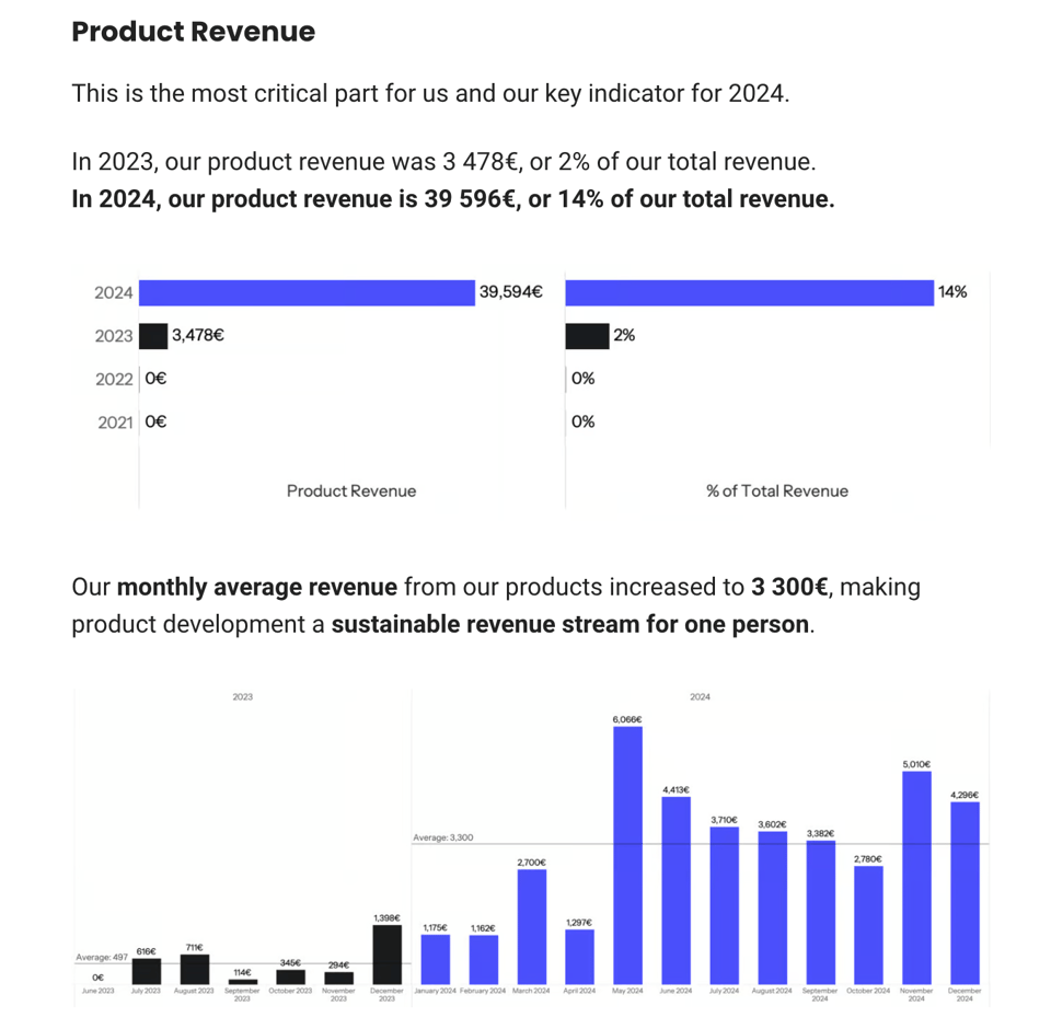
LA Dataviz's 2024 Annual Review
"Was it worth it to build products?"
📈Dataviz, Data Analysis, & Interactive
Who Really Owns the Airbnbs You’re Booking? — Marketing Perception vs Data Analytics Reality
"Over the last 20 years, Airbnb has spent billions on brand building as the authentic, novel and community-led alternative to hotels. But, are they really?". It uses data from the famous InsideAirbnb analytics website, which is not "officially" endorsed by Airbnb.

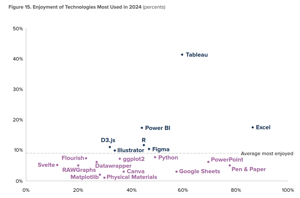
Data Visualization State of the Industry 2024
"The 2024 Data Visualization Society (DVS) disseminated its annual State of the Industry (SOTI) survey was disseminated online between 2 September and 8 October 2024."
Here you can read the results. The survey was quite comprehensive and includes the visualization below.
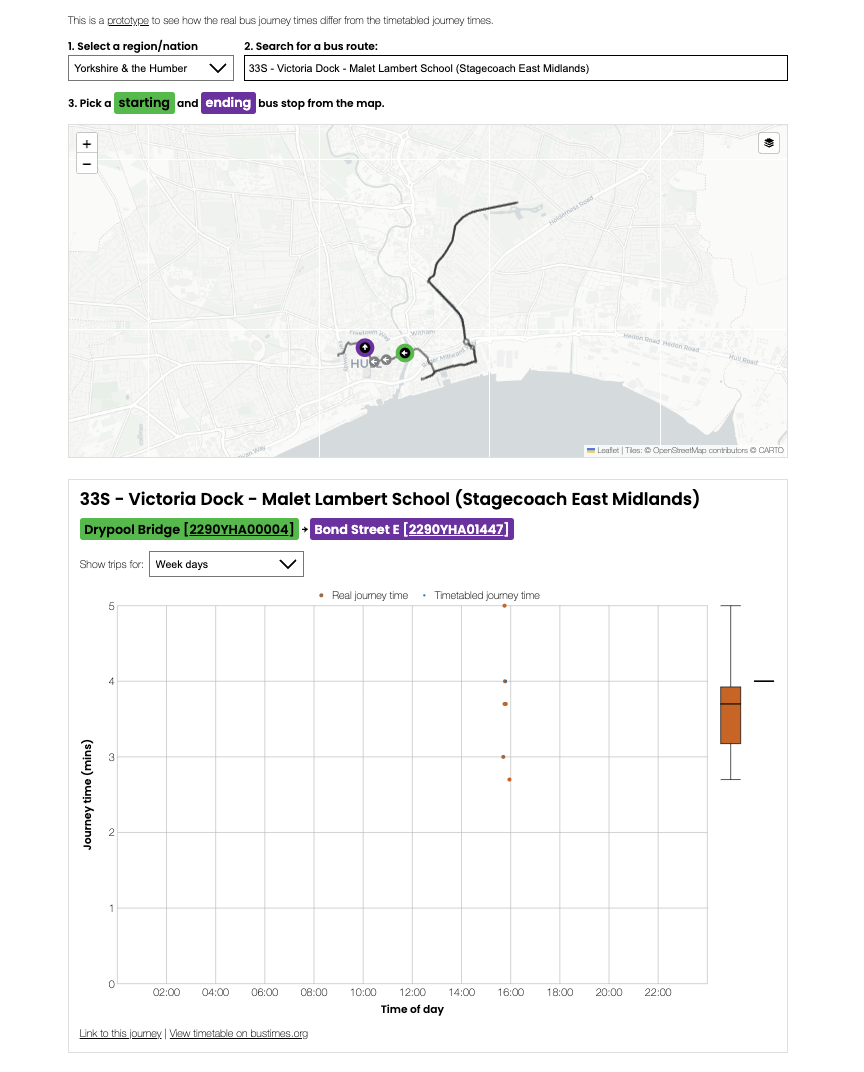
Bus journey times
"Does your bus journey take longer than the timetable says on your commute to/from work? Do you want to know the best time of day to avoid long journeys? Do you wish you had evidence to back up your suspicions about slow bus routes? Well, with our new bus tracking tool, you can."
This is a prototype developed by Open Innovations with data limited to a few days, but it looks like they're developing it further. It uses the DtT's Bus Open Data Service. Blog post here and tool here.
🤖 AI
My AI/LLM predictions for the next 1, 3 and 6 years, for Oxide and Friends
Simon Willison's predictions about AI, 2025.
Labeling things by hand when everyone's trying not to
"The hot stuff right now is labeling with LLMs, but y'know, maybe consider not?"
|
DID YOU LIKE THIS ISSUE>? → BUY ME A COFFEE! 
You're receiving this email because you subscribed to Quantum of Sollazzo, a weekly newsletter covering all things data, written by Giuseppe Sollazzo (@puntofisso). If you have a product or service to promote and want to support this newsletter, you can sponsor an issue. |
quantum of sollazzo is also supported by Andy Redwood’s proofreading – if you need high-quality copy editing or proofreading, check out Proof Red. Oh, and he also makes motion graphics animations about climate change.
