592: quantum of sollazzo
#592: quantum of sollazzo – 14 January 2025
The data newsletter by @puntofisso.

Hello, regular readers and welcome new ones :) This is Quantum of Sollazzo, the newsletter about all things data. I am Giuseppe Sollazzo, or @puntofisso. I've been sending this newsletter since 2012 to be a summary of all the articles with or about data that captured my attention over the previous week. The newsletter is and will always (well, for as long as I can keep going!) be free, but you're welcome to become a friend via the links below.
The most clicked link last week was Vàclav Volhejn's brilliant maps showing times instead of space
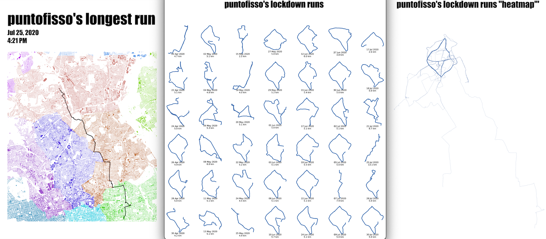
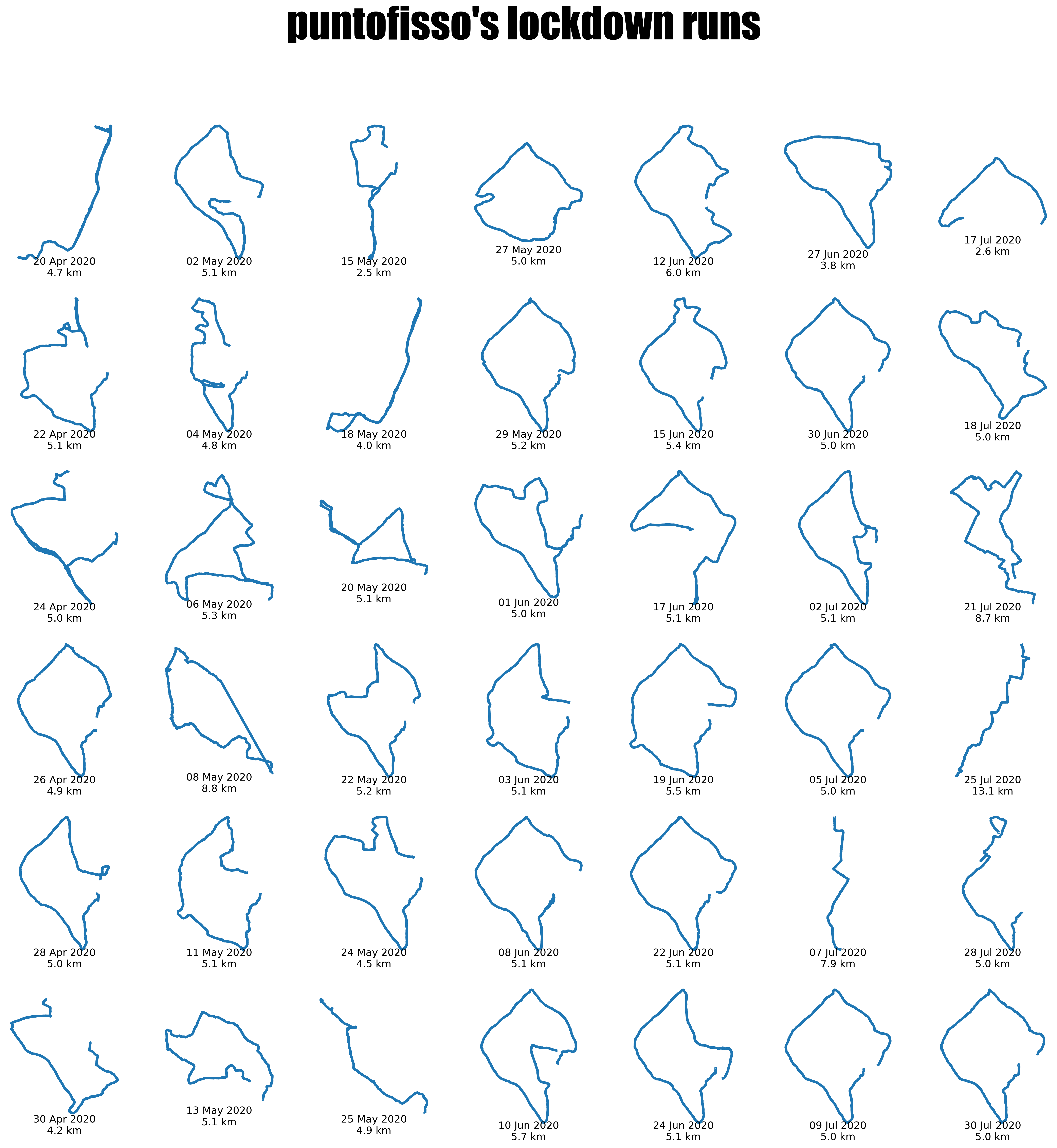
I've done some data wrangling to visualize my lockdown jogs. I've never run that much in my life, before or after. Anyway, if you're interested in learning more and maybe replicate it with your own data, look it the "Dataviz" section below.
It's AMA o'clock! This is the Quantum of Sollazzo Ask Me Anything section.
AMA – Ask Me Anything by submitting a question via this anonymous Google form. If there are many questions, I'll select a few every 4-5 weeks and answer them on here :-) Don't be shy!

The Quantum of Sollazzo grove now has 20 trees. It helps managing this newsletter's carbon footprint. Check it out at Trees for Life.
'till next week,
Giuseppe @puntofisso
Last but not least, Quantum has a new sponsor for the next few issues! Ed Freyfogle, organiser of geospatial meetup Geomob, co-host of the Geomob podcast, and co-founder of the OpenCage, has offered to introduce a set of points around the topic of geocoding. His first entry starts a few paragraphs below on "Why is open geodata important? What's the difference between open and closed data?".
📅 Events
Extra section this week as I've got a few events to recommend.
30 January 12:00-13:30 online: The Feminist Data Club, January 2025 meeting. They say: "This is a community to share, learn and create resources around Data Feminism in the UK. We take an intersectional feminism approach and we explore how data can create more equity for different communities in the UK.
Our first meeting will explore the question - "What is Data Feminism in the UK?"*. Anyone from across the UK, no matter how they define themselves, is welcome."
12 February 12:00-1300 online: A panel at Birkbeck University on the theme 'Is the UK entering a data winter?'. I won't say that the Betteridge's Law applies, but the speakers are top notch, including my friends Mor Rubinstein and Ben Worthy. Book your place here.
27 February 19:00-20:00 online: Open Data Scotland legend Ian Watt will give a webinar on the theme Wikidata as an Open Data Resource. This is part of a series run by the BCS special interest group on Open Source. Reserve a spot here.
Thanks to Mor Rubinstein for flagging the first two, and to Meng Wu for keeping me up to date with BCS activities.
✨ Topical
How to read this chart – 2024 wrap up
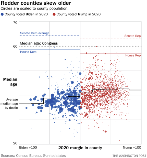
For those of you who don't know it, "How to read this chart" is a column in the Washington Post that explains charts appeared both on the newspaper itself and elsewhere, taking a critical approach. There are quite a few interesting analyses in this end of year review.
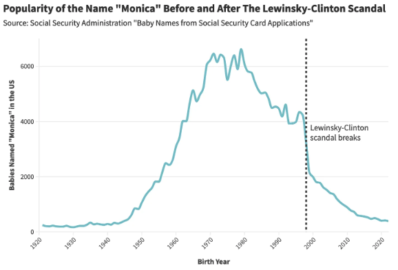
Which Celebrities Popularized (or Tarnished) Baby Names? A Statistical Analysis
The ever excellent Daniel Parris asks: "Which public figures impacted baby naming trends?". There are a few gems in here.
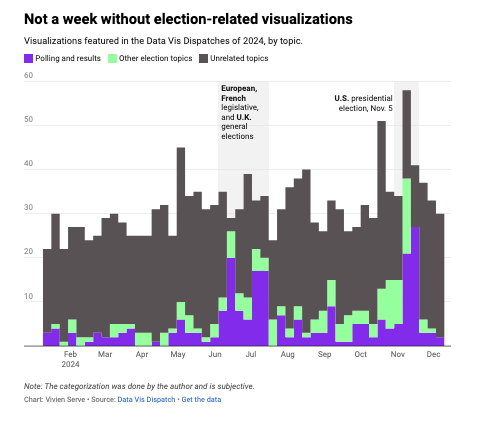
Election madness 2024 — one year in the Data Vis Dispatch
Vivien Serve of Datawrapper, in their analysis of 2024, recognises what a big share electoral dataviz occupies in their regular coverage.
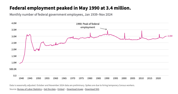
How many people work for the federal government?
USAFacts: "The federal government employs around 3 million people, making it the nation's 15th largest workforce."
It's not a lot, all things considered, but there are remarkable peaks – you can easily spot what they are, if you are a Quantum reader ;-)
Why is open geodata important? What's the difference between open and closed data?
Proprietary geodata from private services like Google are widely used, but come with licenses that severely restrict how you can use the data. Restrictions include:
- don't allow storing (caching) beyond a certain time period, and require deletion when you stop being a customer
- limit which maps you can use to display the geodata
- require a significantly higher cost to use behind a firewall or in desktop software
- no clarity on when or if data will be refreshed or corrected
Open data, like that returned by the OpenCage geocoding API, means:
- store data as long as you like
- display on any map
- use publicly or behind a firewall
- fix errors when you find them
As a final bonus, because the data is free (no cost), our service is also much more affordable.
Have a project that will need geocoding? See our geocoding buyer's guide for an overview of all the factors to consider when choosing between geocoding services.

🛠️📖 Tools & Tutorials
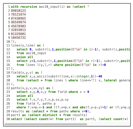
Advent of Code 2024 in pure SQL
Here's day 11 entry but the rest are interesting too. Obviously, no surprises, as SQL is Turing-complete.
Unpopular Opinion: Quarto is 100x better than Jupyter Notebook
Dataviz guru Yan Holtz's thoughts are here.
The future of htmx
From its creators: "htmx is the New jQuery – Now, that’s a ridiculous (and arrogant) statement to make, of course, but it is an ideal that we on the htmx team are striving for."
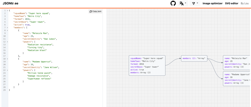
jsontr.ee
"Effortlessly visualize JSON structures as interactive and dynamic tree diagrams."
🤯 Data thinking
A plan for accessible maps
Benjy Stanton: "Designing accessible interactive maps is hard. I don’t think I could point to any single thing that I’ve worked on that covers all of the things mentioned here. But, if I was going to start a brand new project, with plenty of time to get things right, this is where I’d start.
The following isn't perfect, I'm really just sharing my workings so far. I hope that if you can see something is wrong or missing, you'll point it out. I’ll definitely iterate and add to this post in future."
(via Lisa Rimers)
📈Dataviz, Data Analysis, & Interactive
Playing With Gpx Data from Strava
Hey, this one is by me :) I wanted to make a dataviz of all my 2020 lockdown runs, and I ended up data wrangling both in QGIS (including an interesting application of processing tools in order to create the colouring of areas by local authority) and Python/Jupyter. The write-up is on my blog, while the Jupyter notebook is on Github.
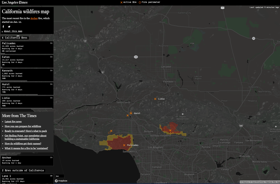
California wildfires map
The Los Angeles Times has this amazing interactive map, based on real-time open data provided by CalFire and the Geospatial Multi-Agency Coordination.
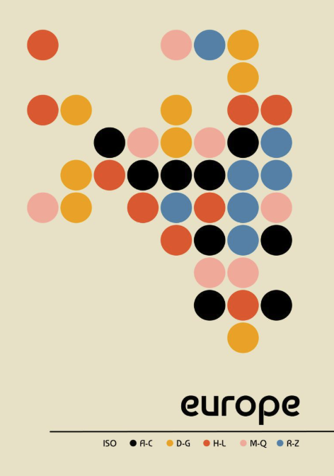
Bauhaus map
Another famous code sharer, Lisa Hornung, has created this beautiful map with Python/Matplotlib, and shared the code here.
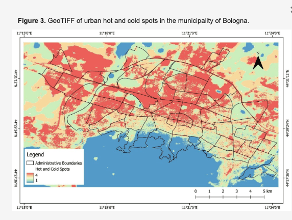
Investigating Social Vulnerability to Extreme Heat: Heat Islands and Climate Shelters in Urban Contexts: The Case of Bologna
A team of researchers at Fondazione Bruno Kessler in Trento (Italy): "n this article we present three instruments: (1) a social vulnerability to extreme heat index to identify the areas of a city (and populations thereof) more vulnerable to extreme heat due to climate change (heat islands); (2) a new overall fragility index that incorporates social vulnerability to extreme heat as well as socioeconomic indicators; and (3) a climate shelter index (CSI) to identify areas within a city that can provide relief from extreme heat based on green and blue solutions. We elaborated these three indexes to measure social vulnerability to extreme heat in the municipality of Bologna, which serves as this article’s case study. By analyzing the connections between social vulnerability to extreme heat and several socio-demographic variables in Bologna, we found that a decrease in income is significantly correlated with an increase in social vulnerability to extreme heat in urban contexts. A comparison between our new overall fragility index and the existing index adopted by the municipality of Bologna (Indice di fragilità, Comune di Bologna) showed that about 75% of the statistical areas observed are worse off when social vulnerability to extreme heat is also considered. Considering social vulnerability to extreme heat shows vulnerabilities in a city (here: Bologna) that the pre-existing index did not consider. These findings and our new indexes can support the Bologna administration (and other local administrations) in addressing the consequences of climate change for their most vulnerable residents."
A lot of good quality data wrangling, and a few maps too.
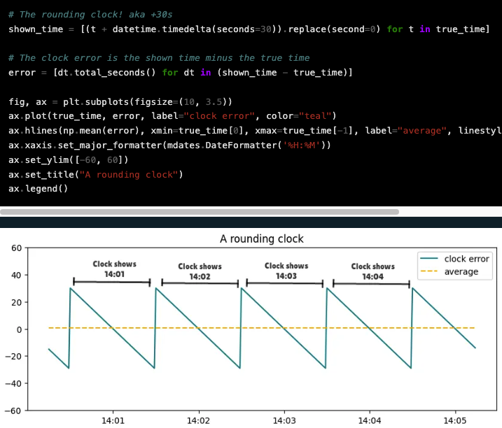
All clocks are 30 seconds late
The first thing I thought was: "This guy must be German" :) An interesting take.
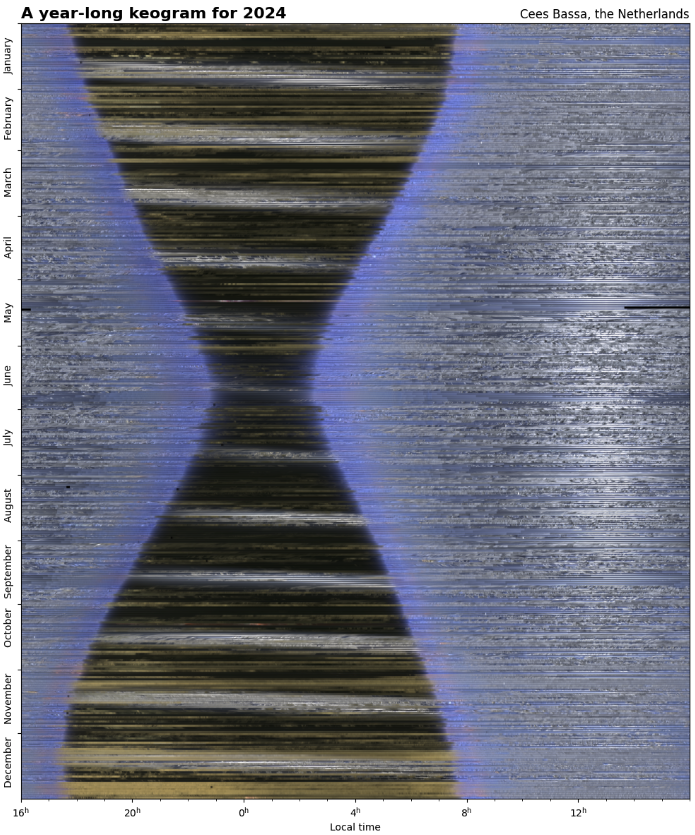
One year of all-sky photos
"For the 4th year in a row, my all-sky camera has been taking an image of the sky above the Netherlands every 15 seconds. Combining these images reveal the length of the night changing throughout the year, the passage of clouds and the motion of the Moon and the Sun through the sky."
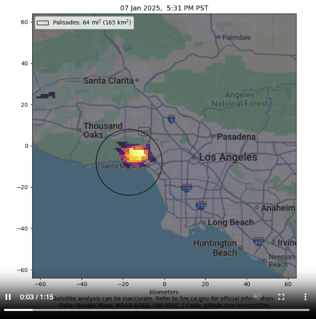
Analysing satellite imagery of the Jan 2025 Southern California wildfires
"3.9 micron data from the GOES-16 East and GOES-18 West satellites on the January 2025 Southern California fires. We download the reprojected data from UW SSEC's RealEarth program. Each image is 128x128 pixels, centered at (34.1, -118.4). Each pixel is 1.0 km. The satellites measure the temperatures of the topmost infrared-opaque region in the atmosphere, which may exaggerate the extent of fires from heated smoke, or hide the extent from cloud cover. You can see how quickly the fires initially grow — up to a square mile every minute at first — fueled by dry vegetation and strong winds. This shows the extreme difficulty of containment."
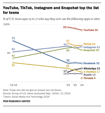
Teens, Social Media and Technology 2024
The Pew Research Centre takes a look at the use of social media in teenagers. I have to admit I wasn't expecting that (tiny, but noticeable) drop in TikTok.
🤖 AI
|
DID YOU LIKE THIS ISSUE>? → BUY ME A COFFEE! 
You're receiving this email because you subscribed to Quantum of Sollazzo, a weekly newsletter covering all things data, written by Giuseppe Sollazzo (@puntofisso). If you have a product or service to promote and want to support this newsletter, you can sponsor an issue. |
quantum of sollazzo is also supported by Andy Redwood’s proofreading – if you need high-quality copy editing or proofreading, check out Proof Red. Oh, and he also makes motion graphics animations about climate change.
