590: quantum of sollazzo
#590: quantum of sollazzo – 31 Dec 2024
The data newsletter by @puntofisso.

Hello, regular readers and welcome new ones :) This is Quantum of Sollazzo, the newsletter about all things data. I am Giuseppe Sollazzo, or @puntofisso. I've been sending this newsletter since 2012 to be a summary of all the articles with or about data that captured my attention over the previous week. The newsletter is and will always (well, for as long as I can keep going!) be free, but you're welcome to become a friend via the links below.
The most clicked link last week was the fascinating Subway Stories (thanks Blanca!)
AMA – Ask Me Anything
A shorter newsletter today as I'm still processing my food coma but... it's AMA o'clock! Welcome to the Quantum of Sollazzo Ask Me Anything section.
Over the past month, you've asked quite a few questions, and I can't answer all of them timely, so here's a selection. I'll try to answer them all over time, so please do keep asking your questions via this anonymous Google form.
An anonymous reader asks: "Have you joined/considered to join Kaggle competition before? Why/why not?." I have, but as much as it might surprise some of you, I'm not really a data scientist. I'm more interested in data quality and data coverage, and sharing interesting ways to explore data, like my Parli-N-Grams web app. Sometimes I play with data science, but my data wrangling is relatively elementary, and I find a thrill in discovery more than in competing. My biggest strength at work is a multidisciplinary understanding of data and the ability to be a bridge between different areas of knowledge. However, I have often used Kaggle to learn what others are doing, what techniques are in and out of fashion, and, most often, simply to find interesting datasets. It's a great resource!
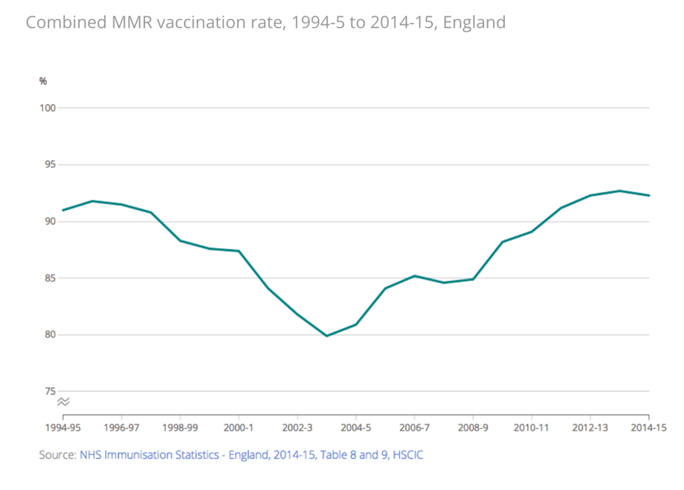
Allan asks: "What are some interesting new ways that data visualizations are being used to mislead or misdirect? I'm thinking of recent additions to things like different or off Y-axis, etc." I'll not point the finger to a specific use, but question points to a very important problem, with the answer being, obviously, "it depends". For example, it makes me think about the debate within the dataviz community about whether it's correct/ethical to cut off the Y-axis. This is the practice of making a chart with a Y-axis that doesn't start at 0, but closer to a value that somewhat highlights the phenomenon that the chart is exploring. This problem had some coverage, for example on the ONS blog (about 8 years ago), with the chart below given as example: "At this zoom level there looks to be a marked decline and subsequent rise in the data. But is this important or not? Some context might be useful to make sense of this trend."
And there it goes: every use of data can be misleading if it doesn't capture the context in which the data was captured and used. In dataviz, which is by nature a summary of a complex reality, this can happen often.
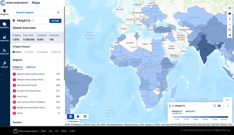
Jez sends an OpenStreetMap question: "OpenStreetMap, perhaps the most valuable Open database in the world, was created in the UK. How would you raise its profile with UK Government and/or with citizens?" Oh, this is a beautiful one, and it's a blank canvas to answer :-) First of all, you'd be surprised: as someone who works in Government, I've seen plenty of uses of OSM when presenting geographic data. It's often appreciated by us in the public sector because of its coverage and timeliness of updates. However, it is also true that Ordnance Survey is another treasure of geo-data, especially in Great Britain, and that it comes with some official status – in Government, we can use the full spectrum of Ordnance Survey data thanks to the permissive PSGA licence. It's all good competition for the best geodataset. So, in all honesty, I would expect OSM to be more popular with other Governments. I have seen some pretty large organisations using it, some of which are listed on the OSM website and include the Italian's Prime Minister's office, the Scottish Government's crime report maps, and the World Bank's project map screenshotted below. I'd say that many international organisation are fully aware and use OSM effectively.
Things are different when we talk about the general public, though, because in this cohort success is all about ease of use for navigation – the ability of getting turn-by-turn directions on loudspeaker, for example, is what ultimately drives people to Google or Apple maps. While there are now great apps that offer services like this using OpenStreetMap data (such as Maps.Me) these are still limited in terms of features and somewhat clunky for the average user. OpenStreetMap doesn't want – and rightly so – to provide a single way of using its data; it's a data source, rather than a map provider, so I suspect that it will never be fully appreciated by the general public as if it did.
Finally, an anonymous reader asks me a personal question about Quantum: "Are you able to monetize your newsletter enough to justify the time you spend on it? If yes, how long did it take to achieve monetization? If no, why do you still write it?". Ha, I'm not a newsletter millionaire (for now? :P). While I have occasional sponsors, and accept donations, at the moment I am not looking to massively monetise this newsletter. I've had enough sponsorships and donors over the past 12 years that allow me to cover the server costs, and that's as much as I'm happy to push (things might change one day).
The reason why I write Quantum is not to run a business. For me, it's a tool to distil things I've seen that caught my interest, learn something from it, understand myself and my evolving interests, and building networks and relationships. It gives me joy, and it has allowed me to get in touch with many interesting data folks. There are also indirect benefits, some financial and some non-financial – for example, readers of this newsletter asked me to freelance for them, or invited me to speak at their conferences, flying me to Buenos Aires for csv,conf or Madrid for TRGCON.
AMA – Ask Me Anything will return in 2025, so please keep submitting your question via this anonymous Google form. Don't be shy!

The Quantum of Sollazzo grove now has 20 trees. It helps managing this newsletter's carbon footprint. Check it out at Trees for Life.
I was on a podcast again, on (data) stories, success, and data done right: "In this episode of It's Not All About the Numbers, Chris and Mike welcome back Giuseppe Sollazzo, Deputy Director of Data Enablement at DWP, for a lively chat on data quality, teamwork, and the future of work. Giuseppe shares lessons from his speaking gigs, along with fresh takes on financial success, online habits, and communicating data effectively. Packed with anecdotes, humour, and sharp insights, this episode is a must-listen for anyone navigating the data and tech world."

Of all the articles I've read and linked to in 2024, one keeps making my brain explode every time I think of it (and, for some reason, I keep thinking of it): "How to date a recording using background electrical noise" by Robert Heaton. It's very technical and I only understand parts of it. The TL;DR: to prove that a suspect was guilty, the police used a recording, not for the content of the recording but because the "hum" sound in the recording, from electrical interference, matched the frequency of the hum of the electrical network at a certain specific time and place. What's remarkable, aside from the CSI technique, is that such frequency data is openly available throughout most of the developed world.
'till next week and happy new year,
Giuseppe @puntofisso
✨ Topical
Dreaming of a White Christmas? These Communities Have Waited a Long Time
"Snow on Christmas Day is idyllic for many. And in recent years, most of the US have seen a “white Christmas.” But many parts of the country haven’t had snow on the ground on Dec. 25 in more than a decade."

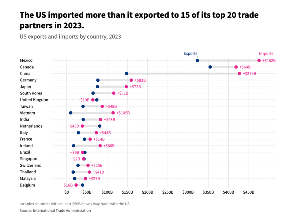
Who are the US’ top trade partners?
USAFacts: "Over 50% of 2023 US trade involved one of five partners: Mexico, Canada, China, Germany, and Japan." The balance is also pretty skewed towards importing.
Brain food, delivered daily
Every day we analyze thousands of articles and send you only the best, tailored to your interests. Loved by 505,869 curious minds. Subscribe.

🛠️📖 Tools & Tutorials
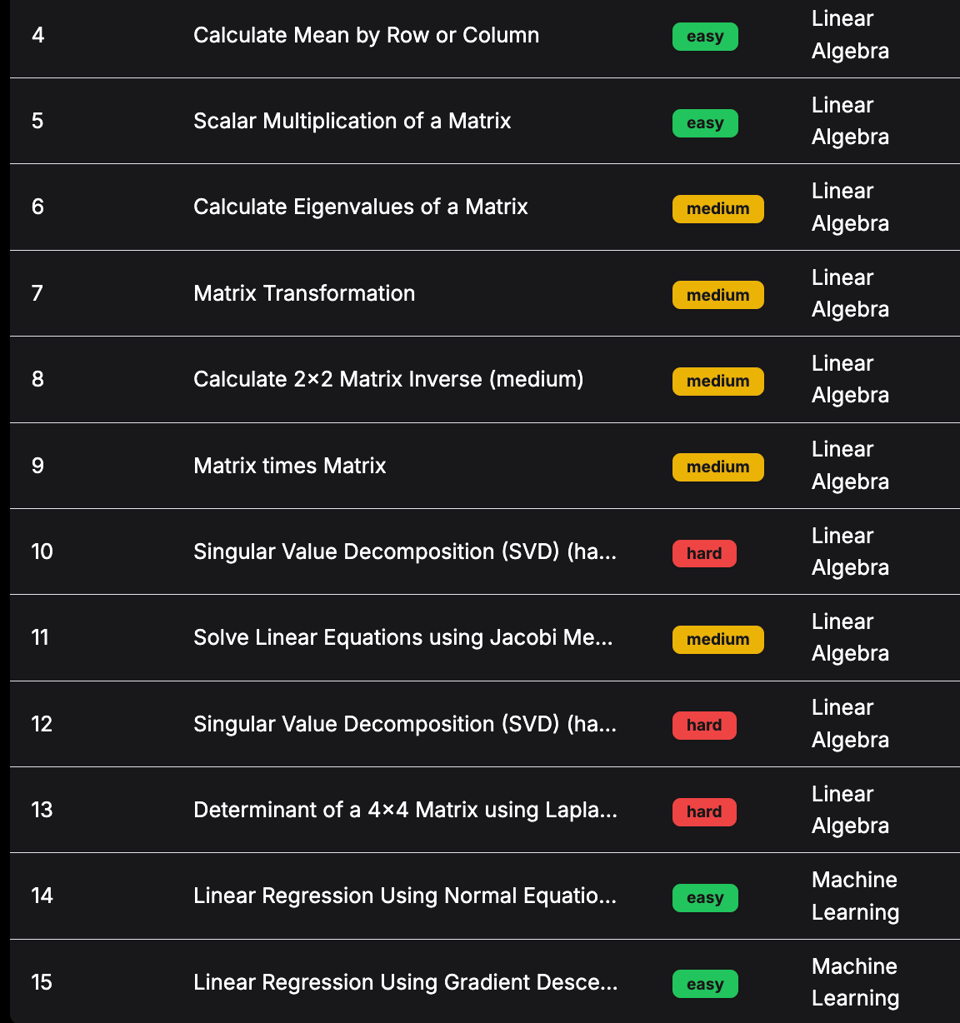
Deep-ML
"Practice Machine Learning and Data Science problems".
📈Dataviz, Data Analysis, & Interactive
Dexterity assessment of hospital workers: prospective comparative study
A serious, yet hilarious, article on the British Medical Journal: "To compare the manual dexterity and composure under pressure of people in different hospital staff roles using a buzz wire game.". Amazing dataviz.
(via Lucilla Piccari)

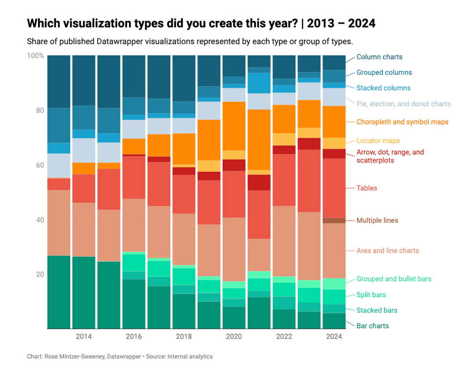
Which chart types did our users create in 2024?
Rose Mintzer-Sweeney wraps up the year for Datawrapper.
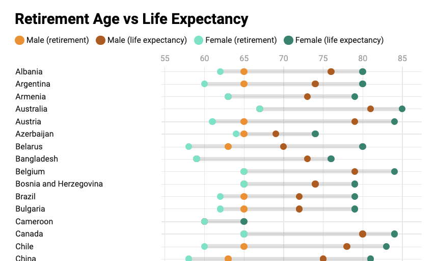
Retirement age vs Life expectancy
One I made. I was looking at the relationship between retirement age and life expectancy, something that was sparked by a conversation at work. Using data from Wikipedia and the WHO, I created this chart. However, there are some caveats that need to be understood: retirement age is for many countries not a fixed date. It changes with age, it will be changing over the next few years, and there are intricate rules almost everywhere. So here I usually captured the earliest date, or the most common date. Dataviz of this kind is hard, but I hope this gives something to think about – especially those countries that seem to have very close retirement age and life expectancy.
Feel free to share, but do share with these caveats if you do.
|
DID YOU LIKE THIS ISSUE>? → BUY ME A COFFEE! 
You're receiving this email because you subscribed to Quantum of Sollazzo, a weekly newsletter covering all things data, written by Giuseppe Sollazzo (@puntofisso). If you have a product or service to promote and want to support this newsletter, you can sponsor an issue. |
quantum of sollazzo is also supported by Andy Redwood’s proofreading – if you need high-quality copy editing or proofreading, check out Proof Red. Oh, and he also makes motion graphics animations about climate change.
