589: quantum of sollazzo
#589: quantum of sollazzo – 24 December 2024
The data newsletter by @puntofisso.

Hello, regular readers and welcome new ones :) This is Quantum of Sollazzo, the newsletter about all things data. I am Giuseppe Sollazzo, or @puntofisso. I've been sending this newsletter since 2012 to be a summary of all the articles with or about data that captured my attention over the previous week. The newsletter is and will always (well, for as long as I can keep going!) be free, but you're welcome to become a friend via the links below.
The most clicked link last week was EDJNet's analysis of naturalisation of sports professionals.
Oh, this has me in total agreement. If you want me to give you attention, never start with "hello" or "hi", just tell me what you need :)

Some of you might want to make a submission, by the 31st January, to the Information is Beautiful Awards.

It's AMA o'clock! This is the Quantum of Sollazzo Ask Me Anything section.
AMA – Ask Me Anything by submitting a question via this anonymous Google form. If there are many questions, I'll select one each couple of weeks and answer it on here :-)
Don't be shy!

Next batch of answers comes next week.
The Quantum of Sollazzo grove now has 20 trees. It helps managing this newsletter's carbon footprint. Check it out at Trees for Life.
If you celebrate it, have a very merry Christmas.
'till next week,
Giuseppe @puntofisso
✨ Topical
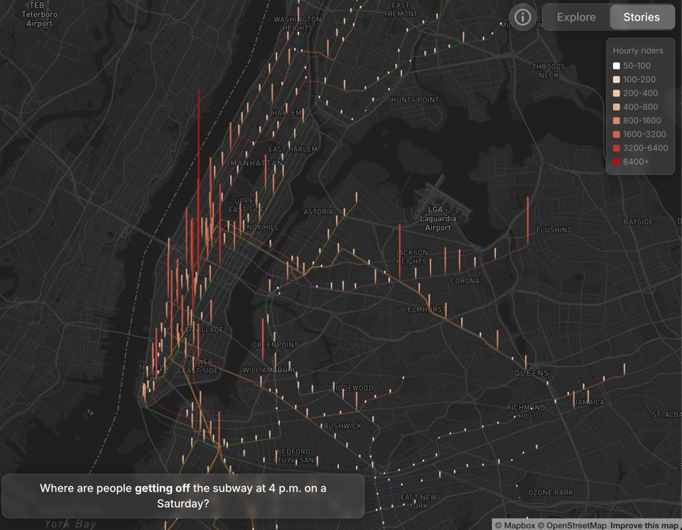
Subway Stories
"Every year, New Yorkers take more than a billion trips on the subway. Using data from the MTA, we mapped out how riders flow between stations at every hour. Each story explores a slice of city life."
(via Blanca Lanaspa)
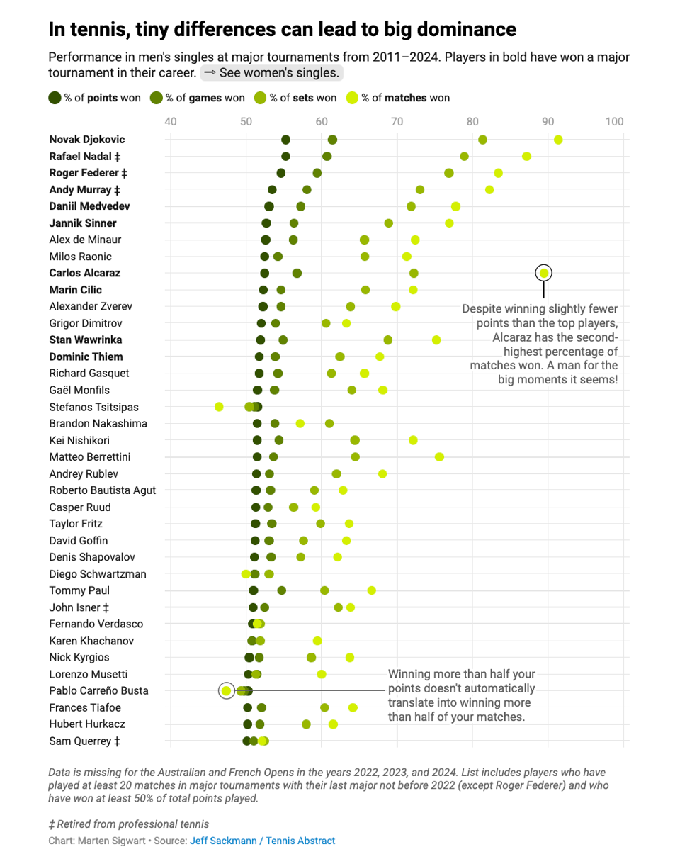
Point after point
Marten Sigwart of DataWrapper: "2024 will go down as the year in which one of tennis’s all-time greats, Rafael Nadal, left the big stage of professional sport to retire after 23 years on the tour. Alongside Novak Djokovic and Roger Federer, a trio sometimes referred to as the “Big Three,” Nadal dominated men’s professional tennis for over two decades. Throughout his career, he won a staggering 82.6% of his singles matches (1080 wins, 228 losses) and amassed 92 ATP singles titles including 22 majors along the way. The Big Three as a whole have won 66 of the possible 87 major titles since 2003."
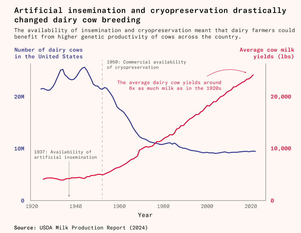
How big data created the modern dairy cow
"What do cryogenics, butterfat tests, and genetic data have in common? They’re some of the reasons behind the world’s most productive dairy cows. Here’s how it all started."
I link to this article mostly for the chart below. But it's an interesting article nonetheless.
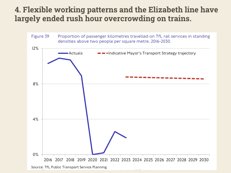
Ageing, static and skint: Nine charts that explain what's going on with London transport
Jim Waterson (London Centric): "How the ability to travel around the city shapes the capital, its residents, and the lives we lead."
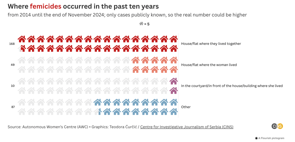
Femicide in Serbia: Women least safe in their own home
"More than 300 femicides have been recorded in Serbia over the last ten years, according to data published by the Autonomous Women’s Centre (AWC) in Belgrade. Most of the women were killed in their own homes, where they lived alone or with their partner."
Brain food, delivered daily
Every day we analyze thousands of articles and send you only the best, tailored to your interests. Loved by 505,869 curious minds. Subscribe.

🛠️📖 Tools & Tutorials
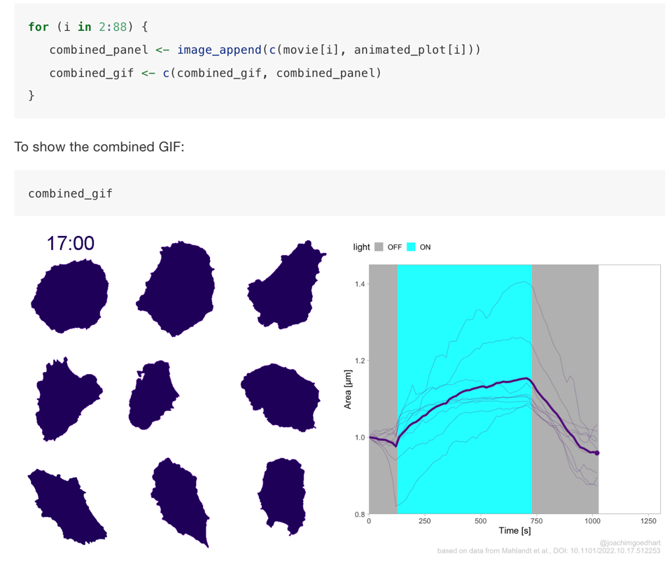
DataViz protocols
"An introduction to data visualization protocols for wet lab scientists"
Open source, experimental, and tiny tools roundup
"This is a list of small, free, or experimental tools that might be useful in building your game / website / interactive project. Although I’ve included ‘standards’, this list has a focus on artful tools and toys that are as fun to use as they are functional."
(via Web Curios)

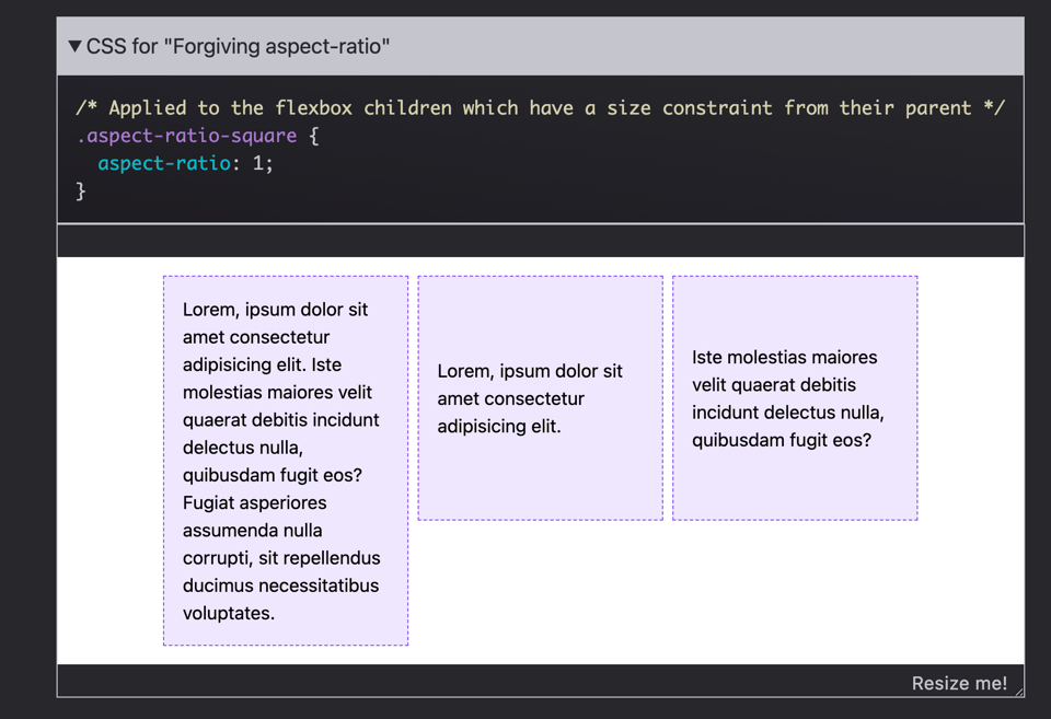
12 Modern CSS One-Line Upgrades
"Sometimes, improving your application CSS just takes a one-line upgrade or enhancement! Learn about 12 properties to start incorporating into your projects, and enjoy reducing technical debt, removing JavaScript, and scoring easy wins for user experience."
Some of these could be handy for your web-based dataviz.
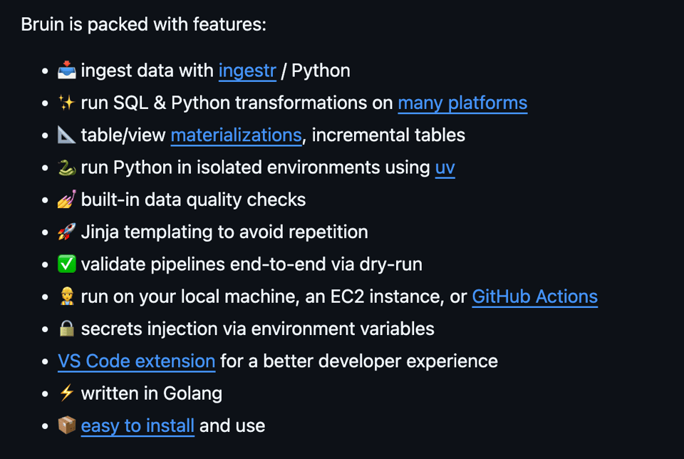
bruin
"Build data pipelines with SQL and Python, ingest data from different sources, add quality checks, and build end-to-end flows... Bruin is a data pipeline tool that brings together data ingestion, data transformation with SQL & Python, and data quality into a single framework. It works with all the major data platforms and runs on your local machine, an EC2 instance, or GitHub Actions."
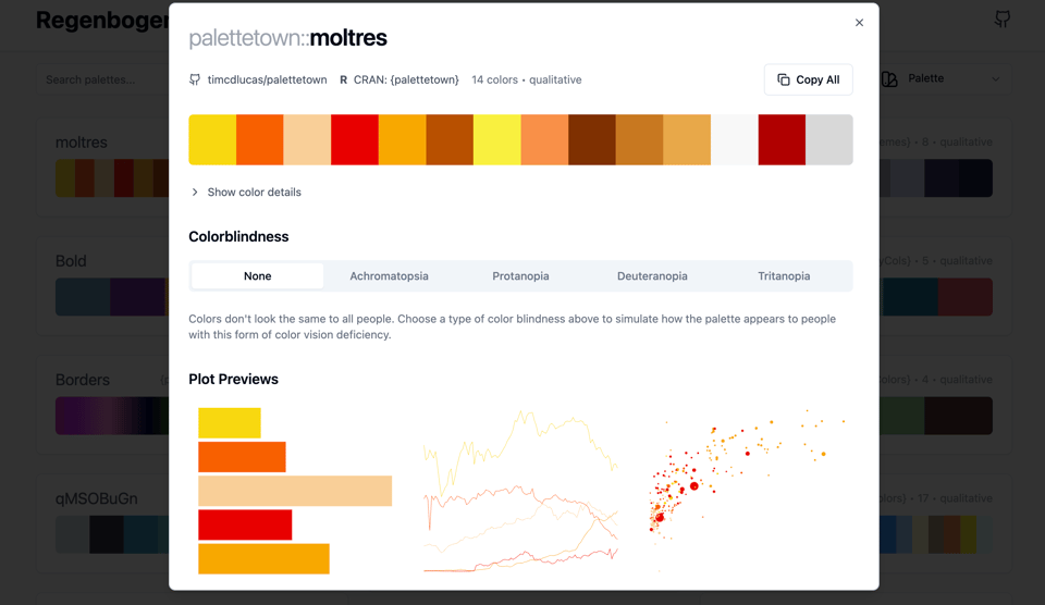
Regenbogen
A useful tool to see "color pallets for data visualization in R, Python and beyond."
Also available on GitHub.
🤯 Data thinking
Reflections and Predictions
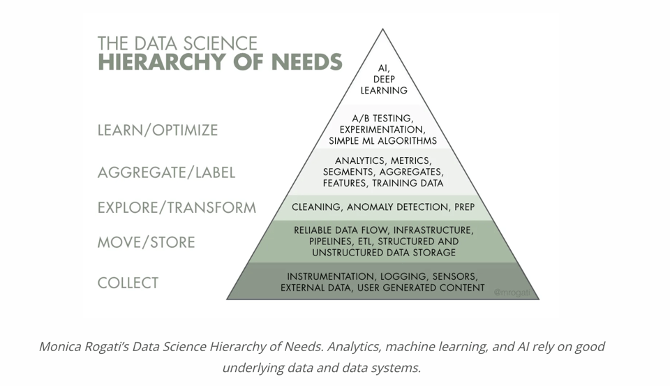
Tristan Handy (Analytics Engineering/dbt): "In the early years (2015-2017), the data ecosystem was dominated by data science... In 2023, everything changed, very quickly. But in 2024, things changed again."
No spoilers ;-)
10 takeaways from 10 years of data science for social good
"When we started DrivenData in 2014, the application of data science for social good was in its infancy... We want to take this chance to distill some of our overarching observations on doing data for good over the last ten years."
📈Dataviz, Data Analysis, & Interactive
NASA Open Science Reveals Sounds of Space
"While the Chandra telescope provides data in X-ray wavelengths for most of the sonifications, the team also took open data from other observatories to create a fuller picture of the universe. Types of data used to create some of the sonifications include visual and ultraviolet light from the Hubble Space Telescope, infrared and visual light from the James Webb Space Telescope, and infrared light from the now-retired Spitzer Space Telescope."
(via Paola Chiara Masuzzo)

Moon
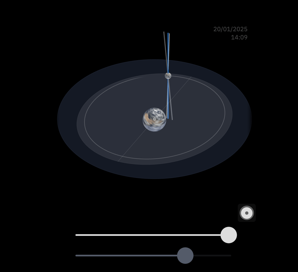
"In the vastness of empty space surrounding Earth, the Moon is our closest celestial neighbor. Its face, periodically filled with light and devoured by darkness, has an ever-changing, but dependable presence in our skies.
In this article, we’ll learn about the Moon and its path around our planet, but to experience that journey first-hand, we have to enter the cosmos itself."
I've covered Bartosz Ciechanowski's work before, so I hope you enjoy this (his mechanical watches explainer is one of my all-time favourites).
Plotting Prime Numbers
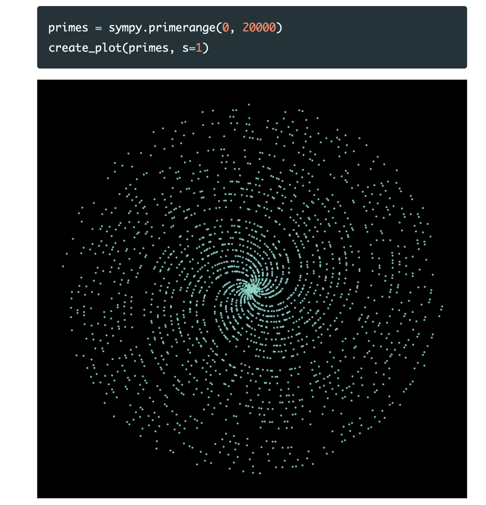
"Why is it that prime numbers, when plotted on polar coordinates, show patterns, such as spirals or lines?"
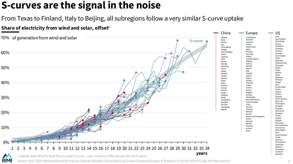
Inside the Race to the Top
"The race for cleantech among Chinese provinces, US states, and European countries", as analysed by RMI. As reader and frequent source of great dataviz articles Peter Wood points out, some great charts, this one below with the interesting use of ordering data to make a trend emerge.
🤖 AI
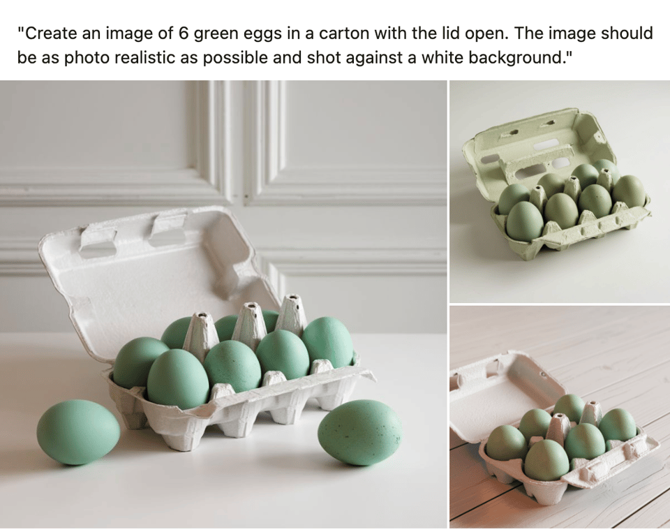
Green eggs and ham.
Ian Makgill tries an image-generating AI: "I've tried with multiple image generating models to create an image of 6 green eggs.
Demanding green eggs is important because I'm asking the AI to render something commonplace but different.
Asking for 6 green eggs does something to the model's ability to count."
This Is The Story Of The Pernicious Rise of AI-Generated Papers and their Online Impact
A Bluesky thread by Altmetric.
(via Lucilla Piccari)
NeurIPS, the largest AI conference, happened last week in Vancouver
a16z's Guido Appenzeller: "Looking back, my top three take-aways are: 1. Pre-training has topped out (at least for LLMs) 2. Inference-time compute and workflow are the new frontier 3. Auto-regressive vs. diffusion is still open"
|
DID YOU LIKE THIS ISSUE>? → BUY ME A COFFEE! 
You're receiving this email because you subscribed to Quantum of Sollazzo, a weekly newsletter covering all things data, written by Giuseppe Sollazzo (@puntofisso). If you have a product or service to promote and want to support this newsletter, you can sponsor an issue. |
quantum of sollazzo is also supported by Andy Redwood’s proofreading – if you need high-quality copy editing or proofreading, check out Proof Red. Oh, and he also makes motion graphics animations about climate change.
