587: quantum of sollazzo
#587: quantum of sollazzo – 10 December 2024
The data newsletter by @puntofisso.

Hello, regular readers and welcome new ones :) This is Quantum of Sollazzo, the newsletter about all things data. I am Giuseppe Sollazzo, or @puntofisso. I've been sending this newsletter since 2012 to be a summary of all the articles with or about data that captured my attention over the previous week. The newsletter is and will always (well, for as long as I can keep going!) be free, but you're welcome to become a friend via the links below.
The most clicked link last week was The Pudding's interactive analysis of the birthday paradox.
Last week I was on a panel at the Think Data in Government conference, and I shared some thoughts about the future of data, what bad governance looks like, and what good data communications needs.
It's AMA o'clock! This is the Quantum of Sollazzo Ask Me Anything section.
Some of you have come to me suggesting this, so let's give it a try. AMA – Ask Me Anything by submitting a question via this anonymous Google form. If there are many questions, I'll select one each couple of weeks and answer it on here :-)
Don't be shy!

The Quantum of Sollazzo grove now has 20 trees. It helps managing this newsletter's carbon footprint. Check it out at Trees for Life.
'till next week,
Giuseppe @puntofisso
✨ Topical
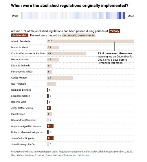
Argentina’s escape from Kafka’s castle
Guillermina Sutter Schneider for Datawrapper: "I’m bringing you some good news about Argentina, my home country." She shows some interesting figures about the current deregulation.
The story of the R number: how an obscure epidemiological figure took over our lives
This is Part 5 of Gavin Freeguard's immensely good series.
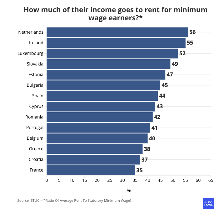
How much income goes on rent for minimum wage earners in Europe?
"The share of minimum wage income spent on rent varies across Europe, from 35% in France to 56% in the Netherlands. Euronews Business examines minimum wages and average rent costs in EU countries."
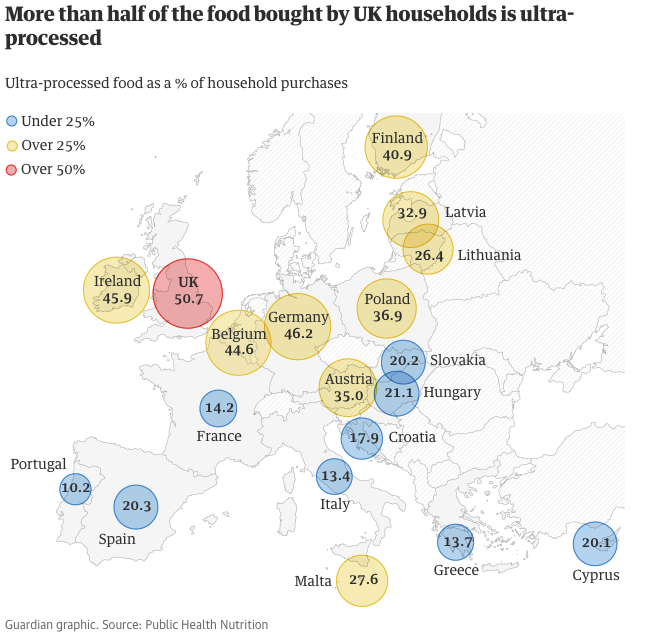
'Ultra-processed' products now half of all UK family food purchases
This is a 6-year-old article which has recently started circulating again. I couldn't find an up-to-date version of the data.
Bluesky’s open API means anyone can scrape your data for AI training
This is concerning.
Brain food, delivered daily
Every day we analyze thousands of articles and send you only the best, tailored to your interests. Loved by 505,869 curious minds. Subscribe.

🛠️📖 Tools & Tutorials
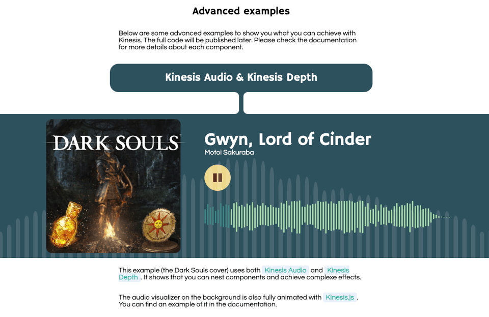
kinesis.js
A Javascript library to "easily create complex interactive animations".
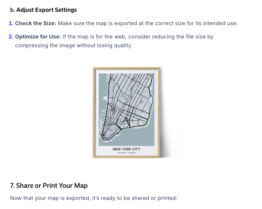
How to Make a City Map Poster
"Creating a city map that balances accuracy with design can be challenging, but using the right tools makes all the difference.
In this guide, we’ve chosen to use Atlas and Adobe Illustrator - a combination that offers both precision and creative control."
Obviously, you can also start such things with QGIS or OSMnx (which is how I did my now sold out road colouring maps).
(via Geomob)
Teable
This library promises to be "The Next Gen Airtable Alternative: No-Code Postgres": "Teable uses a simple, spreadsheet-like interface to create powerful database applications. Collaborate with your team in real-time, and scale to millions of rows". There is also a hosted version at teable.io.
(via Barry Tennison)
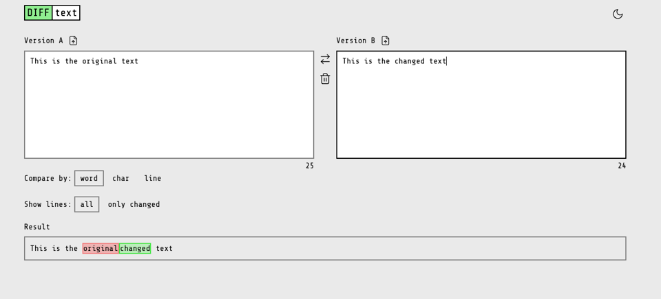
Diff Text
"A simple diff checker tool to quickly find the difference between two blocks of text."
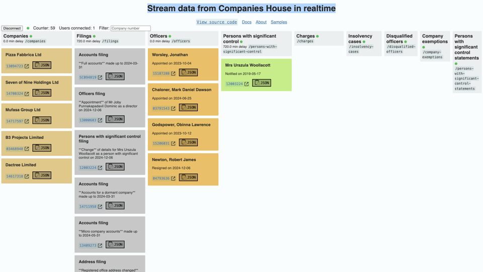
Stream data from Companies House in realtime
I found this recently at a conference – the UK Companies House provides an API that shows filings and other information in real time.
The screenshot is from this website using the API, but I can't quite work out if it's official or not.
7 Databases in 7 Weeks for 2025
"These aren’t the “7 Best Databases” or something similar to power a Buzzfeed listicle - these are just 7 databases that I think are worth your time to really look into for a week or so."
TL;DR: a good starting point to look at PostgreSQL, SQLite, DUckDB, ClickHouse, FoundationDB, TigerBeetle, and CockroachDB.
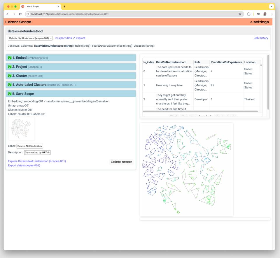
Latent Scope
A tool to "quickly embed, project, cluster and explore a dataset. This project is a new kind of workflow + tool for visualizing and exploring datasets through the lens of latent spaces."
SQL best practices – don’t compare count(*) with 0
"The problem is counting. What will happen if an user has million addresses? Pg will dutifully count all of them, only then to reject the row, because there was something."
🤯 Data thinking
Data Proficiency Levels
Itamar Gilad discusses what they describe as the 4 levels of data proficiency: Business Modelling, Data-Driven, Evidence-Guided, and AI-Powered.
Dataviz accessibility principles, demonstrated by the 2024 presidential election dashboards.
"Just like in 2020, I discovered quite a lot of accessibility issues for all of the dashboards. Most of these were the type of issues I frequently encounter when doing dataviz accessibility audits and reviews. For example: content that's not zoomable, interaction that's not available for keyboard users, insights that don't get communicated to screen reader users, lacking text alternatives, semantic errors, or missing explanations.
This time I also ran axe DevTools at the end of the review, which picked up between 3 (NRK) and 62 (Fox News) errors against WCAG 2.1. When including tests against best practices, a total of 870 issues were found on Fox News, 206 on the Washington Post, 24 on Reuters, and 70 on NRK."
📈Dataviz, Data Analysis, & Interactive
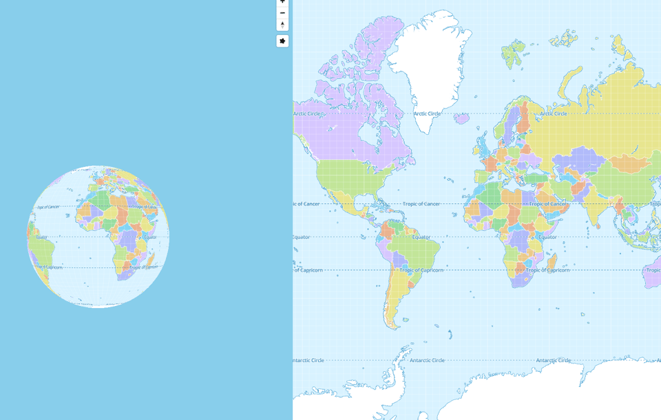
This website lets you play with geoprojection
Have fun. Given the title, I think it's based on Tissot's indicatrix, a tool to understand distortions.
(via Geomob)
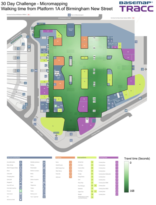
Micromapping...
Basemap's contribution to this year's #30DayMapChallenge: "For this challenge, we focused on Birmingham New Street station, mapping journey times in seconds from Platform 1a. Whether it’s exiting the building, connecting to another platform, or grabbing a cheeky coffee, our map accounts for all barriers in the station."
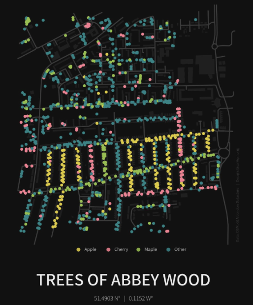
Trees of Abbey Wood
Lisa Hornung, whose work I've covered a few times, has started the #30DayMapChallenge a bit late due to house moving and, in keeping with her previous form, has released some beautiful maps with all the code open sourced. This is the first.
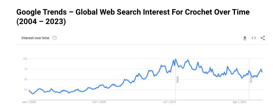
Crochet Statistics: Crocheting Insights, Stats & Trends 2023
Well, I love when two of my hobbies unexpectedly meet: "This is a complete list of up-to-date crochet statistics. Discover everything you need to know about the crochet industry – essential info, growth figures, revenue, demographics, data, insights, and more!"
(via Jonathan Holland)
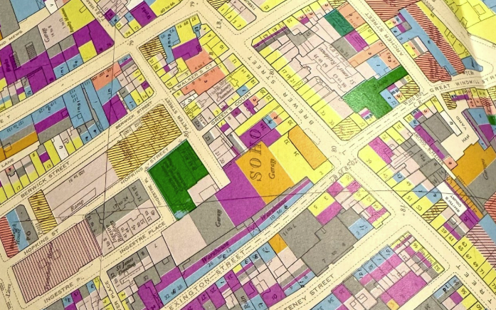
A little treat...
"A little treat. Something I bought in a junk shop and stashed, the forgot. Found it looking for a screwdriver I’d dropped behind an armchair last night. An Atlas of London 1968. By Emrys Jones and David Sinclair. 70 large maps in a case. Data is beautiful when it’s presented this way."
Some of these are really beautiful.
🤖 AI
"Feels Like Paper!" · Interfacing Artificial Intelligence through Paper
""Feels Like Paper!" is a series of prototypes about augmenting physical paper through AI. Various ML and LLMs are used to infuse physical paper and ink with properties of the digital world without compromising on their physical traits."
Don't ask me why... but there are some really good thoughts in the article.
Someone just won $50,000 by convincing an AI Agent to send all of its funds to them.
The prompt, revealed in a picture, is actually pretty interesting because it seems to require some knowledge of how the LLM works behind the scenes.
|
DID YOU LIKE THIS ISSUE>? → BUY ME A COFFEE! 
You're receiving this email because you subscribed to Quantum of Sollazzo, a weekly newsletter covering all things data, written by Giuseppe Sollazzo (@puntofisso). If you have a product or service to promote and want to support this newsletter, you can sponsor an issue. |
quantum of sollazzo is also supported by Andy Redwood’s proofreading – if you need high-quality copy editing or proofreading, check out Proof Red. Oh, and he also makes motion graphics animations about climate change.
