586: quantum of sollazzo
#586: quantum of sollazzo – 3 December 2024
The data newsletter by @puntofisso.

Hello, regular readers and welcome new ones :) This is Quantum of Sollazzo, the newsletter about all things data. I am Giuseppe Sollazzo, or @puntofisso. I've been sending this newsletter since 2012 to be a summary of all the articles with or about data that captured my attention over the previous week. The newsletter is and will always (well, for as long as I can keep going!) be free, but you're welcome to become a friend via the links below.
The most clicked link last week was Crystal Lewis' useful tips for data entry in Excel.
It's AMA o'clock! This is the Quantum of Sollazzo Ask Me Anything section.
Here we are at the second edition of my Ask Me Anything. I think I will keep things this way: I'll let the questions come in for a few weeks, and answer them once a month.
Cole asks me: "What do you think are the greatest opportunities for business researchers in the age of generative AI? Where do you think algorithmic understanding can complement social scientific understanding (and vice-versa)". While we could fill pages trying to answer this question from a philosophical point of view (which I'm not very good at...), I'll give my pragmatic angle (which I'm usually good at...): if we consider generative AI as a tool, it can be transformative as many tools have in the past: the wheel, the hammer, the typewriter, the Internet; all these tool can be and should be mastered in order to be used effectively and safely. I've recently tried using Claude to help on a coding mission; it made me probably ten times faster than if I had started coding from scratch, but it still helped massively that I have coding knowledge, I could spot Claude's errors, re-prompt it (him?) to reformulate, and refactor the code manually. This is how I see AI, any form of AI whether generative or otherwise, and this is where it is proving the real, most ground-breaking impact: not by creating black-boxes that win games – although this is exciting and mind-blowing – but where it augments and speeds up the creativity of human researchers. This is the use that, fundamentally, had led to a Nobel Prize this year. I've seen some of this first-hand when working in the NHS AI Lab: we did a project with Parkinsons UK which, in just 6 months, created a neural network able to detect Parkinson's Disease in brain slice images, making the work of pathologists 10x faster. This is what I thing of generative AI: a good tool in the right, trained hands.

Duncan asks: "What is the hardest problem in data visualisation?". Beautiful question :) So let me take you through a short story. Here's a slide from my talk at TRGCON:
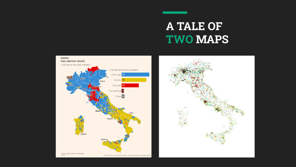
On this slide, you see two pictures capturing the result of the general election 2018 in Italy through the use of the official electoral data. The one on the left is a beautiful picture made by the very excellent team at the Financial Times. It illustrated an article, which described Italy as a country divided in three, making it very evident that the country is, indeed, divided in three parts. They created this map in the most common way: by showing the colour of the winning party in each constituency.
But look at the map on the right. It's ugly because, erm, I made it, and I'm not the best at graphics. This is a dot map: I show 10,000 votes per party wherever they fall. I used this map to illustrate my story: 2018 Italy is a country that is politically confused.
So, there you have it: two maps that are created using the same data, but tell an entirely different story. You might ask: which one is true? Was Italy in 2018 a divided country or a confused country? Well, to an extent, it was both - and there lies my answer to Duncan. Data visualization always has its own agenda. An agenda is not evil by nature: it's just the consequence of the choices we make when we collect and use data (in this case, both the FT team and I had only control on the latter, obviously). These choices give any data visualization a "spin", and for many data visualization practitioners it's hard to come up to terms with this. A data-driven visualization is not neutral. Data is never neutral. Understanding this is the hardest problem in data visualization.
This brings me to a bunch of slightly... provocative questions, which are from Alex, Lucilla, and a few others, who ask me about working in the public sector. I won't say who asks what, but they are all very similar about "what's the worst/most bizarre/most frustrating thing working in the UK public sector". Well, let me tell you first that I very deliberately choose to move into the public sector :) I did so because there's not many other areas where you can use data to have an impact on the lives of million of people, and I find that incredibly exciting. For example, one of my teams looks after the data engine that powers the UK Electoral Roll - that's data about tens of millions of people, checked regularly, that enables the exercise of democracy in our country. Every role, every organisation will have issues of all sorts – after a number of years you either can't face them any longer, and move, or learn to navigate them, work around them, maybe even seeing them as part of a whole. A bit like a long marriage. That applies to pretty much every type of organisation. Working in the public sector is no different.
AMA – Ask Me Anything by submitting a question via this anonymous Google form. If there are many questions, I'll select one each couple of weeks and answer it on here :-)
Don't be shy!

The Quantum of Sollazzo grove now has 20 trees. It helps managing this newsletter's carbon footprint. Check it out at Trees for Life.
'till next week,
Giuseppe @puntofisso
✨ Topical
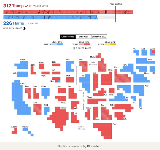
No landslide?
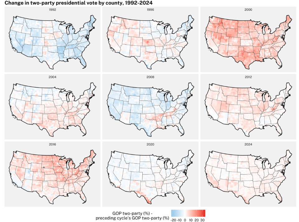
As the full vote count is performed – which in the US takes a rather long time – it is becoming increasingly apparent that Trump's win was not the landslide it first appeared to be. This is in line with previous elections, from what I can remember, which makes me ponder about how the media covers the US Election might need to evolve because the "hot takes" don't necessarily correspond to what's going to happen. Here's a tweet by political scientist Tom Wood giving an angle on it, but there's more/
Elon Musk’s transformation, in his own words
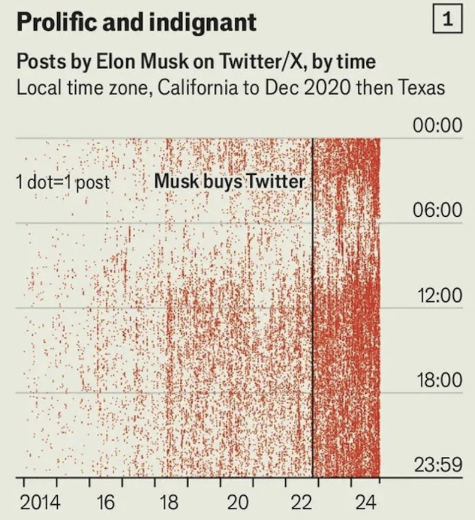
The Economist (sorry, there's a paywall): "Our analysis of 38,000 posts on X reveal a changed man".
What to know about fluoride in drinking water
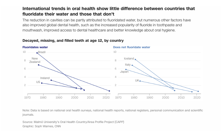
My newsletter rival (with love) Soph Warnes has written a great explainer about water fluoridation for her new employer, the CNN.
Join The Rest
Discover different music, break out of the algorithm, and learn a thing or two, every weekday. Join 5000+ members. Established in February 2024, hailed as an alternative to Pitchfork by the music magazine The Wire.

🛠️📖 Tools & Tutorials
An Interactive Guide to Transforming JSON with jq
"Learn to use jq through incremental, interactive examples right in your browser."

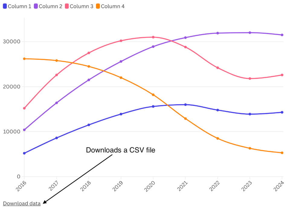
Flourish adds data download
Flourish, the data visualization tool, now allows the user to add a "download data" link into embeddable charts. I've provided some feedback/feature requests, which I hope they'll factor in as they improve the tool.
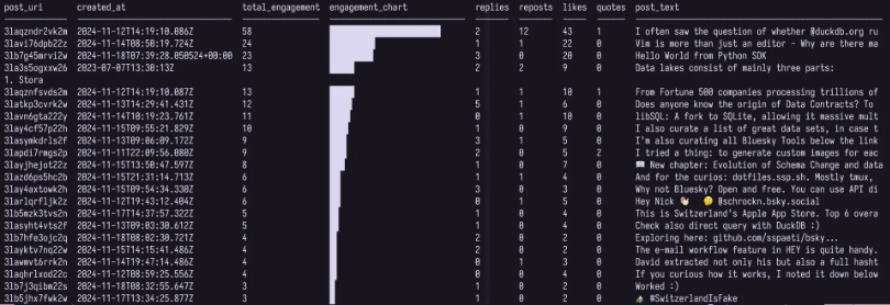
How to extract analytics from Bluesky, the new open social network
"We'll get analytics from Bluesky leveraging DuckDB and MotherDuck, and we'll explore the open APIs and streams so that you can build your own dashboards, tools, and visualizations."
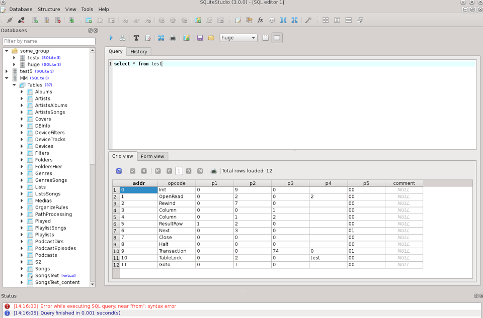
SQLite Studio
A downloadable tool to "create, edit, browse SQLite databases."
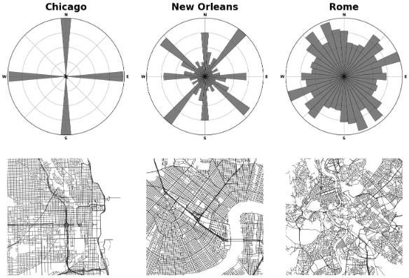
OSMnx 2.0.0
Popular street network analysis Python library OSMnx, created by geographer Geoff Boeing has reached version 2. It's pretty cool, and I've used it extensively in the past.
A Short Introduction to Automotive Lidar Technology
"A guide to the operating principles, techniques and technology in lidar systems for self driving cars."
🤯 Data thinking
Dataviz party
Evelina Parrou, in her brilliant newsletter: "Three dataviz techniques from election graphics we should use more often."
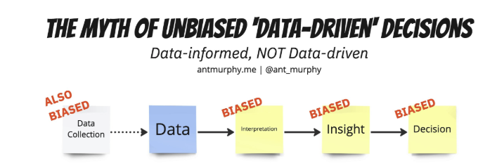
Data-Informed, NOT Data-Driven
"Being data-driven can be an awful trap."
📈Dataviz, Data Analysis, & Interactive
Hey, wait – is employee performance really Gaussian distributed??
Tim Dellinger gives "a data scientist’s perspective": "It’s probably Pareto-distributed, not Gaussian, which elucidates a few things about some of the problems that performance management processes have at large corporations, and also speaks to why it’s so hard to hire good people. Oh, and for the economists: the Marginal Productivity Theory of Wages is cleverly combined with the Gini Coefficient to arrive at the key insight."
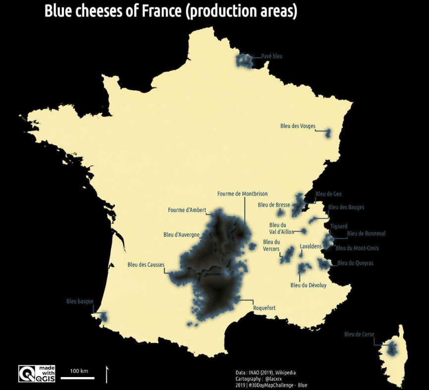
Blue cheeses of France (production areas)
Beautiful map by Romain Lacroix (the original can't be linked as his tweets are protected).
(via Julian Kiely)
The map of Shibuya station
Isn't it nice?.
I've seen this on Pietro Minto's newsletter (in Italian).

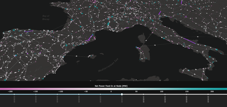
A Pretty Visualisation of the European Power Grid
"This is a map of the European electrical transmission network. Each dot is a connection point where all the consumption from nearby settlements connects to the network, as well as all electricity generation from nearby power plants."
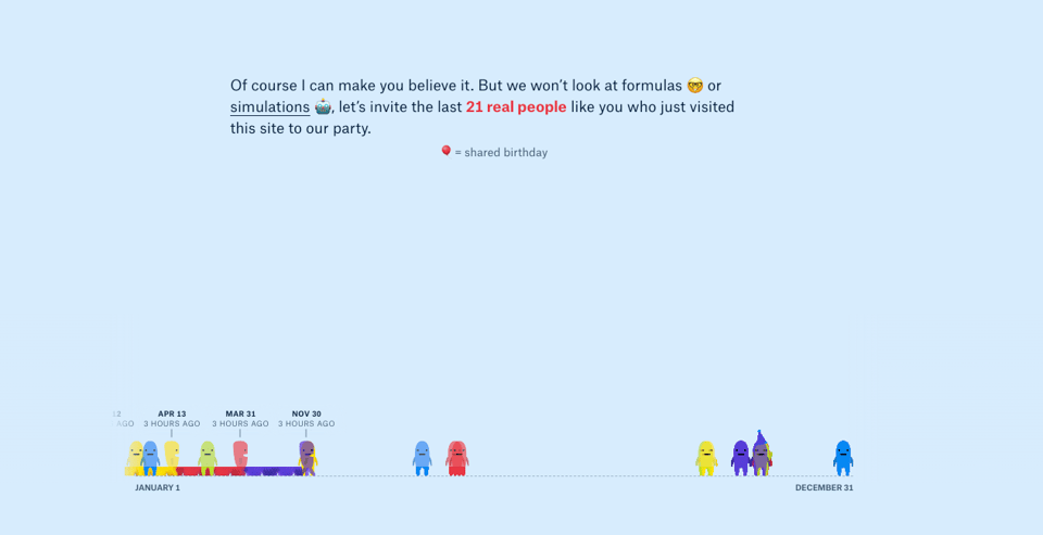
The Birthday Paradox
The Pudding has published yet another great interactive.
🤖 AI
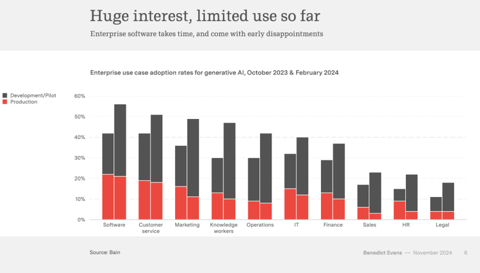
AI eats the world
Benedict Evans' yearly presentation about tech trends is about AI. Favourite quote: "AI gives you infinite interns".
|
DID YOU LIKE THIS ISSUE>? → BUY ME A COFFEE! 
You're receiving this email because you subscribed to Quantum of Sollazzo, a weekly newsletter covering all things data, written by Giuseppe Sollazzo (@puntofisso). If you have a product or service to promote and want to support this newsletter, you can sponsor an issue. |
quantum of sollazzo is also supported by Andy Redwood’s proofreading – if you need high-quality copy editing or proofreading, check out Proof Red. Oh, and he also makes motion graphics animations about climate change.

Brain food, delivered daily
Every day we analyze thousands of articles and send you only the best, tailored to your interests. Loved by 505,869 curious minds. Subscribe.
