582: quantum of sollazzo
#582: quantum of sollazzo – 5 November 2024
The data newsletter by @puntofisso.

Hello, regular readers and welcome new ones :) This is Quantum of Sollazzo, the newsletter about all things data. I am Giuseppe Sollazzo, or @puntofisso. I've been sending this newsletter since 2012 to be a summary of all the articles with or about data that captured my attention over the previous week. The newsletter is and will always (well, for as long as I can keep going!) be free, but you're welcome to become a friend via the links below.
The most clicked link last week was the palette-making Color Buddy app.
It's AMA o'clock! Ask Me Anything.
Here's the first set of answers to the questions you've asked – I've started receiving an interesting collection of questions about data, about my job, and quite a few fun jokes (I know who you are...). I'll answer more in the next few issues :)
Rares Ciurezu asks me this very interesting, deeply technical question: "What is the best way to present INRIX Travel Time Journey Data for motorized vehicles? I have a large dataset that contains thousands of links and data at 15-minute intervals from GPS data. Is there a best practice guide I can use?"
Now, I'm not an expert in the direct use of INRIX data, but I have a couple of hints. First of all, for the uninitiated, INRIX is a provider of transport data. Their data is available and, while not open data, it's widely used within both the public and private sector and my colleagues at the Department for Transport mentioned it many times. This question makes me think of two potential places to start looking at.
First of all, the Charting Transport blog by transport geek Chris Loader offers many visualizations of traffic data, centred in Australia, and could provide a few ideas.
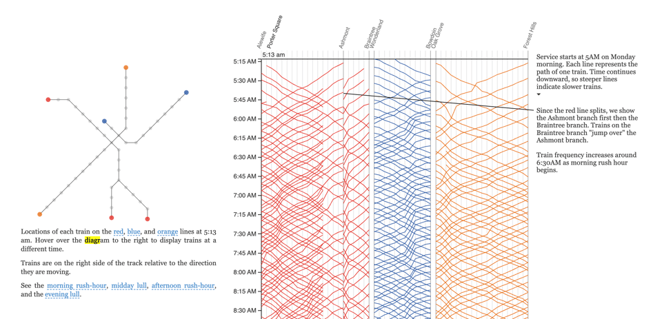
Secondly, the way Rares describes the data as a combination of regular intervals and location makes me think that it might be a good fit for a Marey diagram.
If you have never heard of Marey diagrams, they are an amazing tool to explore how regular or irregular public transit is. They were invented by French scientist Étienne-Jules Marey and have been applied to, for example, buses in Sydney and the metro in New York City – the latter is where the screenshot below comes from. Maybe an option for the INRIX data is to consider, instead of individual cars, groups of cars – for example, all cars that start their trip between 10:30-10:40, or other groups calculated with some form of clustering.
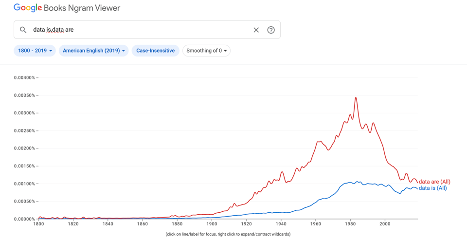
Morten Lind asks: "What is correct: Data are or data is?" – probably knowing he won't get a straight answer from me :D In fact, I asked this exact questions to about 50 data gurus I interviewed in Quantum of Sollazzo (you can find these in the archive, starting from issue 420).
You will find that many will say that the correct form would be "data are"... except the way we refer to data today as a collective noun makes "data is" more appealing. And that's more or less what I end up doing – I say "data is" because it sounds better.
As Jeremy Singer-Vine (issue 421) made me realise, there is an interesting historical analysis of this, thanks to Google Books Ngram Viewer.
Or you can do what Sam Joiner suggested in issue 445 and avoid the problem at all by saying "the data analysis", "the dataset", etc...
Finally, Guy asks me "Why are your jokes so bad?". They are, indeed they are. Bad puns and dad jokes have become part of my "brand", haven't they? Well, my theory is: if people don't run away after being repeated inflicted my terrible jokes, we can discuss more difficult topics...
You can send me a question via this anonymous Google form. I'll select a few in a couple of weeks. Don't be shy!

The Quantum of Sollazzo grove now has 15 trees. It helps managing this newsletter's carbon footprint. Check it out at Trees for Life.
'till next week,
Giuseppe @puntofisso
✨ Topical – US Elections
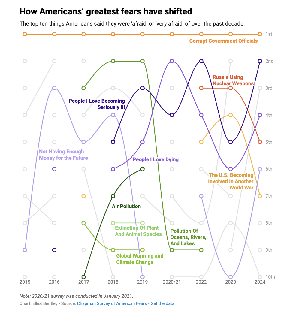
What are Americans afraid of?
Datawrapper's Elliot Bentley analyses the Chapman Survey of American Fears.
How many people have mental illness in the United States?
USAFacts: "About 58.7 million adults had a mental illness in 2023. That’s the equivalent of 22.8% of the adult population of the U.S, or 2 in 9 adults. This data comes from an annual survey by the Substance Abuse and Mental Health Services Administration (SAMHSA), which defines mental illness as a range of disorders, from mild to severe, affecting a person’s thinking, mood, or behavior."
BONUS:

USA Facts Elections special
A solid resource to follow the US election.
Join The Rest
Algorithms keep giving you more of the same. Our weekday newsletter is dedicated to the rest. A song and an interesting story about it, every weekday. Refreshing, insightful and snackable.

🛠️📖 Tools & Tutorials
Build unique React charts
"Based on hundreds of graph examples, this gallery guides you through the basic concepts of data visualization with React and D3.js. It also provides ready-to-use templates to get started quicker."
Yet another great website by Yan Holt..
First aid for figures: all resources
"A collection of links to useful resources for data visualization."
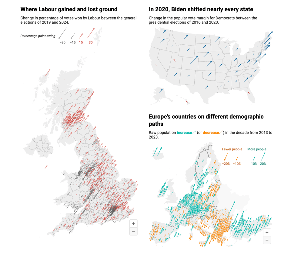
New: Arrow maps
Datawrapper has launched beautiful Arrow maps. These work great to visualize variations on a map.
ml.js - Machine learning tools in JavaScript
Exactly what it says on the tin, assuming you want to run ML in the browser.
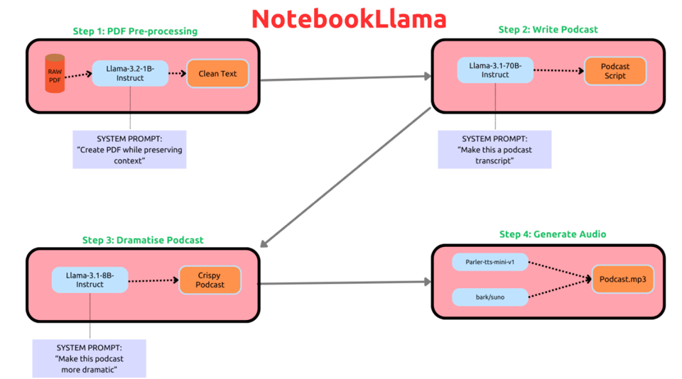
NotebookLlama: An Open Source version of NotebookLM
"This is a guided series of tutorials/notebooks that can be taken as a reference or course to build a PDF to Podcast workflow."
An open source tool inspired to Google's own.
A Business Analyst’s Introduction to Business Analytics (Second Edition)
An online open source book: "Coding in R For Fast, Easy, and Visual Bayesian Inference"
🤯 Data thinking
It’s Time for the Modern Data Culture Stack
Prukalpa Sankar: "Building a dream data team is about much more than using the right data stack".
Data-Twitter is having a MOMENT on Bluesky right now
Randy Au: "Dare I hope Data-bluesky will become a thing?". I'm on there, too.
Get Me Out Of Data Hell
"The Pain Zone, coated in grass which rends those who tread upon it like a legion of upraised spears, is an enterprise data warehouse platform. At the small scale we operate at, with little loss of detail, a data warehouse platform simply means that we copy a bunch of text files from different systems into a single place every morning."
📈Dataviz, Data Analysis, & Interactive
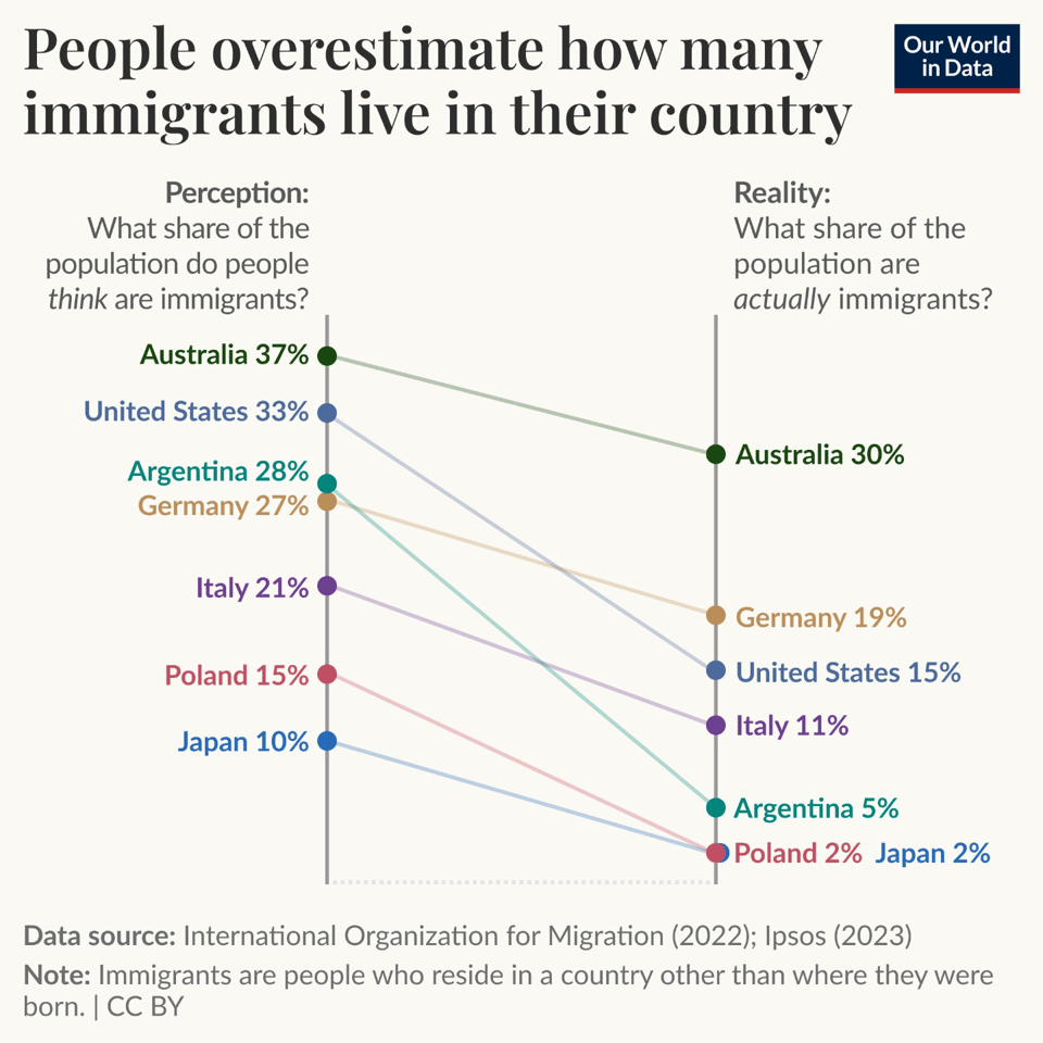
People overestimate how many immigrants live in their country
Interestingly, it seems to happen pretty much everywhere, according to Our World In Data. It uses data from Ipsos and the International Organization for Migration.
🤖 AI
|
DID YOU LIKE THIS ISSUE>? → BUY ME A COFFEE! 
You're receiving this email because you subscribed to Quantum of Sollazzo, a weekly newsletter covering all things data, written by Giuseppe Sollazzo (@puntofisso). If you have a product or service to promote and want to support this newsletter, you can sponsor an issue. |
Brain food, delivered daily
Every day we analyze thousands of articles and send you only the best, tailored to your interests. Loved by 505,869 curious minds. Subscribe.

quantum of sollazzo is also supported by Andy Redwood’s proofreading – if you need high-quality copy editing or proofreading, check out Proof Red. Oh, and he also makes motion graphics animations about climate change.
