579: quantum of sollazzo
#579: quantum of sollazzo – 15 October 2024
The data newsletter by @puntofisso.

Hello, regular readers and welcome new ones :) This is Quantum of Sollazzo, the newsletter about all things data. I am Giuseppe Sollazzo, or @puntofisso. I've been sending this newsletter since 2012 to be a summary of all the articles with or about data that captured my attention over the previous week. The newsletter is and will always (well, for as long as I can keep going!) be free, but you're welcome to become a friend via the links below.
The most clicked link last issue was the NYC Noise Digital Twin.
It's AMA o'clock!
Some of you have come to me suggesting this, so let's give it a try. AMA – Ask Me Anything by submitting a question via this anonymous Google form. If there are many questions, I'll select one each couple of weeks and answer it on here :-)
Don't be shy!

The Quantum of Sollazzo grove now has 15 trees. It helps managing this newsletter's carbon footprint. Check it out at Trees for Life.
'till next week,
Giuseppe @puntofisso
✨ Topical
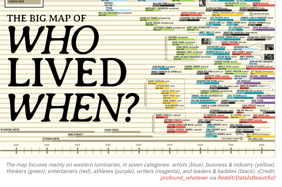
Mapping time: The surprising overlaps of history’s most influential minds
"“The Big Map of Who Lived When” plots the lifespans of historical figures — from Eminem all the way back to Genghis Khan."
(via Soph Warnes' Fair Warning)
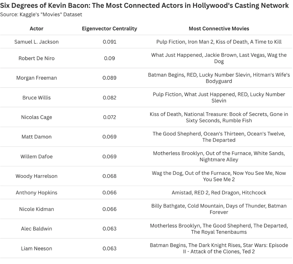
Quantifying 'The Kevin Bacon Game': A Statistical Exploration of Hollywood’s Most Connected Actors
Daniel Parris, Stat Significant: "Examining 'Six Degrees of Kevin Bacon' and its statistical underpinnings."
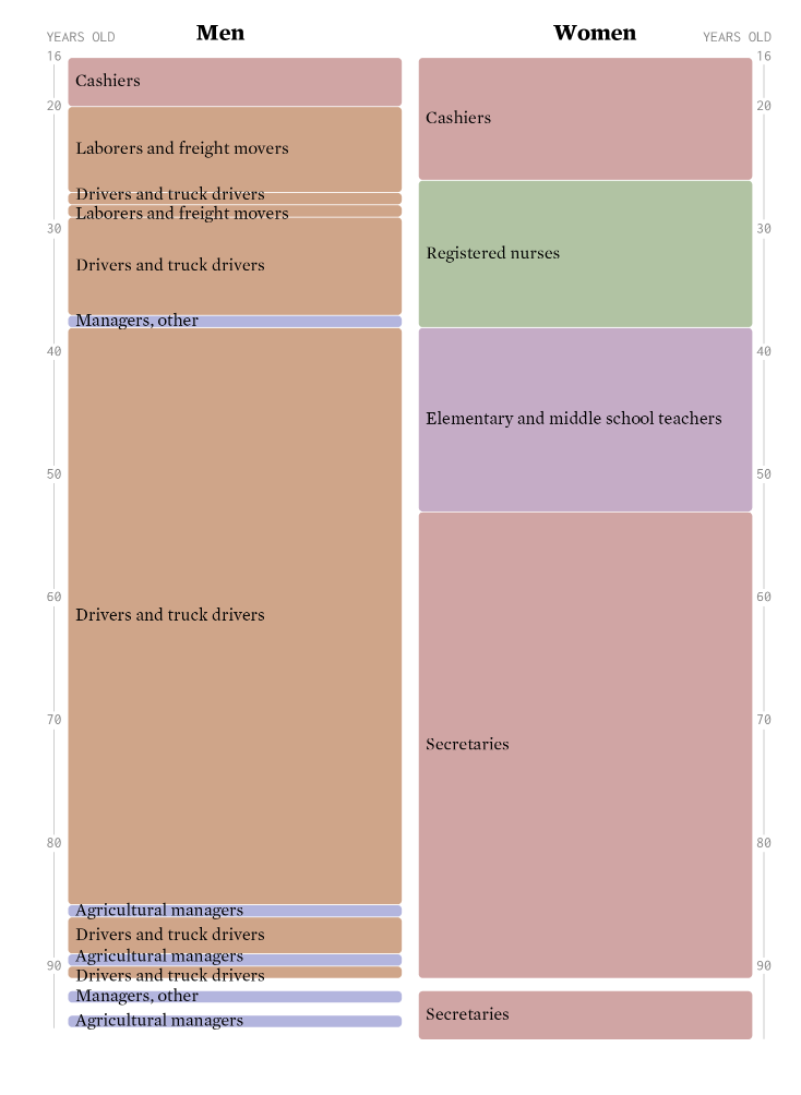
Jobs of a Certain Age
Nathan Yau (FlowingData) again looks at the American Community Survey.
Brain food, delivered daily
Every day we analyze thousands of articles and send you only the best, tailored to your interests. Loved by 505,869 curious minds. Subscribe.

🛠️📖 Tools & Tutorials
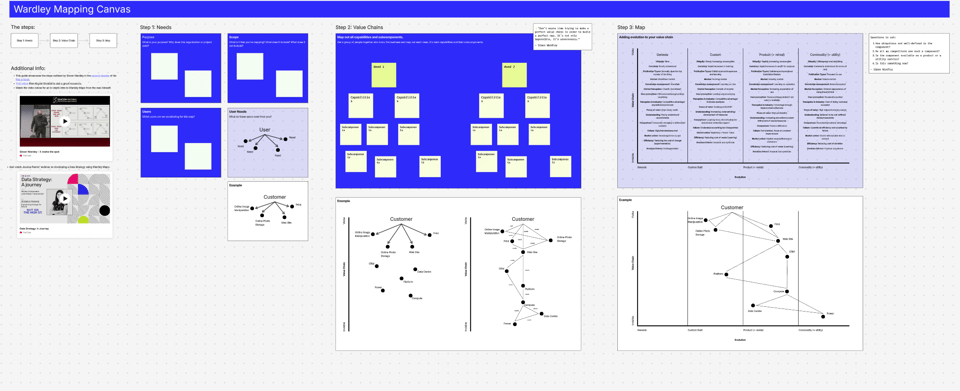
Wardley Mapping templates
Count.co have released useful templates to draw Wardley Maps.
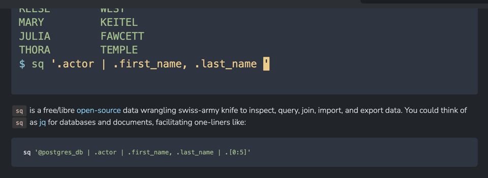
sq
Sq is to relational databases what jq is to JSON: a command line tool with its own mini-language to parse and extract data.
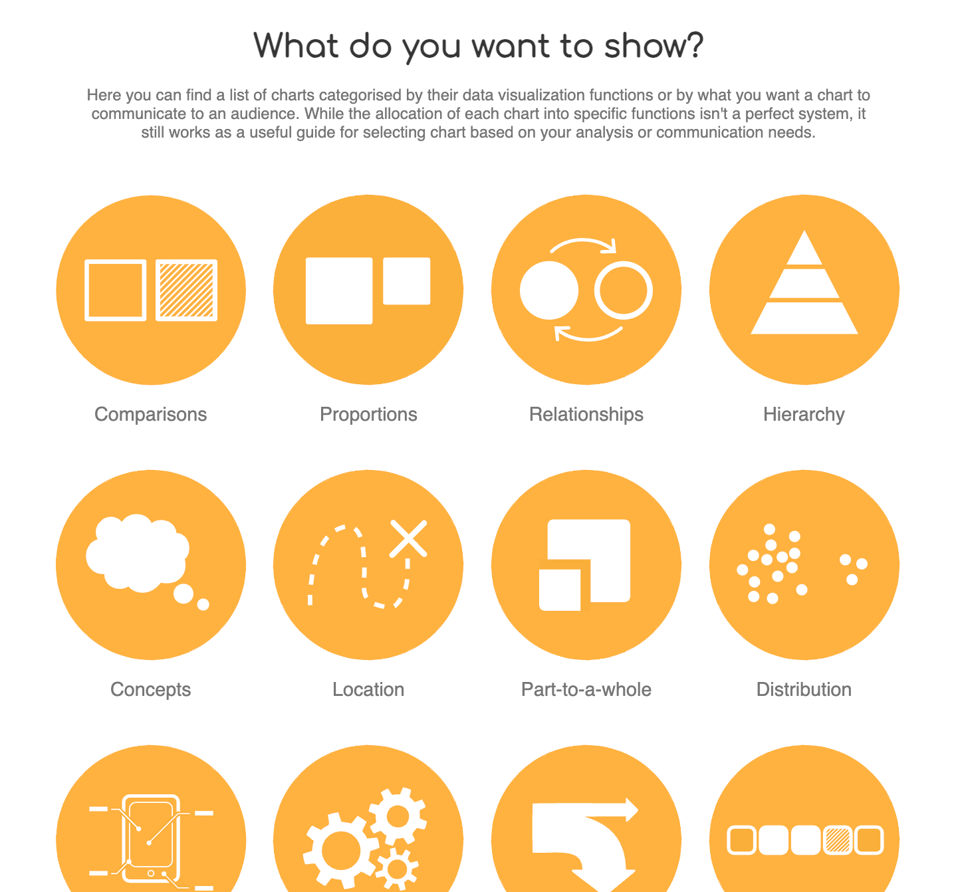
The Data Visualisation Catalogue
"The Data Visualisation Catalogue is a project developed by Severino Ribecca to create a (non-code-based) library of different information visualisation types. The website serves as a learning and inspiration resource for those working with data visualisation."
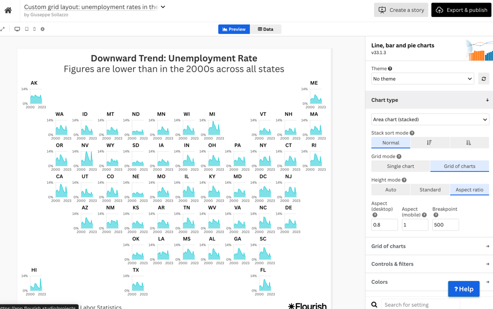
Flourish: custom grids of charts
I like this – Flourish has released a way to build custom grids of charts, which can be arranged in a multitude of ways. The one below is geographically arranged by US State. It needs a (free) account.
Building a Single-Page App with htmx
This could be a good starter: "It’s a simple proof of concept todo list. Once the page is loaded, there is no additional communication with a server. Everything happens locally on the client.
How does that work, given that htmx is focused on managing hypermedia exchanges over the network?
With one simple trick: the “server-side” code runs in a service worker."
I haven't managed to use htmx yet, but it looks like it's got plenty of use cases where it would speed up development.
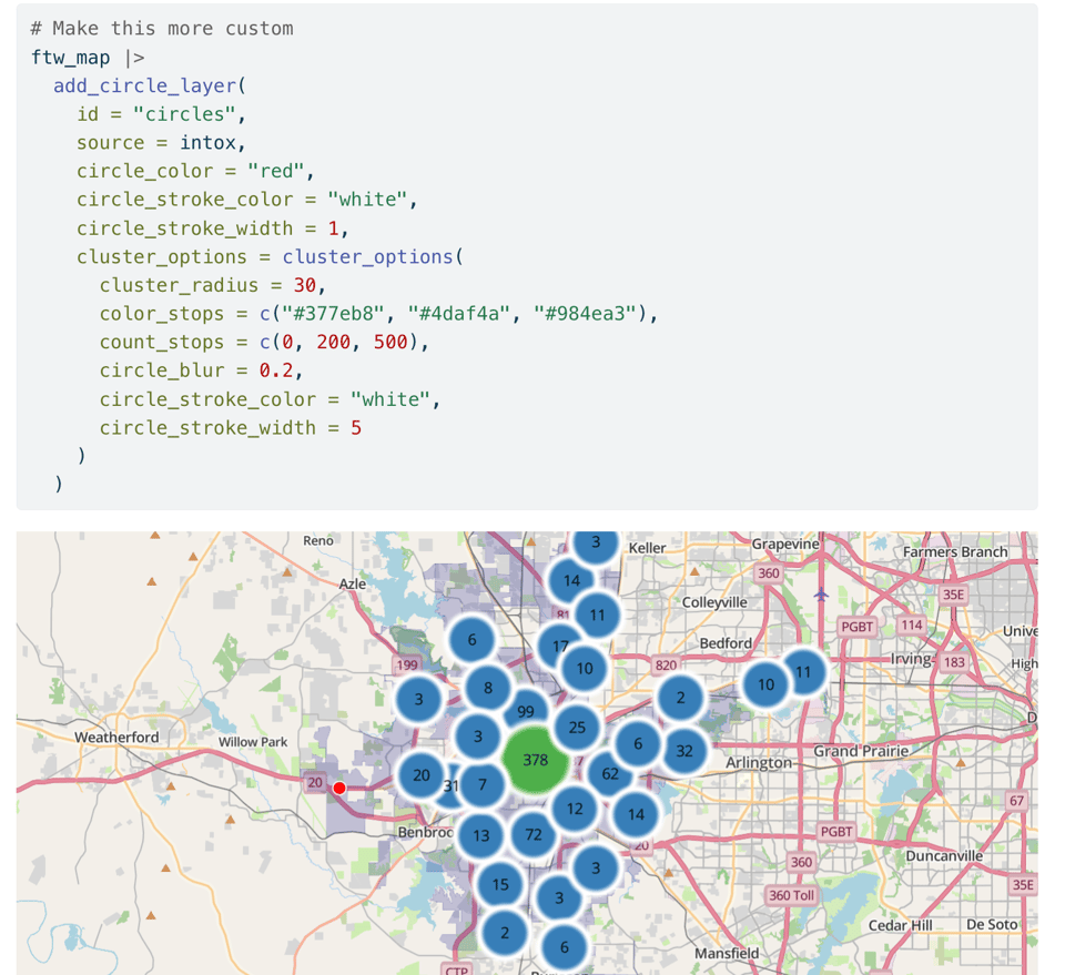
Circle clusters and heatmaps for dense point data in R
This is "a tutorial on some features in my new R package, mapgl, for visualizing clusters of dense point data without showing a bunch of “dots on a map”".
Geocoding CSV files from the command line
OpenCage (many times a sponsor of Quantum) have released a nice command line tool for geocoding, both forward and reverse, CSV files
🤯 Data thinking
The Great Data Integration Schlep
Sarah Constantin says that "to analyze data, you have to get it in one place".
📈Dataviz, Data Analysis, & Interactive
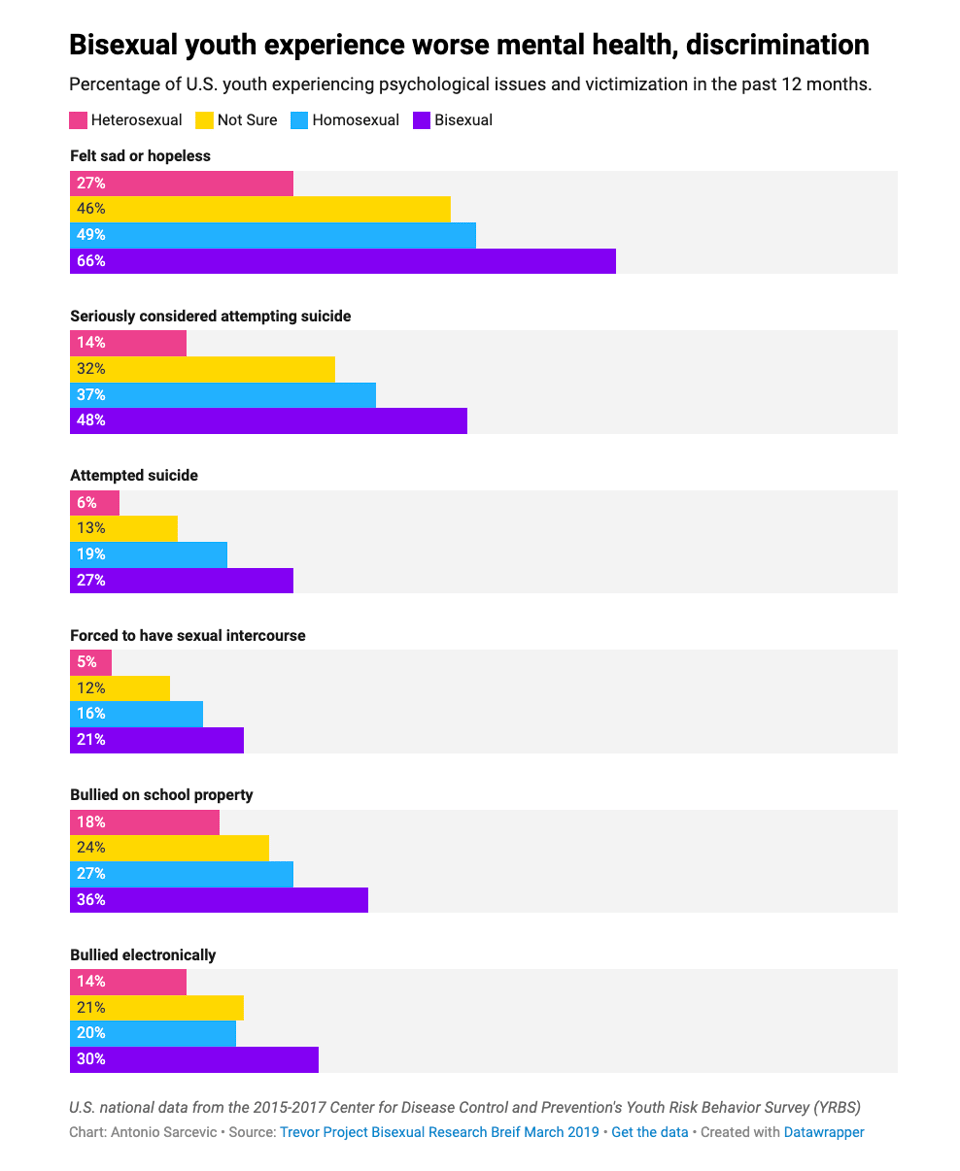
Why bi visibility matters
Datawrapper's Antonio Sarcevic looks at why bisexual experiences are different from both homosexual and heterosexual.
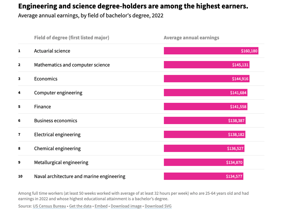
What are the average salaries for four-year college graduates?
USAFacts: "People with bachelor's degrees earned an average of $100,000 in 2022 — more than people without a degree, but less than those with advanced degrees."
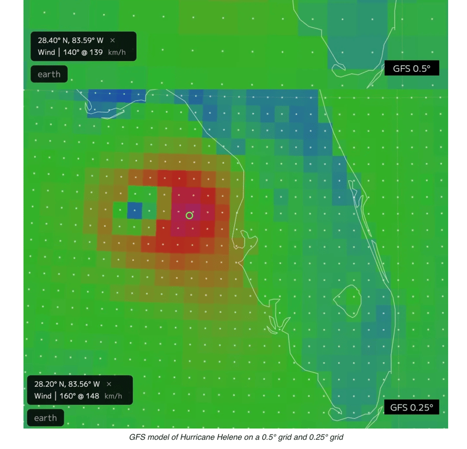
Hurricane Wind Speeds: Understanding the Effect of Model Grids
Cameron Beccario, creator of earth.nullschool.net: "Most of the data you find on earth.nullschool.net and other weather sites/apps come from numerical weather models. These are computer programs that simulate the physical processes of Earth as realistically as possible. They can be very expensive computationally and often require supercomputers to reach the level of detail that is useful for accurate weather forecasting."
A good explanation follows.
🤖 AI
Do AI companies work?
I'm not a market expert but there's something in here that makes me think: "The market needs to be irrational for you to stay solvent."
Google AI vs "vs"
This is hilarious...
|
DID YOU LIKE THIS ISSUE>? → BUY ME A COFFEE! 
You're receiving this email because you subscribed to Quantum of Sollazzo, a weekly newsletter covering all things data, written by Giuseppe Sollazzo (@puntofisso). If you have a product or service to promote and want to support this newsletter, you can sponsor an issue. |
quantum of sollazzo is also supported by Andy Redwood’s proofreading – if you need high-quality copy editing or proofreading, check out Proof Red. Oh, and he also makes motion graphics animations about climate change.
