578: quantum of sollazzo
#578: quantum of sollazzo – 1 October 2024
The data newsletter by @puntofisso.

Hello, regular readers and welcome new ones :) This is Quantum of Sollazzo, the newsletter about all things data. I am Giuseppe Sollazzo, or @puntofisso. I've been sending this newsletter since 2012 to be a summary of all the articles with or about data that captured my attention over the previous week. The newsletter is and will always (well, for as long as I can keep going!) be free, but you're welcome to become a friend via the links below.
The most clicked link last week was the from Data to Viz website and poster.
It's AMA o'clock!
Some of you have come to me suggesting this, so let's give it a try. AMA – Ask Me Anything by submitting a question via this anonymous Google form. If there are many questions, I'll select one each couple of weeks and answer it on here :-)
Don't be shy!

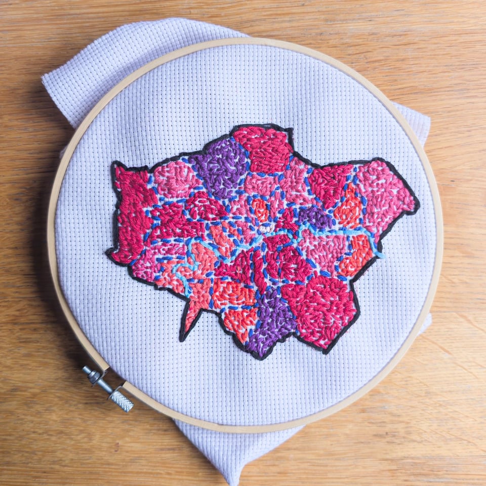
I've also completed my embroidered dataviz of London councils by population. It's taken a few months!
If you're based in or near New York, Matt Allinson tells me the local transport authority, the MTA, has launched an intriguing Open Data Challenge, which will give away transport memorabilia as prizes.
The Quantum of Sollazzo grove now has 15 trees. It helps managing this newsletter's carbon footprint. Check it out at Trees for Life.
'till next week,
Giuseppe @puntofisso
✨ Topical
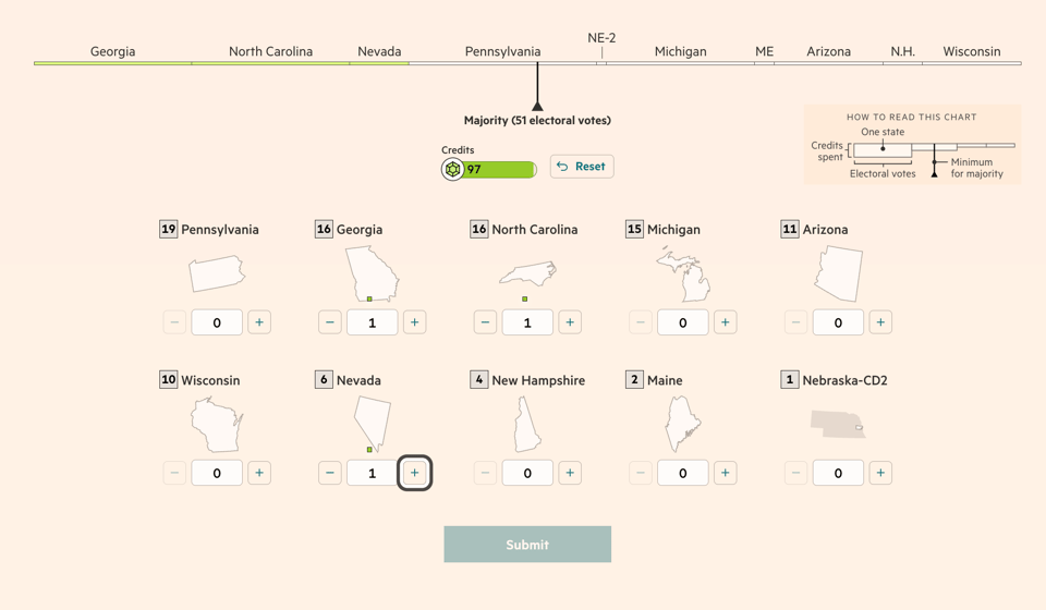
Can you mastermind a US presidential campaign?
"Compete for the White House against other readers in the Election Game", thanks to this interactive game developed by Sam Learner and colleagues for the Financial Times. A clever way to understand how the election works.
New York Noise
A website showing incredible visualizations of noise in New York, using Open Street Map and ESRI data alongside Open Data from New York City.

Brain food, delivered daily
Every day we analyze thousands of articles and send you only the best, tailored to your interests. Loved by 505,869 curious minds. Subscribe.

🛠️📖 Tools & Tutorials
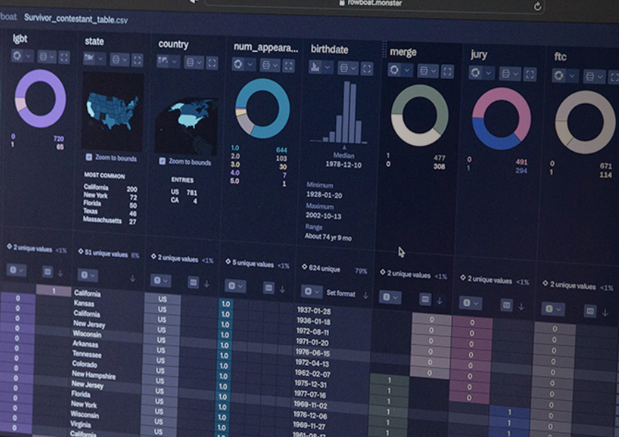
Rowboat
"A lightning fast tool for understanding large datasets."
It's a SaaS but offers a free tier.
Weave
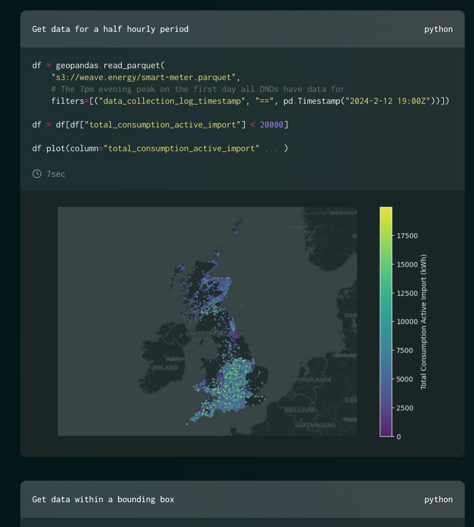
"Weave is the result of a collaboration between the Centre for AI and Climate and CEIMIA (Centre d’expertise internationale de Montréal pour l’avancement de l’intelligence artificielle), with the mission of improving access to energy data to accelerate the adoption of artificial intelligence. The project is funded through a bilateral arrangement between the UK and Canadian governments."
Great data here and an easy to consume API.
(via Kalyan Dutia)
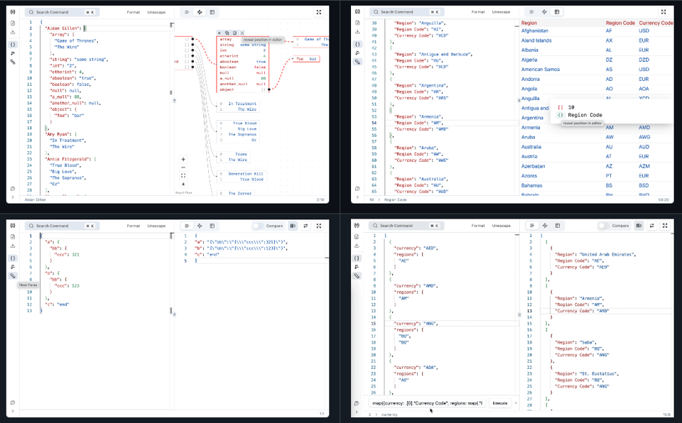
JSON For You
A JSON visualization and processing tool with several UI options.
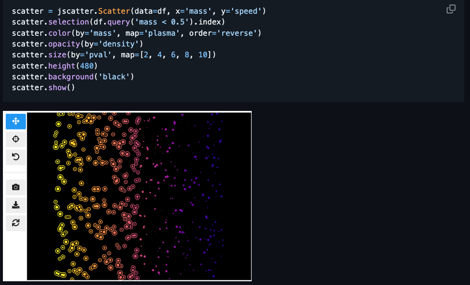
Jupyter Scatter
"An Interactive Scatter Plot Widget. Explore datasets with millions of data points with ease in Jupyter Notebook, Lab, and Google Colab."
It's all open source and also available on GitHub.
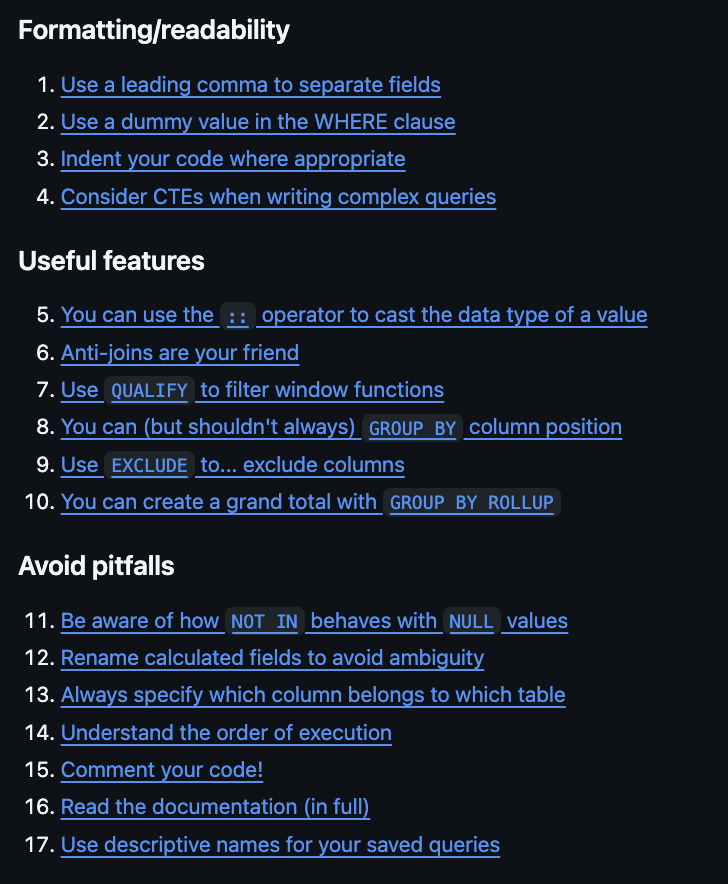
SQL tips and tricks
A set of useful SQL tips and tricks.
thepipe
"Extract clean markdown from PDFs URLs, slides, videos, and more, ready for any LLM."
How it works: "thepi.pe uses computer vision models and heuristics to extract clean content from the source and process it for downstream use with language models, or vision transformers. The output from thepi.pe is a list of chunks containing all content within the source document. These chunks can easily be converted to a prompt format that is compatible with any LLM or multimodal model."
📈Dataviz, Data Analysis, & Interactive
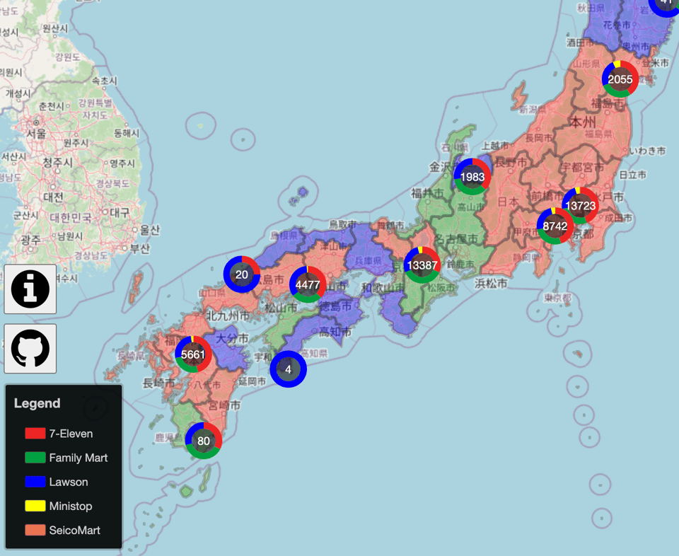
Conbini Wars
For those who don't know, "conbini" or "konbini" is the name of the pervasive, small convenience stores (the word "conbini" coming from the way "convenience" is pronounced in Japan) that you can find in Japan, notorious for stocking a lot of useful items, food, drinks, and offering free WiFi. There are many chains, among which I thought 7-Eleven was the most popular.
The author says: "In my neighborhood there is seemingly only Lawson conbinis. This led me to take a look at how common these pockets of exclusive territory are."
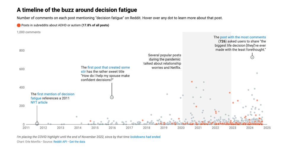
My first Weekly Chart… about what?!
Erle Monfils of DataWrapper, looks at decision fatigue.
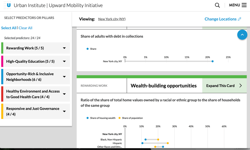
Upward Mobility Data Dashboard
The Urban Institute: "The dashboard provides Mobility Metrics data for 24 predictors. The predictors are indicators that are strongly associated with upward mobility, according to the Upward Mobility Framework’s three-part definition of the term that encompasses long-term economic success, dignity and belonging, and power and autonomy. The predictors fall within one of five pillars, which represent supports people need from their communities to achieve upward mobility."
🤖 AI
AI for Climate Action: Applications and Principles in Development Cooperation
German International Cooperation Organization Erik Lehman: "We’ve just released our position paper, AI for Climate Action – Applications and Principles in Development Cooperation." The paper explores how AI can address global climate challenges, presenting use cases in various sectors.
|
DID YOU LIKE THIS ISSUE>? → BUY ME A COFFEE! 
You're receiving this email because you subscribed to Quantum of Sollazzo, a weekly newsletter covering all things data, written by Giuseppe Sollazzo (@puntofisso). If you have a product or service to promote and want to support this newsletter, you can sponsor an issue. |
quantum of sollazzo is also supported by Andy Redwood’s proofreading – if you need high-quality copy editing or proofreading, check out Proof Red. Oh, and he also makes motion graphics animations about climate change.
