575: quantum of sollazzo
#575: quantum of sollazzo – 10 September 2024
The data newsletter by @puntofisso.

Hello, regular readers and welcome new ones :) This is Quantum of Sollazzo, the newsletter about all things data. I am Giuseppe Sollazzo, or @puntofisso. I've been sending this newsletter since 2012 to be a summary of all the articles with or about data that captured my attention over the previous week. The newsletter is and will always (well, for as long as I can keep going!) be free, but you're welcome to become a friend via the links below.
The most clicked link last issue was Erin Davis' intriguing exploration of webs of characters in novels.
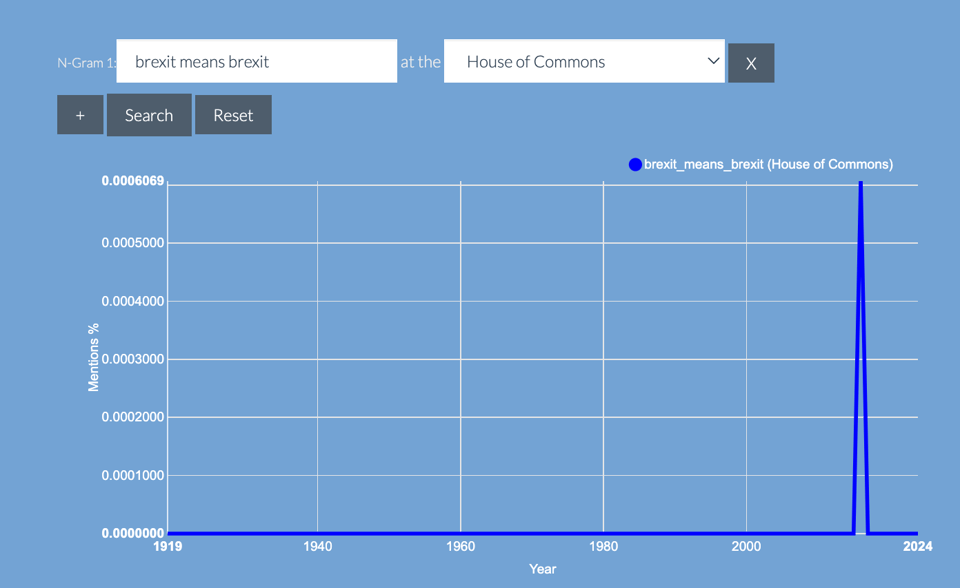
I've made some updates to my app Parli-n-grams. If you use it regularly, you might spot some difference in the frequency of certain n-grams. This is because I've realised that there were some minor errors in the parsing approach (Unicode, we keep meeting) so I have recalculated the whole database after fixing them. I'm also transferring the architecture to a local sqlite database instead of using a mysql server. This is done with the goal of making it a portable app over time, and to generalise the application for others to use.
The Quantum of Sollazzo grove now has 15 trees. It helps managing this newsletter's carbon footprint. Check it out at Trees for Life.
'till next week,
Giuseppe @puntofisso
✨ Topical
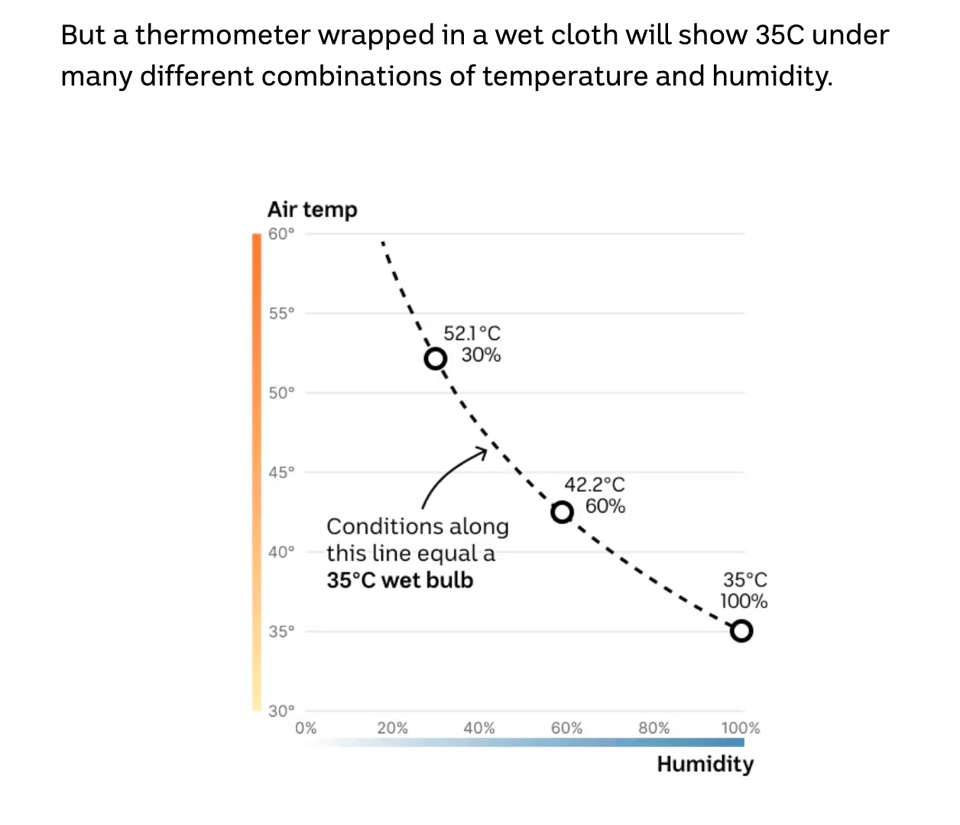
When heat turns deadly
"A world-first study challenges our understanding of how humans cope with extreme heat."
Kudos (?) to scientist Owen Dillon for subjecting himself to the ordeal: "The conditions Owen is being exposed to over the course of the study are varied. [...] But, except one, they’re all equivalent to a wet-bulb temperature of 35C — the critical threshold at which no human can survive for more than six hours, according to the original theory."
(via Lucilla Piccari)
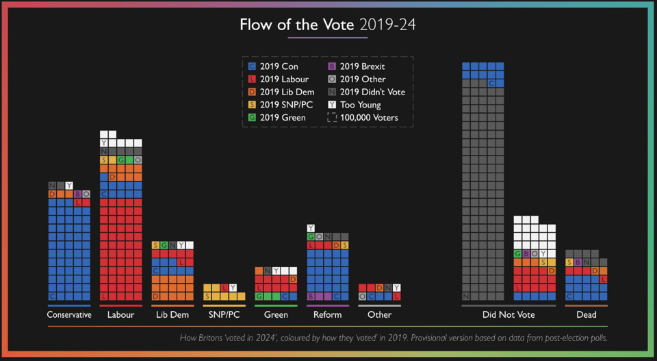
Flow of the vote 2019-24 (provisional)
By YouGov data journo Dylan Difford on Bluesky.
(via Alex Wrottesley)
Convention ratings up from 2020, down from 2016
Among other things, Axios notes that "convention viewership was not only divided heavily along party lines, but partisan networks set new records."

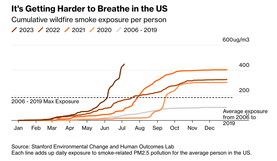
Wildfire Smoke Can Hurt You in Surprising Ways
"Scientists are making connections between burning forests and a host of health problems, from dementia to premature birth."
Also, see the curious use of a pictogram on page 33 here.
(via Peter Wood)
Brain food, delivered daily
Every day we analyze thousands of articles and send you only the best, tailored to your interests. Loved by 505,869 curious minds. Subscribe.

🛠️📖 Tools & Tutorials
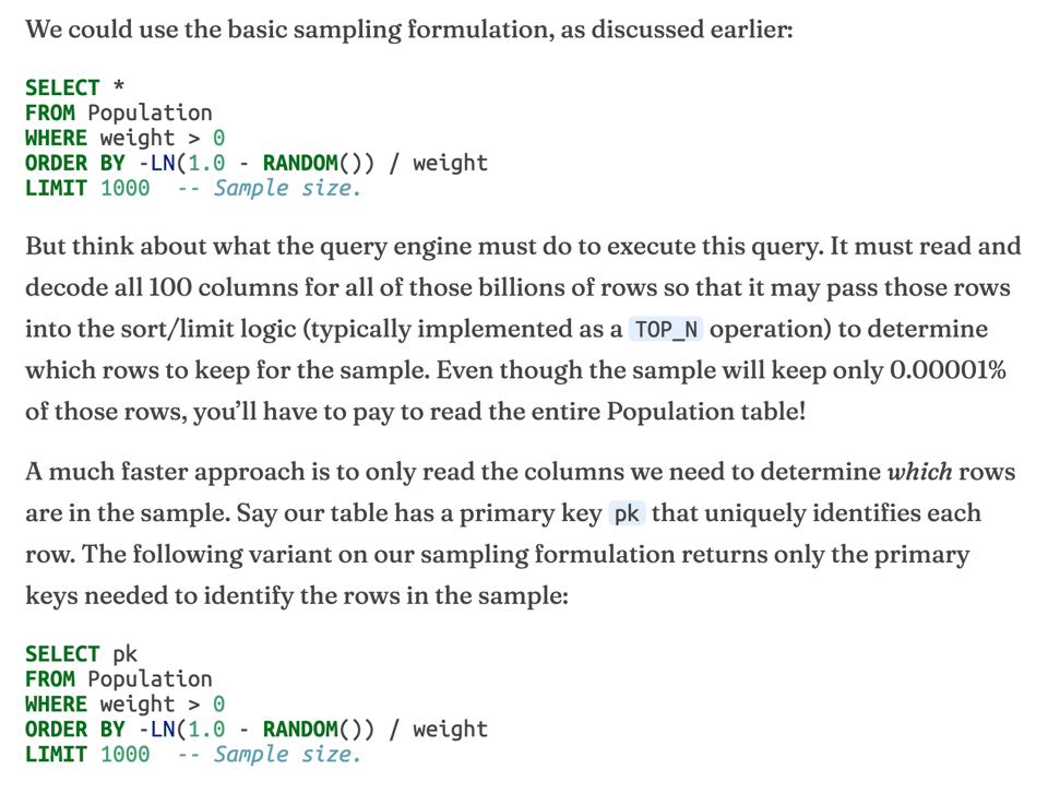
Sampling with SQL
"In this post, we’ll look at some clever algorithms for taking samples. These algorithms are fast and easily translated into SQL."
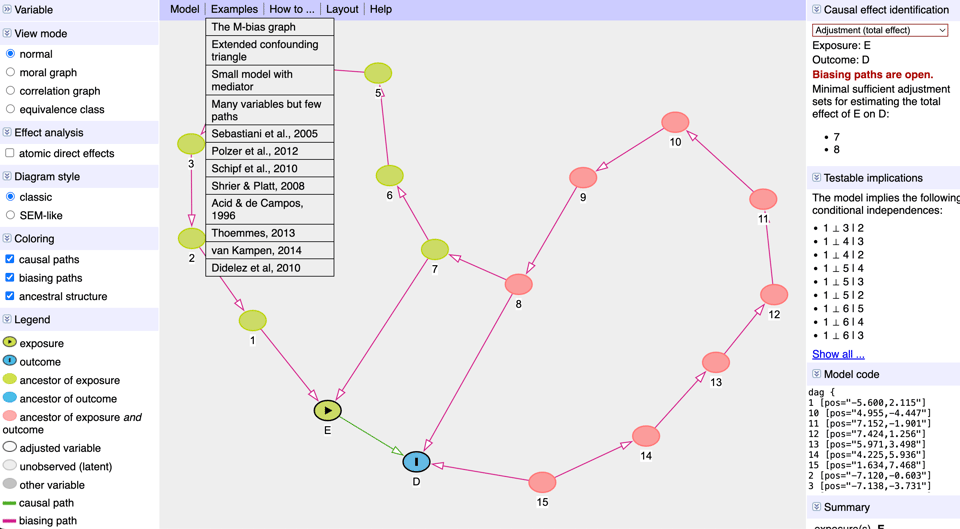
DAGitty
A tool to "draw and analyze causal diagrams"
repo2vec
"repo2vec is a simple-to-use, modular library enabling you to chat with any public or private codebase."
Did you know you can export a ggplot2 chart as an SVG and edit every element in PowerPoint?
Yes, you can.
Machine Learning from Scratch
"Implementations of ML, using only numpy."
Half-tool, half-tutorial. The README is a good read.
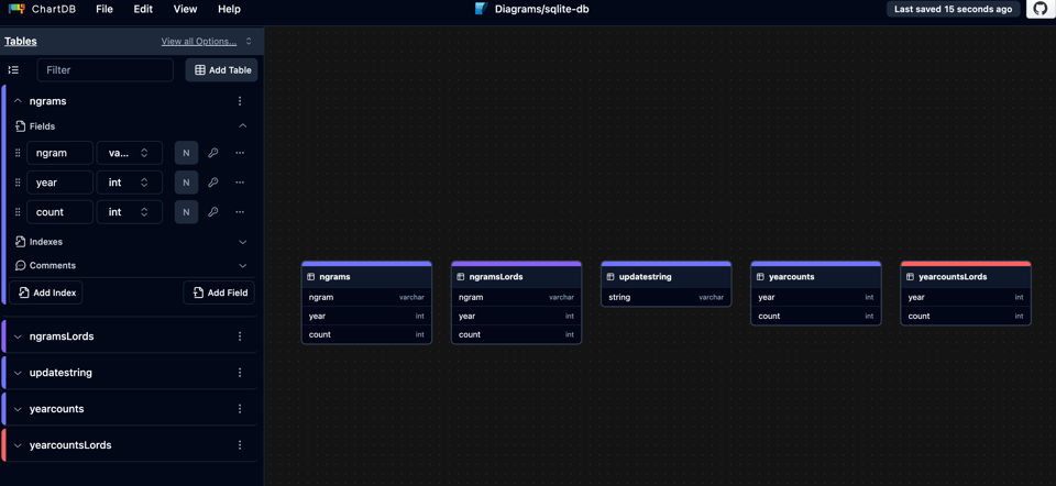
ChartDB
A DB design editor that can also create a diagram using the extract from a single query of the DB schema. Neat. Example below is from my parli-n-grams app DB.
Huetone
Another twist on colour picking tools.

🤯 Data thinking
The point of a dashboard isn't to use a dashboard
Terence Eden: "A dashboard shows that you have access to your data. And that is a huge deal."
What really happened to GOV.UK Registers
David Durant: "For context, I was assigned by GDS to be one of the Business Analysts for Registers in mid 2017. I came in after the team had been in place for a few months. It was my final role in GDS."
The blog post is his take on the history of the now defunct Gov.Uk Registers service.
📈Dataviz, Data Analysis, & Interactive
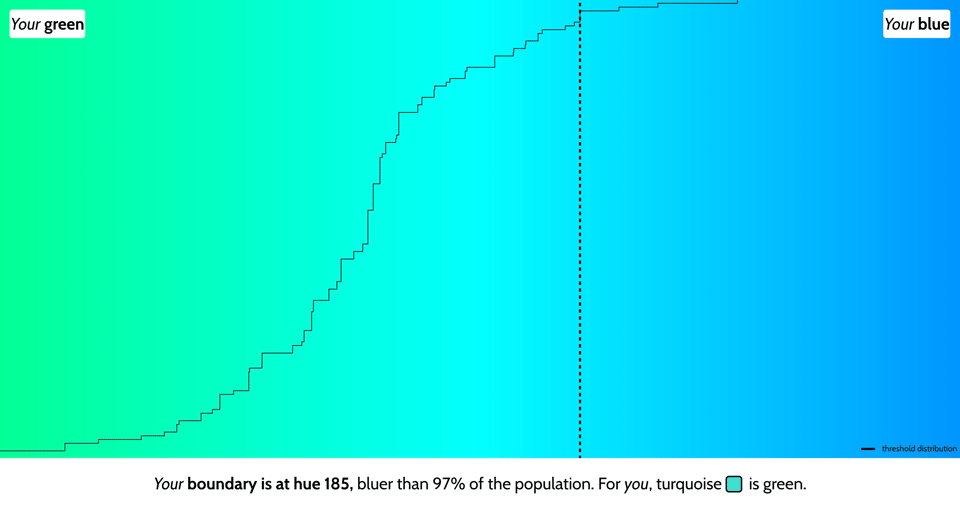
Is my blue your blue?
A brilliantly executed data-driven interactive app.
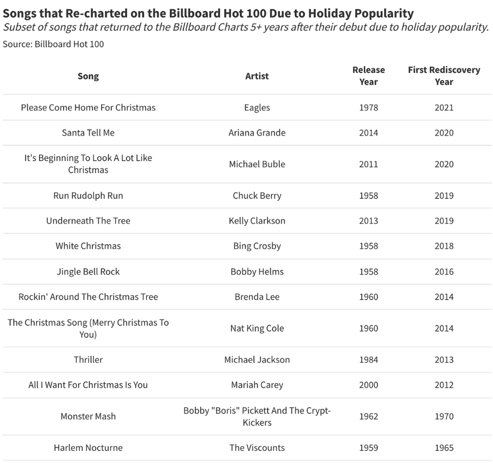
How Are Hit Songs Rediscovered Decades Later? A Statistical Analysis
"How does music undergo a cultural revival long after its original release?"
Daniel Parris, in his latest StatSignificant article, explores why and how a song might get rediscovered. Yes, "All I want for Christmas is you" is on the list.
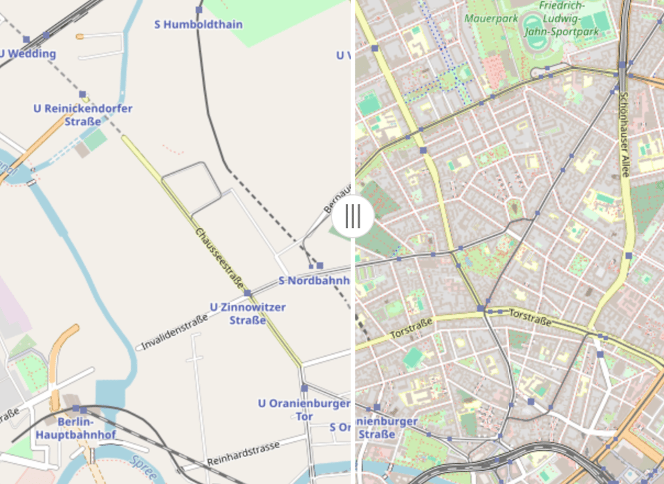
OSM Then and Now
"Explore OSM how it was in 2008 (left) and compare with how it is now (right)."
Although not 100%, due to licensing reasons, as the note explains.
Colombo: Skylines
Nimesha Periyapperuma and Yudhanjaya Wijeratne: "This repository contains Team Watchdog's simulation of the city of Colombo. This is an accurate topographical representation of Colombo, built with detailed land use and zoning based on official city development plans and data centered around 2020; over a million virtual citizens, simulating population dynamics that reflect large-scale, real-world demographics and human movement; public transport based on actual route data; and curated visual assets to better match Colombo's unique architectural style."
Pretty outstanding, and the process is documented, although not fully open source.

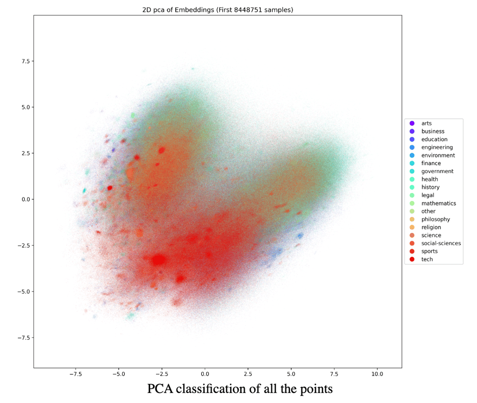
Classifying all of the pdfs on the internet
"TLDR: I classified the entirety of SafeDocs using a mixture of LLMs, Embeddings Models, XGBoost and just for fun some LinearRegressors. In the process I too created some really pretty graphs!"
The obvious question is not "how?" but "why?" ;-)
🤖 AI
An Experiment in Lust, Regret and Kissing
"This summer, I agreed to a literary experiment with Times Opinion: What is the difference between a story written by a human and a story written by artificial intelligence?"
ChatGPT & Rickrolling
As this tweet notes, "Oh my god, it never occurred to me that “rickrolling is deeply embedded in the training set for every LLM” is a legitimate problem that is going to make many AI teams lives miserable". Amazing.
Can an AI make a data-driven, visual story?
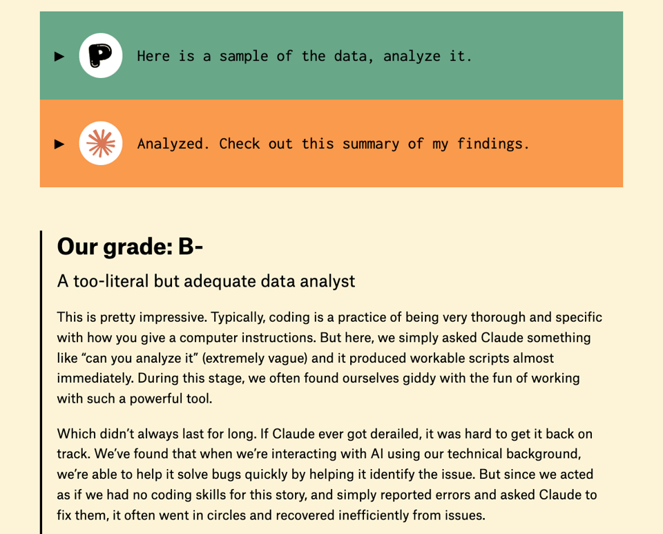
This is an article that might sit in other sections of Quantum. The Pudding have let LLM Claude create one of their data-driven stories. You can judge the results.
Is AI eating all the energy? Part 1/2
"There are proportional costs we have to weigh in order to make a well-grounded judgement, and after looking at them, I think the energy numbers are surprisingly good, compared to the discourse."
I'm definitely not qualified to fact-check this blog post, especially on the energy side of it. But I like the structured approach and inquiry from first elements. Maybe some of you (Guy, I'm obviously looking at you if you read this ;-)) can let me know their critique?
|
DID YOU LIKE THIS ISSUE>? → BUY ME A COFFEE! 
You're receiving this email because you subscribed to Quantum of Sollazzo, a weekly newsletter covering all things data, written by Giuseppe Sollazzo (@puntofisso). If you have a product or service to promote and want to support this newsletter, you can sponsor an issue. |
quantum of sollazzo is also supported by Andy Redwood’s proofreading – if you need high-quality
copy editing or proofreading, check out Proof Red. Oh, and he also makes motion graphics animations about climate change.
