574: quantum of sollazzo
#574: quantum of sollazzo – 27 Aug 2024
The data newsletter by @puntofisso.

Hello, regular readers and welcome new ones :) This is Quantum of Sollazzo, the newsletter about all things data. I am Giuseppe Sollazzo, or @puntofisso. I've been sending this newsletter since 2012 to be a summary of all the articles with or about data that captured my attention over the previous week. The newsletter is and will always (well, for as long as I can keep going!) be free, but you're welcome to become a friend via the links below.
And so I'm back! I've been away for a few weeks, and recovered a bit from what's been an intense period. The most clicked link in the last issue, about a month ago, was this blog post with 10 charts that capture how the world is changing.
The Quantum of Sollazzo grove now has 15 trees. It helps managing this newsletter's carbon footprint. Check it out at Trees for Life.
'till next week,
Giuseppe @puntofisso
✨ Topical
Olympics 100m
The Olympics 100m really captured everyone's attention – I received multiple tips about the excellent use of data visualization for the Olympics 100m race. Starting with the dataviz-heavy BBC coverage, for example.
Marco Cortella gave me a heads-up about the work by Intel. This one by World Athletics is pretty beautiful (but rather confusing – I get what they were trying to do, but I'm none the wiser about how the race went).
Speaking of the Olympics, Guy Lipman sent me this blog post that analyses the brilliant choice made by the New York Times when visualising the ranking by medals.

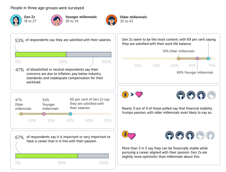
Are Gen Zs and millennials happy with their pay?
The Strait Times looks at job and pay satisfaction.
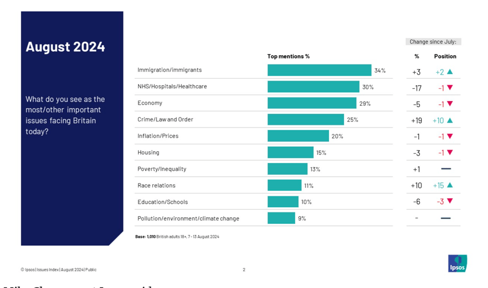
Immigration seen as the biggest issue facing Britain while concern about crime surges
Ipsos: "Thirty-four per cent of Britons name immigration as an important issue for the country, making it the biggest issue for the first time since October 2016."
Brain food, delivered daily
Every day we analyze thousands of articles and send you only the best, tailored to your interests. Loved by 505,869 curious minds. Subscribe.

🛠️📖 Tools & Tutorials
"We ran out of columns" - The best, worst codebase
"Did you know that SQL Server has a limit on the number of columns you can have in a table? Me neither. At the time it was 1024, today it appears to be 4096. Needless to say, most people don't need to know this. We did."
SQLpage
"SQLpage is an SQL-only webapp builder. It is meant for data scientists, analysts, and business intelligence teams to build powerful data-centric applications quickly, without worrying about any of the traditional web programming languages and concepts."

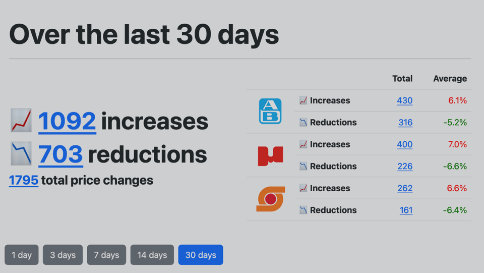
Tracking supermarket prices with playwright
A developer explains how he built a scraper for Supermarket prices.
AI Safety for Fleshy Humans
"This 3-part series is your one-stop-shop to understand the core ideas of AI & AI Safety — explained in a friendly, accessible, and slightly opinionated way!". With comics and humour.

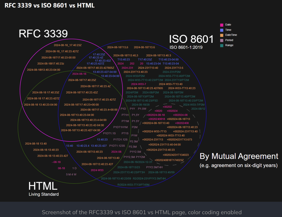
The much broader world of datetime formats
"There's more to date time formats than YYYY-MM-DD HH:MM:SS. Most of it confusing."
Cooking With DuckDB
"This will be a continuously updated collection of recipes for DuckDB. Each chapter will focus on accomplishing a single task, with varying levels of exposition,"
How I Use "AI"
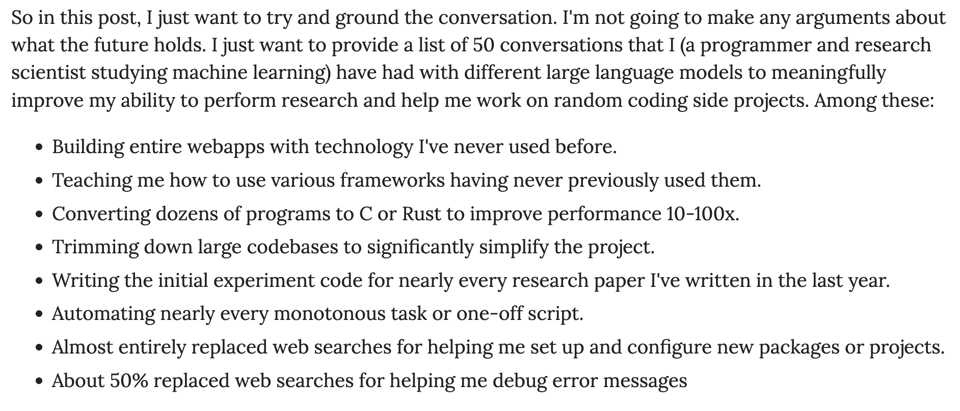
Nicholas Carlini has written this essay about things he does with AI. Which look eminently simple and less debatable than most of the "magic" uses of AI we see around. AI is a tool.
🤯 Data thinking
Analytics Personas
"What everyone gets wrong about the humans who do data."
The Engineer, The Analyst, The Decision Maker.
📈Dataviz, Data Analysis, & Interactive
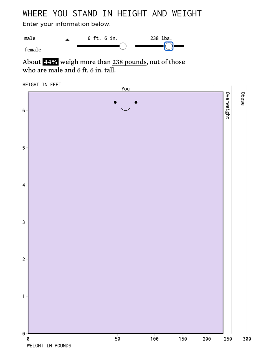
See How Your Weight Compares
Another little cool interactive widget by FlowingData's Nathan Yau. Apparently 85% of male Americans who are as tall as me, are heavier than me (I think I'm relatively average by UK/EU standards).
Tube Map Central
By now, you have probably seen this incredible Tube map designed by academic Max Roberts. But, in case you missed it, here it is.
(via Peter Wood)

A bad chart got better – and then bad again
Yes, we're still at the Olympics :) Datawrapper's Lisa Charlotte Muth looks at this infamous line chart showing Ireland's position in the medal table over time.

Unraveling character webs
Erin Davis uses Gephi to display novel's characters networks.

Dangerous Junctions in London
Lisa Hornung has created another amazing dataviz using data from TfL and the London Cycling Campaign.

The Effect of CRTs on Pixel Art
"On Cathode Ray Tubes, nostalgia and anachronisms."
Not quite dataviz, but close enough. And lovingly nerdy.

Dark – Data Visualization
If you know me, you know how obsessed I am with Netflix's "Dark", a German TV series. I've watched it twice. Every time you watch it, you learn something new. It's got one of the most intricate plots ever, but that doesn't make it less appealing to watch. Anyway, someone has done a fantastic dataviz of it. Wir passen perfekt zusammen.
(via Soph Warnes' Fair Warning)

A prediction system for managing the hospital readmission risk pool
Specific topic aside, this article is about risks and actionable data insight.
"In this effort, how the information is displayed, propagated and relayed between clinical teams and leadership is as (if not more) important than the shear goal of accurate risk estimation (according to statistical metrics). It requires cross-functional involvement (from the get-go), strategic design, attention to nuance and rigor, and a flexible scope in order to tie hospital-wide impact down to the individual patient."
🤖 AI
A new paper shows GPT-4 simulates people well enough to replicate social science experiments with high accuracy
Exciting or terrifying, you judge :)
Ethan Mollick: "Note this is done by having the AI prompted to respond to survey questions as a person given random demographic characteristics & surveying thousands of "AI people," and works for studies published after the knowledge cut-off of the AI models"
Ten (AI) challenges that need to be tackled
Long thread by Jeni Tennison.
Family poisoned after using AI-generated mushroom identification book we bought from major online retailer
I have no way to fact-check this. But I've got a feeling we'll see more news like this.
|
DID YOU LIKE THIS ISSUE>? → BUY ME A COFFEE! 
You're receiving this email because you subscribed to Quantum of Sollazzo, a weekly newsletter covering all things data, written by Giuseppe Sollazzo (@puntofisso). If you have a product or service to promote and want to support this newsletter, you can sponsor an issue. |
quantum of sollazzo is also supported by Andy Redwood’s proofreading – if you need high-quality
copy editing or proofreading, check out Proof Red. Oh, and he also makes motion graphics animations about climate change.
