569: quantum of sollazzo
#569: quantum of sollazzo – 9 July 2024
The data newsletter by @puntofisso.

Hello, regular readers and welcome new ones :) This is Quantum of Sollazzo, the newsletter about all things data. I am Giuseppe Sollazzo, or @puntofisso. I've been sending this newsletter since 2012 to be a summary of all the articles with or about data that captured my attention over the previous week. The newsletter is and will always (well, for as long as I can keep going!) be free, but you're welcome to become a friend via the links below.
Sorry for missing last week :) As you can imagine, things got a little busy in the day job. But, as I'm writing this intro, I'm now happily in Manchester, running the ninth Open Data Camp and taking a little break from manning the registration desk as pitching gets into full swing. If you don't know what Open Data Camp is, it's an unconference about data I co-founded in 2014 with a lovely group of data geeks, and we're still going strong ten years later, bar a pandemic or 2. By the time this issue reaches you, there should be good coverage of the sessions on the blog.
The most clicked link in the last issue was this free online book about data wrangling in R.
The Quantum of Sollazzo grove now has 15 trees. Check it out at Trees for Life.
'till next week,
Giuseppe @puntofisso
✨ Topical
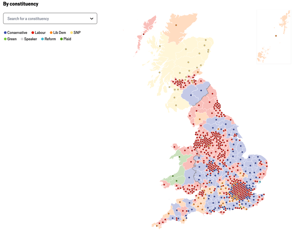
Results by constituency
The very talented Graphic Detail team at The Economist has come up with a very good way to display data on a map that gives both geography and scale. You can find it on their pages about the UK General Elections.
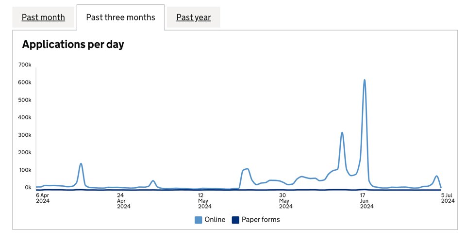
Register to Vote – Performance dashboard
A brilliant Gov.Uk dashboard that shows how many people register to vote over time.
I'm personally a little proud of this because one of my teams (from my day job) is responsible for the data matching process that enables registrations.
For context, Rishi Sunak called the General Election on May 22nd, and the deadline for registration was June 17th.
(via Lisa Riemers)
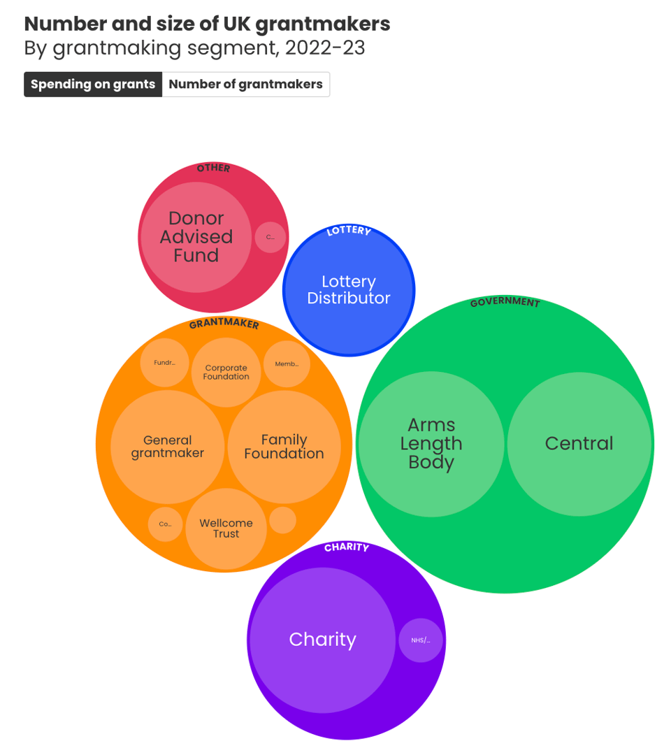
UK Grantmaking 2024
"UKGrantmaking is the definitive annual publication on grant funding in the UK. ... It collates data and insight on over £20 billion of funding from across all funding sectors, using data from regulators, funder accounts and data published using the 360Giving Data Standard to provide an interactive platform for understanding grantmaking in the UK."
Data Songs
The talented folks at Sheldon Studio have created some brilliant "data songs", a new form of data sonification of several datasets.
For example, there's one about electoral turnout, and one about the lack of diversity in street names.
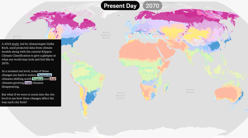
Climate Zones
The Pudding: "How will your city feel in the future?". A brilliant interactive that shows how climate zones are changing.
Which states have the highest murder rates?
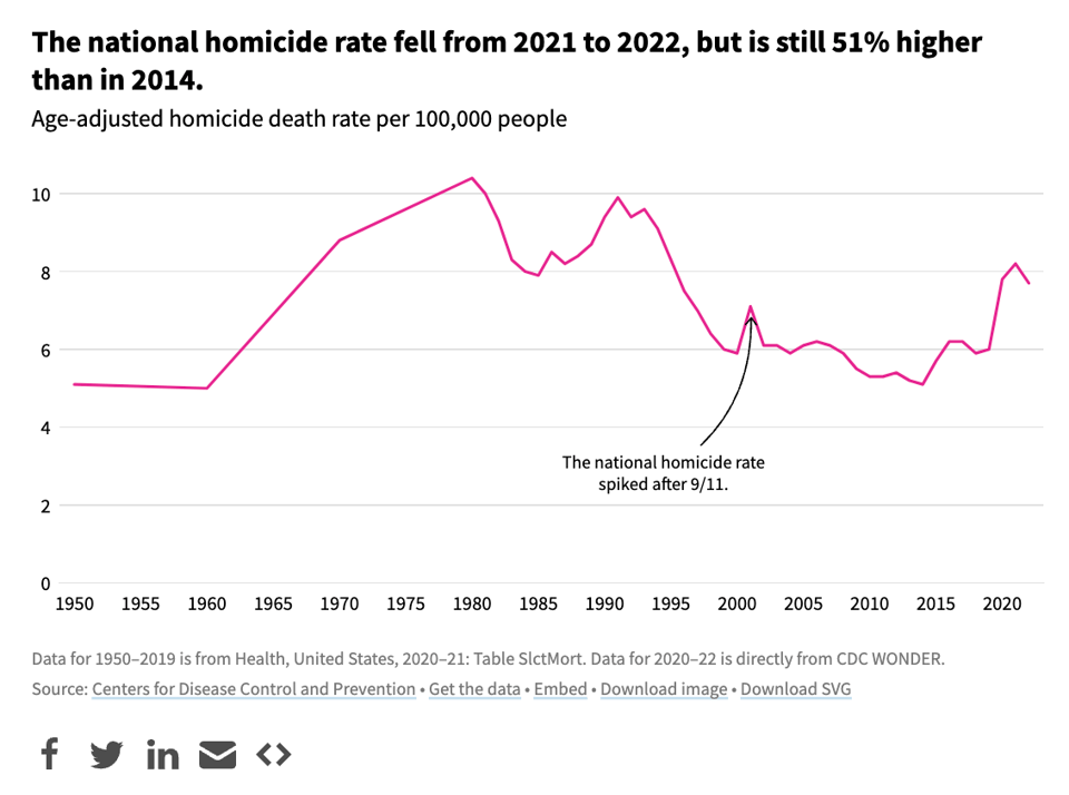
USAFacts: "Mississippi’s homicide rate — the highest in the nation — is more than 11 times New Hampshire’s — the nation’s lowest."
A collection of grim stats, but also the interesting fact captured by the chart below.
Europeans without citizenship: how being stateless means living without rights
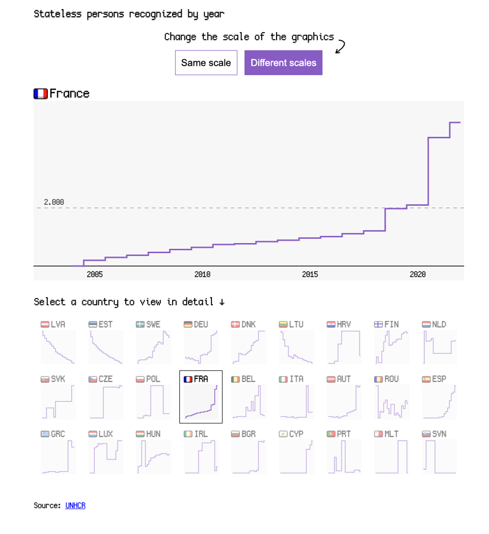
The European Data Journalism Network says that "at least 381,000 people in the European Union have no official nationality" and looks at what it means in terms of electoral and other rights.
🛠️📖 Tools & Tutorials
Lessons learned from scaling to multi-terabyte datasets
"This post is meant to guide you through some of the lessons I’ve learned while working with multi-terabyte datasets. The lessons shared are focused on what someone may face as the size of their dataset scales up and some of the things I’ve done to overcome them. I hope you’re waiting for something to finish running while reading this!"
What to do with age? Linear, Discrete, Both, or Spline
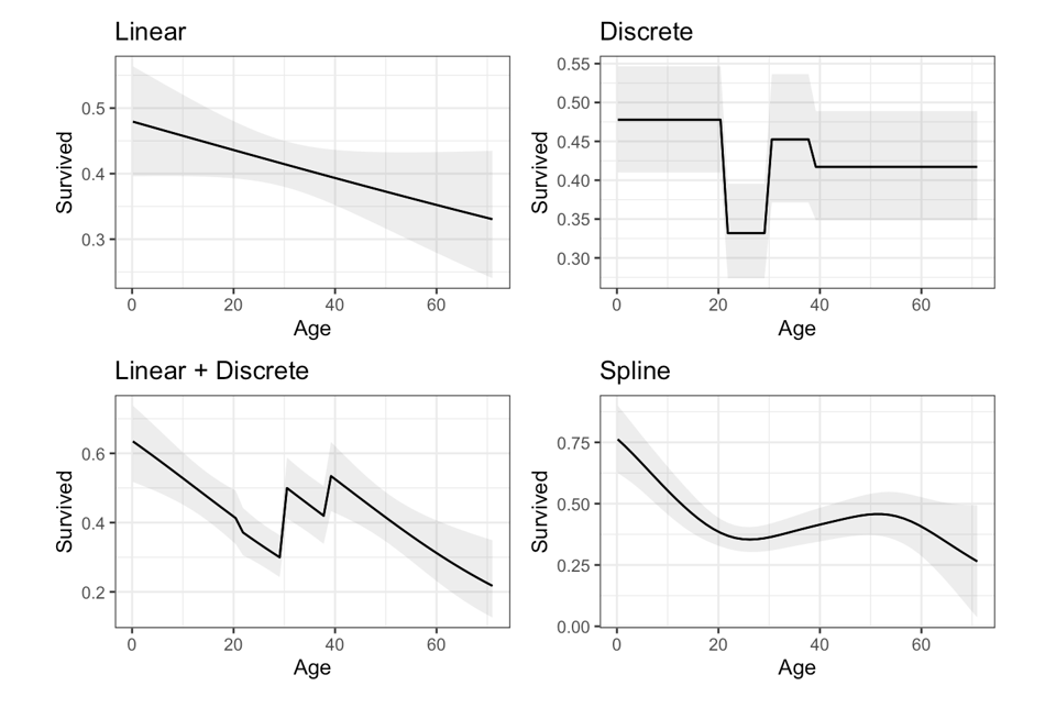
Academic Vincent Arel-Bundock writes: "In a blog post, Andrew Gelman (2024) relays this question:
“The subgroups they examine are 65-74 years old, 75-84, and >85. I’ve seen these types of binning common in medical studies. But why? The actual ages are certainly known, so why not treat age as a continuous variable?”
Gelman’s answer is:
“Discrete binning isn’t perfect, but it’s transparent and can be better than a simple linear model.”
The idea is that fitting a model with multiple coefficients associated with bin-specific binary variables allows more flexibility than a model where age is entered purely linearly, with a single coefficient. The downsides of this strategy are that binning “wastes” information by coarsening a fine-grained measure and that the cutpoints of the age bins can sometimes feel arbitrary.
As Gelman notes, however, analysts can get the best of both worlds by including age as both a set of bins and as a single continuous variable."
Web Performance Guide
"New to the world of web performance? Welcome! Here's everything you need to know to master website monitoring, analytics, and diagnostics. Learn how to deliver a fast, joyous experience to all your users."
A few handy guides.
Deblank Colors
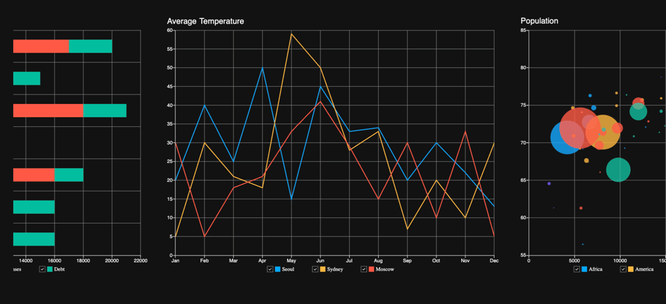
An AI-driven app "to get inspirational color palettes tailored to your vision".
For example, the one below was generated with the prompt "colours for a data dashboard".

fabric.js
"Fabric.js is a powerful and simple Javascript HTML5 canvas library.
Fabric provides interactive object model on top of canvas element.
Fabric also has SVG-to-canvas (and canvas-to-SVG) parser."
How People with Disabilities Use the Web
Brilliant guide by the W3C: "This resource introduces how disabled people use the web, including people with age-related impairments. It helps developers, designers, content creators, and others understand the reasons behind creating accessible digital products — including websites, apps, browsers, and other web tools."
CSS Surprise Manga Lines
"When a manga or anime character is surprised, lines focus on and highlight their face. Is it possible to create a similar effect with HTML and CSS?"

Bringing Flutter's power to Javascript for effortless Data Visualization
"Flitter is your go-to JavaScript library for high-performance, interactive data visualizations with Flutter-like syntax. Seamlessly integrates with React, Svelte, and more. Experience simplicity and power in one package."
It supports both SVG and Canvas.
🤯 Data thinking
Beginning the end – In the zero thickness of the International Date Line
"Another example: after 1750, sailors on long ocean journeys measured physical progress east or west in degrees, minutes, and seconds of longitude when they measured the hours, minutes, and seconds of discrepant time between an untouched home port chronometer and another adjusted optically each noon, with a ritual observed by Melville in his 1850 novel White Jacket."
Yes, geek out on this because it's worth it.
(via Geomob)

How to Make Sure No One Cares About Your Open Data
"Sharing data openly is a noble endeavor. It can drive research, innovation, and transparency. It is also really hard and annoying to do, plus you lose control - who knows what people will get up to. Sadly, publishing open data is often legally required. So your best bet is to technically publish open data, but make sure no one is interested in it. Based on my experience interviewing open data practitioners, working with various open data sources and teaching students about data engineering, here’s a list of common strategies that will help you avoid any attention by users actually interested in working with your data."
(via Lewis Westbury)
📈Dataviz, Data Analysis, & Interactive
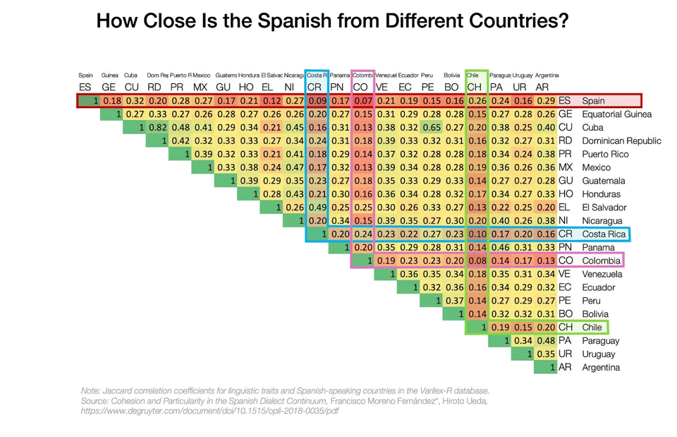
Why Is Chile So Long?
This is pretty amazing. Chile is very long and thin, and that has several consequences for its climate and its language.
An article where map porn meets linguistic porn.
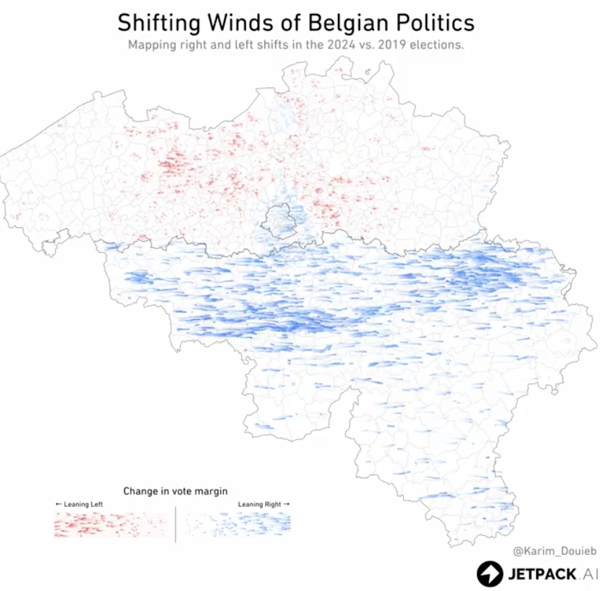
Shifting Winds of Belgian Politics
Sadly no code shared, but this visualization by Karim Douieb is pretty useful to understand swing in a 2-bloc context between two successive elections.
"This visual experiment highlights how the south, including Brussels, has leaned more towards right-wing parties, while the north shows a slight leftward shift."
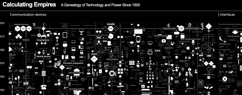
Calculating Empires
"A Genealogy of Technology and Power Since 1500", on an amazing visual, multi-media page.
(via Alex Wrottesley)
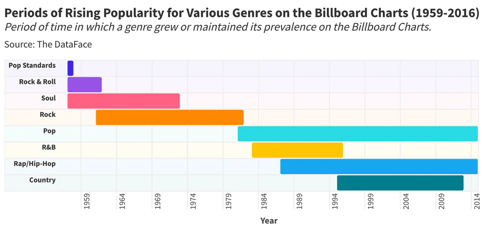
When Did Rock & Roll Die? A Statistical Analysis
Another great analysis by Stat Significant.
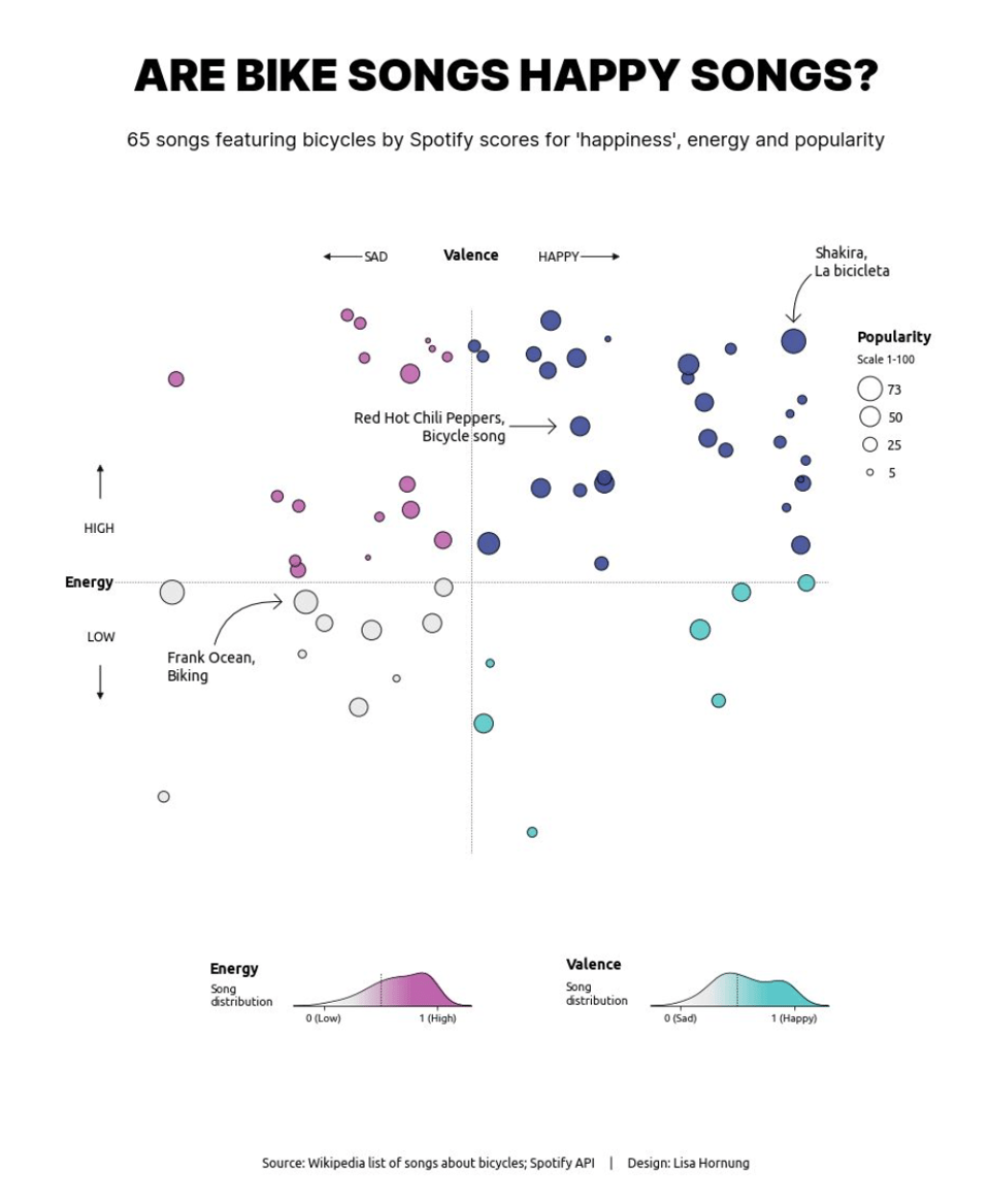
Are songs about bicycles happy songs?
Speaking of music, here's Lisa Hornung's latest brilliant dataviz.
To answer the question, "According to Spotify data not necessarily, but good proportion are energetic + happy."
She used the Spotify API and Python, with full code and link to data sources available here.
So forget all your duties, oh yeah...
One Dataset, Twenty Visualizations
Data Analyst Maryia Maziuk "played with a dataset on labour market exit ages in OECD countries trying to visualise it in different ways. ...
The dataset has 3 dimensions (country, sex, year) and a single measure (age), the data source: OECD Data Explorer."
The result is this Tableau dashboard.

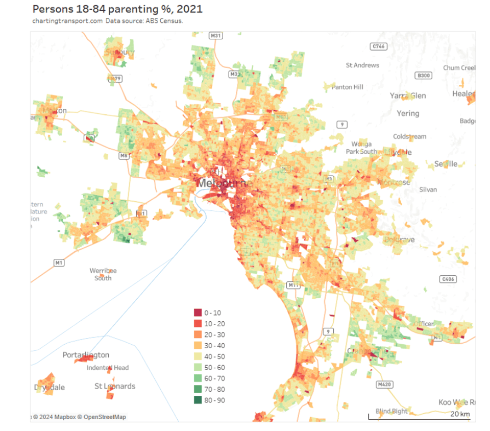
How and why do travel patterns vary by gender and parenting status?
Charting Transport: "This post goes all-in with disaggregating a wide range of available data on transport behaviour on gender and parenting status in Melbourne, and explores some factors likely influencing these behaviours."
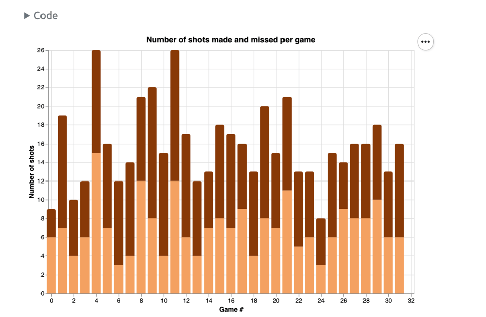
Exploring Wemby’s accuracy
"Did Victor Wembenyama’s accuracy actually improved across his first season in NBA? Leveraging Bayesian stats to find out."
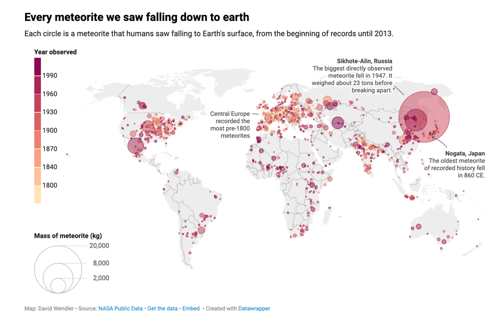
Every meteorite we saw falling down to earth
DataWrapper's David Wendler looks up at the sky. "This map shows every meteorite that has been seen by humans or measuring devices and where it fell down to earth. The symbols are sized by the weight of the meteorite and colored by the year it was observed. The two oldest recorded meteorites fell in Nogata, Japan in the year 860 and in Narni, Italy in 921. While there are several other very old collisions on this map, most of them were witnessed after 1800."
🤖 AI
Dynamics of Corporate Governance Beyond Ownership in AI
Think-tank Common Wealth: "Big Tech dominates investment in AI technology; a public strategy for regulation is crucial to challenge uneven distributions of economic power."
This is interesting as it's taking a critical stance on open source, which I'm sure will generate quite a bit of debate.
(via Durand D'souza)
ChatGPT is bullshit
"Recently, there has been considerable interest in large language models: machine learning systems which produce human-like text and dialogue. Applications of these systems have been plagued by persistent inaccuracies in their output; these are often called “AI hallucinations”. We argue that these falsehoods, and the overall activity of large language models, is better understood as bullshit in the sense explored by Frankfurt (On Bullshit, Princeton, 2005): the models are in an important way indifferent to the truth of their outputs. We distinguish two ways in which the models can be said to be bullshitters, and argue that they clearly meet at least one of these definitions. We further argue that describing AI misrepresentations as bullshit is both a more useful and more accurate way of predicting and discussing the behaviour of these systems."
A research paper with a title like that, and a reference (go look for it) to one of my favourite puns, must be read :)
(via Barry Tennison)
|
DID YOU LIKE THIS ISSUE>? → BUY ME A COFFEE! 
You're receiving this email because you subscribed to Quantum of Sollazzo, a weekly newsletter covering all things data, written by Giuseppe Sollazzo (@puntofisso). If you have a product or service to promote and want to support this newsletter, you can sponsor an issue. |
quantum of sollazzo is also supported by Andy Redwood’s proofreading – if you need high-quality copy editing or proofreading, check out Proof Red. Oh, and he also makes motion graphics animations about climate change.
