567: quantum of sollazzo
#567: quantum of sollazzo – 18 June 2024
The data newsletter by @puntofisso.

Hello, regular readers and welcome new ones :) This is Quantum of Sollazzo, the newsletter about all things data. I am Giuseppe Sollazzo, or @puntofisso. I've been sending this newsletter since 2012 to be a summary of all the articles with or about data that captured my attention over the previous week. The newsletter is and will always (well, for as long as I can keep going!) be free, but you're welcome to become a friend via the links below.
The most clicked link last week was this great visualization of the daily routines of famous creatives.
The Quantum of Sollazzo grove now has 12 trees. Check it out at Trees for Life.
'till next week,
Giuseppe @puntofisso
✨ Topical
12 consecutive months of record-breaking temperatures
Beautiful way to use the dot-chart. I sense some D3 in there :)
The full story is behind a paywall.
(via Peter Wood)
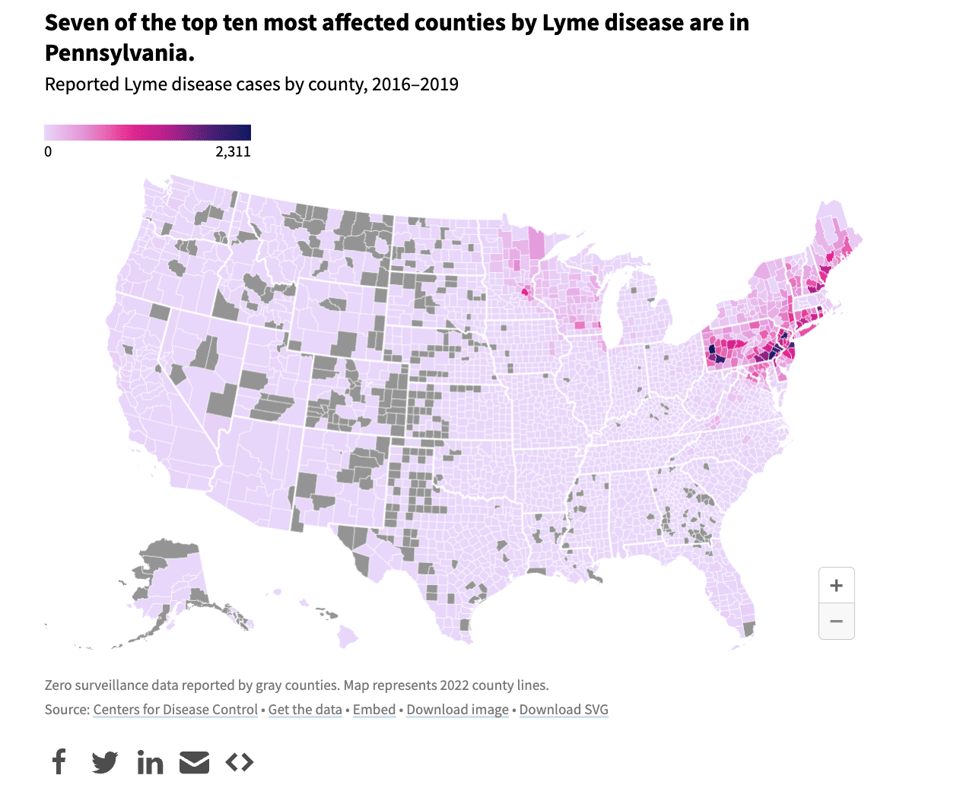
Which states have the highest risk for Lyme disease and other tick-borne diseases?
One of my worst nightmares is getting Lyme disease and being misdiagnosed, which is common. USAFacts: "Lyme disease is the most common tick-borne disease in the US. Tick bite-related ER visits are highest on average from April to July, and peak in May."

🛠️📖 Tools & Tutorials
Causal Inference in R
"The tools in this book will allow readers to better make causal inferences with observational data with the R programming language."
Designing the Avocado of Uncertainty
The very good folks at Stamen, a mapping and dataviz organization, have written up their thinking about visualizing hurricane probabilities. Some good thoughts in here that might be helpful.

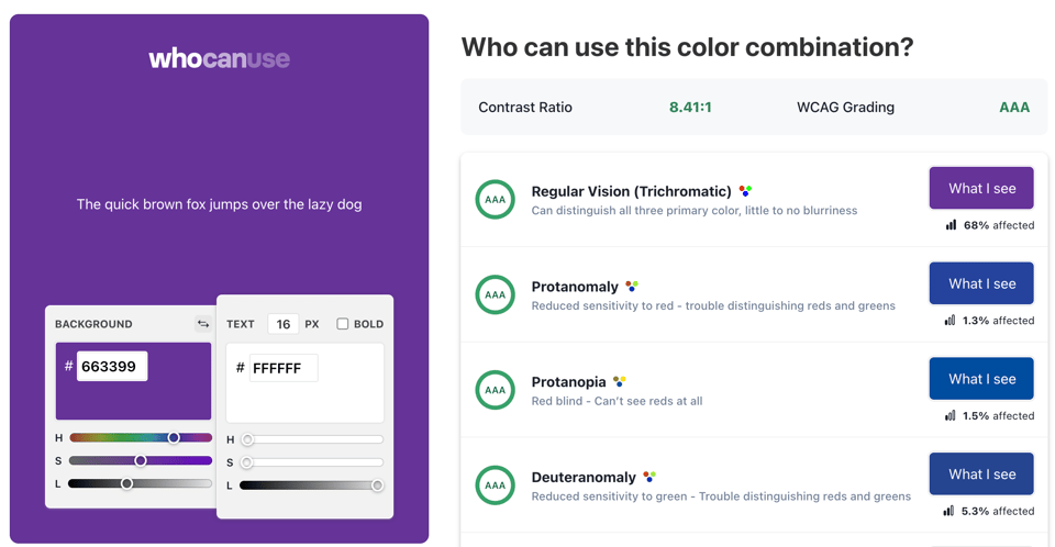
Who can use this color combination?
A useful website to test who your colour palette is accessible to, according to WCAG.

Reshot
"Free Icons & Illustrations. Design freely with instant downloads and commercial licenses."

Promises From The Ground Up
"...the Promises API is so important nowadays. It’s become the de facto way of working with asynchronous code. Modern web APIs are built on top of Promises. There’s no getting around it: if we want to be productive with JavaScript, we need to understand Promises."
📈Dataviz, Data Analysis, & Interactive
The numbers 0–99 sorted alphabetically in different languages
This is more than beautiful, but I'm struggling to find the right adjective.

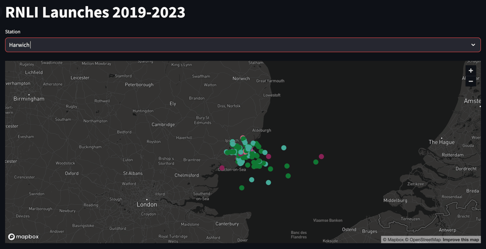
RNLI Launches 2019-2023
Interactive designer Peter Cook has launched this dataviz of lifeboat launches of the Royal National Lifeboat Institution. The source code is available too.

Visualizing music
Datawrapper's Guillermina Sutter Schneider: "For a long time, I’ve been captivated by the idea of seeing sound. I believe that patterns exist in almost everything we hear — intonation, silences, speed, and volume."
The result is pretty good, and she explains how she achieved it.

Occupation and Salary Rankings, Each Decade Since 1970
Nathan Yau (Flowing Data) takes another look at US Census data, as he does frequently, and the resulting dataviz is as usual pretty good.
"Job types changed over the years, because there were these things called computers that created occupations and shifted others. How did income change for different jobs, relative to everyone else? The chart below ranks occupations over the decades by income."

Shaded relief maps made easy
ReliefViz allows users to create relief maps that look great. There is a free tier that sounds relatively ok to get started.
I found about it from this reddit post. It uses the U.S. Geological Survey LiDAR data release layered onto Open Street Map water bodies.

🤖 AI
Financial Statement Analysis with Large Language Models
"We investigate whether an LLM can successfully perform financial statement analysis in a way similar to a professional human analyst. [...] Taken together, our results suggest that LLMs may take a central role in decision-making."
Intriguing.
Cartography of generative AI
"The popularisation of artificial intelligence (AI) has given rise to imaginaries that invite alienation and mystification. At a time when these technologies seem to be consolidating, it is pertinent to map their connections with human activities and more than human territories. What set of extractions, agencies and resources allow us to converse online with a text-generating tool or to obtain images in a matter of seconds?"
Illustration aside, it's a very interesting article.
(via Loud Numbers)

|
DID YOU LIKE THIS ISSUE>? → BUY ME A COFFEE! 
You're receiving this email because you subscribed to Quantum of Sollazzo, a weekly newsletter covering all things data, written by Giuseppe Sollazzo (@puntofisso). If you have a product or service to promote and want to support this newsletter, you can sponsor an issue. |
quantum of sollazzo is also supported by Andy Redwood’s proofreading – if you need high-quality copy editing or proofreading, check out Proof Red. Oh, and he also makes motion graphics animations about climate change.
