566: quantum of sollazzo
#566: quantum of sollazzo – 11 June 2024
The data newsletter by @puntofisso.

Hello, regular readers and welcome new ones :) This is Quantum of Sollazzo, the newsletter about all things data. I am Giuseppe Sollazzo, or @puntofisso. I've been sending this newsletter since 2012 to be a summary of all the articles with or about data that captured my attention over the previous week. The newsletter is and will always (well, for as long as I can keep going!) be free, but you're welcome to become a friend via the links below.
The most clicked link last week was Reuters Graphics' brilliant analysis of the recent flight turbulence incidents.
The Quantum of Sollazzo grove now has 12 trees. Check it out at Trees for Life.
Have you built a crafty website? It might be a good fit for the 2nd edition of the Tiny Awards: "[The] Tiny Awards, [are] a small prize to celebrate interesting, small, craft-y internet projects and spaces which basically make the web a more fun place to be."
'till next week,
Giuseppe @puntofisso
✨ Topical
Glitch Code Jams
Glitch has launched a LGBTQ+ themed series of its monthly code jams: "Whether you’re honoring LGBTQIA+ history or simply making the web a lot more fun, colorful, and welcoming - create and share with the community your interpretation of this rainbow prompt."
There are a lot of links with interesting projects to take inspiration from. The prompt is – needless to say – "rainbows".

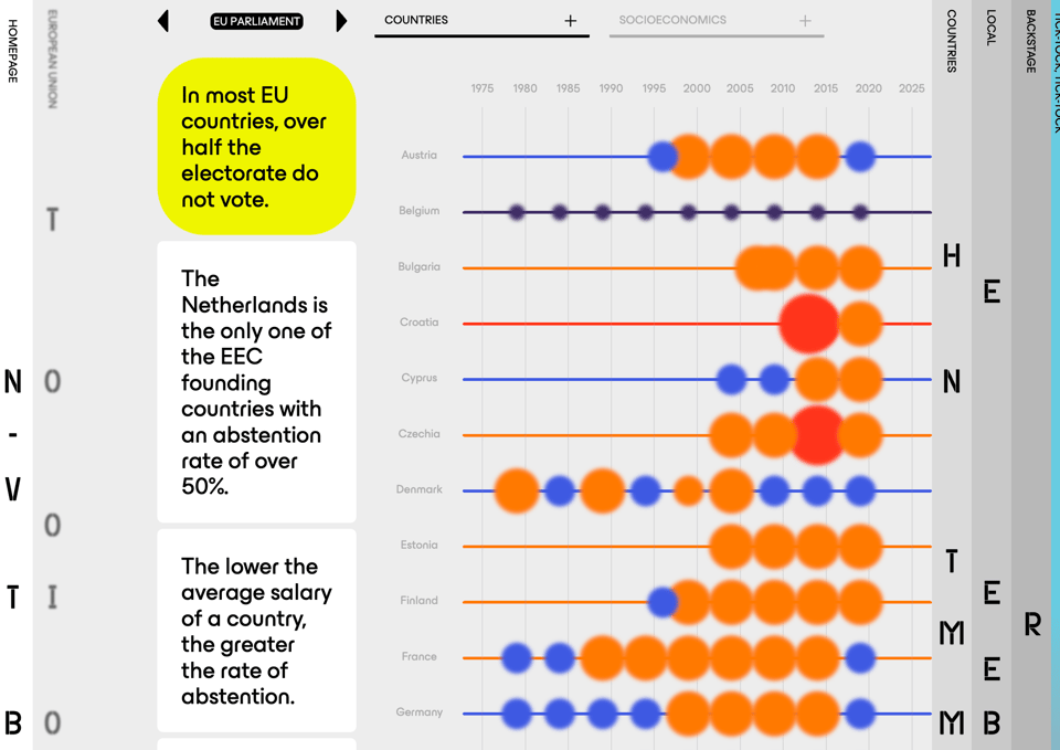
The non-voter time bomb
Divergente and EDJNet look at abstention in the European Parliament elections.
(via Donata Columbro's newsletter)
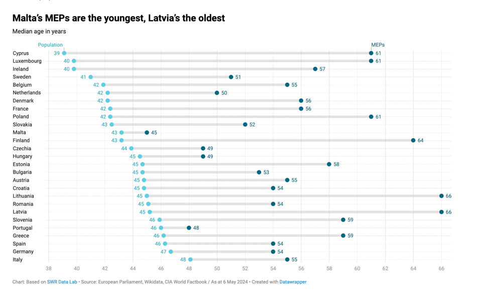
Male, over 50, with a doctorate: this is the European Parliament today
While some of this analysis doesn't reveal anything surprising or different from other Parliaments (although the male/female split is more balanced than the headline suggests) around the world, the "with a doctorate" feature is rather uncommon, I suspect.
🛠️📖 Tools & Tutorials
End To End Data Science With R
An online open access book by Rene Essomba.
Data loader examples in R, Python, shell scripts, and Julia
If you use Observable Framework, this quick guide could be useful. It focuses on using data loaders that allow you to use any language within the framework.
"Even if you don’t regularly use JavaScript, you can use your skills in other languages to build fast and beautiful data apps and dashboards."
All examples are ready with source code to be cloned.
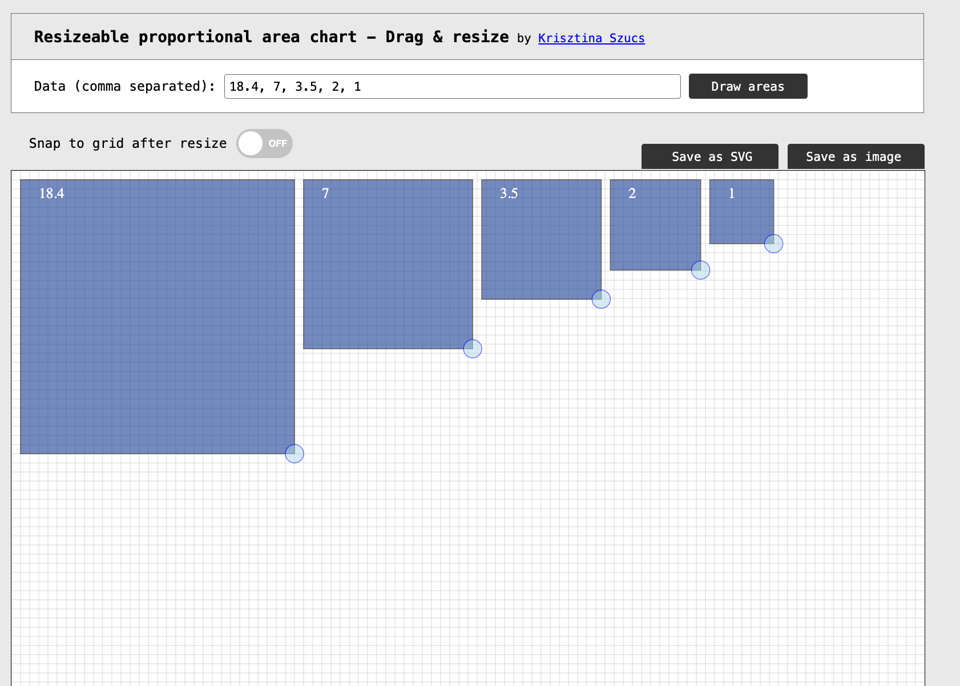
Resizeable proportional area chart
Small but useful tool by designer Kristina Szűcs.
Database Design for Google Calendar: a tutorial
Warning: this is LONG. The author goes through a lot of detail in designing a clone of Google Calendar, explaining all the technical choices behind it. It's an excerpt of a book that will be published later this year.
Rolli
Rolli presents itself as an AI-driven tool for faster newsgathering, saying they are working on "Empowering Journalists and Experts to collaborate on the most compelling stories of the day."
They seem to be offering a free version for journalists, while most of their features are paid-for.
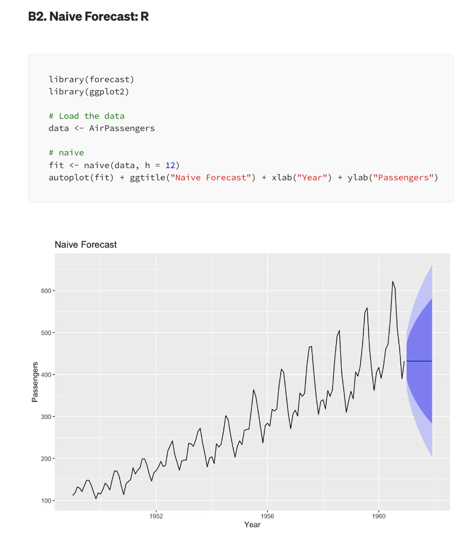
Classical time-series forecasting methods in Python and R for beginners
"Time series forecasting is a method used to predict future values based on previously observed values in a time-ordered sequence. This technique is widely used in various fields, such as finance, economics, weather prediction, inventory management, and many more."
This is a rather comprehensive primer, covering you lot's favourite 2 languages.
What We’ve Learned From A Year of Building with LLMs
"A practical guide to building successful LLM products."
By Amazon's Eugene Yan and others.
Cookiecutter Data Science v2
Cookiecutter is a popular template for data science project in Python using Jupyter. The authors have recently released version 2.
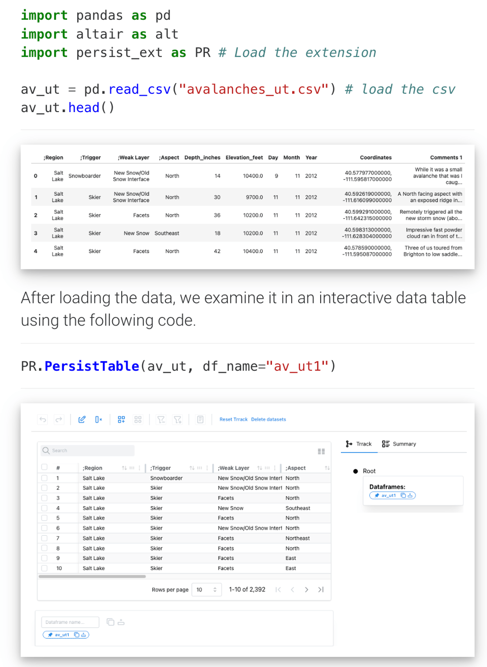
Persist
Speaking about Jupyter, Persist is a very useful plugin which allows – as the name suggests – to persist interactions and data manipulations results.
It's better than saving all intermediate results to csv files, as it also works on the interactive part of a notebook.
Awesome Bootstrap Theme Designed with Atlassian Design
"A Beautiful and Free Bootstrap theme with fully responsive, expertly crafted components with Atlassian Design."
Useful for those setting up web projects.
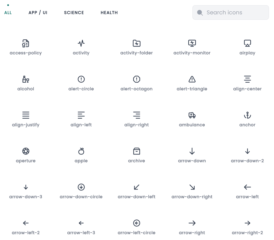
Chromicons
Open source icons (418 at the moment).
🤯 Data thinking
You're Collecting Too Much Data!
"The most instinctive reaction to wanting data is to collect and store as much of it as you can, figure it out later. For many reasons, that's probably a bad idea."
I've seen a few of articles recently that fundamentally address the same question: of all the promises of big data, very few use cases have actually seen success. This is either because there wasn't, in fact, data that was so big to begin with, or that regardless of how big the data is (are? :P), any analysis is only useful for a tiny subset.
📈Dataviz, Data Analysis, & Interactive
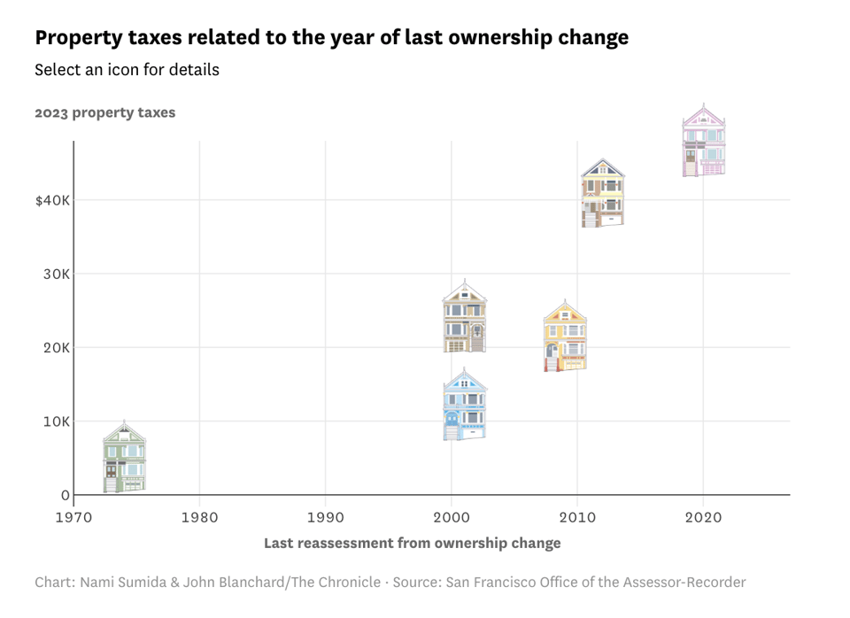
S.F.’s Painted Ladies: Why does one pay $1,000 in property tax and another $44,000?
The San Francisco Chronicle has this brilliantly illustrated look at property taxes.
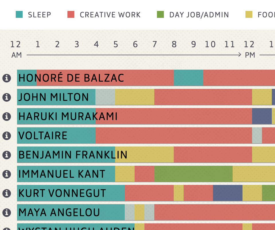
The daily routines of famous creative people
I've seen this before, but never visualised with a bar chart :)
(via Alex Wrottesley)
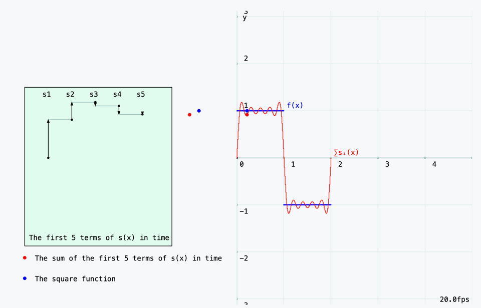
From the Circle to Epicycles (Part 1) - An animated introduction to Fourier Series
Part tutorial and part impressive visualisation, you'll enjoy this article and series. Which features some maths and a lot of interaction.
Which states have the highest cancer rates?
USAFacts: "In 2019, Kentucky had the highest cancer incidence rate nationwide, over 13% above the national average, while Mississippi had the highest cancer mortality rate, over 20% above the national average."
Obviously, the data here is a picture of reality. Understanding the reasons behind such variability and correcting for confounding variables (e.g. more specialist hospitals?) is where it gets very interesting.

🤖 AI
Alice in Wonderland: Simple Tasks Showing Complete Reasoning Breakdown in State-Of-the-Art Large Language Models
If this pre-print is right, it's not great news for LLMs.
"The breakdown is dramatic, as models also express strong overconfidence in their wrong solutions, while providing often non-sensical "reasoning"-like explanations akin to confabulations to justify and backup the validity of their clearly failed responses, making them sound plausible."
Or maybe, it is great news – they sound very human now that I think of it...
|
DID YOU LIKE THIS ISSUE>? → BUY ME A COFFEE! 
You're receiving this email because you subscribed to Quantum of Sollazzo, a weekly newsletter covering all things data, written by Giuseppe Sollazzo (@puntofisso). If you have a product or service to promote and want to support this newsletter, you can sponsor an issue. |
quantum of sollazzo is also supported by Andy Redwood’s proofreading – if you need high-quality copy editing or proofreading, check out Proof Red. Oh, and he also makes motion graphics animations about climate change.
