565: quantum of sollazzo
#565: quantum of sollazzo – 4 Jun 2024
The data newsletter by @puntofisso.

Hello, regular readers and welcome new ones :) This is Quantum of Sollazzo, the newsletter about all things data. I am Giuseppe Sollazzo, or @puntofisso. I've been sending this newsletter since 2012 to be a summary of all the articles with or about data that captured my attention over the previous week. The newsletter is and will always (well, for as long as I can keep going!) be free, but you're welcome to become a friend via the links below.
The most clicked link last week was this very good analysis by newsletter StatSignificant about when, in life, we stop discovering new music and stick to the good oldies.
The Quantum of Sollazzo grove now has 12 trees. Check it out at Trees for Life.

'till next week,
Giuseppe @puntofisso
✨ Topical
The mechanics of turbulence
Reuters Graphics: "What happened to Singapore Airlines flight SQ321 and why?"
This is one of those articles that make me say: "amazing work". Compelling storytelling, perfect analysis, and data visualization really help to understand the story. Bravo, Reuters.

Trees of London
Kevin Lewis of DirectUs: "Today my new show came out on Directus TV where we hope to bring new life to open data by being able to easily explore, analyze, and generate APIs from it. In the first episode, I take data about the over 815k trees managed by London local authorities published by the Greater London Authority."
I won't spoil the surprise of dataviz, but will give you Kevin's big face instead.

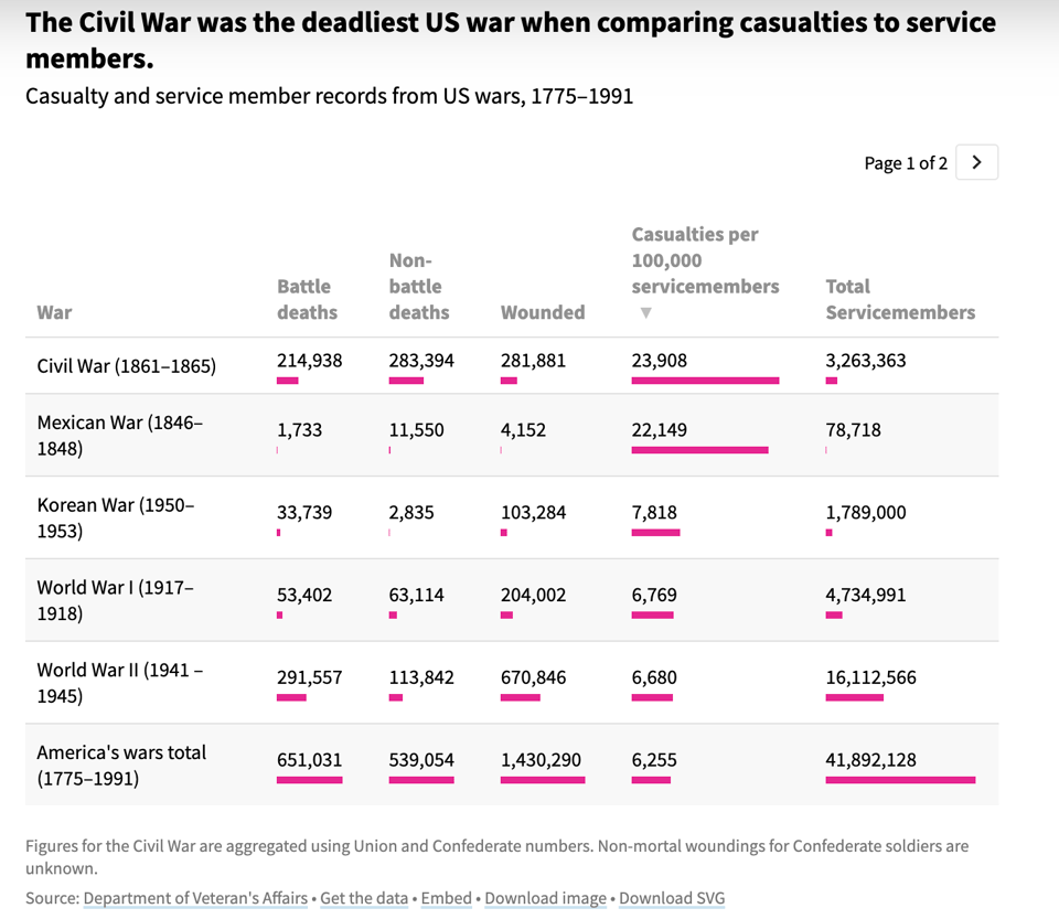
How many people have died in the US military, and how?
USAFacts: "Over 80% of active-duty military deaths since 1980 have come from accidents, illness, and suicides."
Obviously, the decrease comes from the evolution of different models of warfare, but it's also interesting to see how some data (e.g. about suicide) might be missing for earlier times.
How the Guinness Brewery Invented the Most Important Statistical Method in Science
I totally didn't know this: "The most common test of statistical significance originated from the Guinness brewery."
From Scientific American.

Becoming a European citizen is an obstacle race: the paths to naturalization
The European Data Journalism Network looks at the different paths to naturalisation in EU countries, alongside an analysis of the relationship between being born in the country and acquiring citizenship when not entitled from birth.

🛠️📖 Tools & Tutorials
Shiny apps
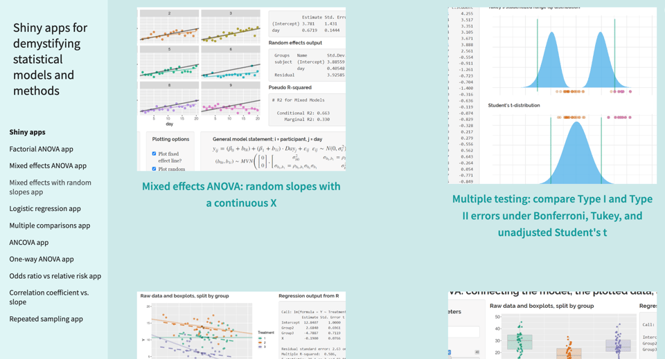
Ben Prytherch, a faculty instructor in the Department of Statistics at Colorado State University, has released this handy collection of R Shiny web apps.
He says: "The purpose of these apps is to demonstrate how statistical methods and models work, using data simulation and visualization. Most of them simulate data according to the rules of a model, plot the simulated data, and report statistical results obtained by fitting the simulated data to the model from which they were generated. The user can adjust values of model parameters or change features of the model, then see what happens to the plotted data and to the statistical results. Most apps have an option to change the random seed, which will generate a new (pseudo-) random set of data."
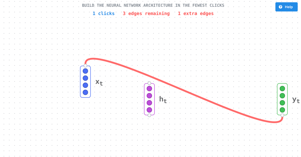
Graph Game
"🧠 The best way to test your understanding of neural networks!
🤖 Choose a neural network, then try to assemble it "
Meet Pyoneer, your Excel Automation Engineer
"Upload an Excel file and let Pyoneer convert it to Python."
AI-driven so... I'm not sure I'd use it without checking ;-)
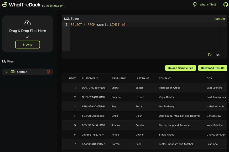
WhatTheDuck
"WhatTheDuck is an open-source web application built on DuckDB. It allows users to upload CSV files, store them in tables, and perform SQL queries on the data."
Code and docs are on GitHub.
Models All The Way Down
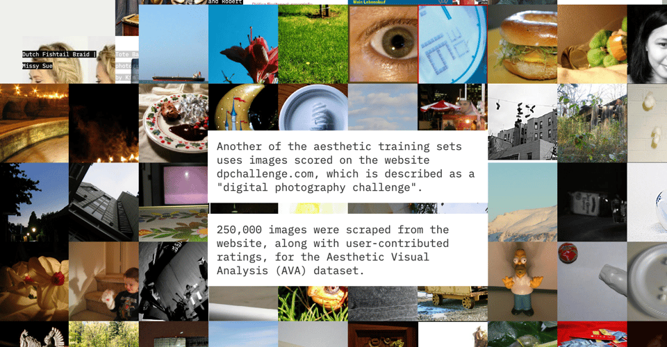
"If you want to make a really big AI model — the kind that can generate images or do your homework, or build this website, or fake a moon landing — you start by finding a really big training set. [...] Scrutinizing these sets is perhaps the only way to get a clear look at the models that are trained on them."
Brilliant scrollytelling article.
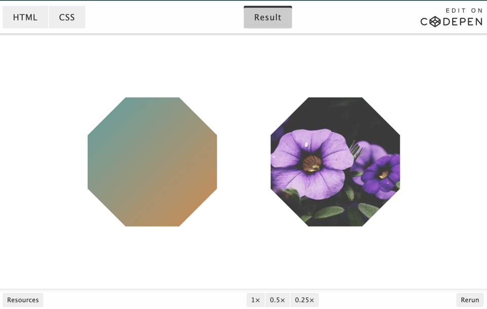
The Modern Guide For Making CSS Shapes
"Creating shapes using CSS is, without any doubt, a classic exercise. In many cases, we try to use hacky code and workarounds, but CSS has evolved, and we have modern ways to create CSS Shapes with clean, reusable code. In this comprehensive guide, Temani Afif explores different techniques for creating common shapes with the smallest and most flexible code possible."
QuickMapTools
"Quickmaptools is an online service providing various map data conversion, creation, editing tools. Quickmaptools focuses on modern as well as legacy formats which are used by GIS industry across the domain."
(via Geomob)
🤯 Data thinking
BIG DATA IS DEAD
"For more than a decade now, the fact that people have a hard time gaining actionable insights from their data has been blamed on its size. “Your data is too big for your puny systems,” was the diagnosis, and the cure was to buy some new fancy technology that can handle massive scale. Of course, after the Big Data task force purchased all new tooling and migrated from Legacy systems, people found that they still were having trouble making sense of their data. They also may have noticed, if they were really paying attention, that data size wasn’t really the problem at all."
The basics of project management for data folk
Counting Stuff: "It's impossible to explain project management in a single post, but the general framework for understanding why work projects feel so objectively different from school ones is helpful to make sense of it all."
📈Dataviz, Data Analysis, & Interactive
Shademap
A map of the world, visualizing the shade profile according to the time.
(via Daniele Bottillo)

Analyzing my text messages with my ex-boyfriend
Teresa Ibarra did this amazing data analysis. Not sure if it's creepy (is it?), but it is good in terms of data! Visualized below is the sentiment analysis for the ex's messages. (The ex knows, by the way.)
(via Web Curios)

How are the Dodgers doing?
I'm definitely not a baseball fan, but what's not to like in this statistical dashboard about the LA Dodgers' performance? Source code also available on GitHub.

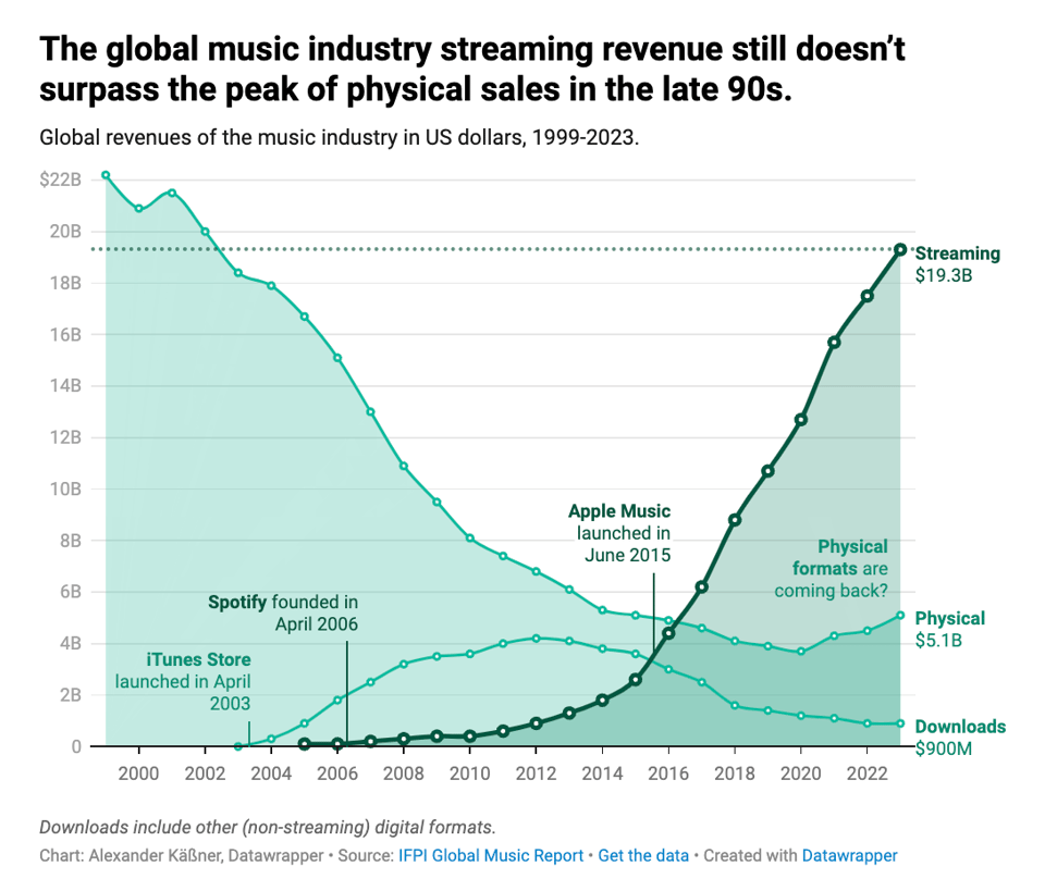
After 20 years of streaming, how is the music industry doing?
Alexander Käßner, Datawrapper: "It’s interesting to see how clearly a few main players in music streaming have impacted the industry as a whole. But I find even more interesting that, to this day, revenues from streaming have never surpassed the peak generated by physical sales in the late 90s. And that with the hundreds of millions of people streaming music every day."
🤖 AI
Don’t Believe the AI Hype
"If you listen to tech industry leaders, business-sector forecasters, and much of the media, you may believe that recent advances in generative AI will soon bring extraordinary productivity benefits, revolutionizing life as we know it. Yet neither economic theory nor the data support such exuberant forecasts."
(via Seyi Ogunyemi)
|
DID YOU LIKE THIS ISSUE>? → BUY ME A COFFEE! 
You're receiving this email because you subscribed to Quantum of Sollazzo, a weekly newsletter covering all things data, written by Giuseppe Sollazzo (@puntofisso). If you have a product or service to promote and want to support this newsletter, you can sponsor an issue. |
quantum of sollazzo is also supported by Andy Redwood’s proofreading – if you need high-quality copy editing or proofreading, check out Proof Red. Oh, and he also makes motion graphics animations about climate change.
