563: quantum of sollazzo
#563: quantum of sollazzo – 21 May 2024
The data newsletter by @puntofisso.

Hello, regular readers and welcome new ones :) This is Quantum of Sollazzo, the newsletter about all things data. I am Giuseppe Sollazzo, or @puntofisso. I've been sending this newsletter since 2012 to be a summary of all the articles with or about data that captured my attention over the previous week. The newsletter is and will always (well, for as long as I can keep going!) be free, but you're welcome to become a friend via the links below.
The most clicked link last week was this very visual analysis of Mexico's changing climate.
Nerd, tech, and with a hint of Bologna, you say? Well, that's basically me, so let me link you to this project by Spencer Wright (founder of Scope of Work / formerly The Prepared, which I've occasionally linked to), "Il Campionato Mondiale di Umari".
Here's what it is: "Umari is the plural form of umarell, and umarell is a jocular Italian term for a person – classically a man of retirement age – who pauses to observe work in progress. The term might be used as light-hearted mockery in Italy, but we think more people ought to umarell; this website is dedicated to that effort.
To umarell is to take an interest in the built environment – this world we move through that our species created, in which most of us spend most of our time. Our lives turn the city into a grey blur, a backdrop to our transits, an obstacle course to negotiate. This is a shame.
Buildings are the redwoods of our time: We’re surrounded by them, they tower over us, and nearly every building you see will be standing long after you’re gone. They ought to be a source of awe and wonder, as much as mountains are, or birds. They’re just as easy to ignore, because they’re so commonplace, and initially offer nothing to hold our attention. But attention is fractal – if you wake up to the city, the city will awaken around you.
We hope you’ll give it a try."
EVENT – interesting for both theme and location: "Learn to create impactful infographics & data-visuals", with Information is Beautiful's David McCandless at the London Transport Museum. Tickets from £75.
(via Lisa Riemers)
The Quantum of Sollazzo's grove has now 11 trees. Check it out at Trees for Life.
'till next week,
Giuseppe @puntofisso
✨ Topical
Who has health insurance? Are rates going up?
USAFacts: "Young adults ages 19 to 25 are the most likely to be uninsured of any age group: 14% of them were uninsured in 2022."

100,000 Stars
A Google Experiment showing how many points you can push Chrome to display.

Eurotrack: who is watching Eurovision 2024 and why?
I love the subheading here, claiming that "Britons are most likely to say they will be watching for ironic reasons".

🛠️📖 Tools & Tutorials
D3 in Depth
A book, freely available online, to "[Learn D3.js from the ground up]".
What I've Learned Building Interactive Embedding Visualizations
"I've compiled details about the whole process from start to finish along with my personal observations about what works and what doesn't here. My hope is that it will be interesting or useful to anyone looking to build similar kinds of tools themselves."

Visual design rules you can safely follow every time
"You do not have to follow these rules every time. If you have a good reason to break any of them, do. But they are safe to follow every time."

Calculating the proportion of US state borders that are coastlines
"Measuring coastlines is hard and causes fractal paradoxes, but we can use R and {sf} to try!"
Aside from the R code, this article presents quite a few tips and common pitfalls.
📈Dataviz, Data Analysis, & Interactive
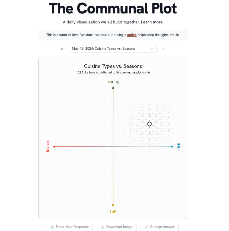
The Communal Plot
PerThirtySix has launched "a daily visualization we all build together."
The way you interact with the chart is pretty good.

How do we use the Earth’s land?
Elana Levin Schtuberg, Datawrapper's CEO, analyses land usage.

Exploring Hacker News by mapping and analyzing 40 million posts and comments for fun
"The above is a map of all Hacker News posts since its founding, laid semantically i.e. where there should be some relationship between positions and distances. I've been building it and some other interesting stuff over the past few weeks, to play around with text embeddings."
The map is pretty cool, but, most importantly, the blog post details how you can build your own.

🤖 AI
Improvements to data analysis in ChatGPT
"Interact with tables and charts and add files directly from Google Drive and Microsoft OneDrive."
Let's see if this works...
|
DID YOU LIKE THIS ISSUE>? → BUY ME A COFFEE! 
You're receiving this email because you subscribed to Quantum of Sollazzo, a weekly newsletter covering all things data, written by Giuseppe Sollazzo (@puntofisso). If you have a product or service to promote and want to support this newsletter, you can sponsor an issue. |
quantum of sollazzo is also supported by Andy Redwood’s proofreading – if you need high-quality copy editing or proofreading, check out Proof Red. Oh, and he also makes motion graphics animations about climate change.
