561: quantum of sollazzo
#561: quantum of sollazzo – 7 May 2024
The data newsletter by @puntofisso.

Hello, regular readers and welcome new ones :) This is Quantum of Sollazzo, the newsletter about all things data. I am Giuseppe Sollazzo, or @puntofisso. I've been sending this newsletter since 2012 to be a summary of all the articles with or about data that captured my attention over the previous week. The newsletter is and will always (well, for as long as I can keep going!) be free, but you're welcome to become a friend via the links below.
The most clicked link last week was this interesting article showing the results of tests on how users look at and read web pages.
The Quantum of Sollazzo's grove now has 10 trees.
'till next week,
Giuseppe @puntofisso
✨ Topical
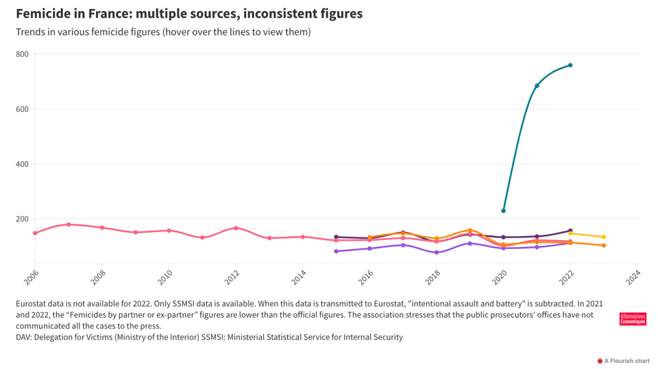
How many femicides? International comparisons are impossible
EDJNet: "The second part of EDJNet's investigation on femicides once again highlights the lack of data that would enable useful comparisons at the European level. The case of France provides a good example of such shortcomings."
Aside from the interesting yet tragic topic, the angle on how data collection allows us to understand a problem in depth is very important (with obvious parallels to Du Bois and his analysis of the "undercounting" of African-Americans in the early US Census).
How much does the US spend on the military?
"Since 1980, defense spending has risen by 62%, climbing from $506 billion to $820 billion by 2023, after adjusting for inflation."

How is the Green Deal doing, five years later? A compass for Europe’s carbon neutrality
Klaxon for a second weekly link to EDJNet: "With its goal of carbon neutrality by 2050, the European Green Deal is crucial to the EU's green transition policy. But how should we gauge the progress made in implementing the pact’s various objectives? Economists from the Observatoire Français des Conjonctures Économiques have developed a tool that allows everyone to monitor the real-life progress being made towards the Green Deal’s medium-term targets."
The actual viz is available at the source article on Vox Europe.

🛠️📖 Tools & Tutorials
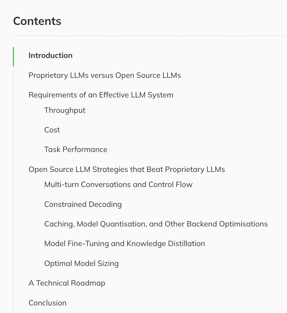
How to Beat Proprietary LLMs With Smaller Open Source Models
Data scientist Aidan Cooper: "Building your AI applications around open source models can make them better, cheaper, and faster."
It comes with quite a few very useful practical tips.
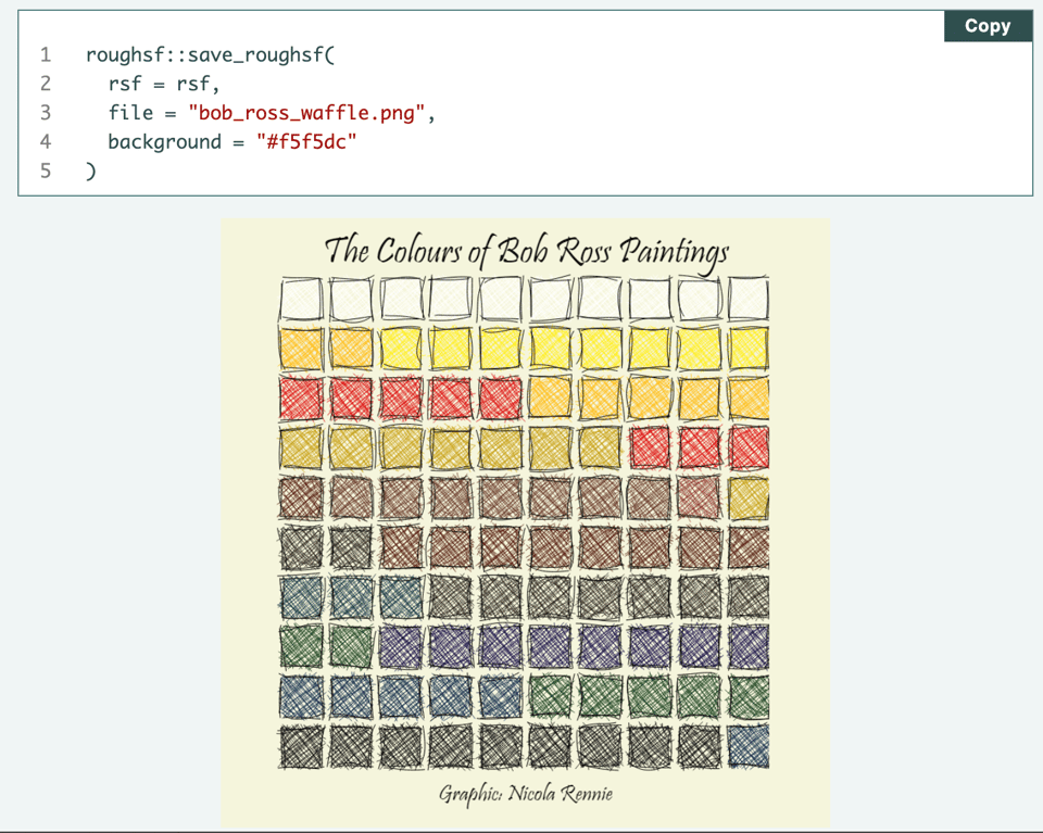
Sketchy waffle charts in R
"Waffle charts can be used to visualise counts or percentages of categorical data. This blog post describes a slightly unusual solution to creating sketchy looking waffle charts in R using the {sf} and {roughsf} packages."
As much as R is not my language of choice, I find its versatility in creating amazing looking charts pretty outstanding, with (usually) fewer headaches around imports, which often make my beloved Python a little infuriating.
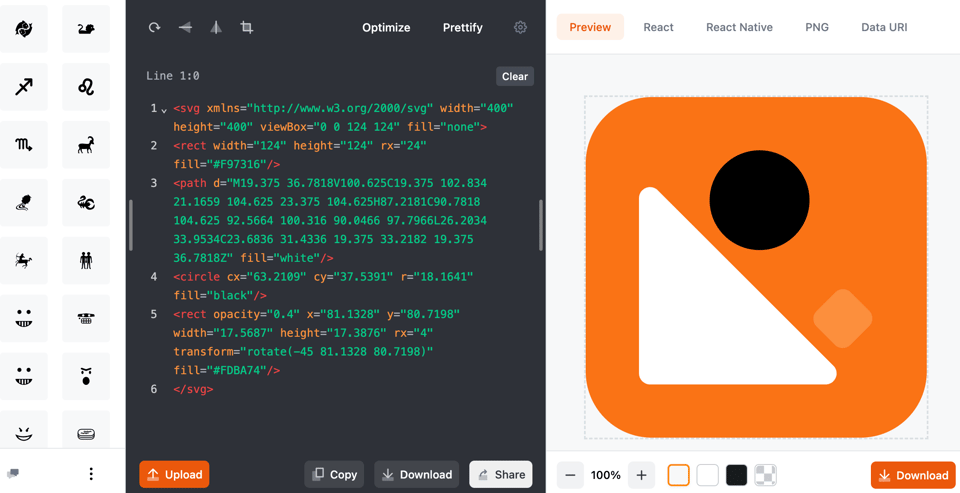
SVG Viewer
Exactly what it says on the tin, brilliantly delivered.
Crafting data colors and staying on brand
"The Observable 10 color palette as a case study in how to create color schemes that tell your stories".
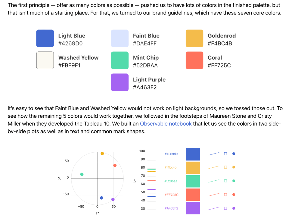
Observable tutorials
Speaking of Observable, they've released a handy video tutorial series.
Design Patterns For Effective Maps UX
"Practical design patterns for planning, designing and building better map experiences for websites and apps."
Wow, there's a lot to digest in here (see taster below).
(via Geomob)

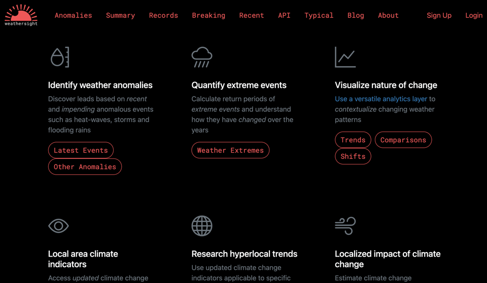
Data-driven climate change communication
"Weathersight is the platform for discovering and contextualizing global weather trends."
(via Geomob)
Bringing Lapis to life: How we built a storytelling platform from scratch
Not quite a tutorial in the strict sense, but it explains all the design choices that led Kontinentalist – a brilliant data journalism studio based in Singapore – to design and launch their own platform for data storytellers, Lapis. There is a waitlist to become user/testers of it.
JSON Generator
A handy online JSON editorthat allows users to describe complex structures within an intuitive UI.

🤯 Data thinking
Minority genders in quantitative survey research: a data-driven approach to clear, inclusive, and accurate gender questions
Academic paper KLAXON: "Whilst linguistic research on speakers of minority genders has increased in the past decade, much less is known about how they can best be included in broader (socio)linguistic research. The current paper compares the way a range of five different gender measures for survey research are filled out and evaluated by a sample of LGBTQ+ people (N = 682). It finds that providing a larger range of answering options allows researchers to gain a better view of the gender diversity in their sample, whilst preventing refusals and loss of participants. The gender question that was least likely to be refused and was rated the most accurate, most inclusive, and clearest was a six-option multiple-choice question which included a “prefer not to say” and a write-in option. This question reconciles two competing interests in the treatment of queer data: it explicitly recognizes and names minority genders and simultaneously carves out space for participants to refuse categorization or write out gender identities beyond those preset by the researcher."
(via Lisa Riemers)
📈Dataviz, Data Analysis, & Interactive
Can I Eat It Yet?
"A visual guide to seasonal fruit and veg".
This is for Australia, but the code is available.

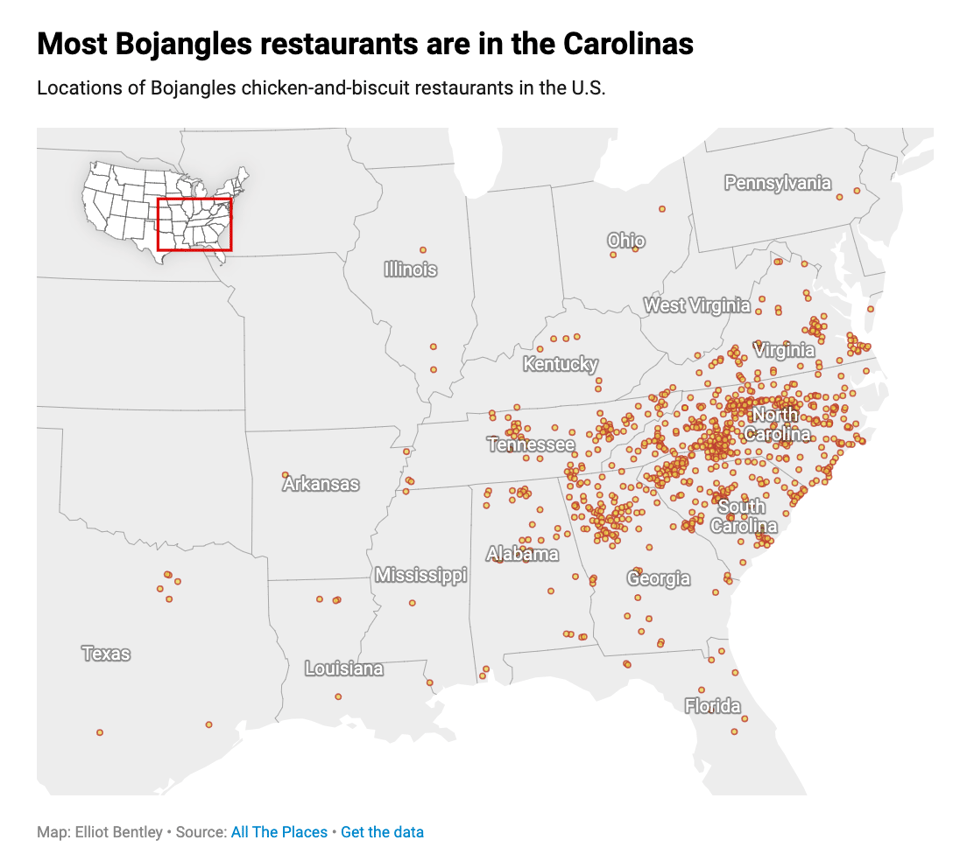
Where to get Bojangles biscuits
Datawrapper's Elliot Bentley always asks the best questions.
(Almost) Every North American NHL Player's Birth City
Remarkable dataviz which "plots 6871 North American born players going back to the 1917-1918 inaugural".
The author made the map using ArcGIS, and the interactive version is here. They used player data from a popular hockey website, using Geoapify to geocode the locations.

🤖 AI
What can LLMs never do?
"On goal drift and lower reliability. Or, why can't LLMs play Conway's Game Of Life?"
|
DID YOU LIKE THIS ISSUE>? → BUY ME A COFFEE! 
You're receiving this email because you subscribed to Quantum of Sollazzo, a weekly newsletter covering all things data, written by Giuseppe Sollazzo (@puntofisso). If you have a product or service to promote and want to support this newsletter, you can sponsor an issue. |
quantum of sollazzo is also supported by Andy Redwood’s proofreading – if you need high-quality copy editing or proofreading, check out Proof Red. Oh, and he also makes motion graphics animations about climate change.
