559: quantum of sollazzo
#559: quantum of sollazzo – 23 April 2024
The data newsletter by @puntofisso.

Hello, regular readers and welcome new ones :) This is Quantum of Sollazzo, the newsletter about all things data. I am Giuseppe Sollazzo, or @puntofisso. I've been sending this newsletter since 2012 to be a summary of all the articles with or about data that captured my attention over the previous week. The newsletter is and will always (well, for as long as I can keep going!) be free, but you're welcome to become a friend via the links below.
Sponsorship news
As of last week, I've announced to my Github sponsors that I'm ceasing to accept sponsorship for this newsletter. This is the consequence of a few reflections, including the fact that I never intended to run this newsletter as a "for profit" initiative, and patronage was originally a way to pay the expenses and create a community around the newsletter.
But with my day job keeping me too busy to invest more time in the community and the occasional commercial sponsor, as well as the many opportunities that this newsletter has opened up for me, I decided it was time to let go of formal patronage (occasional relevant ads might still appear).
A huge thank you to everyone who sponsored Quantum – some have gone on for years.
If you like an issue, you can always BuyMeACoffee, or sponsor an issue.
Trees for Quantum
Speaking of sponsorship, I used last month's donations to... plant trees :-)
I started a grove dedicated to Quantum and the plan is to grow it with part of the donations/coffees/sponsorship money. I'll keep you posted as it grows, and you are very much welcome to add trees to it directly.
The most clicked link last week was this article on England's sewers by The Guardian.
'till next week,
Giuseppe @puntofisso
✨ Topical
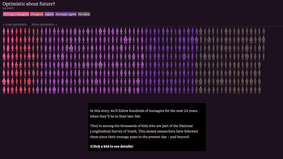
This is a teenager
A scrollytelling article by Alving Chang for The Pudding looks at the National Longitudinal Survey of Youth.
Climate Pulse
The Copernicus Climate Change Service has launched this amazing website that allows the user to navigate through air and ocean temperature data in quasi real-time. All data can be downloaded with a few clicks. The website is intended for both experts and non-experts.

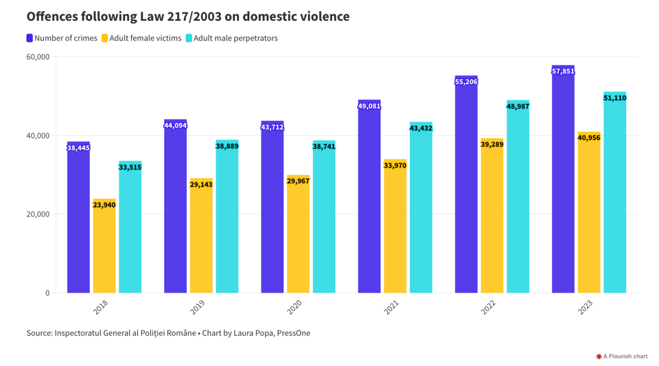
9 things we learned when investigating partner violence and feminicide in Slovakia
The European Data Journalism Network: "Investigating gender-based violence and femicide, we have found that one third of all murdered women are killed by their partners - among other worrying data. Also, due to an inaccurate way of counting victims of domestic violence, many victims may be uncounted."
🛠️📖 Tools & Tutorials
How I Created an AI Version of Myself
"Using Retrieval Augmented Generation (RAG) on my content to create a bot that answers using my knowledge."
(via Guy Lipman)
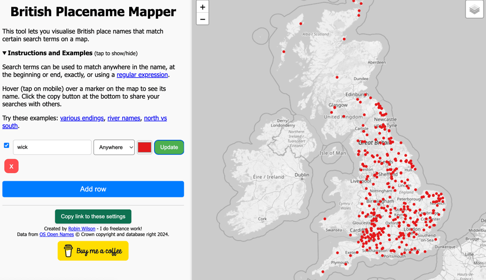
British Placename Mapper
This tool by Robin Wilson "lets you visualise British place names that match certain search terms on a map".
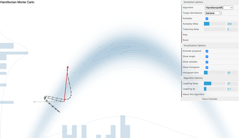
The Markov-chain Monte Carlo Interactive Gallery
An interactive visualizer of Monte Carlo algorithms. The image below is that of Hamiltonian Monte Carlo.
Building a weather data warehouse part I: Loading a trillion rows of weather data into TimescaleDB
"But to do this analysis globally we need to make querying the data warehouse fast, and there’s a lot of data. The first step is to load the data into a database of some kind."
A Visual Guide to Vision Transformers
"This is a visual guide to Vision Transformers (ViTs), a class of deep learning models that have achieved state-of-the-art performance on image classification tasks. Vision Transformers apply the transformer architecture, originally designed for natural language processing (NLP), to image data. This guide will walk you through the key components of Vision Transformers in a scroll story format, using visualizations and simple explanations to help you understand how these models work and how the flow of the data through the model looks like."
It comes with an attached Colab Notebook.
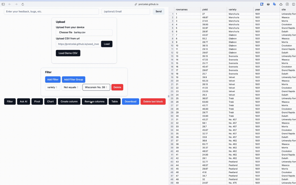
Pretzel
"Pretzel is an open-source, offline browser-based tool for fast and intuitive data exploration and visualization. It can handle large data files, runs locally in your browser, and requires no backend setup. Pretzel makes it easy to manipulate data via visual chained data transform blocks. It's also reactive - changing a transform block in the chain automatically updates all transform blocks, and charts that follow."
ADS-B Massive Visualizer
"This website (technology demo) allows you to aggregate and visualize massive amounts of air traffic data."
GitHub repo also available.
The image below shows all A380s in the data.

🤯 Data thinking
A Curious Phenomenon Called ‘Etak’
Etak was the first car navigation system, launched before GPS became available. It worked (badly) in some pretty amazing ways. This article, part 9 of a series called "12 Map Happenings that Rocked our World" tells its story.

📈Dataviz, Data Analysis, & Interactive
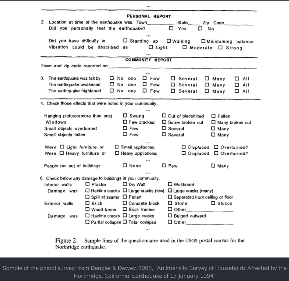
Earthquakes bringing in tons of survey data
"April 5th 2024 brought a rare earthquake to the Northeast US. That opens up a big rabbit hole for looking at the roots of the USGS "Did You Feel It" survey."
|
DID YOU LIKE THIS ISSUE>? → BUY ME A COFFEE! 
You're receiving this email because you subscribed to Quantum of Sollazzo, a weekly newsletter covering all things data, written by Giuseppe Sollazzo (@puntofisso). If you have a product or service to promote and want to support this newsletter, you can sponsor an issue. |
quantum of sollazzo is also supported by Andy Redwood’s proofreading – if you need high-quality copy editing or proofreading, check out Proof Red. Oh, and he also makes motion graphics animations about climate change.
