554: quantum of sollazzo
#554: quantum of sollazzo – 27 Feb 2024
The data newsletter by @puntofisso.

Hello, regular readers and welcome new ones :) This is Quantum of Sollazzo, the newsletter about all things data. I am Giuseppe Sollazzo, or @puntofisso. I've been sending this newsletter since 2012 to be a summary of all the articles with or about data that captured my attention over the previous week. The newsletter is and will always (well, for as long as I can keep going!) be free, but you're welcome to become a friend via the links below.
The most clicked link last week was this article on the falsehoods programmers believe about time zones in coding.
Some of you might be interested in this Microsoft/Open Data Institute workshops on prompting for generative AI in a couple of days (on the 29th of February).
'till next week,
Giuseppe @puntofisso
|
Before you go... DO YOU LIKE QUANTUM OF SOLLAZZO? → BECOME A SUPPORTER! :) If you enjoy this newsletter, you can support it by becoming a GitHub Sponsor. Or you can Buy Me a Coffee. I'll send you an Open Data Rottweiler sticker. You're receiving this email because you subscribed to Quantum of Sollazzo, a weekly newsletter covering all things data, written by Giuseppe Sollazzo (@puntofisso). If you have a product or service to promote and want to support this newsletter, you can sponsor an issue. |
✨ Topical
Race and Occupation
Nathan Yau (Flowing Data): "About 22 percent of physicians in the United States are Asian, but Asian people only make up about 6 percent of the total working population. Compare the former to the latter, and you could say that Asian people are about 3.5 times more likely to be physicians.
Are there other jobs that jump out? What’s it like for other races and ethnicity?"

How Gaza’s ‘safe’ city Rafah came to be on the precipice of catastrophe – visualised
Ashley Kirk and team for The Guardian look at the situation around Rafah, interestingly using satellite imagery among other sources.

🛠️📖 Tools & Tutorials
Observable Framework
"Observable Framework is an open-source static site generator for data apps, dashboards, reports, and more. Framework includes a preview server for local development, and a command-line interface for automating builds & deploys.
You write simple Markdown pages — with interactive charts and inputs in reactive JavaScript, and with data snapshots generated by loaders in any programming language (SQL, Python, R, and more) — and Framework compiles it into a static site with instant page loads for a great user experience. ."
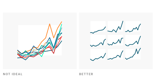
What to consider when creating small multiple line charts
Datawrapper's Lisa Charlotte Muth has written this handy guide: "Use small multiple line charts to untangle overlapping lines. Even when you have only a handful of lines, if they overlap a lot, you might want to consider giving each one space to breathe in its own panel."

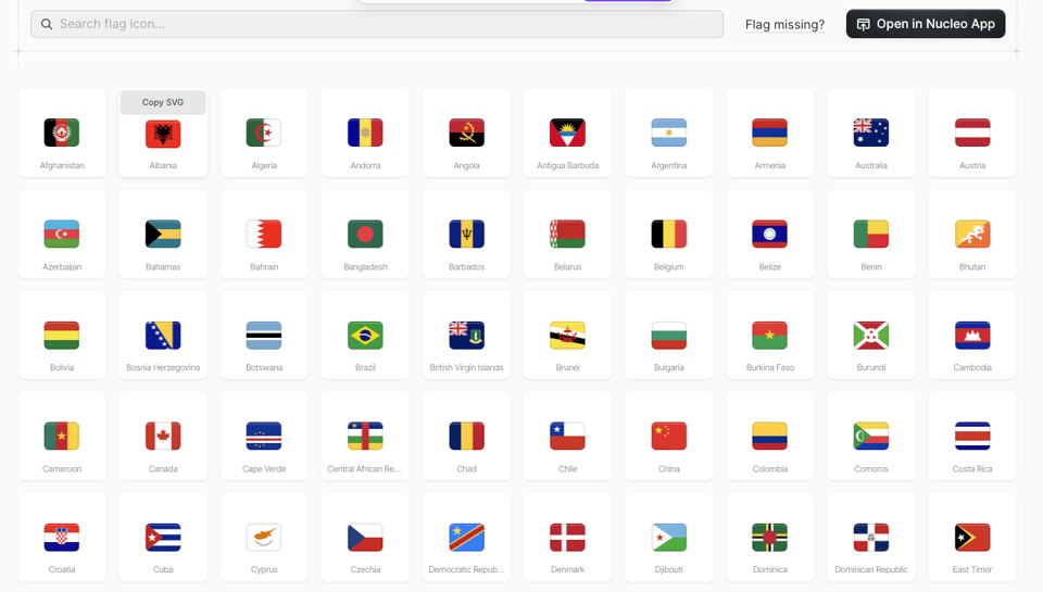
SVG Flag Icons
"Explore over 200 optimized SVG country flag icons — Perfectly crafted on a 32px grid."

Latent Scope
"Quickly embed, project, cluster and explore a dataset. This project is a new kind of workflow + tool for visualizing and exploring datasets through the lens of latent spaces."

Translating OpenStreetMap data to HTML5 Canvas with Rust and WebAssembly
"I'm working on a revamp of an old project of mine called Line Buddy (github). It used a now-deprecated API library called themeparks (github) and A-Frame to visually represent the wait times in the Disney World theme parks in 3D.
The original project used OpenStreetMap screenshots as the base, with columns representing the wait times. (They're all zero now since this version of the API no longer works.)
My plan is to use OpenStreetMap data to create a simplified version of the map. Eventually, I'll create the map in 3D. As a proof of concept, however, I'm going to draw to an HTML5 canvas first. I want to make sure that I'm able to get the data that I need, process it, and use it to create my own maps."

Etse-Ada. All in one suite of customisable web tools and support for managing your business operations - including websites, professional emails and an ERP consisting of CRM, accounting, project management, service/product management, and many more features. Learn more & Start a free trial.
📈Dataviz, Data Analysis, & Interactive
We all carry a map inside
I heard Ana Lucía present this work as a talk at London Geomob. A brilliant, geo-special, geospatial, heartwarming little story.

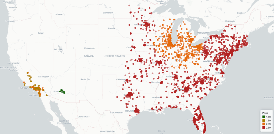
How much do X cost at Aldi?
A US-based map.

Amsterdam Typography
"Amsterdam Typography is a project by Arno Verweij that explores Amsterdam through the lens of typography."
(via Luis Natera's newsletter)

Nine Maps Show How Britain Is on the Move
"A new dataset allows anyone to explore almost 1 billion journeys from every one of its more than 2,500 train stations."
The article, on Bloomberg, points to the original tweet and GitHub code.

Remaking a 200-year-old chart
Datawrapper's Ivan Lokhov remade that famous Playfair chart abut the Napoleonic wars, applying what Lisa Charlotte Muth explained a few links above in the "Tools and Tutorials" section :-)

Running my first marathon in Hong Kong
Lai Ka Kay: "I ran my first marathon on Jan. 21, 2024 in Hong Kong, in 3 hours 50 minutes". She shares some pretty good dataviz.

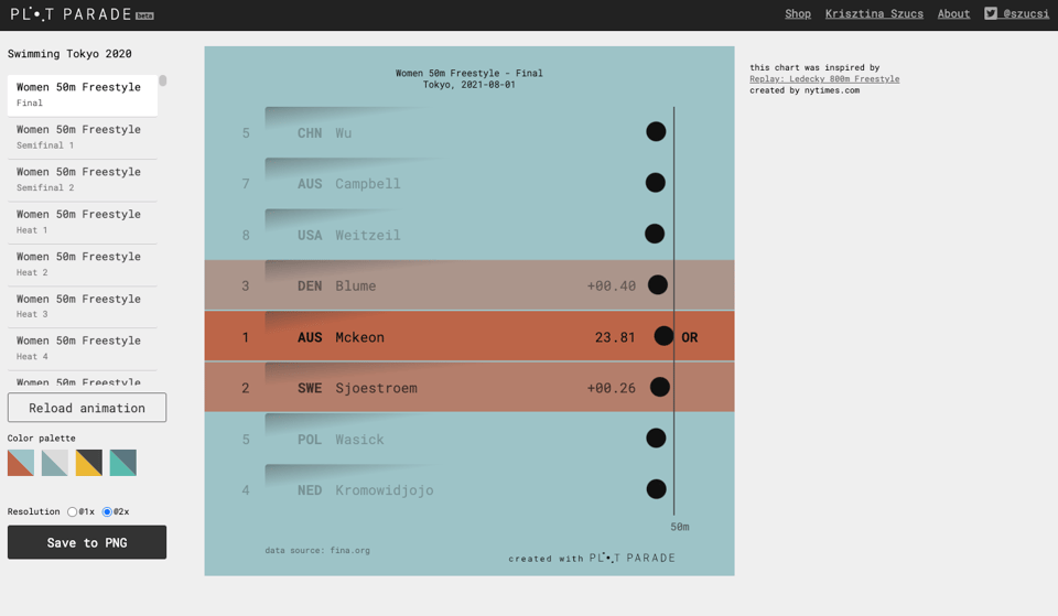
Swimming
A brilliant viz by designer Krisztina Szucs.

🤖 AI
AI Is Like Water
"Water is three things. Necessary. Ubiquitous. And the same. fucking. thing. inside every bottle. AI is like water. Or more specifically, generative AI applications are like bottled water."
quantum of sollazzo is also supported by Andy Redwood’s proofreading – if you need high-quality copy editing or proofreading, check out Proof Red. Oh, and he also makes motion graphics animations about climate change.

Supporters*
Alex Trouteaud
casperdcl
[*] this is for all $5+/months Github sponsors. If you are one of those and don't appear here, please e-mail me
