552: quantum of sollazzo
#552: quantum of sollazzo – 13 February 2024
The data newsletter by @puntofisso.

Hello, regular readers and welcome new ones :) This is Quantum of Sollazzo, the newsletter about all things data. I am Giuseppe Sollazzo, or @puntofisso. I've been sending this newsletter since 2012 to be a summary of all the articles with or about data that captured my attention over the previous week. The newsletter is and will always (well, for as long as I can keep going!) be free, but you're welcome to become a friend via the links below.
We have some great new sponsored content: Ed Freyfogle, organiser of location-based service meetup Geomob, co-host of the Geomob podcast, and co-founder of the OpenCage, has offered to introduce a set of points around the topic of geodata. His first entry starts a few paragraphs below on geocoding API.
The most clicked link last week was Vox's look at Americans' protein intake.
'till next week,
Giuseppe @puntofisso
|
Before you go... DO YOU LIKE QUANTUM OF SOLLAZZO? → BECOME A SUPPORTER! :) If you enjoy this newsletter, you can support it by becoming a GitHub Sponsor. Or you can Buy Me a Coffee. I'll send you an Open Data Rottweiler sticker. You're receiving this email because you subscribed to Quantum of Sollazzo, a weekly newsletter covering all things data, written by Giuseppe Sollazzo (@puntofisso). If you have a product or service to promote and want to support this newsletter, you can sponsor an issue. |
✨ Topical
Joining the data dots to reduce road deaths
The RAC Foundation: "Collision data and medical information sharing could lead to a better understanding of the causes and costs of road traffic collisions."
A good report on linking data for better road safety.
(via Ivo Wengraf)
Charted: The Approval Ratings of World Leaders in 2024
Visual Capitalist published this handy chart. A curios: Anthony Albanese's dad was originally from my hometown in the South of Italy.

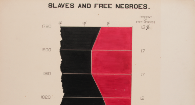
W. E. B. Du Bois’ staggering Data Visualizations are as powerful today as they were in 1900 (Part 1)
"One of the most powerful examples of data visualization was made 118 years ago by an all-black team led by W.E.B. Du Bois only 37 years after the end of Slavery in the United States."
The remarkable story and legacy of Du Bois, whose analysis of what he called "the undercounting of African Americans" (in the US Census) is still valid today whenever we discuss bias in datasets.
Geocoding is just the first step
Most data projects involve tedious cleaning and enriching before the data can actually be "used".
At OpenCage, we are firm believers that laziness is one of the virtues of a great developer. We’ve thought a lot about making geocoding with open data dead simple, but also how to simplify the total journey to using the data. Our geocoding API returns "annotations" - extra information about the location that developers might find useful, thus saving work.
An example is EU NUTS codes, standard codes commonly used for linking datasets and statistical analysis. Looking up the relevant codes for a region is not particularly complex, but it is the kind small tasks that need to be done correctly (and maintained) in a larger data processing project. So, as a simplification for our users, we already return the correct codes as an annotation.
As an example, a request to the OpenCage geocoder for 52.387, 9.733 (in northern Germany) returns the annotation
"NUTS": {
  "NUTS0": {
    "code": "DE"
  },
  "NUTS1": {
    "code": "DE9"
  },
  "NUTS2": {
    "code": "DE92"
  },
  "NUTS3": {
    "code": "DE929"
  }
},
We also return many other types of information, for example: the local timezone, calling code, currency information, other reference systems like geohash, what3words, MGRS, US FIPS cdes, Maidenhead, the time of sunrise and sunset, the qibla angle, and much more.
Have a project that will need geocoding? See our geocoding buyer's guide for an overview of all the factors to consider when choosing between geocoding services.

🛠️📖 Tools & Tutorials
An Introduction to SQL for Weary Data Scientists
A pretty useful introduction to SQL from first concepts, but intended to be used as a guide to deliver lessons – the authors don't recommend starting with it if you are a true beginner. It's a good sequence of 100 examples of increasing complexity.

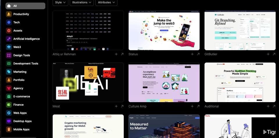
Web design inspiration catalog
"Unleash your creativity with out-of-this-world web design inspiration from across the web".
sqlite-web
"Web-based SQLite database browser written in Python".
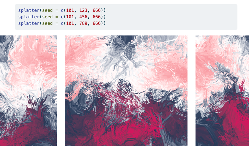
Splatter
"How to make a mess with ggplot2 and ambient."
Artsy generative R.
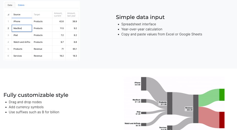
SankeyArt
"Turn financial statements into beautiful Sankey diagrams. Also available as an add-in for Excel and PowerPoint."
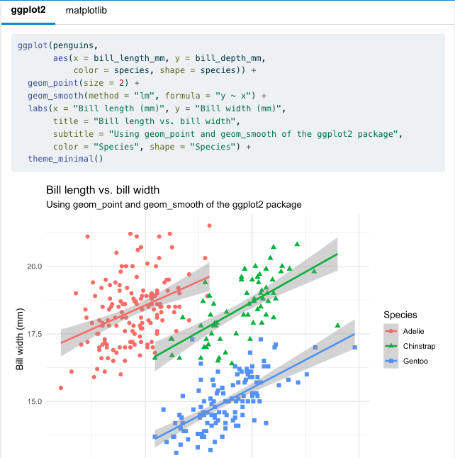
Tidy Data Visualization: ggplot2 vs matplotlib
"ggplot2 is based on Leland Wilkinson”s Grammar of Graphics, a set of principles for creating consistent and effective statistical graphics, and was developed by Hadley Wickham. The package is a cornerstone of the R community.
matplotlib is a widely-used data visualization library in Python, renowned for its ability to produce high-quality graphs and charts."
And now, fight!
earthaccess: Earth Science Data Simplified
"The earthaccess Python library provides an easy way to search, download, or stream NASA Earth science data using a few lines of code."

🤯 Data thinking
The story of the R number: How an obscure epidemiological figure took over our lives. Part 1: History
Data policy thinker and overall outstanding geek Gavin Freeguard has written an interesting long read about the R number which was, as he describes, the “breakout star” of the early weeks of the Covid-19 lockdowns. Here you'll find the first instalment of the article in serialised form; while Gavin has also written a blog post summary.

📈Dataviz, Data Analysis, & Interactive
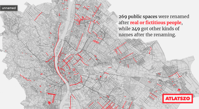
Poets, politicians and saints: Budapest’s changing street names
From the European Data Journalism Network/Atlaszo: "A third of Budapest’s 8,598 streets and squares have been renamed at least once in their history. A third of those now bear the name of a real or fictitious person, the most popular being Attila József. A look at the reasons for renaming and the issues of political memory they highlight."
The shapes of a working day
Datawrapper's Elliot Bentley: "Not everyone works nine to five. Here’s a data vis revealing what kinds of jobs work when."

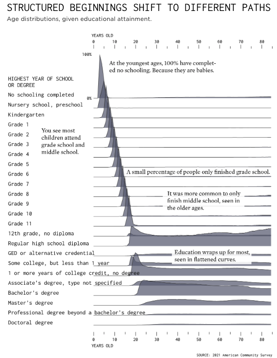
Highest Education Level and Age Distributions
FlowingData: "When you’re a kid, most (if not all) of the people you know who are your age are in the same grade as you. Education paths start to diverge towards the end of high school and after."
Yet another great use of the American Community Survey.
Red Sea attacks
"How Houthi militants in Yemen are attacking ships in one of the world’s busiest maritime trade routes"

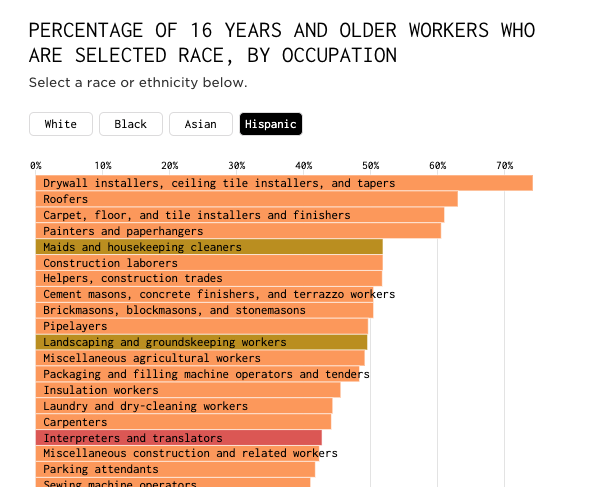
Commonness of Races in Different Occupations
Ok, another viz from FlowingData, but it's really worth it. An interactive chart of occupation by ethnicity, according to the US Bureau of Labor Statistics.
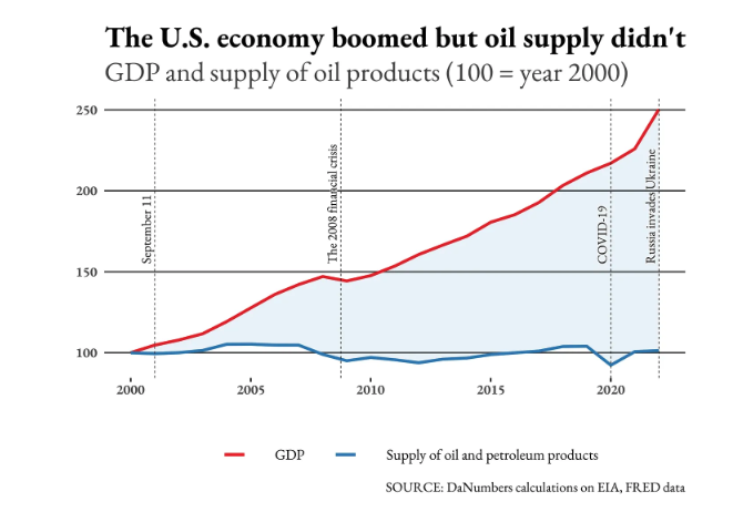
Is the green transition one of the reasons for global instability?
Francesco Piccinelli's DaNumbers newsletter returns with an analysis of global impacts of fossil fuels production: "As traditional oil and gas-producing countries are losing their leverage, they could resort to violence to keep their place on the global stage."
quantum of sollazzo is also supported by Andy Redwood’s proofreading – if you need high-quality copy editing or proofreading, check out Proof Red. Oh, and he also makes motion graphics animations about climate change.

Supporters*
Alex Trouteaud
casperdcl
[*] this is for all $5+/months Github sponsors. If you are one of those and don't appear here, please e-mail me