551: quantum of sollazzo
#551: quantum of sollazzo – 6 February 2024
The data newsletter by @puntofisso.

Hello, regular readers and welcome new ones :) This is Quantum of Sollazzo, the newsletter about all things data. I am Giuseppe Sollazzo, or @puntofisso. I've been sending this newsletter since 2012 to be a summary of all the articles with or about data that captured my attention over the previous week. The newsletter is and will always (well, for as long as I can keep going!) be free, but you're welcome to become a friend via the links below.
We have some great new sponsored content: Ed Freyfogle, organiser of location-based service meetup Geomob, co-host of the Geomob podcast, and co-founder of the OpenCage, has offered to introduce a set of points around the topic of geodata. His first entry starts a few paragraphs below on building or buying a geocoder.
The most clicked link last week was Hoodmaps (I'm not surprised).
'till next week,
Giuseppe @puntofisso
|
Before you go... DO YOU LIKE QUANTUM OF SOLLAZZO? → BECOME A SUPPORTER! :) If you enjoy this newsletter, you can support it by becoming a GitHub Sponsor. Or you can Buy Me a Coffee. I'll send you an Open Data Rottweiler sticker. You're receiving this email because you subscribed to Quantum of Sollazzo, a weekly newsletter covering all things data, written by Giuseppe Sollazzo (@puntofisso). If you have a product or service to promote and want to support this newsletter, you can sponsor an issue. |
✨ Topical
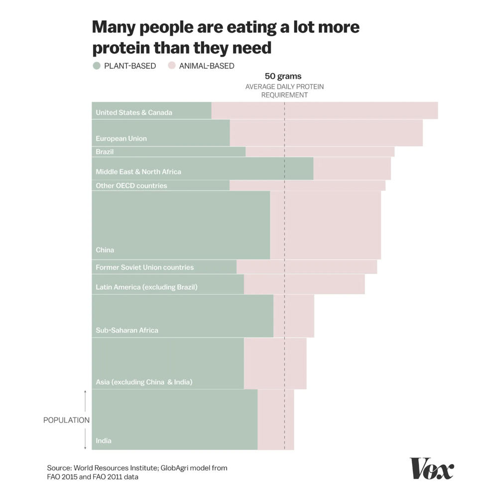
You’re probably eating way too much protein
"Americans are obsessing over protein and forgetting about fiber."
To think that Peter Attia says we don't eat enough...
(via Peter Wood)
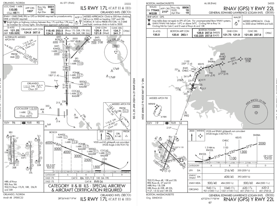
FAA Aviation Maps
"Among all of the visual information published by the U.S. government, there may be no product with a higher information density than the Federal Aviation Administration’s aviation maps."
Another great collection on Beautiful Public Data. They contain a bit of everything, from waypoints to landing maps.
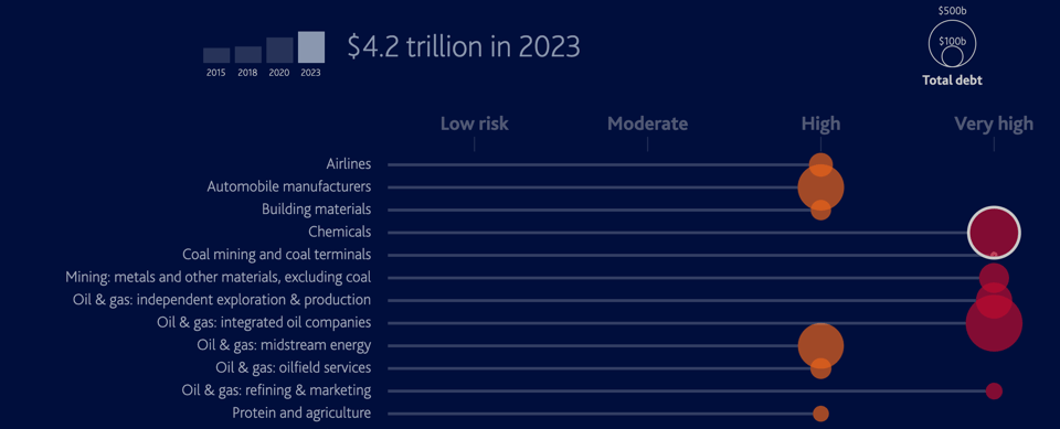
Trillions of dollars in global sectors’ debt highly exposed to environmental risks
Interest report by Moody's, with a few pretty charts.
Harder, better, faster, stronger… forever?
Datawrapper's Julian Freyberg looks at sports records and human limits.

Build or Buy? Should you try to create your own geocoder?
Welcome to part four of our series on geocoding.
Given freely available opensource software, and open data like OpenStreetMap, should you run your own geocoder? Or should you pay a service like ours to host the geocoding software for you? The whole point of open data is that you can do it yourself, right?
The short answer is that yes, you can run, or even write, your own geocoder. Unqiue technical requirements may mean it makes sense to craft your own custom service, but most people prefer to leave it experts and get on with their real work.
Our geocoding API aggregates many different open data sources and provides enterprise level reliability. One factor we see many people overlook: setting up the software is one thing, keeping the underlying data current is another. Put another way: building is easy, maintaining is hard. OSM alone gets 4-5 million edits per day. Still, as a developer myself and long-time OSM contributor, I understand the inclination to get your hands dirty. Hopefully it helps put you at ease to know that we’re doing our part to give back to the open data and open source geo software community.
Finally, rest easy knowing that if you ever need to the data and code is all there for you to dive into. That’s the real power of open-source and open data.
Have a project that will need geocoding? See our geocoding buyer's guide for an overview of all the factors to consider when choosing between geocoding services.
🛠️📖 Tools & Tutorials
qgis-processing-trajectory
This library by GIS expert Anita Graser (see her recent blog post) is a QGIS plugin that adds trajectory analysis algorithms to the QGIS Processing toolbox.

DataTrove
"DataTrove is a library to process, filter and deduplicate text data at a very large scale. It provides a set of prebuilt commonly used processing blocks with a framework to easily add custom functionality."
gnuplotlib
"A gnuplot-based plotting backend for numpy."
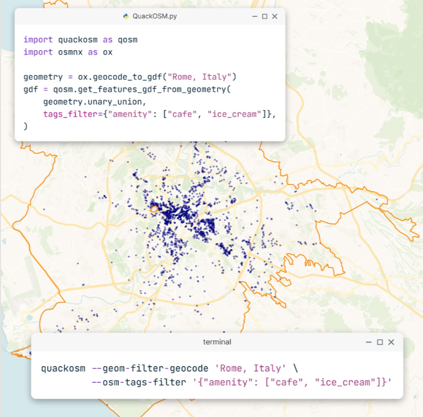
quackosm
"*QuackOSM: an open-source tool for reading OpenStreetMap PBF files using DuckDB"
130 Data Science Terms Every Data Scientist Should Know in 2024
"Most Data Science Jargon explained in plain English"
Binary logistic regression in R
"The two most common regressions are linear and logistic regressions. A linear regression is used when the dependent variable is quantitative, whereas a logistic regression is used when the dependent variable is qualitative."
This blog post explains how to calculate the latter in R.
🤯 Data thinking
How to deal with receiving a cease-and-desist letter from Big Tech
I'm not sure I'd necessarily advocate for following the suggestions in this blog post, but it's an interesting story about the trouble one can get in working with third-party platforms and data.
Taking the leap towards building trusted data sets
Bit of a stretch, but "there are several parallels between going for the gold in the long jump and building trusted data sets using software-inspired CI/CD practices."
📈Dataviz, Data Analysis, & Interactive
Polar Radar
A website that monitors air traffic over the Arctic Circle and Antarctica, and obviously avoids the issues with the Mercator projection used by FlightRadar24 and other similar websites.

A Brief and Inspiring History of Data Visualization in Korea
Discussing the evolution of mapping Korea.
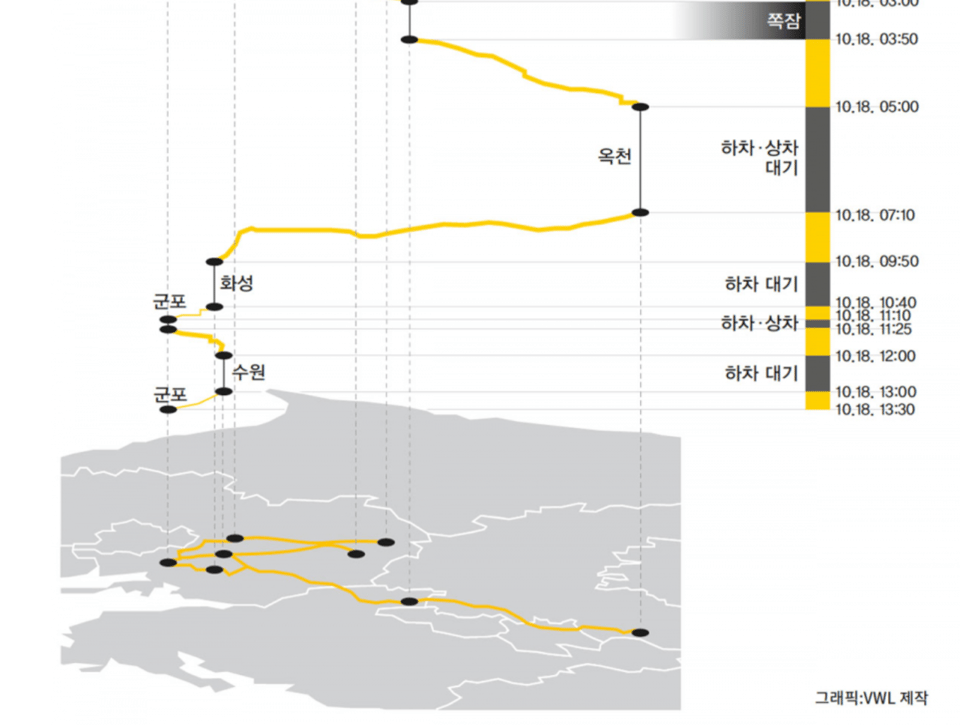
Curvature
"Curvature generates a map highlighting the most twisty roads, all across the world."
(via Geomob)

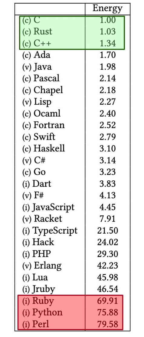
What Are the Greenest Programming Languages?
"The study below runs 10 benchmark problems in 28 languages. It measures the runtime, memory usage, and energy consumption of each language. The abstract of the paper is shown below."
It links to a in-depth technical academic pre-print. It's an interest concept.
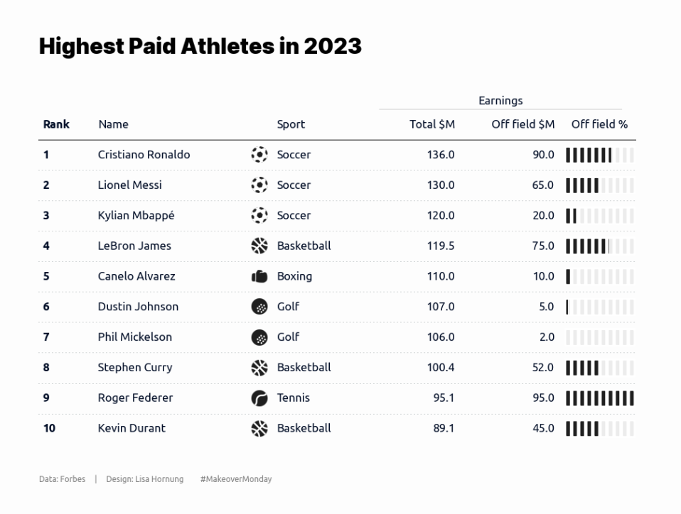
Highest Paid Athletes
Lisa Hornung has created this table – topic aside, she also shared the code that uses Python plottable library.
'Big Five' Mass Extinctions in Earth's History
I didn't know you could do such pretty charts with Power BI :) Jokes aside, it really shows that no matter the tool, you can achieve some good viz.
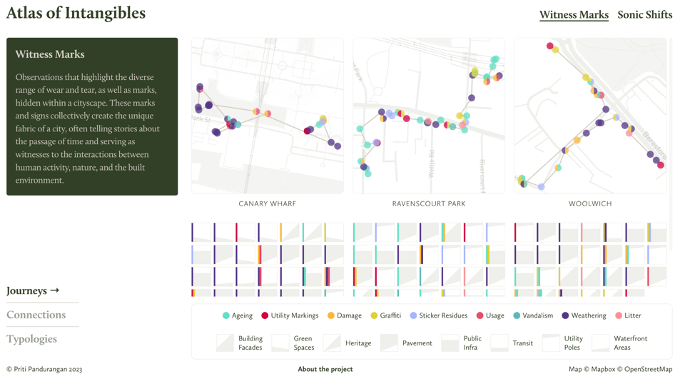
Atlas of Intangibles
"*Atlas of Intangibles is a data experience designed to highlight the rich, interconnected web of sensory information that lies beneath our everyday encounters. Showcasing sensory data collected by me around the city of London through score-based data walks, the digital experience allows viewers to choose specific themes and explore related data as views — journeys, connections, and typologies. Each data point is rich in context, encompassing images and audio recordings."
Harmonics Explorer
Not quite data, but close. This tool lets you play with the relationship between tones and overtones.

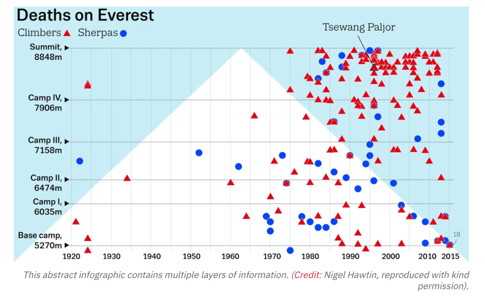
Mapped: The deadly geography of Mount Everest
"The world’s highest mountain is also the world’s highest cemetery, with some bodies serving as creepy landmarks for today’s climbers."
quantum of sollazzo is also supported by Andy Redwood’s proofreading – if you need high-quality copy editing or proofreading, check out Proof Red. Oh, and he also makes motion graphics animations about climate change.

Supporters*
Alex Trouteaud
casperdcl
[*] this is for all $5+/months Github sponsors. If you are one of those and don't appear here, please e-mail me
