543: quantum of sollazzo
#543: quantum of sollazzo – 5 December 2023
The data newsletter by @puntofisso.

Hello, regular readers and welcome new ones :) This is Quantum of Sollazzo, the newsletter about all things data. I am Giuseppe Sollazzo, or @puntofisso. I've been sending this newsletter since 2012 to be a summary of all the articles with or about data that captured my attention over the previous week. The newsletter is and will always (well, for as long as I can keep going!) be free, but you're welcome to become a friend via the links below.
Yours truly is probably taking a couple of weeks of medical leave (nothing serious, but I need to have a small procedure done to my leg). I might be able to do an issue next week, but it depends on my ability to sit and stand :-) Just so you're warned, no worries, I'll be back!
The most clicked link last week, rather unsurprisingly, was the Information is Beautiful awards showcase.
Speak soon,
Giuseppe @puntofisso
|
Before you go... DO YOU LIKE QUANTUM OF SOLLAZZO? → BECOME A SUPPORTER! :) If you enjoy this newsletter, you can support it by becoming a GitHub Sponsor. Or you can Buy Me a Coffee. I'll send you an Open Data Rottweiler sticker. You're receiving this email because you subscribed to Quantum of Sollazzo, a weekly newsletter covering all things data, written by Giuseppe Sollazzo (@puntofisso). If you have a product or service to promote and want to support this newsletter, you can sponsor an issue. |
✨ Topical
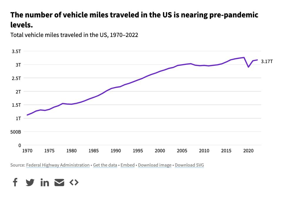
Has vehicle traffic returned to pre-pandemic levels?
USAFacts: "Forty-eight states reported an increase in vehicle miles traveled on all roads this year, according to preliminary 2023 numbers."
No Room To Grow
"A look at how we have changed the planet to feed ourselves – and why we can't keep doing it the same way in the future."
A dataviz project by the Associated Press.

Dogs with jobs: data on canine employment in the government
And, again, USAFacts: "Dogs working for the federal government typically have roles that involve either detection or search — nearly 3,000 work for the Department of Homeland Security."

Who might win the next UK Election?
Datawrapper takes a look at the UK next General Election, which, by law, will happen no later than January 2025.

Etse-Ada: all in one suite of customisable web tools and support for managing your business operations - including websites, professional emails and an ERP consisting of CRM, accounting, project management, service/product management, and many more features. Learn more & Start a free trial.
🛠️📖 Tools & Tutorials
The Data Engineering Handbook
"This is a repo with links to everything you'd ever want to learn about data engineering."
It contains a bit of everything, from books, to YouTube videos, to communities.
Animotion
As it self describes, this is a tool to build CSS Animations with No-Code, Adobe Premiere style.
"Animotion lets you create CSS animations visually, by dragging, resizing, rotating, clipping and more, including a keyframes editor, a collection of ready-to-use animations and 29 built-in easings."

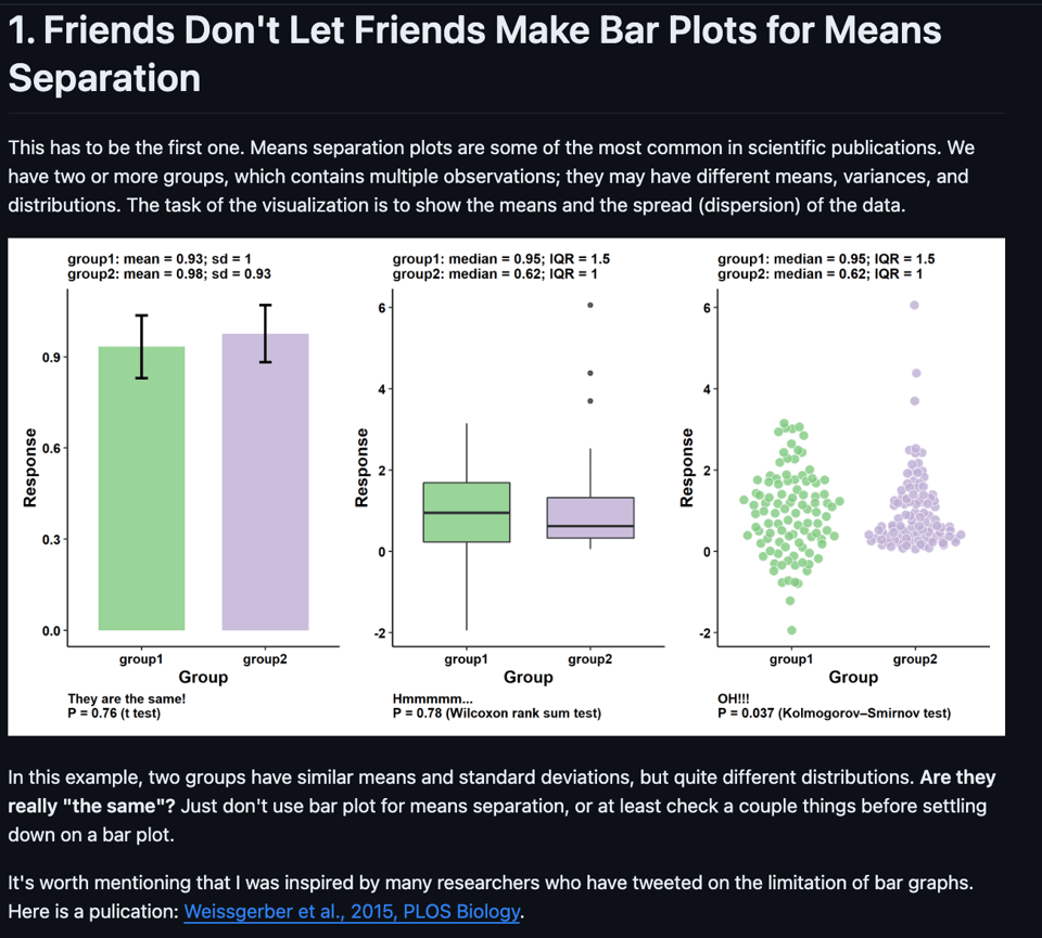
Friends Don't Let Friends Make Bad Graphs
"This is an opinionated essay about good and bad practices in data visualization."
pdf-to-table
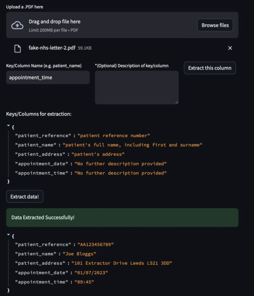
Jon Fuller, the UK Health Security Agency's Principal Data Scientist, has created an LLM-driven tool to extract structured data out of PDFs. You find the application here on HuggingFace and his announcement here.
An Interactive Guide to CSS Grid
"In this tutorial, I'm going to share the biggest 💡 lightbulb moments I've had in my own journey with CSS Grid. "
Fun with sockets
You might have seen this mind-boggling feat by Bjorn Staal going viral. Someone replicated it (in a simplified form) and shared the source code (sadly, without a licence attached – I've opened an issue to request it). A good similar example is this "brickception" game (believe me, give this a go!).

Generative AI for beginners
"A 12 Lesson course teaching everything you need to know to start building Generative AI applications"
Making a font
In case you are really curious on how to create a font for whatever reason – for example, creating a font with your own handwriting (which is what this first-timer font creator chronicles in this article).
How to pick more beautiful colors for your data visualizations
"Choosing good colors for your charts is hard. This article tries to make it easier."
By Lisa Charlotte Muth, DataWrapper's head of communications, previously featured in QoS. Note also her recent blog post on how to get started in data visualization.

🤯 Data thinking
The Dunning-Kruger Effect is Autocorrelation
"The Dunning-Kruger effect also emerges from data in which it shouldn’t. For instance, if you carefully craft random data so that it does not contain a Dunning-Kruger effect, you will still find the effect. The reason turns out to be embarrassingly simple: the Dunning-Kruger effect has nothing to do with human psychology.1 It is a statistical artifact — a stunning example of autocorrelation."
My knowledge of statistics and psychology is too limited to really have an opinion on this. What do you think?
📈Dataviz, Data Analysis, & Interactive
Qualité du service Vélib
Valentin Cathelain has created a dashboard monitoring the quality of service of Paris' Vélib bike sharing program.
He said: "As many users have experienced issues with the service recently, my goal was to leverage their open data API to gain insights that could help improve the user experience. By collecting data hourly and transforming it, I created an interactive dashboard powered by HEX."

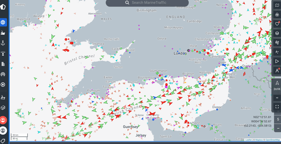
Marine Traffic live map
An excellent use of AIS data.
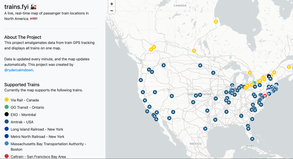
Trains.fyi
"A live, real-time map of passenger train locations in North America. 🇨🇦🇺🇸"
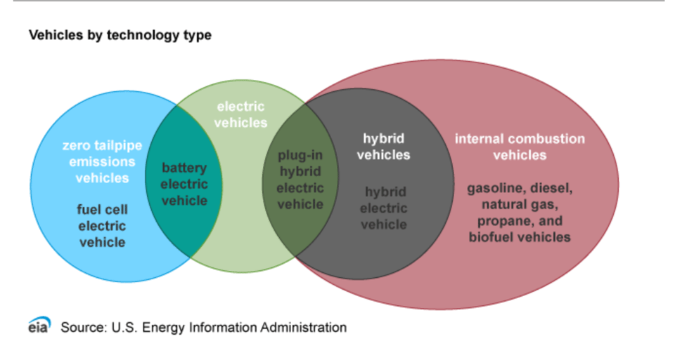
Use of energy explained
By the U.S. Energy Information Administation, a governmental agency, this is a publication showing the energy use for transportation.
(via Peter Wood)
Improving the Strava Training Log
"Visualising the training patterns of marathon runners using Strava, Python, and Matplotlib."

🤖 AI
AI Art: How artists are using and confronting machine learning
This is a really cool video on the behind-the-scenes of an AI-driven exhibition at New York's MoMA (Museum of Modern Art).
(via Juliana Antoninus)
Semantic Layer as the Data Interface for LLMs
"A new benchmark for natural language questions against databases dropped last week. What does it mean and how does the dbt Semantic Layer stack up?"
As Jason Ganzi illustrates, the paper is about the intuition that "layering structured Semantic Knowledge on top of your data leads to much stronger ability to correctly answer ad-hoc questions about your organizational data with Large Language Models."
AI doomerism is also AI hype
Very good thread by computational linguistics Prof. Emily M. Bender.
"The idea that synthetic text extruding machines are harbingers of AGI that is on the verge of combusting into consciousness and then turning on humanity is unscientific nonsense. At the same time, it serves to suggest that the software is powerful, even magically so: if the "AI" could take over the world, it must be something amazing."
quantum of sollazzo is also supported by Andy Redwood’s proofreading – if you need high-quality copy editing or proofreading, check out Proof Red. Oh, and he also makes motion graphics animations about climate change.

Supporters*
Alex Trouteaud
casperdcl / iterative.ai
Naomi Penfold
[*] this is for all $5+/months Github sponsors. If you are one of those and don't appear here, please e-mail me
