542: quantum of sollazzo
#542: quantum of sollazzo – 21 November 2023
The data newsletter by @puntofisso.

Hello, regular readers and welcome new ones :) This is Quantum of Sollazzo, the newsletter about all things data. I am Giuseppe Sollazzo, or @puntofisso. I've been sending this newsletter since 2012 to be a summary of all the articles with or about data that captured my attention over the previous week. The newsletter is and will always (well, for as long as I can keep going!) be free, but you're welcome to become a friend via the links below.
The awesome folks at The Pudding have just launched the seventh edition of their annual Pudding cup. It's free to enter, and there are cash prizes for judges' favourites. They are exclusively focusing on non-commercial projects. The deadline for submissions is November 30th. I'm pretty sure I've seen some worthy nominees on Quantum in the past year :-)
Enter here.
The most clicked link last week was FlowingData's analysis of job frequency by income group.
No newsletter next week – I have a little work trip sandwich followed by a weekend commitment, but I'll be back in 2 weeks. I hope that the Information is Beautiful Awards winner list below keeps you busy ;-)
Giuseppe @puntofisso
|
Before you go... DO YOU LIKE QUANTUM OF SOLLAZZO? → BECOME A SUPPORTER! :) If you enjoy this newsletter, you can support it by becoming a GitHub Sponsor. Or you can Buy Me a Coffee. I'll send you an Open Data Rottweiler sticker. You're receiving this email because you subscribed to Quantum of Sollazzo, a weekly newsletter covering all things data, written by Giuseppe Sollazzo (@puntofisso). If you have a product or service to promote and want to support this newsletter, you can sponsor an issue. |
✨ Topical
Information is Beautiful Awards – The Winners
What a great list.

What are the basics on veterans?
10 charts by USAFacts.

How Power Companies Profited From Italy’s Covid Lockdown
"Low demand for electricity usually means lower prices, but traders turned that dynamic upside down during the pandemic. They used a technique that has cost consumers billions over the years."
Not sure what to make of this, but the charts they use in the article are absolutely great.

Italian Poetry
This website offers translations of Italian poems into English in an interactive format. It's a work in progress.


Etse-Ada: all in one suite of customisable web tools and support for managing your business operations - including websites, professional emails and an ERP consisting of CRM, accounting, project management, service/product management, and many more features. Learn more & Start a free trial.
🛠️📖 Tools & Tutorials
Occupied Palestinian Territory - Israel Hostilities data
A repository of data by the UN Office for the Coordination of Humanitarian Affairs (OCHA).
Bringing QGIS maps into Jupyter notebooks
GIS guru Anita Graser: "Earlier this year, we explored how to use PyQGIS in Juypter notebooks to run QGIS Processing tools from a notebook and visualize the Processing results using GeoPandas plots.
Today, we’ll go a step further and replace the GeoPandas plots with maps rendered by QGIS."
Maxar's Open Satellite Feed
"Maxar operates a fleet of satellites that capture imagery of the Earth. Some of these satellites offered the best resolution commercially available when they were first launched into space. [...] This could end up becoming an expensive hobby but thankfully Maxar also runs an Open Data Programme."
A handy tutorial.

Perfect-freehand
A tool to draw shapes, smooth them, and export them to SVG.

🤯 Data thinking
A coder considers the waning days of the craft
James Somers on The New Yorker: "Coding has always felt to me like an endlessly deep and rich domain. Now I find myself wanting to write a eulogy for it."
Although I've never really been a full-time professional coder, I am having very similar feelings.
📈Dataviz, Data Analysis, & Interactive
Iconic Infographic Map Compares the World’s Mountains and Rivers
I had never seen this map by von Humboldt before. It dates back to 1805. Just wow.
(via Lucilla Piccari)

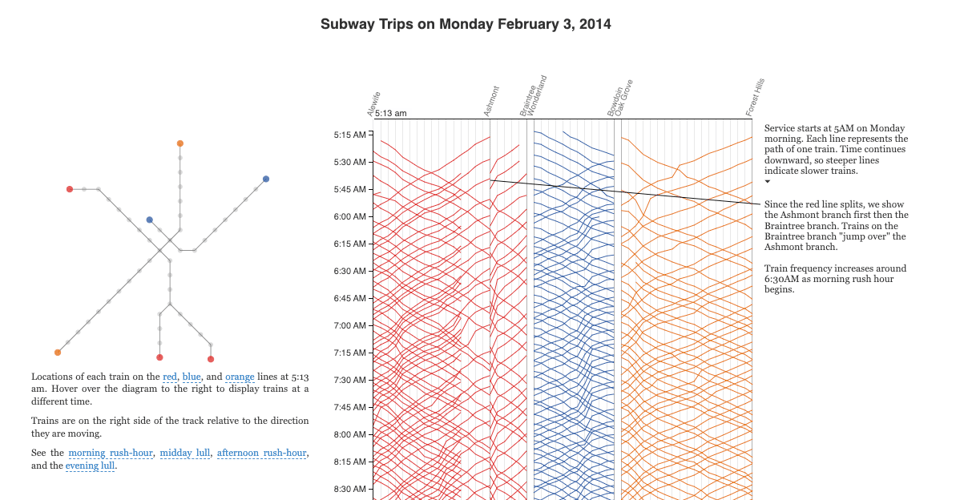
Visualizing MBTA Data
"An interactive exploration of Boston's subway system".
Some very juicy charts.
Germany’s highest bandwidth is a pigeon’s wingspan
Datawrapper's Rose Mintzer-Sweeney: "Have you been frustrated with the speed of your home internet? Are you tired of waiting for big files to upload? Does the connection just keep dropping?
Why not consider a pigeon?"

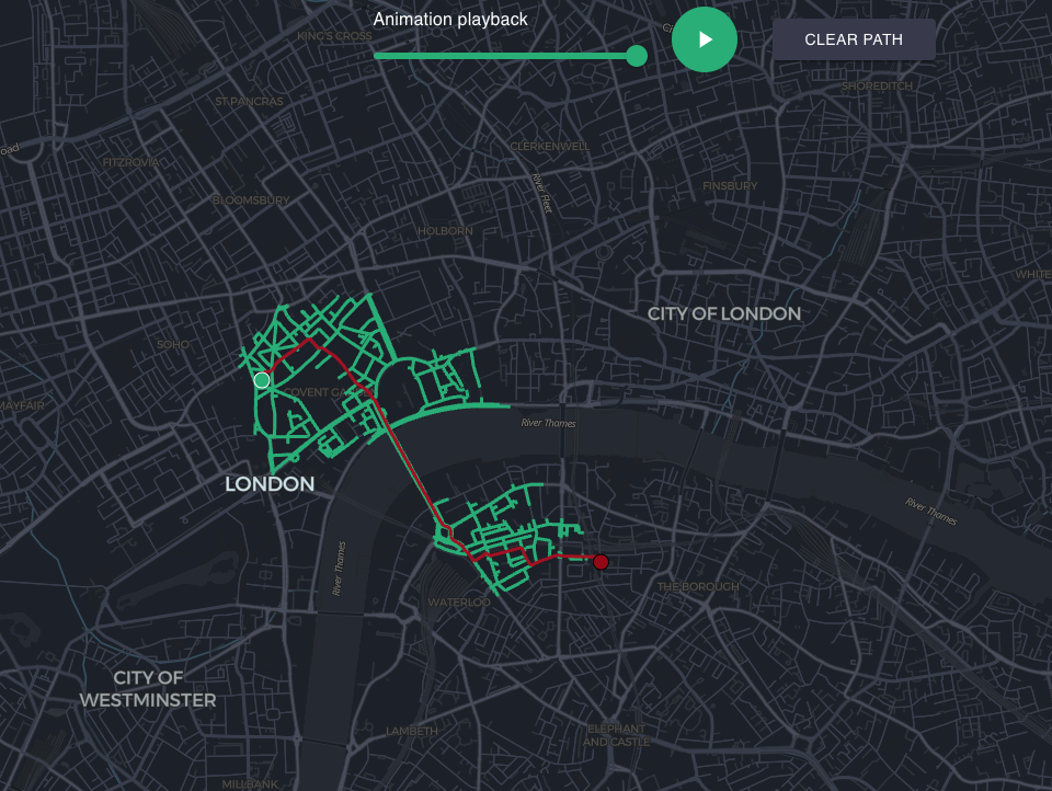
Map Pathfinding Visualizer
"Pathfinding algorithms visualized on a real map. Anywhere in the world."
Code on GitHub and demo app here.
30 Day Map Challenge: Lisa Hornung's Day 9
Lisa uses hexagons to display collision hotspots. As usual, she's released all the code.

Every story in the world has one of these six basic plots
"The Vermont researchers describe the six story shapes behind more than 1700 English novels as:
1 Rags to riches – a steady rise from bad to good fortune
2 Riches to rags – a fall from good to bad, a tragedy
3 Icarus – a rise then a fall in fortune
4 Oedipus – a fall, a rise then a fall again
5 Cinderella – rise, fall, rise
6 Man in a hole – fall, rise"
🤖 AI
Trustworthy AI in Government + Public Services — A self assessment tool
Oxford Insights have released this Trustworthy AI Assessment tool.
AI Timelines
"How many years will pass before transformative AI is built? Three people who have thought about this question a lot are Ajeya Cotra from Open Philanthropy, Daniel Kokotajlo from OpenAI and Ege Erdil from Epoch. Despite each spending at least hundreds of hours investigating this question, they still still disagree substantially about the relevant timescales."

quantum of sollazzo is also supported by Andy Redwood’s proofreading – if you need high-quality copy editing or proofreading, check out Proof Red. Oh, and he also makes motion graphics animations about climate change.

Supporters*
Alex Trouteaud
casperdcl / iterative.ai
Naomi Penfold
[*] this is for all $5+/months Github sponsors. If you are one of those and don't appear here, please e-mail me