540: quantum of sollazzo
#540: quantum of sollazzo – 7 November 2023
The data newsletter by @puntofisso.

Hello, regular readers and welcome new ones :) This is Quantum of Sollazzo, the newsletter about all things data. I am Giuseppe Sollazzo, or @puntofisso. I've been sending this newsletter since 2012 to be a summary of all the articles with or about data that captured my attention over the previous week. The newsletter is and will always (well, for as long as I can keep going!) be free, but you're welcome to become a friend via the links below.
The most clicked link last week was Population.io.
'till next week,
Giuseppe @puntofisso
|
Before you go... DO YOU LIKE QUANTUM OF SOLLAZZO? → BECOME A SUPPORTER! :) If you enjoy this newsletter, you can support it by becoming a GitHub Sponsor. Or you can Buy Me a Coffee. I'll send you an Open Data Rottweiler sticker. You're receiving this email because you subscribed to Quantum of Sollazzo, a weekly newsletter covering all things data, written by Giuseppe Sollazzo (@puntofisso). If you have a product or service to promote and want to support this newsletter, you can sponsor an issue. |
✨ Topical
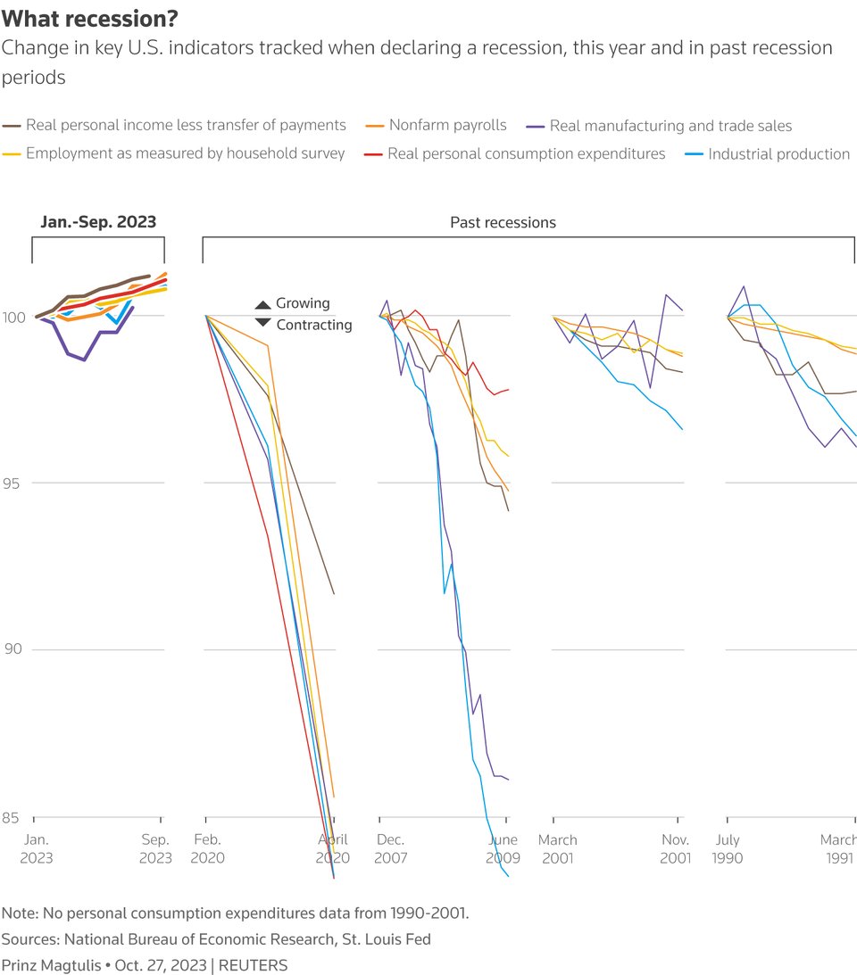
What recession?
Reuters Graphics' Prinz Magtu looks at key indicators to compare the US economy to previous recessions.
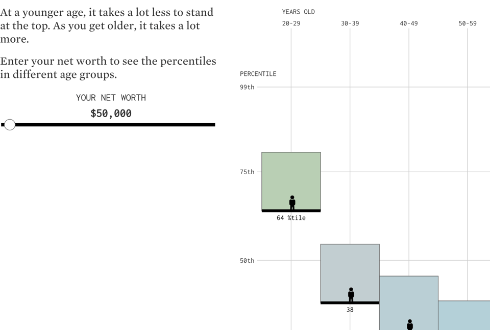
Rising to Top Net Worth, by Age
An interactive look at the US Survey of Consumer Finances (from the Federal Reserve) by Flowing Data.
NEW: we need to talk about UK graduate wages...
"... and the idea that Britain sends too many people to university."
Good thread by the Financial Times' John Burn-Murdoch.
(via Alex Wrottesley)

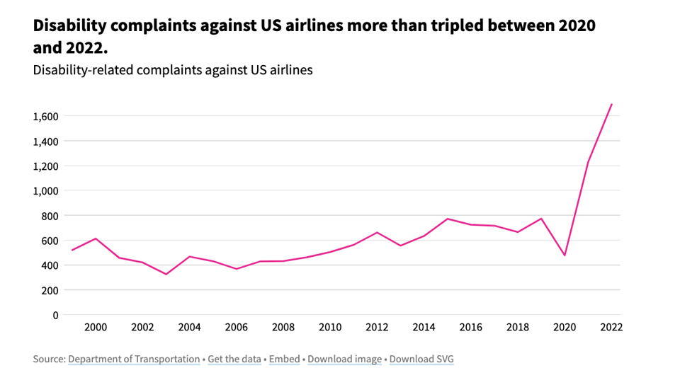
Which airlines receive the most disability-related complaints?
USAFacts: "Disability complaints against US airlines have tripled since 2020. Horizon, Endeavor, and Frontier reported the sharpest increases between 2021 and 2022."
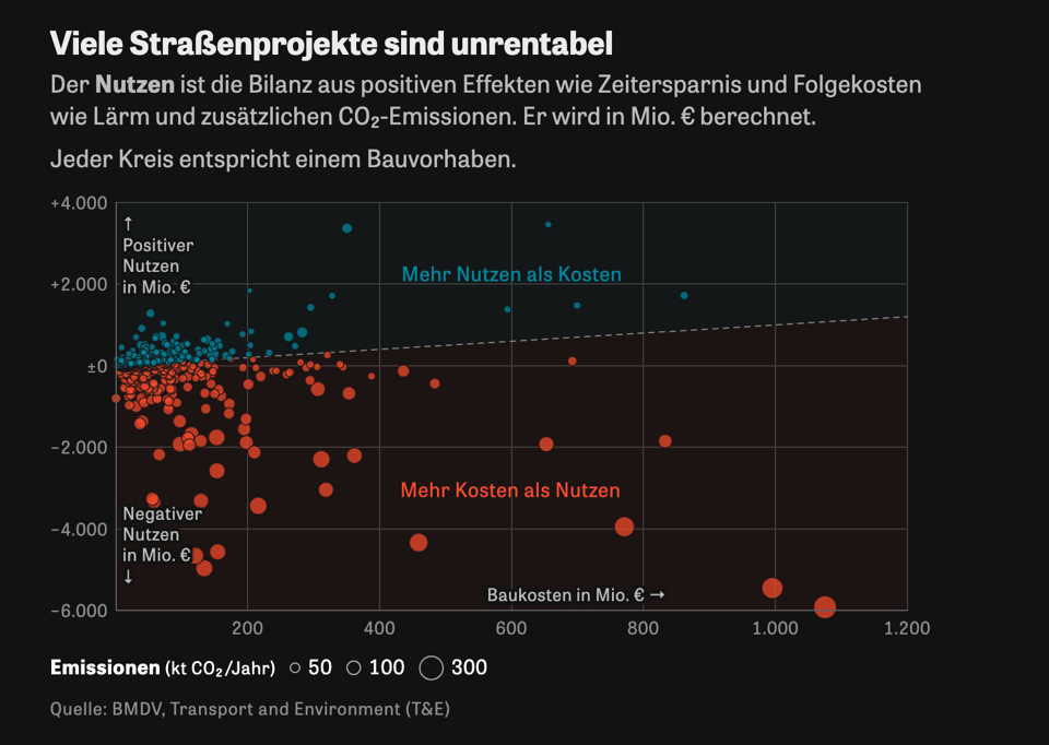
Straßenbau könnte dem Klima viel mehr schaden als angenommen
From this original German article on Die Zeit, the automatic translation reads "Road construction could harm the climate much more than expected".
The article takes also a look at how some roadworks are unprofitable, if we factor in the cost of emissions and other quantifiable issues.
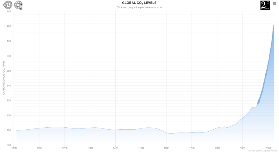
CO2 Levels
By the 2 Degrees Institute, this website collates together multiple data sources to look at historical levels of carbon dioxide in the atmosphere.
Walt Disney Studio's Drawing on the past
This is a pretty little visual article by Reuters Graphics on the tricks employed by Walt Disney Studios over time, and what may lie ahead.

Etse-Ada: all in one suite of customisable web tools and support for managing your business operations - including websites, professional emails and an ERP consisting of CRM, accounting, project management, service/product management, and many more features. Learn more & Start a free trial.
🛠️📖 Tools & Tutorials
Railfares
A Python tool to study the cost of train travel in Great Britain.
Federico Botta, its coder, introduces it: "Ever wanted to study the cost of train journeys in Great Britain? Now you can! First version of my new python package is now available on GitHub together with some related data sets". It also comes with an academic pre-print on arXiv.

Making Music with Google Sheets and Web MIDI API
"Do you know that the modern web browser can access real musical instruments? With the help of Web MIDI API, we can create a web application that can access MIDI devices connected to our computer. In this article, I will explain how I use Google Sheets as a music sequencer for composing and playing ambient music with a hardware synthesizer."
EXCELlent.
Explore the world in data: introducing the 3D Globe
Flourish: "Redefine the way you tell stories about the world with our new 3D Globe template". Good for scrollytelling, too.

PyGWalker and Graphic-walker
Two packages to create data-driven interactive UIs. Graphic Walker presents itself as an alternative to Tableau, while PyGWalker is to turn pandas dataframes into interactive UIs. The same team is behind both.

Tracking SQLite Database Changes in Git
"SQLite stores data in binary" but there's a good hack in Git to make it display database diffs in SQL format.
Snapchat previous bitmojis extractor
"OSINT tool to download all the previous bitmoji's of any snapchat user."
I'm probably too old to understand what this is for...
Julius
An online chat-driven tool for AI data analysis. I was in two minds about linking this – do you want me to keep posting AI tools?
Data Visualisation
From data.europa.eu: A Comprehensive Guide to Unlocking Your Data’s Potential".
"This guide leads you through 7 important topics linked to data visualisation and is ordered in growing complexity. It starts with five topics for beginner and advanced users, followed by two topics for experienced users.
There are 3 ways to explore it: use the thematic links below, search for your topic of interest, or navigate by following the sequence of pages."

Carbon14
"OSINT tool for estimating when a web page was written."
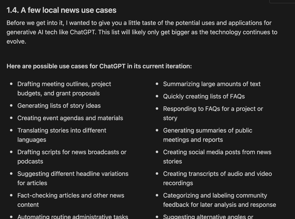
Beginner’s prompt handbook: ChatGPT for local news publishers
"A handbook for small newsrooms and local publishers, created by Joe Amditis."
The Case of a Curious SQL Query
"Languages that suffer success often have to do so by selling out and adding features that go against some of the original purposes of their design."
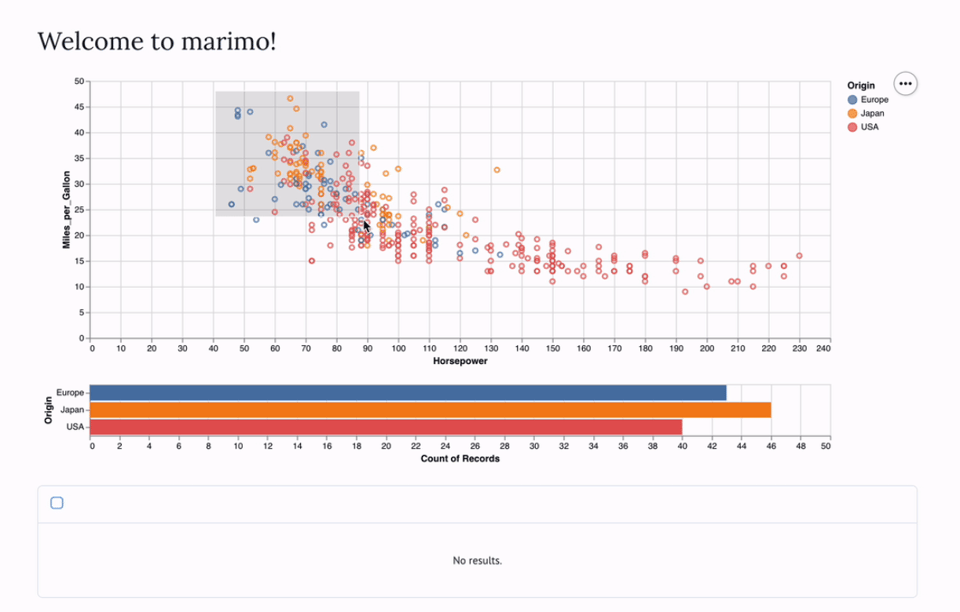
marimo
marimo is "a next-generation Python notebook where every notebook is also shareable as an interactive web app: explore data, run experiments, build tools, and deploy apps, all from one seamless environment."
Serving a custom vector web map using PMTiles and maplibre-gl
This might be a bit much, even by the standards of my very highly geeky readership... but it is pretty good :)
It explains how Protomaps (which we discussed before) works.
🤯 Data thinking
Organizing Data is Picking What you Care About
"And some examples on how to pick" by Randy Au of Counting Data.
📈Dataviz, Data Analysis, & Interactive
Darkhotels
A website to explore hotel availability in dark sky areas.

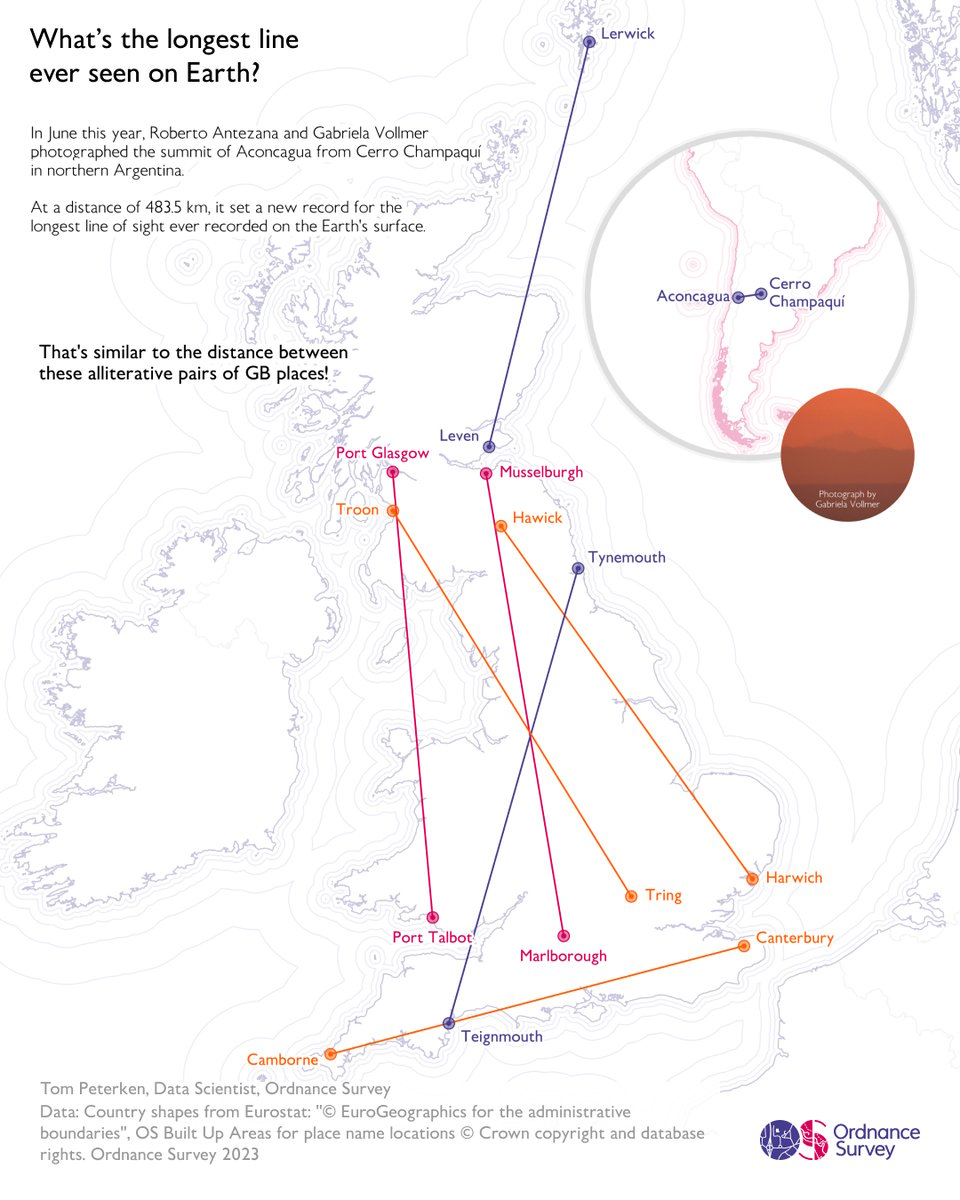
The longest line of sight ever photographed
Ordnance Survey data scientist, Tom Peterken, puts some GB-based distances on this map, for context.
Are attitudes to immigration changing and does it matter?
A thread by ESRC CEO Stian Westlake, summarising a lecture by politics academic Rob Ford. A few intriguing charts in the lecture.

666 horror movies
A Tableau app showing them by release year and worldwide box office results.

Tri Math
A tool to display mathematical expressions.

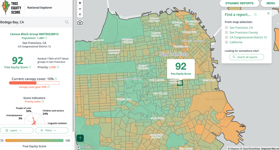
Tree Equity Score
"Tree Equity Score was created to help address damaging environmental inequities by prioritizing human-centered investment in areas with the greatest need." US-only, but a really cool tool.
Colouring London
"Colouring London is a free knowledge exchange platform designed to provide over fifty types of open data on buildings in the city, to help make the city more sustainable."

🤖 AI
Measuring Foundation Model Transparency
"Is Stanford's new AI model transparency index comprehensive or overkill?"
Embeddings: What they are and why they matter
Simon Willison: "Embeddings are a really neat trick that often come wrapped in a pile of intimidating jargon.
If you can make it through that jargon, they unlock powerful and exciting techniques that can be applied to all sorts of interesting problems.
I gave a talk about embeddings at PyBay 2023. This article represents an improved version of that talk, which should stand alone even without watching the video."
quantum of sollazzo is also supported by Andy Redwood’s proofreading – if you need high-quality copy editing or proofreading, check out Proof Red. Oh, and he also makes motion graphics animations about climate change.

Supporters*
Alex Trouteaud
casperdcl / iterative.ai
Naomi Penfold
[*] this is for all $5+/months Github sponsors. If you are one of those and don't appear here, please e-mail me
