538: quantum of sollazzo
#538: quantum of sollazzo – 24 October 2023
The data newsletter by @puntofisso.

Hello, regular readers and welcome new ones :) This is Quantum of Sollazzo, the newsletter about all things data. I am Giuseppe Sollazzo, or @puntofisso. I've been sending this newsletter since 2012 to be a summary of all the articles with or about data that captured my attention over the previous week. The newsletter is and will always (well, for as long as I can keep going!) be free, but you're welcome to become a friend via the links below.
It's issue #538, which the numerologists among you will like very much.
The most clicked link last week was Datawrapper's weekly chart on the gender pay gap.
Oh, this isn't data-related but I really liked some of the answers on this academic Stack Exchange question: How do professors advise PhD students that are smarter than them?.
'till next week,
Giuseppe @puntofisso
|
Before you go... DO YOU LIKE QUANTUM OF SOLLAZZO? → BECOME A SUPPORTER! :) If you enjoy this newsletter, you can support it by becoming a GitHub Sponsor. Or you can Buy Me a Coffee. I'll send you an Open Data Rottweiler sticker. You're receiving this email because you subscribed to Quantum of Sollazzo, a weekly newsletter covering all things data, written by Giuseppe Sollazzo (@puntofisso). If you have a product or service to promote and want to support this newsletter, you can sponsor an issue. |
✨ Topical
The Gaza Strip — in charts
This Financial Times article has a few interesting charts, including the one below, comparing population densities in the strip and in London.
(via Peter Wood)

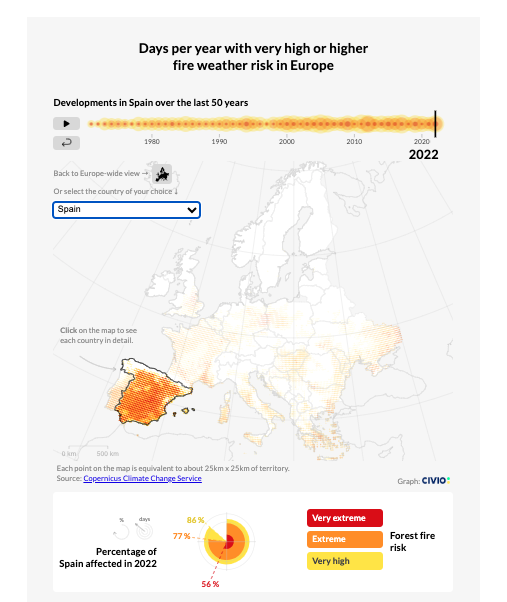
The share of Europe’s territory at high risk of fire has doubled in the last 50 years
Civio/EDJNet: "Since 1971, the share of Europe that experiences high or higher weather risk has risen from 20% to almost 40%. But there are big differences between countries".
It's interactive.
Are we back yet?
FlowingData, using the American Time Use Survey, finds out "how we spent our days from 2019 through 2022."

More pets than children?
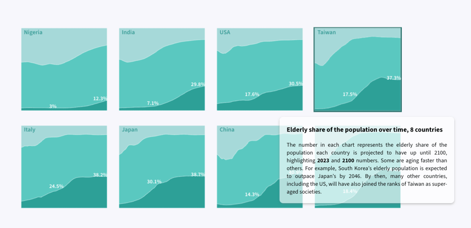
"A look at Taiwan's super-aged future."
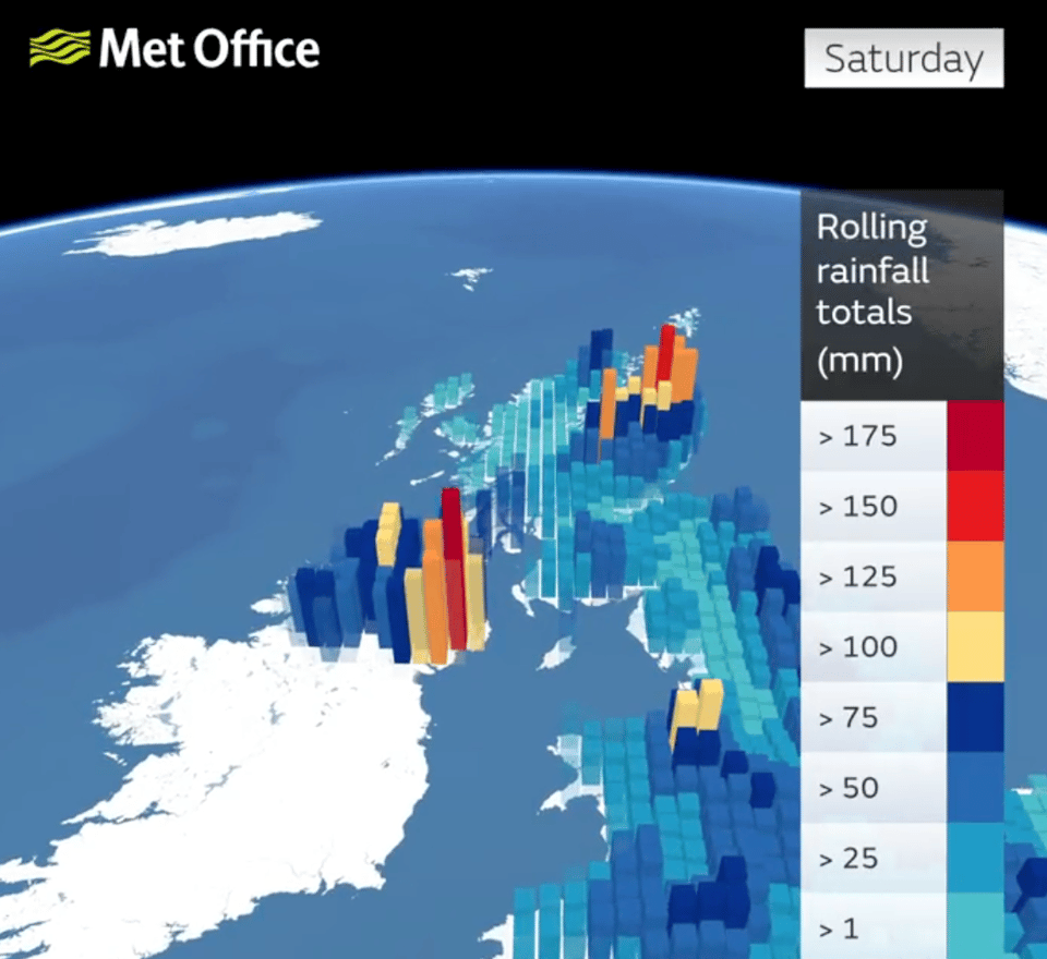
Met Office on Storm Babet
This dataviz of cumulative rain is pretty effective, I think.
(via Chris Weston)
🛠️📖 Tools & Tutorials
Bruno
A privacy-friendly API-testing desktop app: "Bruno is a new and innovative open source API client, aimed at revolutionizing the status quo represented by Postman, Insomnia and similar tools out there."

The 6 most popular R packages for Dataviz
Yan Holtz: "The tiny fraction of R libs you can't miss out!".
This is a quick round-up, but they are also working on a curated gallery.

Analyzing multi-gigabyte JSON files locally
"While trying to analyse files of this size, I’ve found two ways of doing efficient local processing of very large JSON files that I want to share. One is based on parallelizing the jq command line with GNU parallel, the other is based on Jupyter with the Dask library."
The idea is that you can do this locally without having to use the cloud, which is handy.
Binning: An Alternative to Point Maps
Nate Smith (Mapbox): "Binning is a great alternative technique for visualizing density when working with large data sets. Many of our maps are made with point data, such as locations of banks in South Africa and health facilities in Kenya. While these make for powerful visualizations, sometimes aggregating the data tells a better story or uncovers new findings. One method we’ve been using lately is hexagonal binning, which uses hexagon shapes to create a grid and develop a spatial histogram."

Detect objects in images
The interesting part of this article by Simon Willison (Django, Lanyrd, Datasette) is that it runs in the browser.

How To Animate Along A Path In CSS
"CSS loaders and progress indicators are some of the most widely used examples in tutorials and documentation. There are so many ways to approach them. It’s possible that some approaches may be “better” than others, but it also depends on what you want to accomplish. In this article, Preethi demonstrates an approach using animated custom properties, a conic gradient, CSS offset, and emoji to create the illusion of a scooter racing along a donut track."

PureImage
"PureImage is a pure 100% JavaScript implementation of the HTML Canvas 2D drawing API for NodeJS. It has no native dependencies. You can use it to resize images, draw text, render badges, convert to grayscale, or anything else you could do with the standard Canvas 2D API. It also has additional APIs to save an image as PNG and JPEG."

Vectorpea
If you liked Photopea, the browser-based picture editing software that is fundamentally a Photoshop clone (and works offline), try Vectorpea, which is a vector imaging tool by the same author. Note: it's in beta, and it's working on compatibility with Adobe Illustrator and other popular tools.
Evaluate your python score
How well do you know python? Here's a test.
Geospatial Data Science with Julia
"Geospatial Data Science with Julia presents a fresh approach to data science with geospatial data and the Julia programming language. It contains best practices for writing clean, readable and performant code in geoscientific applications involving sophisticated representations of the (sub)surface of the Earth such as unstructured meshes made of 2D and 3D geometries.
By reading this book, you will:
Get a broader perspective on geospatial data
Learn advanced geostatistical algorithms
Reproduce practical open source examples
Most importantly, you will learn a set of geospatial features that is much richer than the simple features implemented in traditional geographic information systems (GIS)."
It's still work in progress.

Etse-Ada Systems. All in one suite of customisable web tools and support for managing your business operations - including websites, professional emails and an ERP consisting of CRM, accounting, project management, service/product management, and many more features. Learn more & Start a free trial.
📈Dataviz, Data Analysis, & Interactive
Half of the world is past a peak in fossil power
"Half of the world’s economies are already at least five years past a peak in power generation from fossil fuels, with emissions from these 107 power sectors falling by almost 20% in the last decade."
It's an interesting article that pulls together a few good chart. The one below is particularly good – as Peter, who sent this to me, noted, it's a good example where multiple small charts are used to make a bigger point.
(via Peter Wood)

Highways England Network Graph
Tom Strain did a PhD that involved creating this network graph: "A directed network graph of the Strategic Road Netowork (SRN) that is maintained by Highways England (now National Highways). The network is built with the published HATRIS link dataset (see our paper for full details) and models two highways (edges, i.e, one for each direction of travel) between each junction (nodes). It is assumed that a central crash barrier is always in place and therefore a pair of edges only ever meet at a node."
It comes with a Jupyter notebook that uses networkx, a Python package, to create the illustration below.
As Tom explains: "During my PhD I created directed graph model of the Strategic Road Network in England. I initially used the graph as simulation environment for a highway traffic officer patrol route optimisation piece of work. However it dawned on me that I should have shared the graph with anybody else who may want to play such highway-based operational research, graph dynamics, or anything else you can think of games (it took quite a while to make so thought I'd save someone the pain)."

Love in the fast lane
Michael Do Thoi for Datawrapper: "I have a slight fascination with dating (on a conceptual level, mind you). Perhaps this stems from a larger interest in how relationships form and run their course, where dating feels like a microcosm of that process. And if normal dating can tell us something about what pushes people together and apart, isn’t speed dating an even more compressed version of the same thing?"
He does a quick but effective dataviz of a recent study about speed dating (which is an interesting read in its own right).

🤖 AI
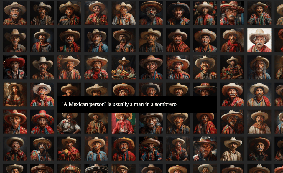
How AI reduces the world to stereotypes
"Rest of World analyzed 3,000 AI images to see how image generators visualize different countries and cultures."
State of AI Report 2023
The yearly issue of Air Street Capital's Nathan Benaich slide deck.
quantum of sollazzo is also supported by Andy Redwood’s proofreading – if you need high-quality copy editing or proofreading, check out Proof Red. Oh, and he also makes motion graphics animations about climate change.

Supporters*
Alex Trouteaud
casperdcl / iterative.ai
Naomi Penfold
[*] this is for all $5+/months Github sponsors. If you are one of those and don't appear here, please e-mail me
