536: quantum of sollazzo
#536: quantum of sollazzo – 10 October 2023
The data newsletter by @puntofisso.

Hello, regular readers and welcome new ones :) This is Quantum of Sollazzo, the newsletter about all things data. I am Giuseppe Sollazzo, or @puntofisso. I've been sending this newsletter since 2012 to be a summary of all the articles with or about data that captured my attention over the previous week. The newsletter is and will always (well, for as long as I can keep going!) be free, but you're welcome to become a friend via the links below.
I know there's a few charity data geeks that read this list. If you're based in the UK, you might want to attend UKCharityCamp, the Third Sector Unconference. It's on Thursday 30/11/2023 in Birmingham.
The most clicked link last week was Josh Horowitz's website that displays two maps side by side adjusting their scale to be the same.
'till next week,
Giuseppe @puntofisso
|
Before you go... DO YOU LIKE QUANTUM OF SOLLAZZO? → BECOME A SUPPORTER! :) If you enjoy this newsletter, you can support it by becoming a GitHub Sponsor. Or you can Buy Me a Coffee. I'll send you an Open Data Rottweiler sticker. You're receiving this email because you subscribed to Quantum of Sollazzo, a weekly newsletter covering all things data, written by Giuseppe Sollazzo (@puntofisso). If you have a product or service to promote and want to support this newsletter, you can sponsor an issue. |
✨ Topical
Last week temperatures were ~1.9C hotter than pre-industrial temperatures
This is now the biggest anomaly ever recorded. Article by CarbonBrief, with a very nice chart that is reminiscent of the famous annual temperature band graphic.
It chimes with this animated chart of sea-ice levels in Antarctica by Steven Bernard.
(via Peter Wood)

Everything you need to know about a government shutdown
USAFacts: "The impacts of government shutdowns include furloughed employees, reductions in services, closed parks and museums, and much more."

How Cause of Death Shifted with Age and Time in America
"As we get older, our life expectancy declines. But when and how quickly the decline happens and how it happens has changed over the years."
FlowingData's Nathan Yau looks at data from the US Centers for Disease Control and Prevention (CDC).

🛠️📖 Tools & Tutorials
Tutorial: data-driven news discourse analysis with Python (Part 1)
NESTA's Karlis Kanders: "In this tutorial, I will show you how you can get started with news discourse analysis using Python, and begin piecing together the narrative around a topic of your interest. I’ll cover how to collect news articles using The Guardian API, look at the number of news articles across years, and perform topic analysis with sentence embeddings.".
Viselect
A library to select elements visually on a web page.

Vizro
"Vizro is a toolkit for creating modular data visualization applications."
By McKinsey.

Building an API in the cloud in fewer than 200 lines of code
The ONS's Arthur Turrell: "In this blog post, you’ll see how to use Google Cloud, Terraform, and FastAPI to deploy a queryable data API on the cloud.".
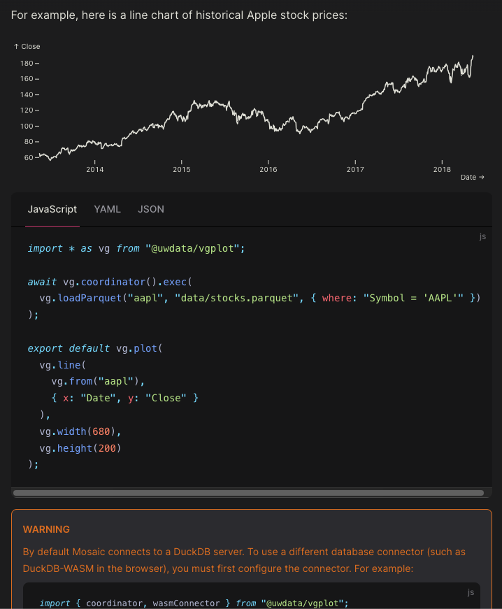
Mosaic
"Scalable, interactive data visualization. Mosaic is an extensible framework for linking databases and interactive views."
This looks pretty good. It was developed by a collaboration of the University of Washington Interactive Data Lab and the Carnegie Mellon University Interaction Group.
Mel is the easiest way to stop unwanted mail, for good. Simply text a photo of junk mail and Mel will contact the sender to have you removed from their list.

🤯 Data thinking
Types of data on a common receipt
Brilliant post here by Malcolm Chisholm. He identified several types of data on a common receipt: meta data, reference data, master data, event data, and other data.

📈Dataviz, Data Analysis, & Interactive
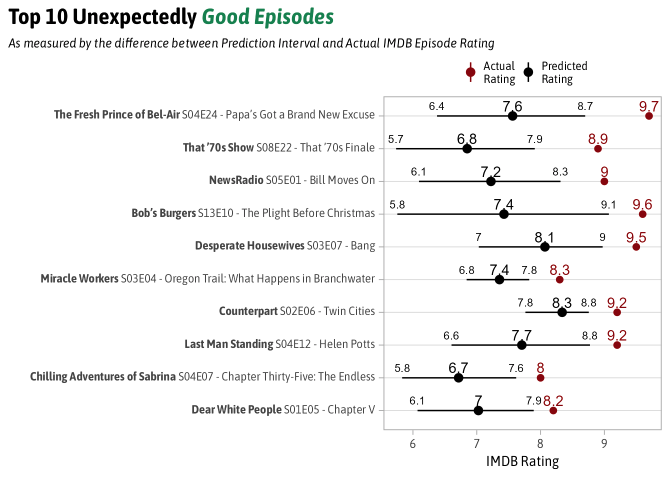
The Most Unexpectedly Good and Bad TV Episodes
"Why the Fresh Prince of Bel-Air has the Most Unexpectedly Good Episode of TV". Nice data analysis, with all R code available.
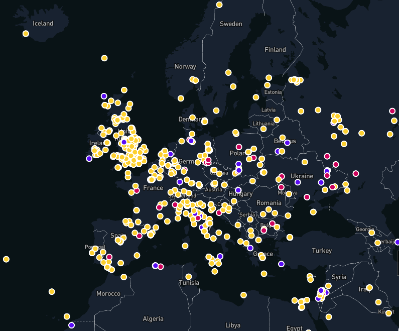
Working Class History Map
The website/podcast Working Class History has launched a map visualization of their stories.
(via Erika Atzori)
Menstrual cycle length and variability: a visual explanation
From Harvard University: "The Apple Women's Health Study (AWHS ) is helping us characterize menstrual cycles throughout people's lives".
This research study uses Apple devices to gather data.

Fine, I'll run a regression analysis. But it won't make you happy.
Nate Silver: "State partisanship and COVID vaccination rates are strongly predictive of COVID death rates even once you account for age."
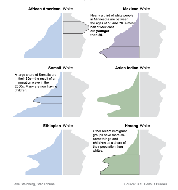
New census data details diversity in Minnesota's population
"Community leaders and policymakers hope the new detail will help them better serve subgroups."
quantum of sollazzo is also supported by Andy Redwood’s proofreading – if you need high-quality copy editing or proofreading, check out Proof Red. Oh, and he also makes motion graphics animations about climate change.

Supporters*
Alex Trouteaud
casperdcl / iterative.ai
Naomi Penfold
[*] this is for all $5+/months Github sponsors. If you are one of those and don't appear here, please e-mail me