531: quantum of sollazzo
#531: quantum of sollazzo – 22 August 2023
The data newsletter by @puntofisso.

Hello, regular readers and welcome new ones :) This is Quantum of Sollazzo, the newsletter about all things data. I am Giuseppe Sollazzo, or @puntofisso. I've been sending this newsletter since 2012 to be a summary of all the articles with or about data that captured my attention over the previous week. The newsletter is and will always (well, for as long as I can keep going!) be free, but you're welcome to become a friend via the links below.
An anonymous reader got in touch with me with a very important question: "What does Puntofisso mean?". Well, the long story short is that it's both a very nerdy thing and something that makes me feel pretty old. I once described it as "one of those things that stick on you, like all the most terrible things".
The name "Puntofisso" dates back to 2004. I was an undergraduate student back then, and that's where I set up my Gmail account and, at the time, basing it on my name and surname seemed very boring. Instead, what did I do? I came up with this nickname in such an exciting way. I tell you, it was so exciting. I was losing the will to live while revising for the Theoretical Computer Science exam, and after spending a few hours on this theorem the deal was done. The fixed point theorem or, in Italian, il teorema del punto fisso, decided it for me. Jesus, how has it been 19 years?!
I did a thing.
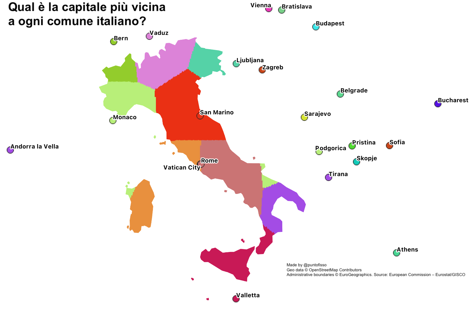
Last week, I saw on Facebook one of those odd viral maps. It showed Italy coloured by how close any point is to a capital. So I thought: can I replicate it in a way that allows to easily create other maps, for example by changing country or using a different set of points rather than capitals? Here's my step-by-step guide on how to do it, which also allows me to say I'll be (sporadically) writing things up at https://puntofisso.net/blog/.
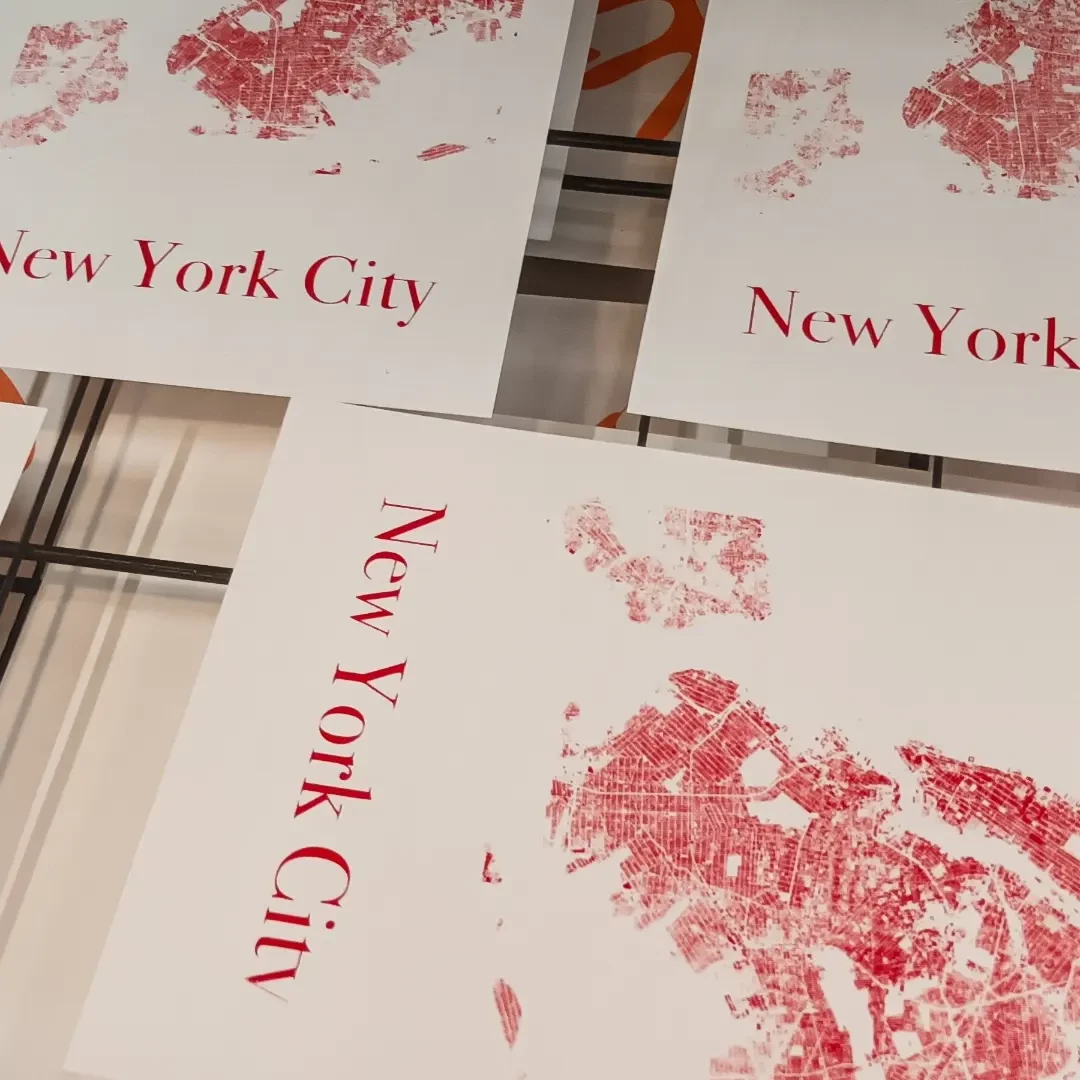
I'm still in my in-between-jobs time (but not for long). Last week I treated myself to a screenprinting workshop, doing new variations on my OpenStreetMap-derived maps. Here's a couple of shots from the workshop.
If you fancy one, reply to this e-mail with "I want one" by Tuesday 29 August 10am GMT. I'll randomly pick one of those who replied by the deadline, and will ask for your details to ship you one :-)
The most clicked link last week was Bellingcat's guide to using PeakVisor to fact-check geolocation.
'till next week,
Giuseppe @puntofisso
|
Before you go... DO YOU LIKE QUANTUM OF SOLLAZZO? → BECOME A SUPPORTER! :) If you enjoy this newsletter, you can support it by becoming a GitHub Sponsor. Or you can Buy Me a Coffee. I'll send you an Open Data Rottweiler sticker. You're receiving this email because you subscribed to Quantum of Sollazzo, a weekly newsletter covering all things data, written by Giuseppe Sollazzo (@puntofisso). If you have a product or service to promote and want to support this newsletter, you can sponsor an issue. |
✨ Topical
Health in Virginia
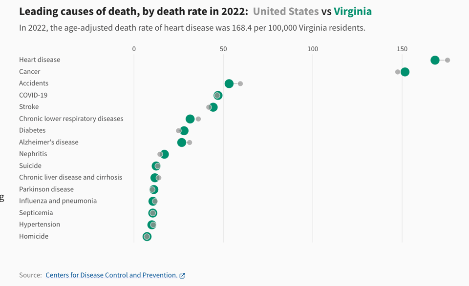
"How much is spent on healthcare in Virginia? What is the death rate in Virginia?"
Well, just because Virginia was at hand, but this interactive page by USA Facts allows you to search health-related data for every US State.
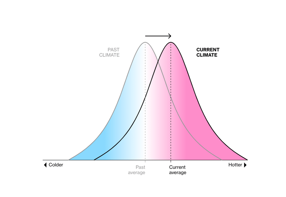
Rising Temperatures Are Wreaking Havoc Year-Round
"Even small changes in global average temperature are driving environmental and economic consequences."
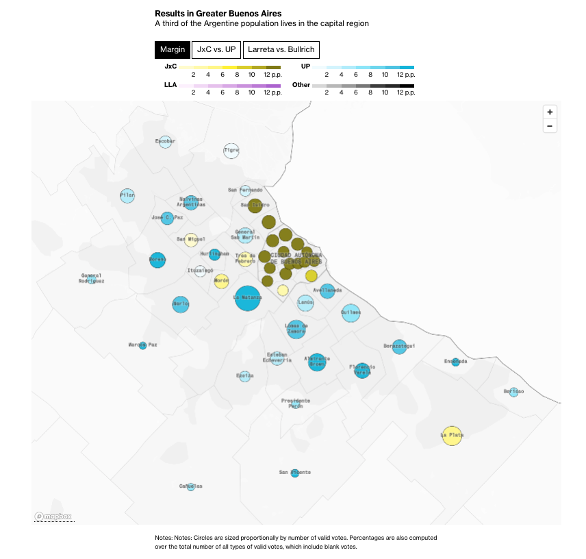
Argentina Election Live Results
Few Americans are aware of growth in the number of U.S. jobs
"The latest jobs report showed a continued increase in the number of jobs, but many Americans don’t see an improving employment picture, new polling from the Economist/YouGov finds:"

🛠️📖 Tools & Tutorials
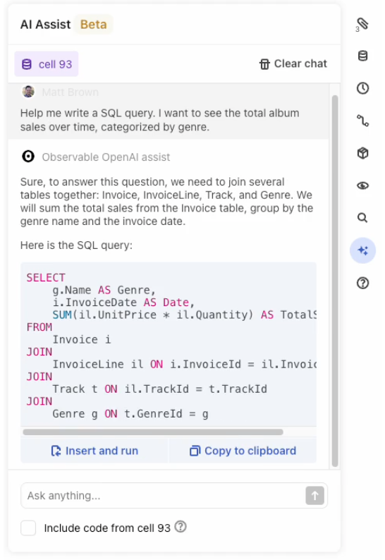
Give your data work a boost with AI Assist
Observable has added an AI assistant function. I'm curious to see how it goes.
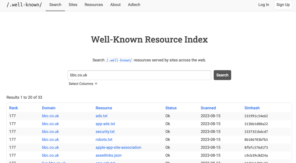
Well-Known Resource Index
This is a website which reveals the information contained in the /.well-known and ads.txt of a website. It claims to be scanning millions of websites.
favicon
This API will let you download pretty much any website's favicon.
"There are many other use-cases, mostly for B2B companies. For example if you are a SaaS you could look at the domain when someone signups and automatically set their workspace logo based on that."
I'm thinking this must be what my bank does when it gets the logo for a bank transfer in its app.
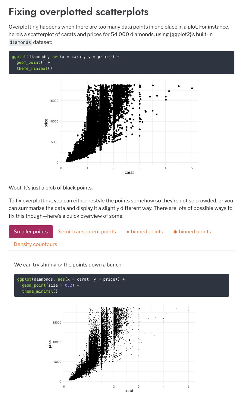
How to fill maps with density gradients with R, {ggplot2}, and {sf}
"Fix overplotted points on maps by creating bins or filled density gradients using R, {ggplot2}, and {sf}."
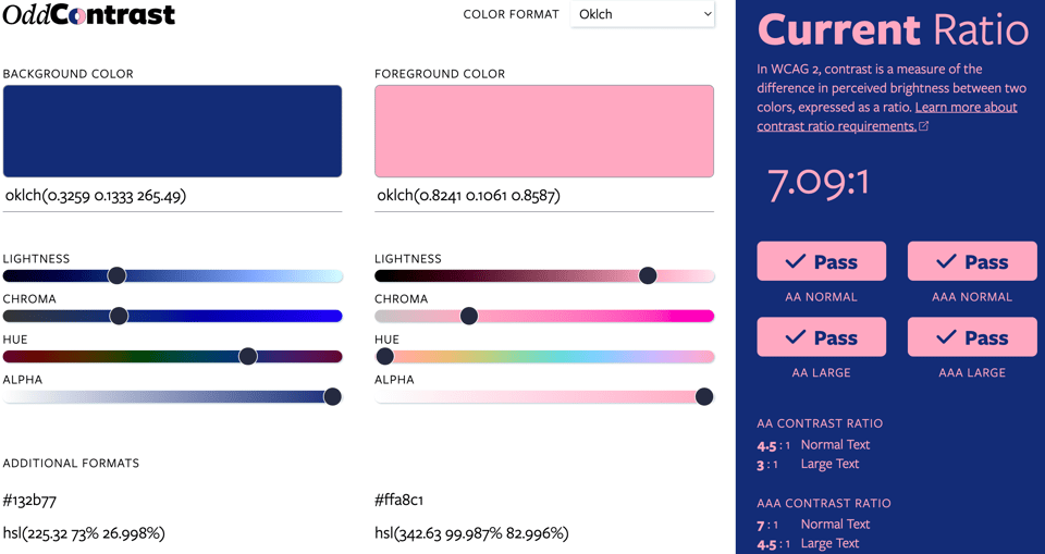
OddContrast
"In WCAG 2, contrast is a measure of the difference in perceived brightness between two colors, expressed as a ratio."
This website will let you measure if your colour scheme passes any standards.
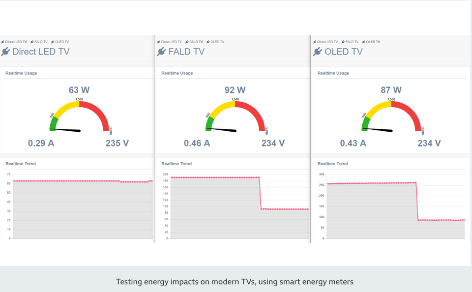
Introducing the energy saving concept of Lower Carbon Graphics
Speaking about screen features, the BBC R&D team tells how they explored creating TV graphics that consume less energy: "Asking an initial question, 'how much energy do televisions use?' ultimately led us on a journey to develop and implement a new idea that we called 'Lower Carbon Graphics' (LCGFx), which we believe has already saved energy in homes across the UK."
Not quite dataviz, but I sense a theme developing.
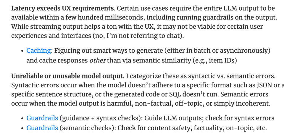
How to Match LLM Patterns to Problems
"After my previous write-up on LLM patterns, I’ve received questions on how to match those patterns to various LLM problems. Thus, in this follow-up, we’ll discuss some potential problems faced when using LLMs and the patterns that help mitigate them."
LearnDB
"Learn database internals by implementing it from scratch."
A small sqlite clone made for learning database implementation.
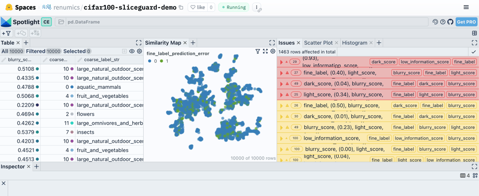
Finding data slices in unstructured data
"A short introduction to data-slicing methods including hands-on examples on the CIFAR-100 dataset."
"Data slices are semantically meaningful subsets of the data, where the model performs anomalously. When dealing with an unstructured data problem (e.g. images, text), finding these slices is an important part of every data scientist’s job. In practice this task involves a lot of individual experience and manual work. In this post, we present some methods and tools to make finding data slices more systematic and efficient. We discuss current challenges and demonstrate some hands-on example workflows based on open-source tooling."
It includes an interactive demo.
🤯 Data thinking
Infographics Journalist Charles Apple on Making Effective Charts
TK Sajeev Kumar interviews Charles Apple for Nightingale. Charles is the “Further Review” page editor of The Spokesman-Review of Spokane, Washington. He talks about his charts of choice.
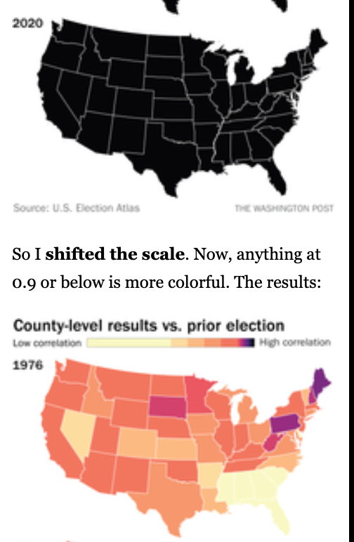
Correlation county-general elections visualised
The Washington Post's "How to read this chart" uses scale shifting to highlight correlation variations.
📈Dataviz, Data Analysis, & Interactive
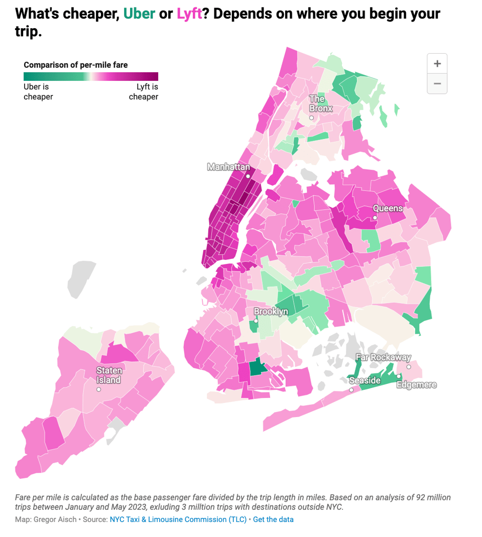
Using DuckDB to analyze over 95 million taxi rides
Datawrapper's Gregor Aisch: "This week I tried using DuckDB to prepare a massive dataset for a Datawrapper map."
The AAPI Nonprofit Database
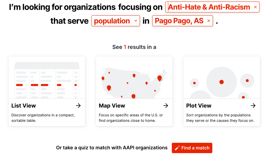
"The AAPI Nonprofit Database is an interactive resource to find and connect with AAPI organizations."
AAPI stands for people of Asian, Asian American, or Pacific Islander ancestry.
Struve’s flat(ter) Earth
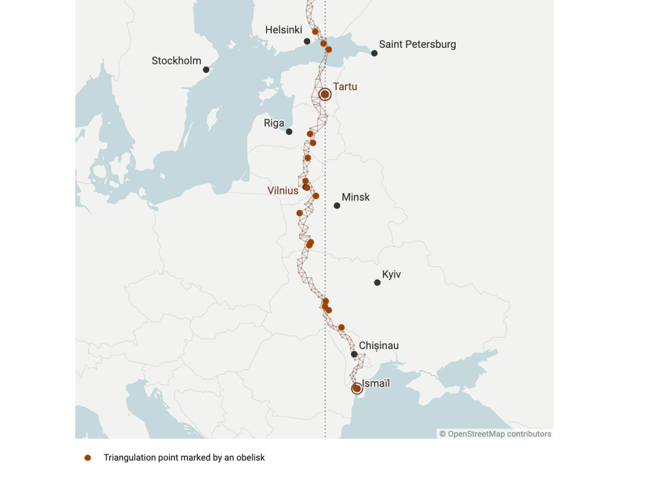
"In the first Map Story we met Eratosthenes, who tried to calculate the size of the Earth almost 2300 years ago (and got really pretty close). Today we’ll meet a second guy, Friedrich Wilhelm von Struve, who revisited the same problem in the 1800s."
Really good blog post by Datawrapper's Anna Thieme, including a look at triangulation – so geogeeky!
🤖 AI
Using AI for good
"Humanitarian organizations turned to artificial intelligence (AI) to generate a comprehensive map of sub-Saharan Africa at scale and also keep it updated to reflect real-world changes."
AI bots are so good at mimicking the human brain and vision that CAPTCHAs are useless
"The bots’ accuracy is up to 15% higher than that of humans".
I think we'll find soon that we're in trouble because AI is really good at the little silly things that we thought we could automate, and not because of super-intelligence displacing human nature.
quantum of sollazzo is supported by Andy Redwood’s proofreading – if you need high-quality copy editing or proofreading, check out Proof Red. Oh, and he also makes motion graphics animations about climate change.

Supporters*
Alex Trouteaud
casperdcl / iterative.ai
Naomi Penfold
[*] this is for all $5+/months Github sponsors. If you are one of those and don't appear here, please e-mail me