530: quantum of sollazzo
#530: quantum of sollazzo – 15 August 2023
The data newsletter by @puntofisso.

Hello, regular readers and welcome new ones :) This is Quantum of Sollazzo, the newsletter about all things data. I am Giuseppe Sollazzo, or @puntofisso. I've been sending this newsletter since 2012 to be a summary of all the articles with or about data that captured my attention over the previous week. The newsletter is and will always (well, for as long as I can keep going!) be free, but you're welcome to become a friend via the links below.
The most clicked link last week was Reuters Graphics' look at the impact on heat of different types of surfaces.
'till next week,
Giuseppe @puntofisso
✨ Topical
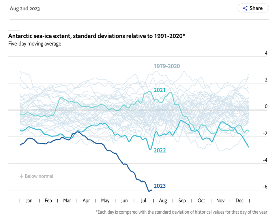
The rapid loss of Antarctic sea ice brings grim scenarios into view
The Economist's Graphic Detail: "The extent of newly exposed ocean is the size of Argentina".
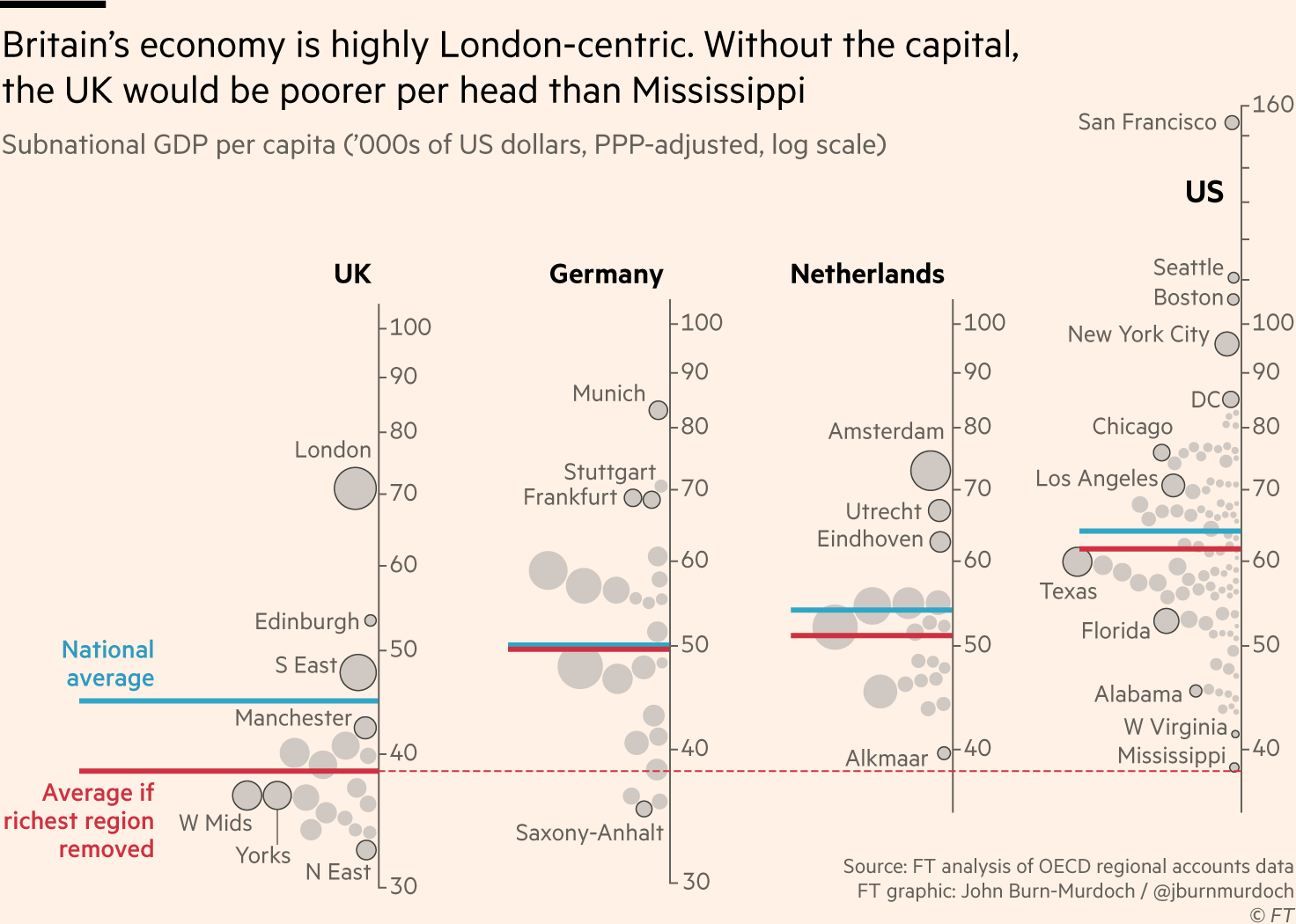
Is Britain really as poor as Mississippi?
"America is a rich country. Britain is a poor country with one wealthy region."
Impressive analysis and data visualization. Article on the Financial Times, and, on this Twitter thread, John Burn-Murdoch's salient points.
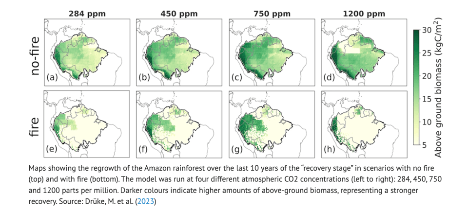
Fires could lock vast parts of the Amazon into ‘treeless state’
Carbon Brief: "Human-ignited fires play a decisive role in shaping the Amazon’s future, potentially locking more than three-quarters of the rainforest into a “treeless state”, a new study finds."
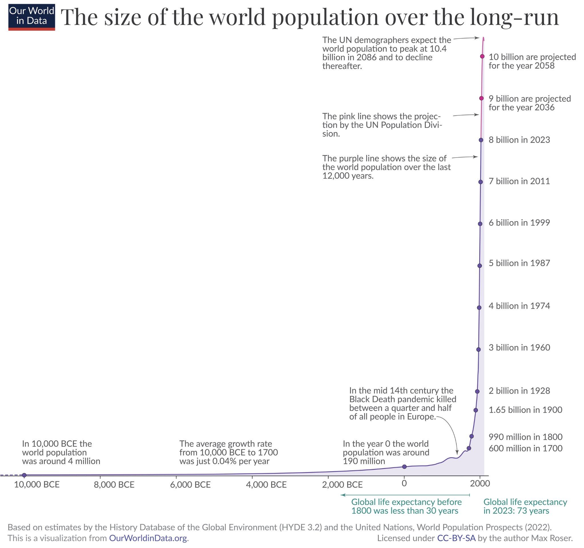
A new chart on the long-term history of population growth
Tweet by Max Roser.
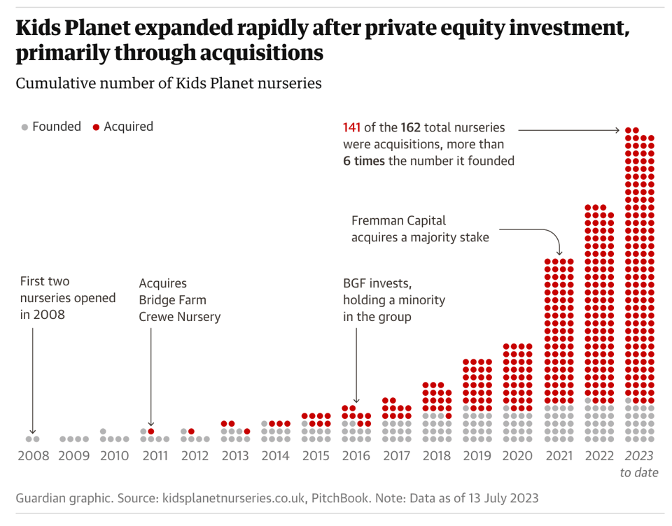
Childcare sector in England must not become ‘playground for private equity’, experts say
Not an issue you hear a lot about, but apparently the data is telling.

Mailscribe is a new generation email marketing platform powered by artificial intelligence that allows you to create and send emails to your subscribers extremely fast with built-in components. Mailscribe eliminates the loss of time in the email design process with its many design components. In addition, with the artificial intelligence tools it contains, you can quickly create your email content with the power of artificial intelligence..
🛠️📖 Tools & Tutorials
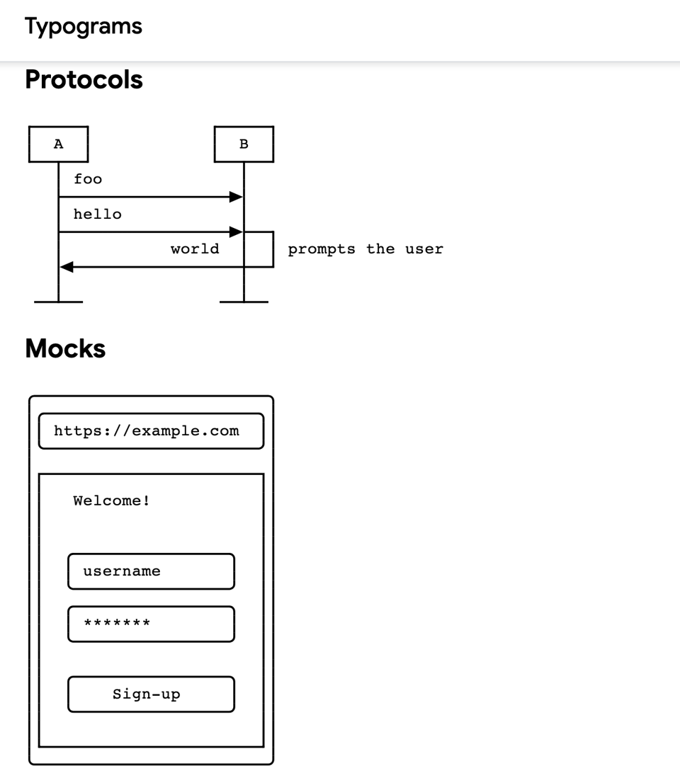
Typograms
"Typograms (typographic diagrams) is a lightweight image format (text/typogram) useful for defining simple diagrams in technical documentation."
Think Markdown for diagrams, getting something akin to ASCII art as a result.
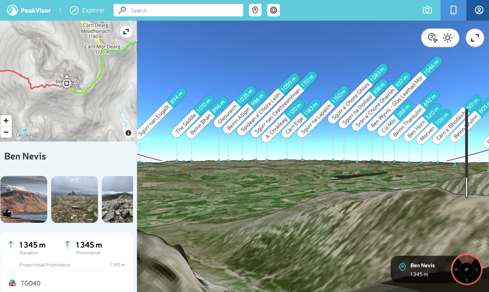
More than Mountaineering: Using PeakVisor for Geolocation
Useful article on Bellingcat – I wasn't aware of PeakVisor!
"A short, shaky video and a single photograph show mourners standing on a mountainside as a row of bodies lie shrouded, about to be buried. Both images appear to be taken from close viewpoints and at nearly the same time — 17:53 UTC on May 28, 2022. But where exactly were they taken?"
g9.js – automatically interactive graphics
"Welcome to the g9 gallery! Drag all the graphics!"
g9 is a library to draw shapes based on data.
pure-bash-bible
"A collection of pure bash alternatives to external processes."
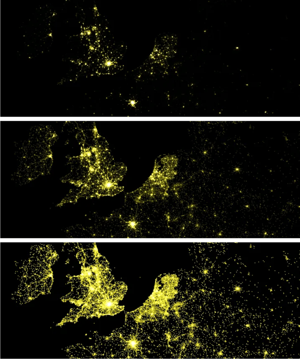
Mapping Millions of Dots
Mapbox's Eric Fischer writes: "Here are some of the lessons I learned in the process about making dot maps look good on the web", at a huge scale.
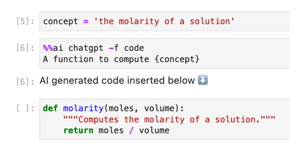
Generative AI in Jupyter
"Jupyter AI brings generative artificial intelligence to Jupyter notebooks, giving users the power to explain and generate code, fix errors, summarize content, ask questions about their local files, and generate entire notebooks from a natural language prompt."
This blog post offers a look at Jupyter AI, an extension for the popular notebook framework.
Everyone fears the cartesian
Randy Yu: "If you’ve ever run any query that involved joining one or more tables together and counting things, you’ve probably come across situations where you had unintentionally introduced a bug and rows that you thought were singletons became multiple rows with mostly duplicated data."
Don't use DISTINCT to de-duplicate your queries. Write them well in the first place.
A Blog Post With Every HTML Element
"Many of the tags like \<html> don’t make sense to include in the text of a blog post, but if you’re viewing this post on patrickweaver.net, then every one of the elements is used somewhere on this page."
Finance Toolkit
Finance Toolkit is "an open-source toolkit in which all relevant financial ratios (50+), indicators and performance measurements are written down in the most simplistic way allowing for complete transparency of the calculation method."
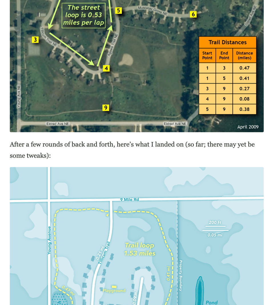
Getting Local: A Map Disassembly
Cartographer Daniel Huffman explains the thinking behind a map he designed: "This time around, the piece is for a small homeowners association, as requested by one of the residents, who is also my brother. He had originally annotated some satellite imagery back in 2009 and shared printouts with others in the community. As I had learned some cartography in the last 14 years, he asked if I’d be willing to help him re-make his older work."
(via Duncan's newsletter)
Build unique React charts
"Based on hundreds of graph examples, this gallery guides you through the basic concepts of data visualization with React and D3.js. It also provides ready-to-use templates to get started quicker."
📈Dataviz, Data Analysis, & Interactive
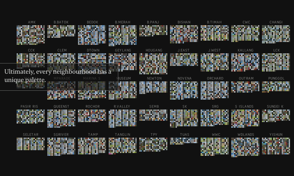
Singapore in Colour
"The Straits Times’ digital graphics team and photo desk teamed up to programmatically extract Singapore’s hues from thousands of photos."
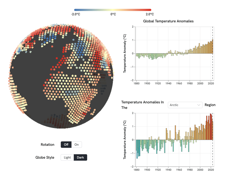
Our Reddening Globe
"Visualize climate change data with a 3D globe."
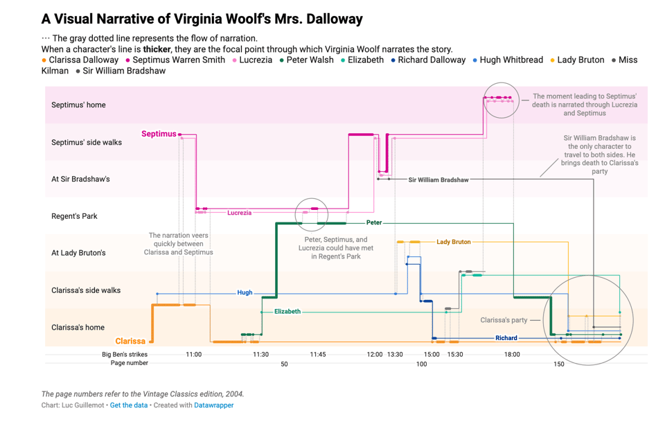
Fleeting encounters in Mrs. Dalloway’s London
"Hi 👋 I’m Luc, engineer in the visualization team. For this Weekly Chart, I gathered data from my favorite novel, “Mrs. Dalloway” by Virginia Woolf, about how time and space are used in its narration."
The Fibonacci Matrix
"When you think about the Fibonacci sequence, you probably imagine a swirling vortex of oscillating points stretching outwards to infinity. [...] Okay, no, obviously you don’t. Yet."

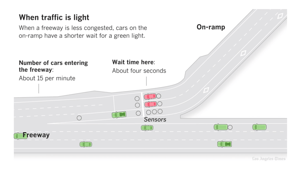
One car per green: Why the lights on freeway onramps can’t end traffic jams
I love a good traffic simulation. This one is by the Los Angeles Times.
🤖 AI
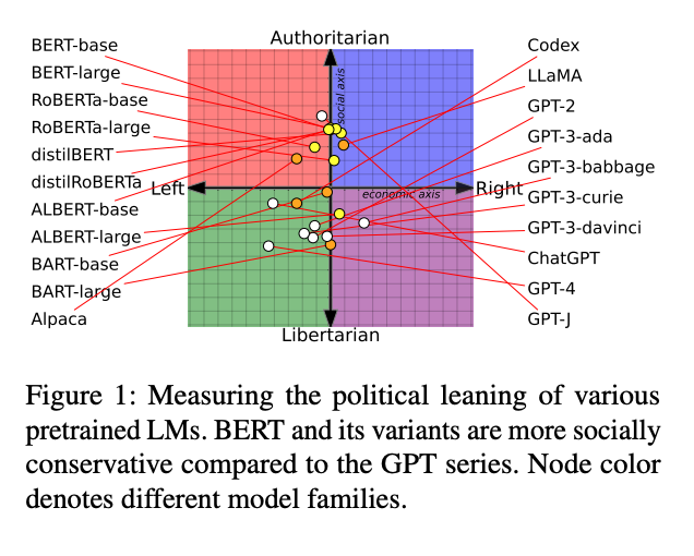
Do LLMs have political bias?
Oh, this is a superb academic paper.
|
Before you go... DO YOU LIKE QUANTUM OF SOLLAZZO? → BECOME A SUPPORTER! :) If you enjoy this newsletter, you can support it by becoming a GitHub Sponsor. Or you can Buy Me a Coffee. I'll send you an Open Data Rottweiler sticker. You're receiving this email because you subscribed to Quantum of Sollazzo, a weekly newsletter covering all things data, written by Giuseppe Sollazzo (@puntofisso). If you have a product or service to promote and want to support this newsletter, you can sponsor an issue. |
quantum of sollazzo is also supported by Andy Redwood’s proofreading – if you need high-quality copy editing or proofreading, check out Proof Red. Oh, and he also makes motion graphics animations about climate change.

Supporters*
Alex Trouteaud
casperdcl / iterative.ai
Naomi Penfold
[*] this is for all $5+/months Github sponsors. If you are one of those and don't appear here, please e-mail me