529: quantum of sollazzo
#529: quantum of sollazzo – 8 August 2023
The data newsletter by @puntofisso.

Hello, regular readers and welcome new ones :) This is Quantum of Sollazzo, the newsletter about all things data. I am Giuseppe Sollazzo, or @puntofisso. I've been sending this newsletter since 2012 to be a summary of all the articles with or about data that captured my attention over the previous week. The newsletter is and will always (well, for as long as I can keep going!) be free, but you're welcome to become a friend via the links below.
I really enjoyed recording this episode of the Royal Society of Medicine Digital Health podcast with Dr Annabelle Painter, a former colleague of mine in the NHS AI Lab.
We discuss the importance of open source (and general openness) in AI innovation, as well as what I think is the true meaning of workforce training, how we talk about success and failure (and why we should do more of the latter), and the difference between regulatory barriers (broadly: good) and knowledge barriers (broadly: bad).
See it as my legacy from the AI Skunkworks programme.

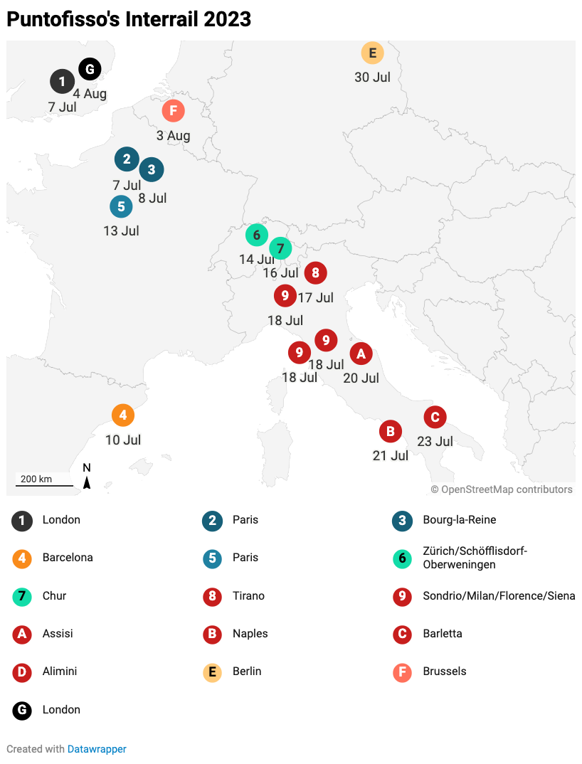
My interrailing has finally come to an end – as you read this, I'll have been firmly in London for a few days. All the highlights are in this thread on Mastodon, including a link to the obligatory map.
'till next week,
Giuseppe @puntofisso
|
DO YOU LIKE QUANTUM OF SOLLAZZO? BECOME A SUPPORTER! :) → If you enjoy this newsletter, you can support it by becoming a GitHub Sponsor. Or you can Buy Me a Coffee. I'll send you an Open Data Rottweiler sticker. You're receiving this email because you subscribed to Quantum of Sollazzo, a weekly newsletter covering all things data, written by Giuseppe Sollazzo (@puntofisso). If you have a product or service to promote and want to support this newsletter, you can sponsor an issue. |
✨ Topical
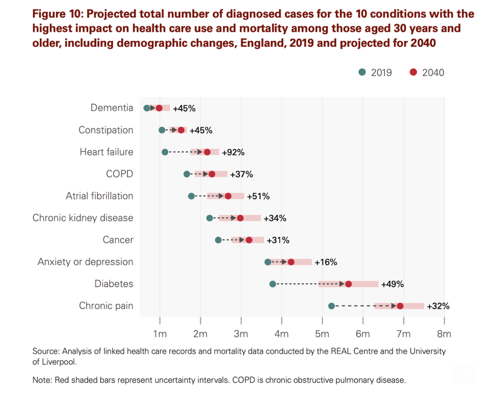
Health in 2040: projected patterns of illness in England
The Health Foundation's recent report about the future of health. It makes for interesting reading, and it's beautifully illuminated by Duncan Geere's datavisz.
The floor is lava
"How concrete, asphalt and urban heat islands add to the misery of heat waves."

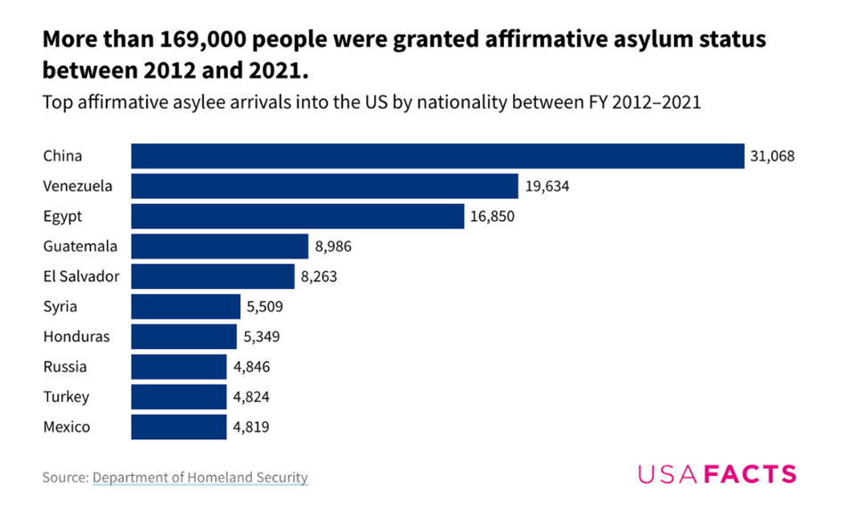
How many people seek asylum in the US?
"Over the past decade, Chinese nationals made up the largest group of asylum seekers from any country."
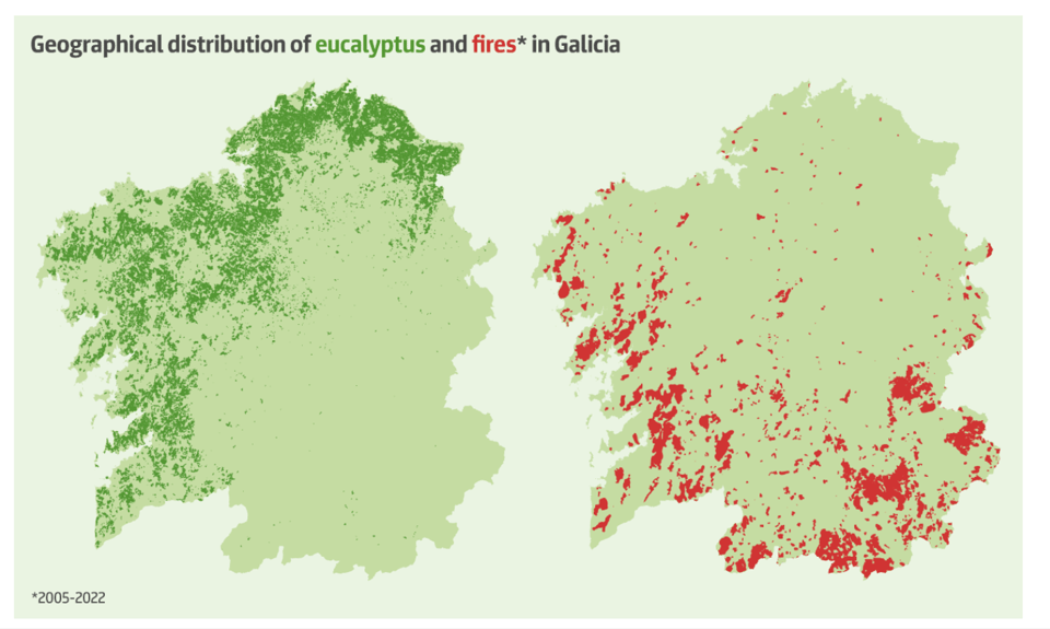
Eucalyptus fever: speculation and wildfire in Galicia
"Eucalyptus, a tree species that thrives on fire, now accounts for 28% of the forests in the Spanish region of Galicia. The situation has come about through the policies of the local Popular Party."
Itself an interesting story, this article is also part of a large series about wildfires in Europe, from the European Data Journalism Network.
A Bite-Sized Email For Your Most Productive Day Yet. Subscribe to ProductivityGlide now for free.

🛠️📖 Tools & Tutorials
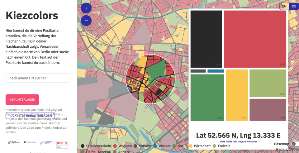
Kiezcolors
A beautiful project by CityLab Berlin, that allows you to get a dataviz of the "colours" of any area of Berlin, according to terrain composition.
Reproducible data science with Nix, part 1 -- what is Nix
"Disclaimer: I’m a super beginner with Nix. So this series of blog posts is more akin to notes that I’m taking while learning than a super detailed tutorial."
Statistician Bruno Rodrigues is publishing this useful series, based on R. He's up to 3 parts for now.
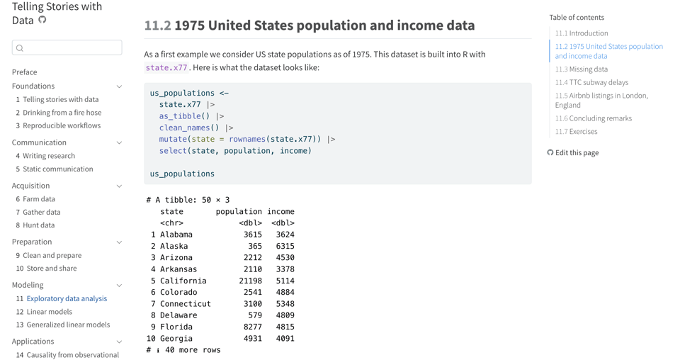
Telling Stories with Data
This online book (a print version is available) is using case studies of applications in R to show how to use data for storytelling.
theme-park
A way to style your R plots so that they look like Game of Thrones, Barbie, and more.
I'm betting on HTML
"With the advent of large language model-based artificial intelligence, semantic HTML is more important now than ever."
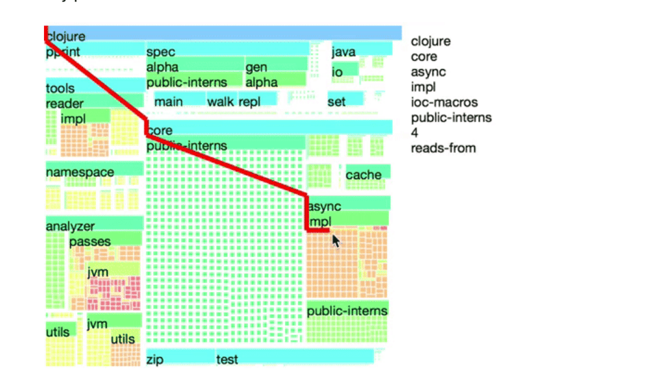
Treemaps are awesome!
"An alternative to pprint for generically visualizing heterogeneous, hierarchical data."
"Treemaps are an underutilized visualization that are capable of generically summarizing data of many shapes and sizes. To date, they've mostly been used for displaying the files consuming all of your disk space, but with a few tweaks, treemaps can be a flexible tool for exploring and navigating messy data blobs."
With a few good ideas on how to improve them, such as showing the path to the root (as in the image below).
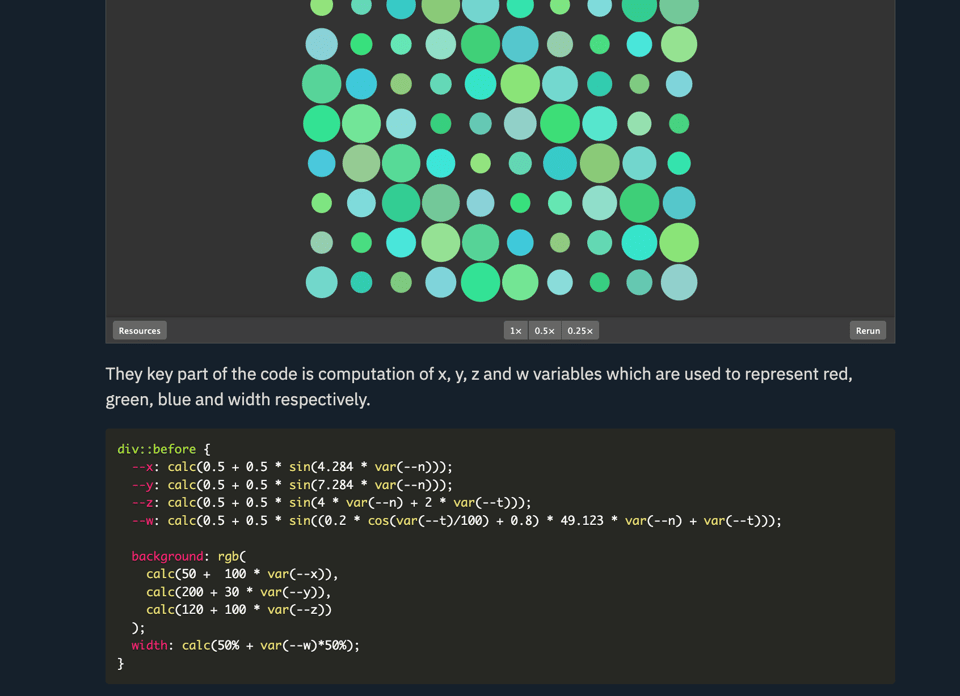
Randomness in CSS using trigonometry
"Since the last time I explored this topic, new amazing features arrived in CSS. One of the most exciting additions is the trigonometric functions. They unlock a lot of previously impossible tasks. They are also the first bounded continuous functions natively supported in CSS, making them an amazing tool for creating pseudo-random generators."
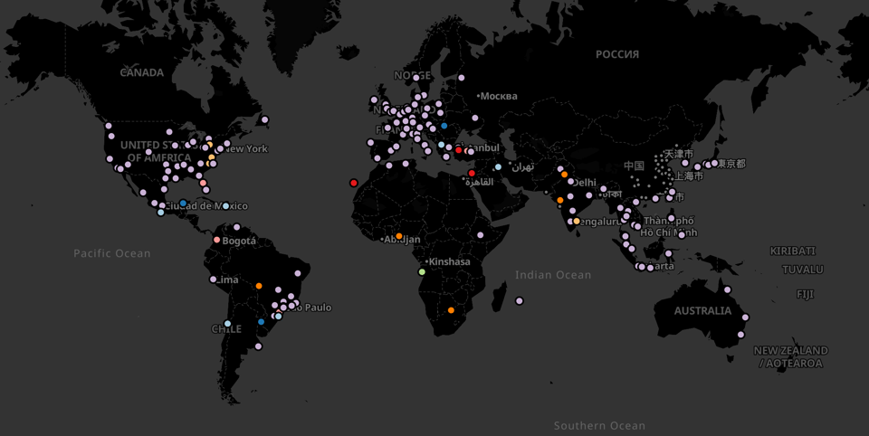
Cartography, Geovisualization & GIS on Mastodon
"A list of recommended accounts, manually curated and annotated by Florian Ledermann."
calamanCy
"NLP pipelines for Tagalog using spaCy."
I don't know much about Tagalog, but this matters because there's a lot of NLP out there that is just too Anglo-centric, which limits the ability of language models to capture complex semantics that English might not display.
Machine Learning for Business Decision Optimization
A free course from Weights and Biases (registration required).
CSS And Accessibility: Inclusion Through User Choice
"It is challenging to accurately understand the preferences of over 7.8 billion people at any given time. Carie Fisher outlines which CSS media features are available for detecting user preferences and how they are used to design and build more inclusive experiences."
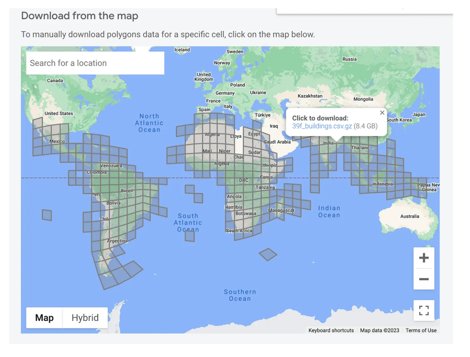
Cloud-Native Geo Data Explorations with Google Open Buildings
"In this post I’m going to mostly describe the overall path to getting to the partitioned GeoParquet dataset on source.coop."
🤯 Data thinking
The eternal Google search for truth
Brilliant column by Tim Harford: "As the sociologist Francesca Tripodi explains, if you type “Why is the sky blue?” into a search box, you’ll get plenty of scientific explanations. (“Rayleigh scattering”, apparently.) But ask “why is the sky white?” and you may be told — as I was — that this is because of the scattering of light by large particles in the atmosphere. Ask “why is the sky red?” and you’ll be told: it’s Rayleigh scattering again."
📈Dataviz, Data Analysis, & Interactive
Overture points
Brandon Liu (Protomaps' creator) launched this map that displays all of the 60 million POIs that have been released by the Overture Map Foundation. Hint: keep zooming in.
If you don't know about Overture, start here.
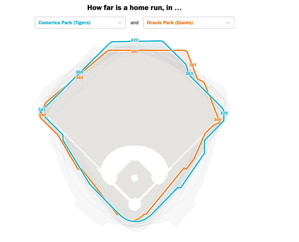
How far must a ball travel to be a home run? Depends on the MLB stadium.
"By this measure, the Tampa Bay Rays are the biggest winner, having hit 19 more home runs than expected because of favorable stadium factors."
I love the Washington Post for its ability to notice this sort of effect.
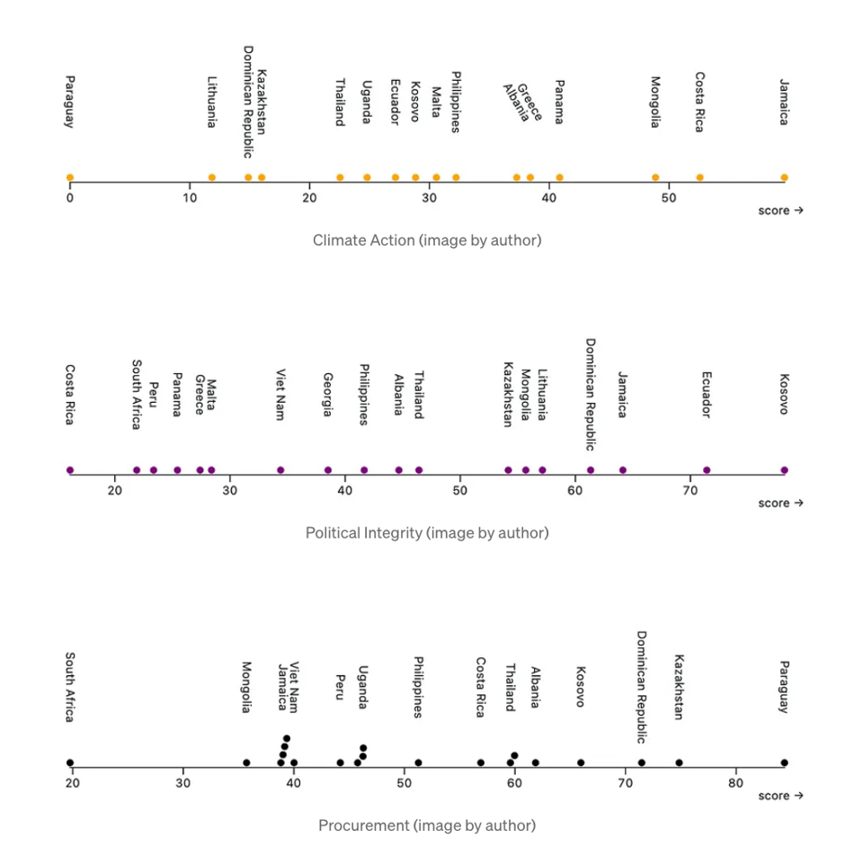
Global Data Barometer: What’s the Current State of Open Data in the World?
"To what extent are countries adopting data policies and systems for the public good?"
Some pretty visualizations in this article.
(via Jeremy Singer-Vine's Data Is Plural)
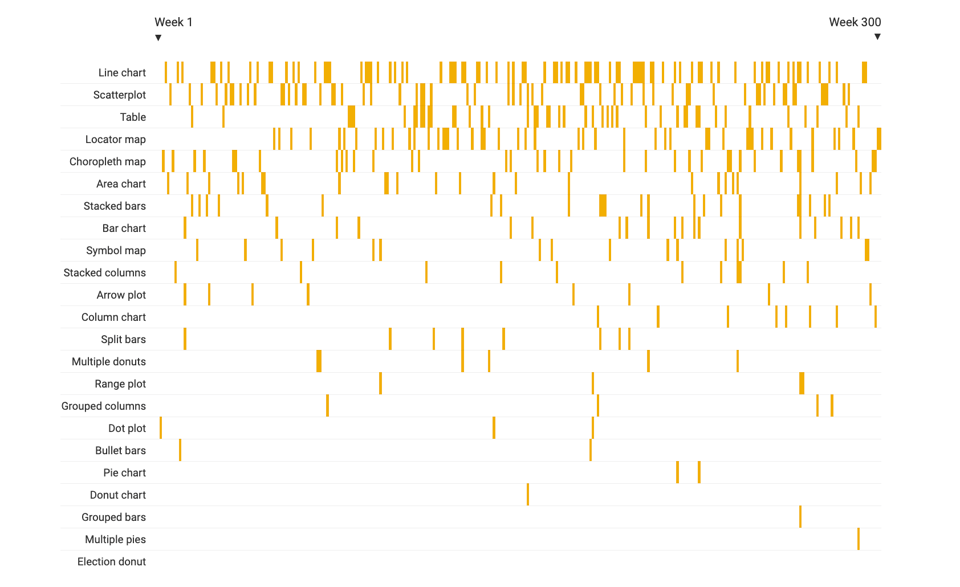
This is the 300th Weekly Chart
Well done to our friends at Datawrapper. This is a good retro of charts used in their weekly column.
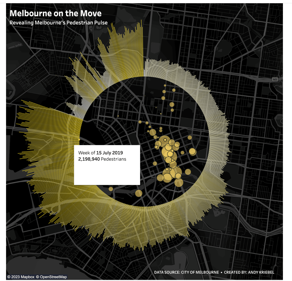
Melbourne on the move
A pretty cool interactive Tableau dataviz.
(via Mobility Matters)
🤖 AI
FacTool: Factuality Detection in Generative AI
This is academic research, but believe me – fact detection is going to be the next big trend in LLMs.
quantum of sollazzo is supported by Andy Redwood’s proofreading – if you need high-quality copy editing or proofreading, check out Proof Red. Oh, and he also makes motion graphics animations about climate change.

Supporters*
Alex Trouteaud
casperdcl / iterative.ai
Naomi Penfold
[*] this is for all $5+/months Github sponsors. If you are one of those and don't appear here, please e-mail me