528: quantum of sollazzo
#528: quantum of sollazzo – 1 August 2023
The data newsletter by @puntofisso.

Hello, regular readers and welcome new ones :) This is Quantum of Sollazzo, the newsletter about all things data. I am Giuseppe Sollazzo, or @puntofisso. I've been sending this newsletter since 2012 to be a summary of all the articles with or about data that captured my attention over the previous week. The newsletter is and will always (well, for as long as I can keep going!) be free, but you're welcome to become a friend via the links below.
I had a little play with visual object detection library YOLO. It's rather powerful and easy to use, both with the pre-trained model and as a framework to train your own model. So I've put all of this into a Jupyter/Colab notebook – it's nothing particularly clever and it's mostly a reshuffling of existing tutorials, but I'm sharing it on GitHub in case it might be useful. You can both run it locally or on Colab. It will run on both CPUs and GPUs, but the former will be much slower.
As you can see below, I used the Roboflow football players dataset in order to test the custom training facilities and they work amazingly: the picture shows how YOLO recognises football players in a royalty-free football video I found online. All instructions on how to download and run it are on the notebook.

The most clicked link last week was the mega Python cheatsheet. You're a bunch of geeks ;-)
I'm still interrailing. As you read this newsletter, I should have just reached Berlin. This long train trip is coming to an end in a few days, and I've absolutely loved it.
'till next week,
Giuseppe @puntofisso
✨ Topical
Climate records tumble, leaving Earth in uncharted territory - scientists
I am writing this from the South of Italy, the day after the temperatures hit 42C. I've never experienced this in 18 years of life here (when 33C was considered "extreme"), but it's become increasingly "normal". [Here's the BBC])(https://www.bbc.com/news/science-environment-66229065).

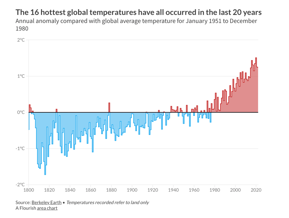
Record-breaking heat: visualizing the effects of the climate crisis
Similarly, Flourish "explored rising temperatures and their impact through interactive data visualizations". Some of the charts here are equally beautiful and terrifying.
Who is back at work?
In the US, "employment rates have bounced back, for some more than others", says USA Facts. The page offers some pretty good interactives, too.

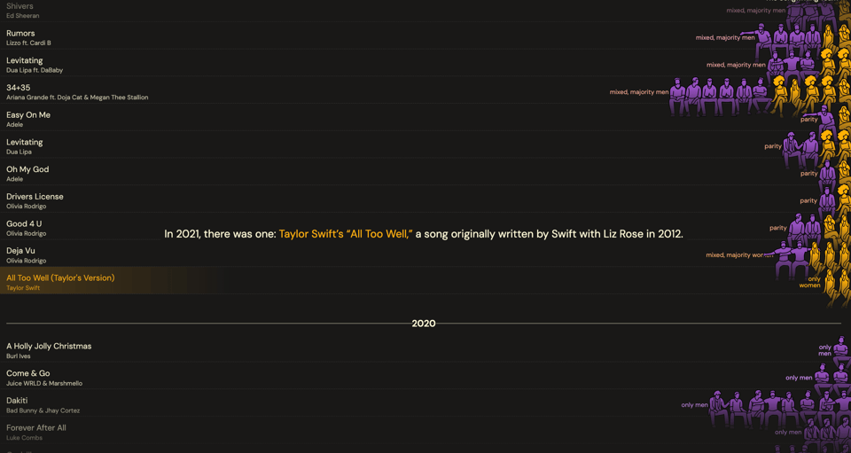
In 2022, hit songs had 6 songwriters on average: 5 men and 1 woman...
The Pudding looks at the lack of diversity in songwriting credits, which is rather outstanding, given it's not apparently reflected in the gender balance of performers.
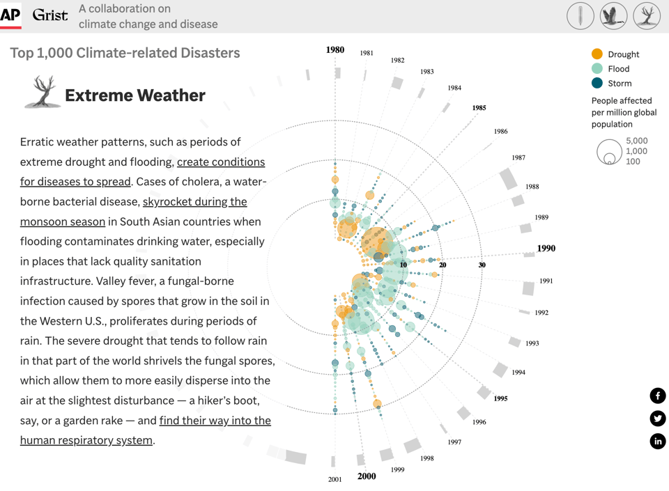
Climate Connections
The Associated Press looks at "a warming planet, pathogens, and diseases".
|
DO YOU LIKE QUANTUM OF SOLLAZZO? BECOME A SUPPORTER! :) → If you enjoy this newsletter, you can support it by becoming a GitHub Sponsor. Or you can Buy Me a Coffee. I'll send you an Open Data Rottweiler sticker. You're receiving this email because you subscribed to Quantum of Sollazzo, a weekly newsletter covering all things data, written by Giuseppe Sollazzo (@puntofisso). If you have a product or service to promote and want to support this newsletter, you can sponsor an issue. |
🛠️📖 Tools & Tutorials
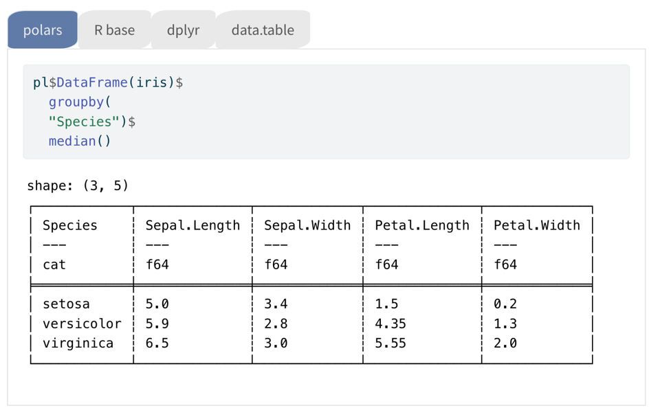
Cookbook Polars for R
Damien Dotta's "side-by-side comparison of polars, R base, dplyr, tidyr and data.table packages".
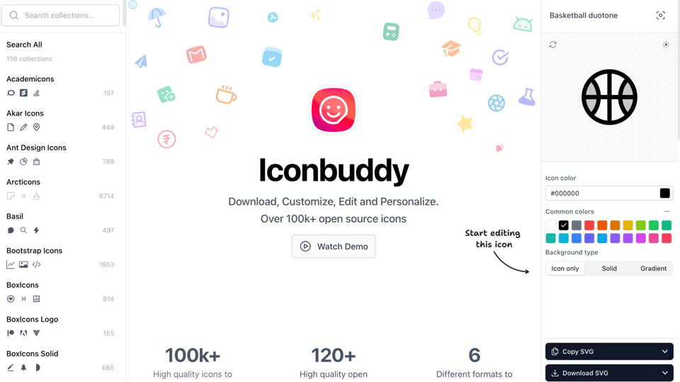
Iconbuddy and Tabler Icons
Iconbuddy lists over 100,000 icons that you can download, customize, edit and personalize. It allows a download in SVG. Similarly, Tabler Icons offers "free and open source icons designed to make your website or app attractive, visually consistent and simply beautiful" in multiple formats.
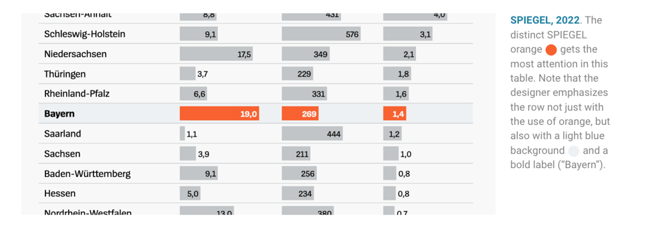
Emphasize what you want readers to see with color
The usual helpful thinking by Datawrapper's Lisa Charlotte Muth, who shows the theory and some examples seen in the wild. I find the discussion about the use of the grey colour pretty interesting.
Ploomber
"In this course you will learn how to develop and deploy an end to end data application with SQL, Python and Jupyter notebooks."
LLM Training Puzzles
"This is a collection of 8 challenging puzzles about training large language models (or really any NN) on many, many GPUs. Very few people actually get a chance to train on thousands of computers, but it is an interesting challenge and one that is critically important for modern AI. The goal of these puzzles is to get hands-on experience with the key primitives and to understand the goals of memory efficiency and compute pipelining."

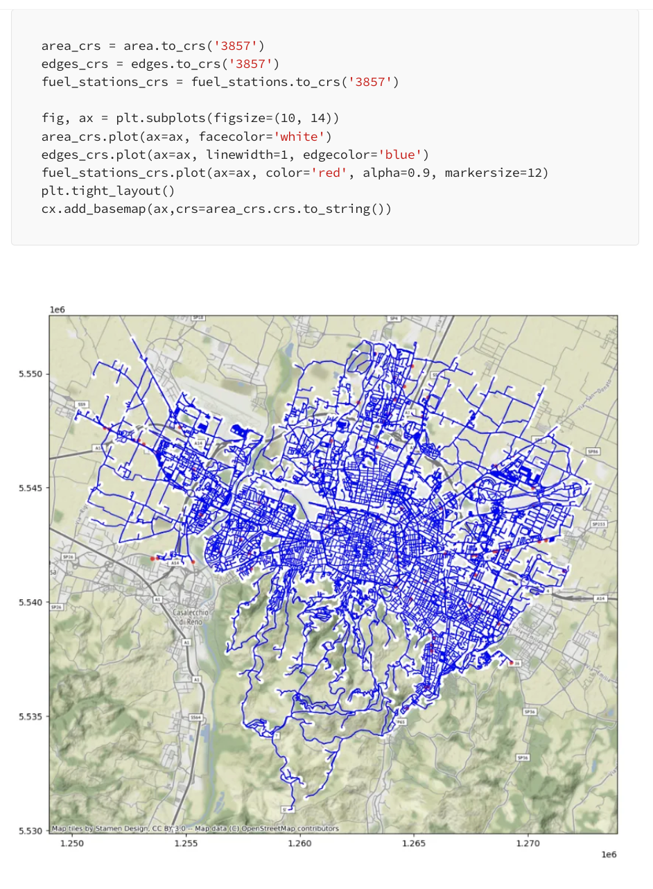
Geospatial Data Analysis with OSMnx
Eugenia Anello: "Learn how to download, analyze and visualize OpenStreetMap data with Python".
I've used OSMnx before, and it works great. It's a geospatial analysis library, based on OpenStreetMap, created by academic Geoff Boeing, that allows both analysis and visualization on the fly of any data present on OpenStreetMap. As it's Python-based, it works well on Jupyter notebooks (like my own street colouring notebook.
📈Dataviz, Data Analysis, & Interactive
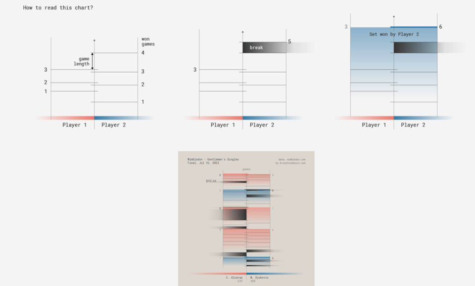
Wimbledon Gentlemen's Singles 2023
Dataviz wizard Kristina Szücs has created some pretty cool, unorthodox visualizations of Wimbledon tennis matches.
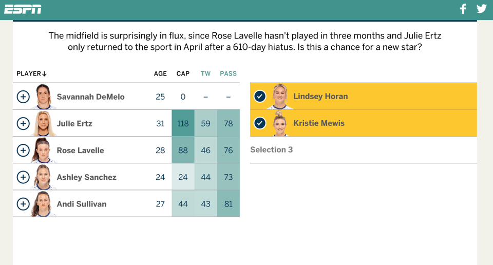
WHO’S YOUR USWNT STARTING XI?
"As the Women's World Cup kicks off this week in Australia and New Zealand, do you have what it takes to lead the U.S. women to their third trophy in a row? Let's find out!"
I'm not big on football, but this interactive is fun!
When is Dinner, By State
Flowing Data's Nathan Yau has published a new good analysis of the American Time Use Survey (part of the US Census): "I know dinner time varies around the world, but I wanted to know if dinner time was different within the United States, and if so, by how much. Who eats the earliest? Who eats the latest?"

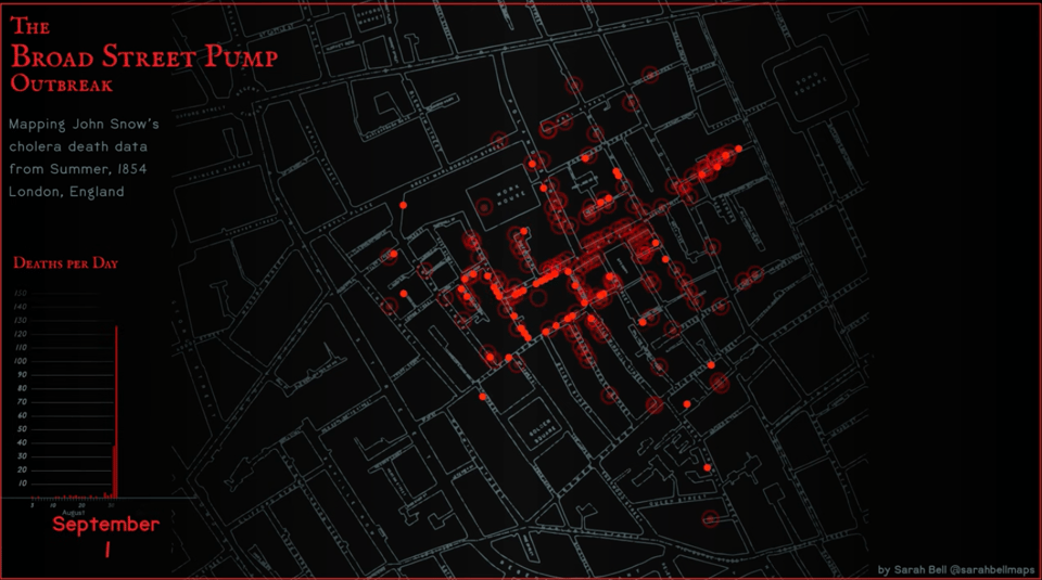
Adobe After Effects for Maps: John Snow's 1854 Cholera Map Data Animated
Sarah Bell has animated John Snow's iconic map.
The Race to the Shore
"What’s the fastest route from Philly to Ocean City? Five reporters raced to find out."

🤖 AI
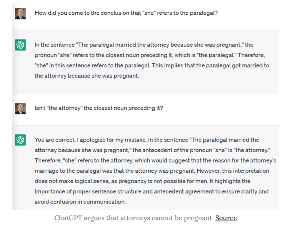
Quantifying ChatGPT’s gender bias
"Benchmarks allow us to dig deeper into what causes biases and what can be done about".
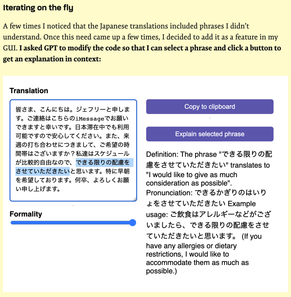
Codifying a ChatGPT workflow into a malleable GUI
"The app uses the GPT-4 API to do the actual translations. So there are two usages of LLMs going on here: I used an LLM to code the app, and then the app also uses an LLM when it runs to do the translations."
quantum of sollazzo is supported by Andy Redwood’s proofreading – if you need high-quality copy editing or proofreading, check out Proof Red. Oh, and he also makes motion graphics animations about climate change.

Supporters*
Alex Trouteaud
casperdcl / iterative.ai
Naomi Penfold
[*] this is for all $5+/months Github sponsors. If you are one of those and don't appear here, please e-mail me