527: quantum of sollazzo
#527: quantum of sollazzo – 25 July 2023
The data newsletter by @puntofisso.

Hello, regular readers and welcome new ones :) This is Quantum of Sollazzo, the newsletter about all things data. I am Giuseppe Sollazzo, or @puntofisso. I've been sending this newsletter since 2012 to be a summary of all the articles with or about data that captured my attention over the previous week. The newsletter is and will always (well, for as long as I can keep going!) be free, but you're welcome to become a friend via the links below.
Recently, I was a guest on the IT Couch (video) Podcast. Together with Antonio, Mauro, and Samith, we discuss IT and CS careers, open data, AI, and ethics. If you understand Italian, you can watch/listen to it on Spotify, YouTube, and listen to it on a variety of platform.
One of the most talented teams working with data and visuals, that of the Guardian, by the talented Ashley Kirk, is recruiting.
They're looking for:
The most clicked link last week was Bloomberg's look at how the NHS is doing as it turns 75.
I'm still interrailing. This issue was composed between Assisi, Naples, and Barletta (my home town).

'till next week,
Giuseppe @puntofisso
|
DO YOU LIKE QUANTUM OF SOLLAZZO? BECOME A SUPPORTER! :) → If you enjoy this newsletter, you can support it by becoming a GitHub Sponsor. Or you can Buy Me a Coffee. I'll send you an Open Data Rottweiler sticker. You're receiving this email because you subscribed to Quantum of Sollazzo, a weekly newsletter covering all things data, written by Giuseppe Sollazzo (@puntofisso). If you have a product or service to promote and want to support this newsletter, you can sponsor an issue. |
✨ Topical
Meteo Blue – real-time urban weather monitoring
This is an interesting set of maps created by a weather app. It's only for a few major tows in Italy, but it gives some very interesting visuals about the heat sinks in urban environments.
(h/t Maurizio Napolitano)

Sound and fury?
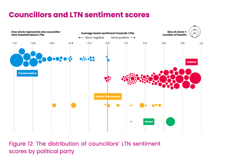
"The impact of councillors’ LTN positions on voting behaviour in Greater London."
The topic of this report by climate organization Possible will resonate with the fallback from the recent by-election in Uxbridge, where the impact of the so-called ULEZ (Ultra Low Emission Zone) on the very tight outcome is still being hotly debated (and it will be hotly debated for some time, I think).
Duncan Geere worked on some of these charts, which are pretty good at illustrating the issue, including the one below about the degree of polarisation about ULEZ seen in statements by Conservative and Labour politicians.
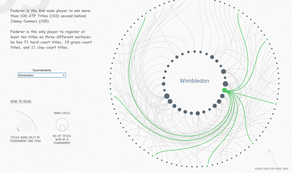
Roger Federer
An interactive Tableau viz about the Swiss tennis player.
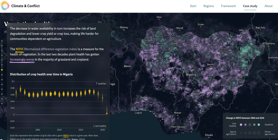
Climate & Conflict
"What is the relation between climate change and violent conflicts? Which role do socio-economic scope conditions play in exacerbating climate impact? How can we allow analysts and policymaker to make better decisions — based on heterogenous, multi-faceted information sources?"
Interest use of scrollytelling in this site by the German Foreign Office.
Australian Bureau of Statistics on Barbie vs Oppenheimer
"With blockbusters Barbie and Oppenheimer both hitting the cinemas tomorrow, we're counting Aussies with professions in the films! Which will you see first?"
Well played, ABS.
(via Lisa Riemers)

🛠️📖 Tools & Tutorials
An Open-source Plotting Library for Statistical Data
"Lets-Plot API is largely based on the API provided by ggplot2 package well-known to data scientists who use R."

web-check
Web-check is an "all-in-one website OSINT tool for analysing any website". Accessible here, with open source code here.
"Get an insight into the inner-workings of a given website: uncover potential attack vectors, analyse server architecture, view security configurations, and learn what technologies a site is using.
Currently the dashboard will show: IP info, SSL chain, DNS records, cookies, headers, domain info, search crawl rules, page map, server location, redirect ledger, open ports, traceroute, DNS security extensions, site performance, trackers, associated hostnames, carbon footprint. Stay tuned, as I'll add more soon!
The aim is to help you easily understand, optimize and secure your website."

R for Data Science, 2nd edition
Hadley Wickam, author of the O'Reilly tome, has released a free online version of it.
Creating a Design System to Prevent Problematic Colour Pairings
A thoughtful piece by Ben Willers of the Economist for Nightingale: "So, to help us rapidly test colour palette ideas against accessibility standards, we developed and prototyped a colour accessibility tool. “Colour accessibility” is a bit of a mouthful, hence this tool became affectionately known as “Cassy.”"
Cassy is accessible here.

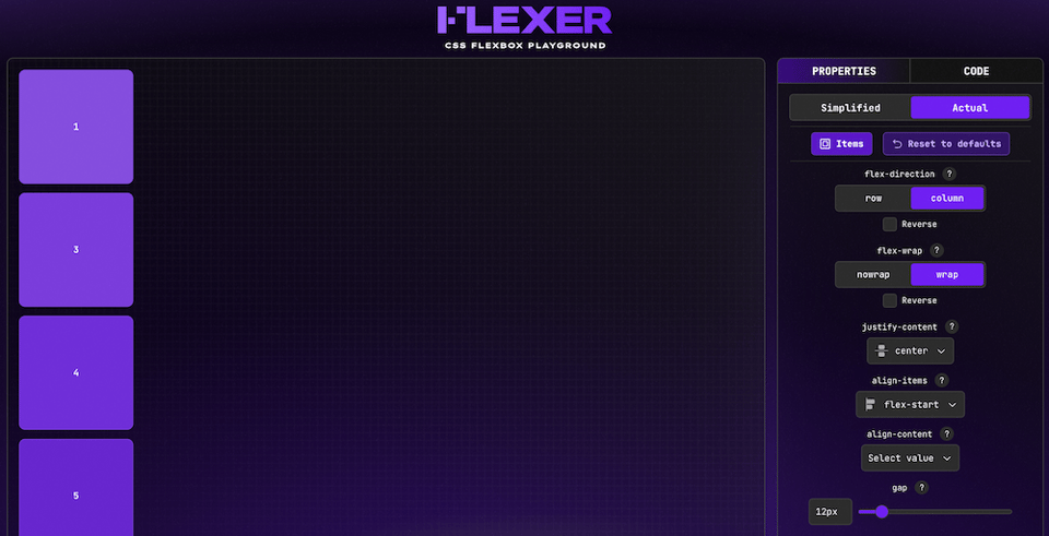
Flexer
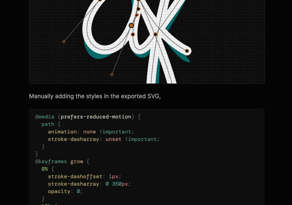
Animated SVG Logo
Anthony Fu: "I recently replaced the logo on the top left corner with an animated SVG", and now explains how to do it.
4 Common Angles Data Journalists Use to Tell Stories
Paul Bradshaw on GIJN: "I found that there are actually broadly seven core data story angles. Many incorporate other angles as secondary dimensions in the storytelling (a change story might go on to talk about the scale of something, for example), but all the data journalism stories I looked at took one of these as its lead)."
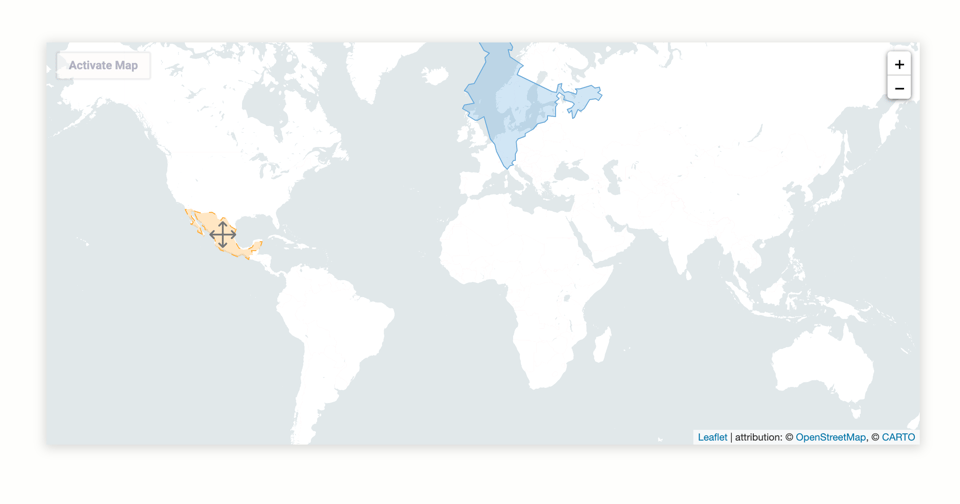
Leaflet TrueSize
"A plugin for easily comparing sizes of geographical shapes".
A library for "drag-and-resize" shapes on map, rescaling for the used projection.
Comprehensive Python cheatsheet
One of the best of its kind, I'd say.

🤯 Data thinking
Peter Well's FOI Request about addressed data
The legal geeks among you will find this request, its response, and the conversation itself pretty interesting.
(h/t Owen Boswarva)
Misinformation Susceptibility Test
"Think you can beat misinformation? Try this comprehensive test of misinformation susceptibility".
(via Andy Redwood)
Writing guidelines for the role of AI in your newsroom? Here are some, er, guidelines for that
The Nieman Lab: "What’s okay and what’s verboten when it comes to AI in the production of news? Here’s how 21 newsrooms in the U.S., Europe, and elsewhere have laid out their own policies and plans."
📈Dataviz, Data Analysis, & Interactive
Linear A
Linear A is the not-yet-decode writing of Crete (the other one, Linear B, was deciphered a few years back). This website allows the reader to explore known excerpts of Linear A interactively.

Chronotrains Rail Route
Train journey feasibility tool Chronotrains now shows the actual rail route whenever available.
(via Durand D'souza)

Nursing Home Inspect
"Search over 90,000 nursing home inspection reports to look for trends or patterns, evaluate nursing homes near you and compare nursing homes by state."
A great tool by ProPublica about US nursing homes. About this topic, also look at GIJN's write-up of similar reporting.

🤖 AI
Programs to detect AI discriminate against non-native English speakers, shows study
"Over half of essays written by people were wrongly flagged as AI-made, with implications for students and job applicants".
Wikipedia-grounded chatbot "outperforms all baselines" on factual accuracy
This is found on Wikipedia's round-up of research involving Wikipedia, it's the third entry: "We design WikiChat [...] to ground LLMs using Wikipedia to achieve the following objectives. While LLMs tend to hallucinate, our chatbot should be factual. While introducing facts to the conversation, we need to maintain the qualities of LLMs in being relevant, conversational, and engaging."
quantum of sollazzo is supported by Andy Redwood’s proofreading – if you need high-quality copy editing or proofreading, check out Proof Red. Oh, and he also makes motion graphics animations about climate change.

Supporters*
Alex Trouteaud
casperdcl / iterative.ai
Naomi Penfold
[*] this is for all $5+/months Github sponsors. If you are one of those and don't appear here, please e-mail me