518: quantum of sollazzo
#518: quantum of sollazzo – 23 May 2023
The data newsletter by @puntofisso.

Hello, regular readers and welcome new ones :) This is Quantum of Sollazzo, the newsletter about all things data. I am Giuseppe Sollazzo, or @puntofisso. I've been sending this newsletter since 2012 to be a summary of all the articles with or about data that captured my attention over the previous week. The newsletter is and will always (well, for as long as I can keep going!) be free, but you're welcome to become a friend via the links below.
The most clicked link last week was South China Morning Post's excellent graphical take on King Charles' coronation.
Open Data Camp UK is returning! Wolverhampton University will welcome us on 1 and 2 July at the Springfield Campus. You can find all the details here and free tickets are available on Eventbrite.
Some of you asked how easy to reach Wolverhampton is. It's just a 15-20 minutes ride from Birmingham New Street, which is one of the best connected train stations in the country. And the campus itself is a short walk from Wolverhampton station. So you have no excuses :-)
If you've never heard of Open Data Camp, it's a volunteer-run unconference for all things data and transparency (not just open data, but the name has stuck). I helped co-found it in 2014 and we've been running a few events since. It is well attended by data wranglers, advocates, public sector data officials (including, once, a Permanent Secretary!), and data journalists. The message is: if you are interested in any aspect of data, this is the event for you. We had 120 attendees in Belfast. Can you help us beat that record?

Last but not least, Open UK has launched their State of Open: The UK in 2023 Survey, which will feed into their State of Open: The UK in 2023 report.
'till next week,
Giuseppe @puntofisso
|
DO YOU LIKE QUANTUM OF SOLLAZZO? BECOME A SUPPORTER! :) → If you enjoy this newsletter, you can support it by becoming a GitHub Sponsor. Or you can Buy Me a Coffee. I'll send you an Open Data Rottweiler sticker. You're receiving this email because you subscribed to Quantum of Sollazzo, a weekly newsletter covering all things data, written by Giuseppe Sollazzo (@puntofisso). If you have a product or service to promote and want to support this newsletter, you can sponsor an issue. |
✨ Topical
A visual guide to Eurovision
Quite a lot in this article by Reuters, including some music analysis.
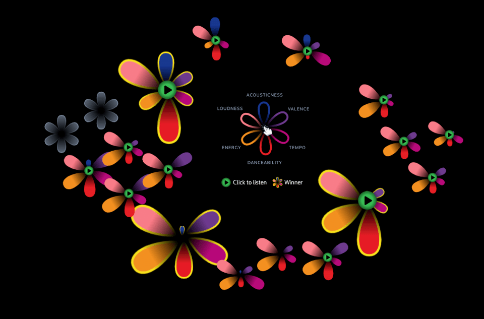
Alliances objectives
Who votes for whom at Eurovision, in charts. Article in French and here automatically translated into English.

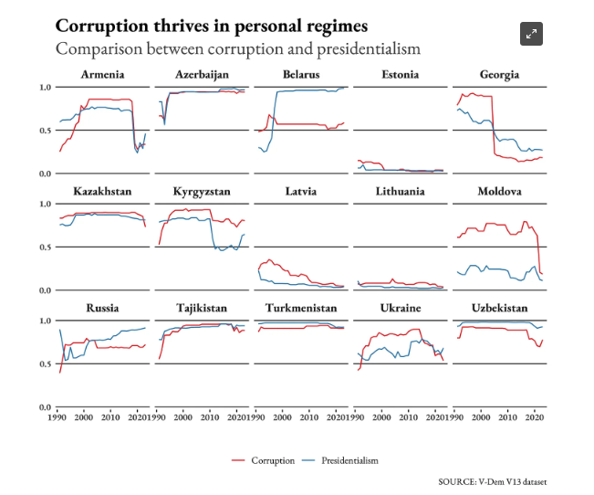
All you need to know about democracy and ex-USSR countries
"Some societies in the former Soviet bloc managed to build functioning democracies, but others didn't; why it happened has lessons for the West too".
Francesco Piccinelli's DaNumbers returns with a look at politics, which includes the intriguing chart below.
Type in your job to see how much AI will affect it
One of those great interactives by the Washington Post, using occupational exposure data by Edward W. Felten, Princeton University; Manav Raj, University of Pennsylvania; and Robert Seamans, New York University, “Occupational Heterogeneity in Exposure to Generative AI.” Salary data is from the “2022 Occupational Employment and Wage Statistics” by the U.S. Bureau of Labor Statistics.

These tax cuts are set to reshape Australia’s budget
"Do you understand their true scale?"
Featuring an excellent use of scrollytelling.

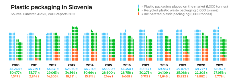
Slovenia and the EU have a problem with uncollected waste
"As plastic waste increases in Slovenia, the European Union, and the world, so do the difficulties in disposing of and recycling it."
The first of a 4-part data-driven investigation with the collaboration of the European Data Journalism Network. More detail about the investigation, including links to data and methodology, can be found here.
🛠️📖 Tools & Tutorials
Good Tools. 100% free, hard-to-find, zero-cost digital tools that offer time and money savings to indie entrepreneurs.
Cosmograph: visualize big networks within seconds
A browser-based library that claims to be able to visualize up to 1 million nodes, more than a million edges, "with a reasonable trade-off in force graph simulation accuracy".

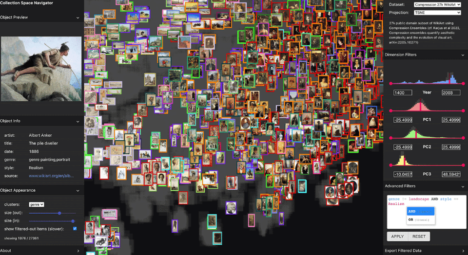
Collection Space Navigator
"An Interactive Visualization Interface for Multidimensional Datasets."
In a sense, similar to Cosmograph, but for more complex data.
Get started making music
Great music tutorial by Ableton. Not quite data, but it might be useful to the data sonifiers among you.

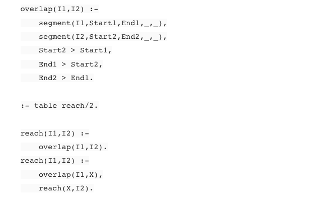
Prolog for data science
"I demonstrate a widely applicable pattern which integrates Prolog as a critical component in a data science analysis. Analytic methods are used to generate properties about the data under study and Prolog is used to reason about the data via the generated properties. The post includes some examples of piece-wise regression on timeseries data by symbolic reasoning. I also discuss the general pattern of application a bit."
Simulated Hospital
"Simulated Hospital is a tool that generates realistic and configurable hospital patient data in HL7v2 format."
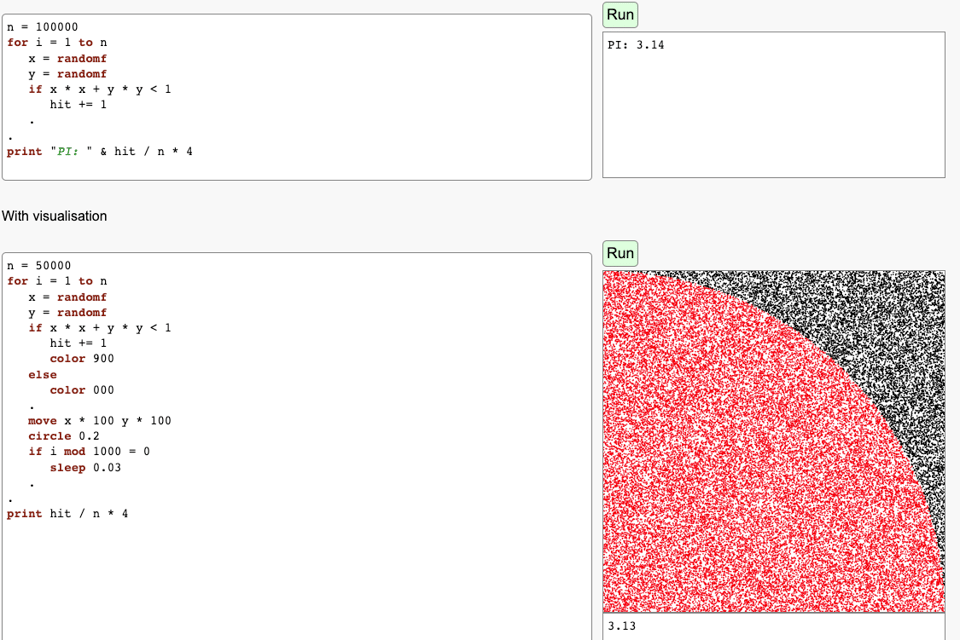
The Law of Large Numbers, or Why It Is a Bad Idea to Go to the Casino
A quirky tutorial on Monte Carlo methods.
Tidy Finance with R
"This book aims to lift the curtain on reproducible finance by providing a fully transparent code base for many common financial applications."
The World Is Built On Probability
A pdf on archive.org of a 1980s Russian book by Lev Tarasov.
"This text is divided into two major parts.
The aim of the first part is to convince the reader that the random world begins directly in his or her own living room because, in fact, all modern life is based on probability. The first part is on the concept of probability and considers making decisions in conflict situations, optimizing queues, games, and the control of various processes, and doing random searches.
The second part of this text shows how fundamental chance is in nature using the probabilistic laws of modern physics and biology as examples. Elements of quantum mechanics are also involved, and this allows the author to demonstrate how probabilistic laws are basic to microscopic phenomena. The idea is that the reader, passing from the first part of the book to the second one, would see that probability is not only around us but it is at the basis of everything."

📈Dataviz, Data Analysis, & Interactive
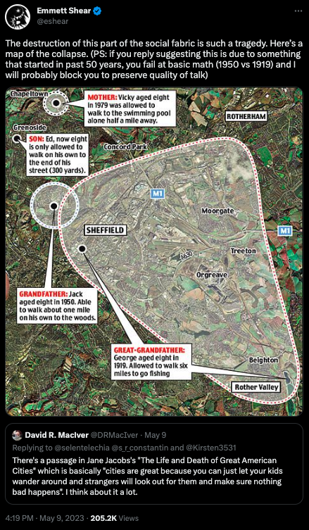
Walking on your own as a child
This is more an invite to research and visualize than anything :-) But it reminded me that aged about 10 I had made an agreement with my dad on where I could go on my own or with friends, walking or cycling, which included a map of my hometown and nearby areas. It was definitely ok to get to the nearest town (circa 10km).
Search Roulette
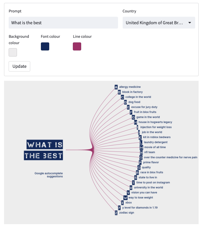
"Visualise Google search autocomplete suggestions", by Lisa Hornung (profile covered in Quantum issue #452). The code is available here.
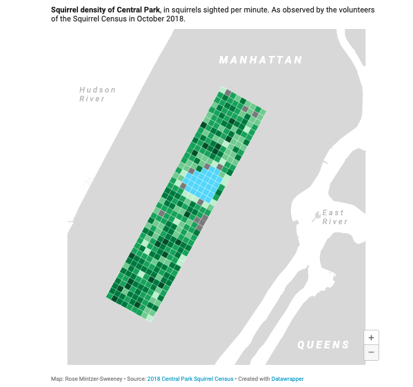
The 2018 Central Park Squirrel Census
Datawrapper's Rose Mintzer-Sweeney: "Instead of traps and poisons, the squirrels of New York get an adorable citizen-science project: the Squirrel Census."
Rose highlights how to create a custom choropleth in Datawrapper, shaped after and overlayed onto a map of Central Park.
Intra-interstate populations
Alasdair Rae (profile in Quantum issue #461) looks at how many people live within the boundaries of US Internst, using MapTiler and QGIS.

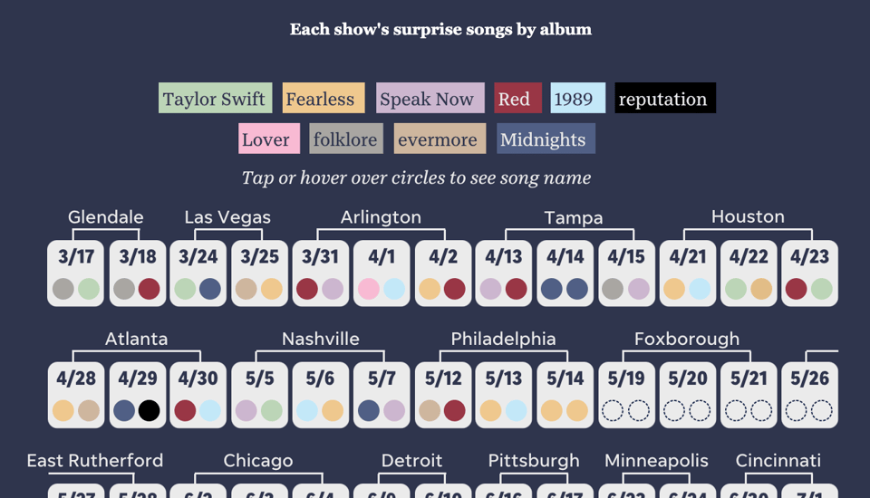
Visualizing Taylor Swift Eras Tour's epic 44-song set list and tracking its surprise songs
"The Eras Tour encompasses 44 songs across Taylor Swift's 10 albums over a three-hour set."
🤖 AI
DiffusionDB
"DiffusionDB is the first large-scale text-to-image prompt dataset. It contains 14 million images generated by Stable Diffusion using prompts and hyperparameters specified by real users."

quantum of sollazzo is supported by ProofRed's excellent proofreading. If you need high-quality copy editing or proofreading, head to http://proofred.co.uk. Oh, they also make really good explainer videos.

Supporters* Alex Trouteaud casperdcl / iterative.ai Naomi Penfold
[*] this is for all $5+/months Github sponsors. If you are one of those and don't appear here, please e-mail me
