517: quantum of sollazzo
#517: quantum of sollazzo – 16 May 2023
The data newsletter by @puntofisso.

Hello, regular readers and welcome new ones :) This is Quantum of Sollazzo, the newsletter about all things data. I am Giuseppe Sollazzo, or @puntofisso. I've been sending this newsletter since 2012 to be a summary of all the articles with or about data that captured my attention over the previous week. The newsletter is and will always (well, for as long as I can keep going!) be free, but you're welcome to become a friend via the links below.
The most clicked link last week was NPR's look at how melting Artic ice is having an impact in other places in the world, often quite far away.
'till next week,
Giuseppe @puntofisso
|
DO YOU LIKE QUANTUM OF SOLLAZZO? BECOME A SUPPORTER! :) → If you enjoy this newsletter, you can support it by becoming a GitHub Sponsor. Or you can Buy Me a Coffee. I'll send you an Open Data Rottweiler sticker. You're receiving this email because you subscribed to Quantum of Sollazzo, a weekly newsletter covering all things data, written by Giuseppe Sollazzo (@puntofisso). If you have a product or service to promote and want to support this newsletter, you can sponsor an issue. |
✨ Topical
The coronation of Britain’s King Charles
I think this is one of the best coverage articles on the Coronation, not just because of its excellent use of scrollytelling and maps, but because of the very nerdy succession line chart. By the South China Morning Post.

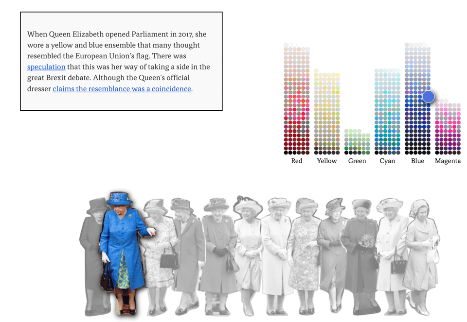
Communicating in color
"How the women of the British monarchy use their clothing to send a message". For Axios by a team including Erin Davies, who we featured in our past "Six Questions" section; with a solid explanation of the methodology. Bravo.
The third most trusted news source in the US is…
"...The British Broadcasting Corporation", as noted by John Burn-Murdoch on this YouGov poll.

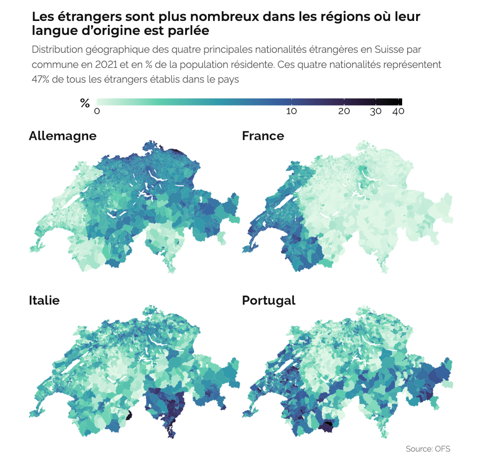
POPULATION, IMMIGRATION, VIEILLISSEMENT
The evolution of Switzerland in 15 charts, including the map below, which shows how immigrants into the confederation tend to move to areas where there are already speakers of their same native language. Originally in French, and here automatically translated into English.
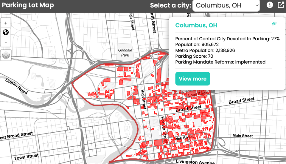
These maps provide graphic evidence of how parking lots “eat” U.S. cities
"Parking lots are about one-fifth of all land in U.S. city centers, making them "easy to get to, but not worth arriving at.""
The article points to this very interesting interactive map of parking lots.
(via Soph's Fair Warning)
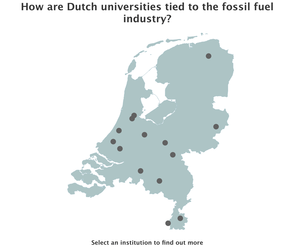
How are Dutch universities tied to the fossil fuel industry?
The Mapping Fossil Ties Coalition, a group of environment advocates, is working on this data collection.
🛠️📖 Tools & Tutorials

Good Tools. 100% free, hard-to-find, zero-cost digital tools that offer time and money savings to indie entrepreneurs.
gridstack.js
"Build interactive dashboards in minutes. gridstack.js is a modern Typescript library designed to help developers create beautiful draggable, resizable, responsive layouts with just a few lines of code. You can create more advanced grids: allow users to persist changes, create a sidebar of widgets to drag into your grid, nested grids, and much more."
It's also open sourced on GitHub.

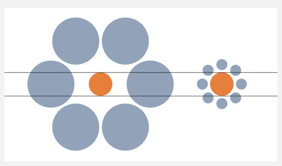
Optical Illusions and Data Viz
In other words, why perception matters for dataviz accuracy.
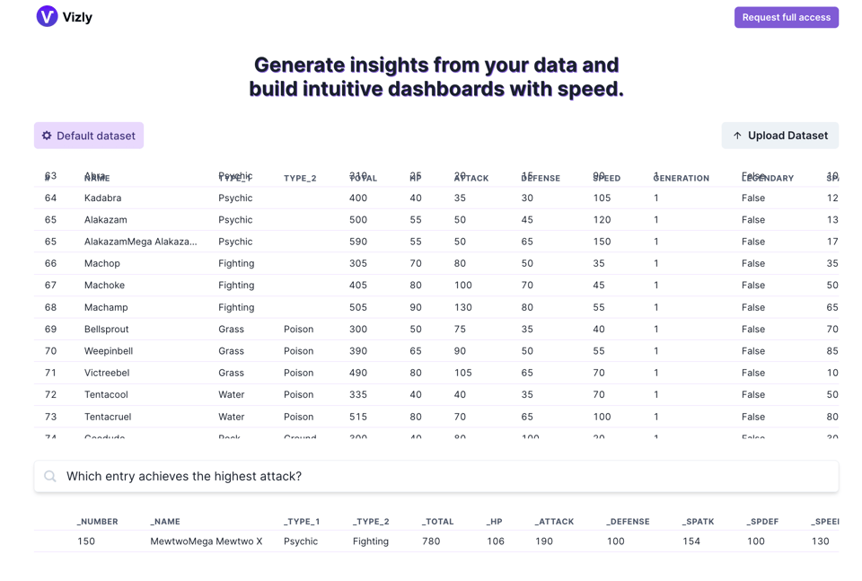
Vizly
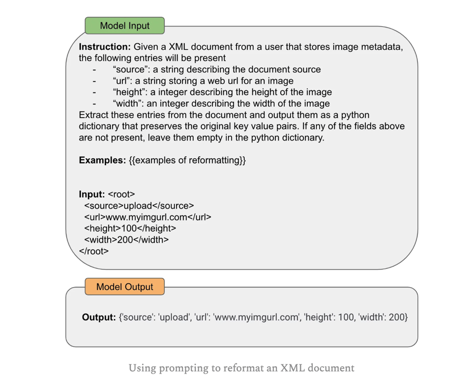
Advanced Prompt Engineering
An in-depth look at several prompting techniques for language models.
50+ ChatGPT Prompts for Web Developers
"If you're tired of tedious and repetitive coding tasks and want to optimize your efficiency, you're in the right place. With the power of ChatGPT, you can streamline your workflow, reduce errors, and even gain insights on improving your code."
I'm increasingly hearing software developers telling me they've started using ChatGPT to help with coding. There are a few interesting examples here.

Permutation Group Visualizer
"This app visualizes the operations of a permutation group given a set of generators. Click the circular buttons or the lines in the diagram to apply that operation (or its inverse) on the elements."

Coloring in R's blind spot
"New arXiv working paper on the new color palette functions palette.colors() and hcl.colors() in base R since version 4.0.0."
But, fundamentally, the TL;DR is: R has massively improved its palettes.

🤯 Data thinking
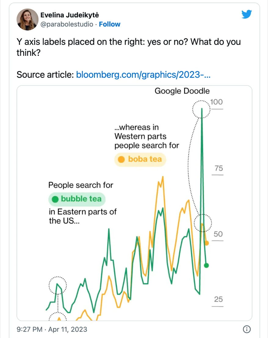
Creative axes
Evelina Judeikyte on the "controversial" move of the vertical axis to the right side of a chart: "Let your Y-axis follow the data".
Dual axes are a great way to show correlation
"So yes, dual axes transform the series, and that transformation can lie. But it is the same kind of transformation that is already built into the Pearson correlation coefficient. Insofar as dual axes are bad, so is the Pearson correlation coefficient. Their merits and their badness go together. Dual axes are good at showing spurious correlation because they are good at showing correlation."
An interesting argument and Observable notebook.
📈Dataviz, Data Analysis, & Interactive
A visual book recommender
"I have this long running conjecture that used book stores are superior to commercial book outlets (including Amazon) for discovering books. One of the reasons for this I think has less to do with a skewed explore/exploit strategy, and more to do with the way exploratory suggestions are sourced."
And so use t-SNE on 100M book reviews to then create a visual clustering of books. Pretty interesting.
Building Bridges with Data Visualization
"The project I realized back in July 2022 was part of the collaboration with Bridges to Prosperity (B2P), an organization that helps isolated communities throughout the world by building trail bridges over impassable rivers. ... Rural isolation is a root cause of poverty and their work has been demonstrated to create a pivotal change in rural communities, with farm profits increasing by 75% and wage labor increasing by 36% following bridge construction. ...They reached out VFSG to showcase their impact through some policy briefs that incorporated data visualization."
A very good dataviz story and write-up, by Martina Dossi.

Analyzing California’s Electric Vehicle Adoption Rate
"Using DMV Data with Pandas and GeoPandas". Oh, Open Transport Data, we meet again.

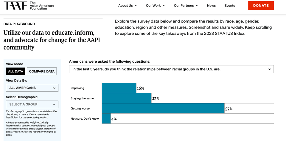
Attitudes towards Asian Americans and Pacific Islanders
"Now in its third year, the 2023 STAATUS Index survey continues to serve as the leading national study of American attitudes towards the Asian American and Pacific Islander (AAPI) community."
🤖 AI
AI machines aren’t ‘hallucinating’. But their makers are
Very interesting critique of AI by Naomi Klein.
"By appropriating a word commonly used in psychology, psychedelics and various forms of mysticism, AI’s boosters, while acknowledging the fallibility of their machines, are simultaneously feeding the sector’s most cherished mythology: that by building these large language models, and training them on everything that we humans have written, said and represented visually, they are in the process of birthing an animate intelligence on the cusp of sparking an evolutionary leap for our species."
(via Lucilla Piccari)
Visualizing Global Attitudes Towards AI
Visual Capitalist using data from Ipsos shows an interesting phenomenon that sets apart attitudes by linking with economic development.

INTRODUCING TOTAL CRAP, THE FIRST MAGAZINE WRITTEN ENTIRELY BY AI
"Our technology has rendered terrible human writers obsolete. Clichés, plagiarism, lazy repetition of unexamined ideas—this software does it all."
For the LOLs.
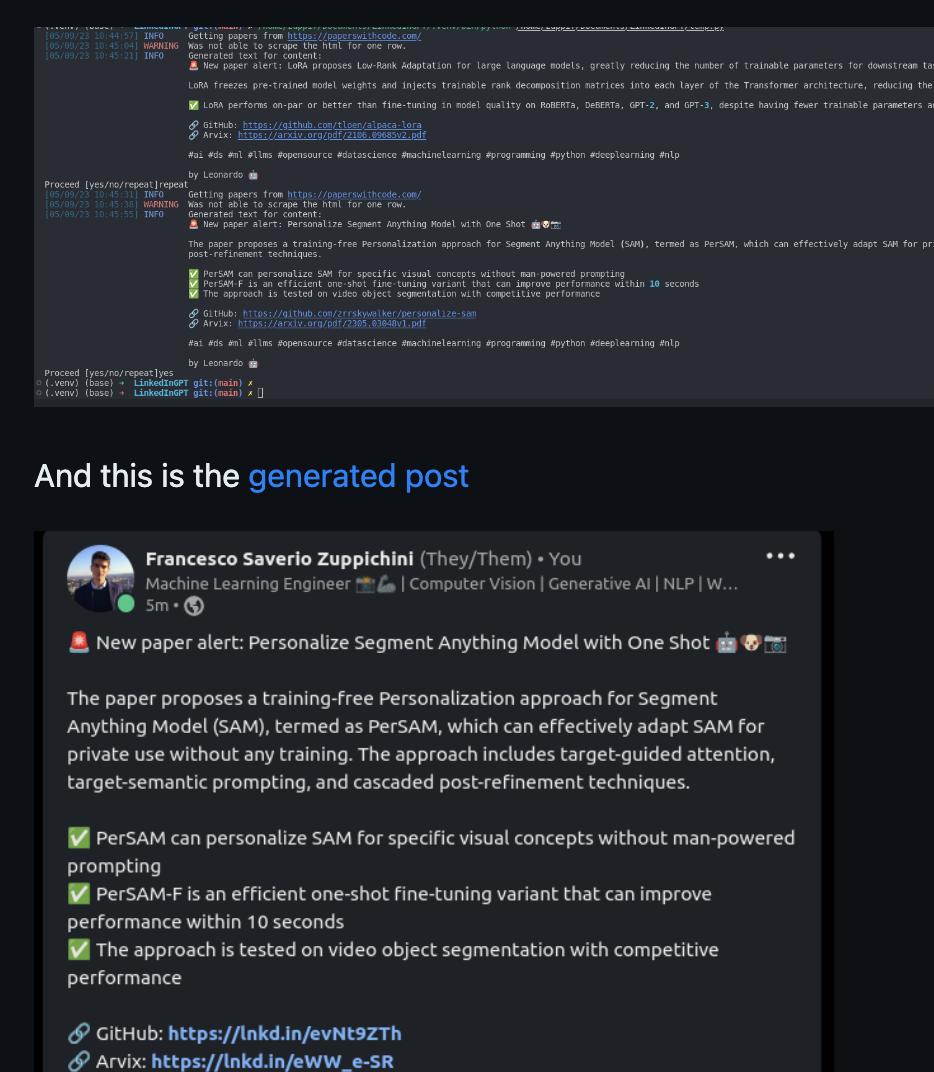
LinkedIn GPT
This is "an automatic way to generate nice guru-like posts about the latest ai papers using chatGPT and a bunch of stuff".
Another one for the LOLs, but with the extra benefit that the code is available.
See also LinkedIn.
(via Paolo Filipe Bertoldi)
quantum of sollazzo is supported by ProofRed's excellent proofreading. If you need high-quality copy editing or proofreading, head to http://proofred.co.uk. Oh, they also make really good explainer videos.

Supporters* casperdcl and iterative.ai Jeff Wilson Fay Simcock Naomi Penfold
[*] this is for all $5+/months Github sponsors. If you are one of those and don't appear here, please e-mail me