512: quantum of sollazzo
#512: quantum of sollazzo – 4 April 2023
The data newsletter by @puntofisso.

Hello, regular readers and welcome new ones :) This is Quantum of Sollazzo, the newsletter about all things data. I am Giuseppe Sollazzo, or @puntofisso. I’ve been sending this newsletter since 2012 to be a summary of all the articles with or about data that captured my attention over the previous week. The newsletter is and will always (well, for as long as I can keep going!) be free, but you’re welcome to become a friend via the links below.
The most clicked link last week was the World Happiness Report.
‘till next week,
Giuseppe @puntofisso
|
Become a Friend of Quantum of Sollazzo from $1/month → If you enjoy this newsletter, you can support it by becoming a GitHub Sponsor. Or you can Buy Me a Coffee. I'll send you an Open Data Rottweiler sticker. You're receiving this email because you subscribed to Quantum of Sollazzo, a weekly newsletter covering all things data, written by Giuseppe Sollazzo (@puntofisso). If you have a product or service to promote and want to support this newsletter, you can sponsor an issue. |
✨ Topical
As Biden considers reelection bid, who are the oldest – and youngest – current world leaders?
The Pew Research Centre looks at the age of world leaders.

Online daters are less open-minded than their filters suggest
“Users with permissive settings show similar biases to those with restrictive ones.“
Oh, well done The Economist. “Open-minded” means nothing.

How Forest Loss Can Unleash the Next Pandemic
“Scientists have linked this and other Ebola outbreaks to specific patterns of deforestation.
To understand why, ProPublica adapted an academic model to show how the way forests are being cut down around the locations of multiple previous outbreaks could increase the risk of another outbreak today.“
Correlation is not causation, etc etc, but this is one to read. The methodology is here.

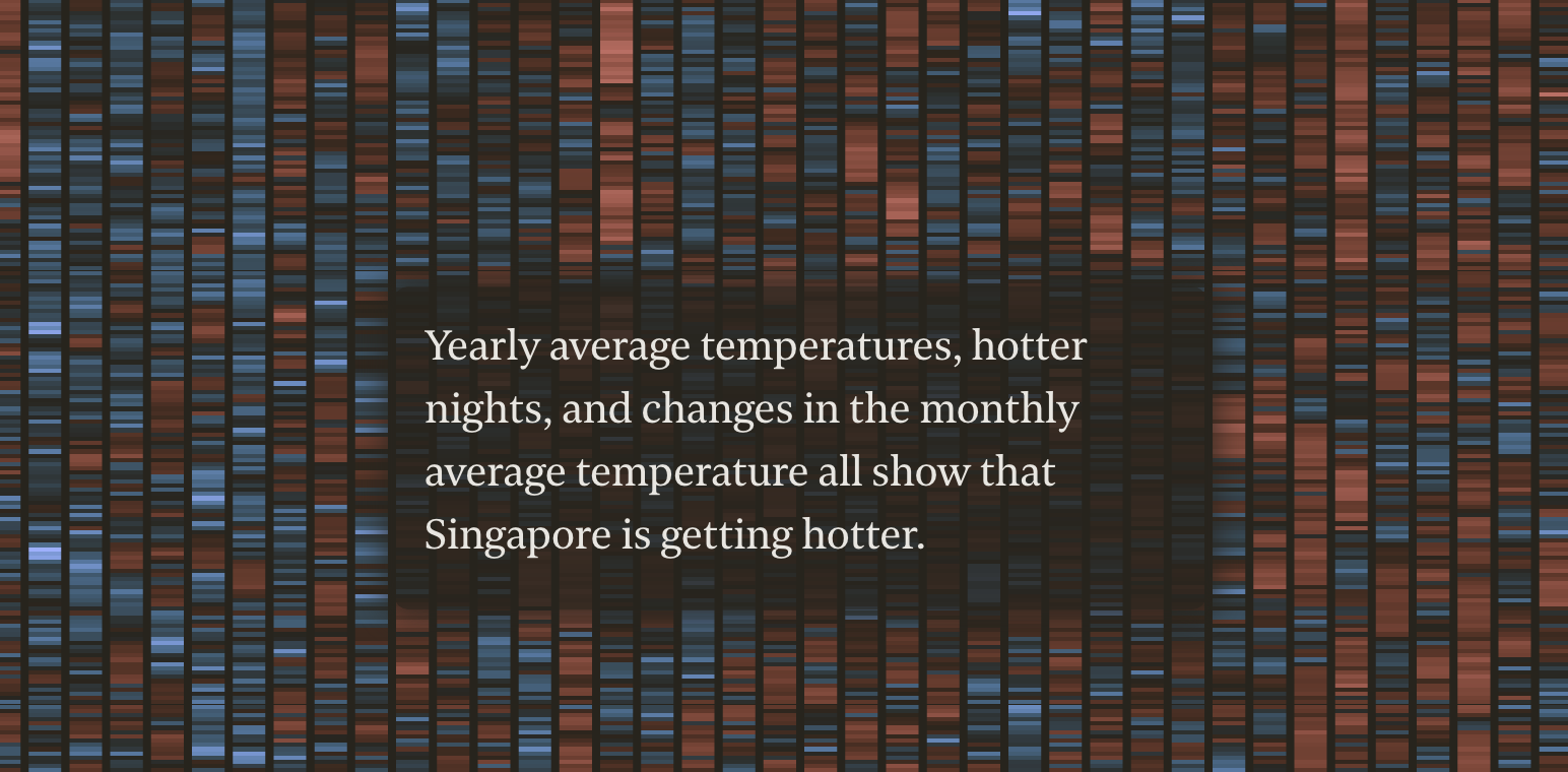
Singapore’s weather is getting hotter
A very good scrollytelling article with excellent dataviz by the Strait Times is looking at new temperature records in Singapore and putting them in context.
YOUNG & KENYAN: 7 YEARS, 13,000 INTERVIEWS WITH KENYA’S MOST IMPORTANT GENERATION
A guide to trends in Kenya and how they will affect today’s youth, by Shujaaz Inc, a Nairobi-based network of social ventures for 15-24 year-olds.
“Countries across East Asia have already experienced this demographic shift – and it enabled an incredible acceleration in productivity, economic growth and prosperity.3 So far, it’s never happened in Africa. But Kenya has a 15-year window to drive it.“

The UK’s coal to clean journey
“This study is an insight on the United Kingdom’s coal phase out. It charts the UK’s journey out of coal and the transformation of the power system over the past decade.“

China and Russia: a friendship with ‘no limits’
“Though not a formal alliance, China and Russia have forged a friendship with “no limits”, according to the leaders of both countries.“
It will be interesting to see if the chart below changes.

Deeply, truly, very sorry: How tech CEOs talk when they lay off workers
Interesting analysis of the Washington Post (probably behind a paywall) looking at the wording of layoff comms.


The Motley Fool
Get Unlimited Access to Motley Fool Stock Advisor!
🛠️📖 Tools & Tutorials
Autoplot matrix
“A symmetric grid where each row (and each column) represents a dimension of the dataset. Each subplot contains a chart that shows the combined distribution of the data over the two dimensions. On the diagonal, the subplots show the distribution of a single dimensions.“
An Observable notebook that you’ll want to replicate.

Data wrangling essentials: comparisons in JavaScript, Python, SQL, R, and Excel
“When adding JavaScript to your data work, it can be useful to see how it compares with other languages you’ve used before. Here, we show common data wrangling methods (like filtering, sorting, and adding columns) in JavaScript, Python, SQL, R, and Excel.“
Yes, another Observable notebook. I have quite a few to share this week :)

Creating timelapse animations from satellite imagery timeseries
This is one of 72 tutorials about Leafmap, “a Python package for interactive mapping and geospatial analysis with minimal coding in a Jupyter environment”.
(via Ananth Iyer)
The Beginner’s Guide to Databases
“There are 300+ databases; [what do they all do(https://technically.substack.com/p/the-beginners-guide-to-databases)]?“
It comes with… a database database.

Prompt Engineering
“Prompt Engineering, also known as In-Context Prompting, refers to methods for how to communicate with LLM to steer its behavior for desired outcomes without updating the model weights. It is an empirical science and the effect of prompt engineering methods can vary a lot among models, thus requiring heavy experimentation and heuristics. This post only focuses on prompt engineering for autoregressive language models, so nothing with Cloze tests, image generation or multimodality models.“
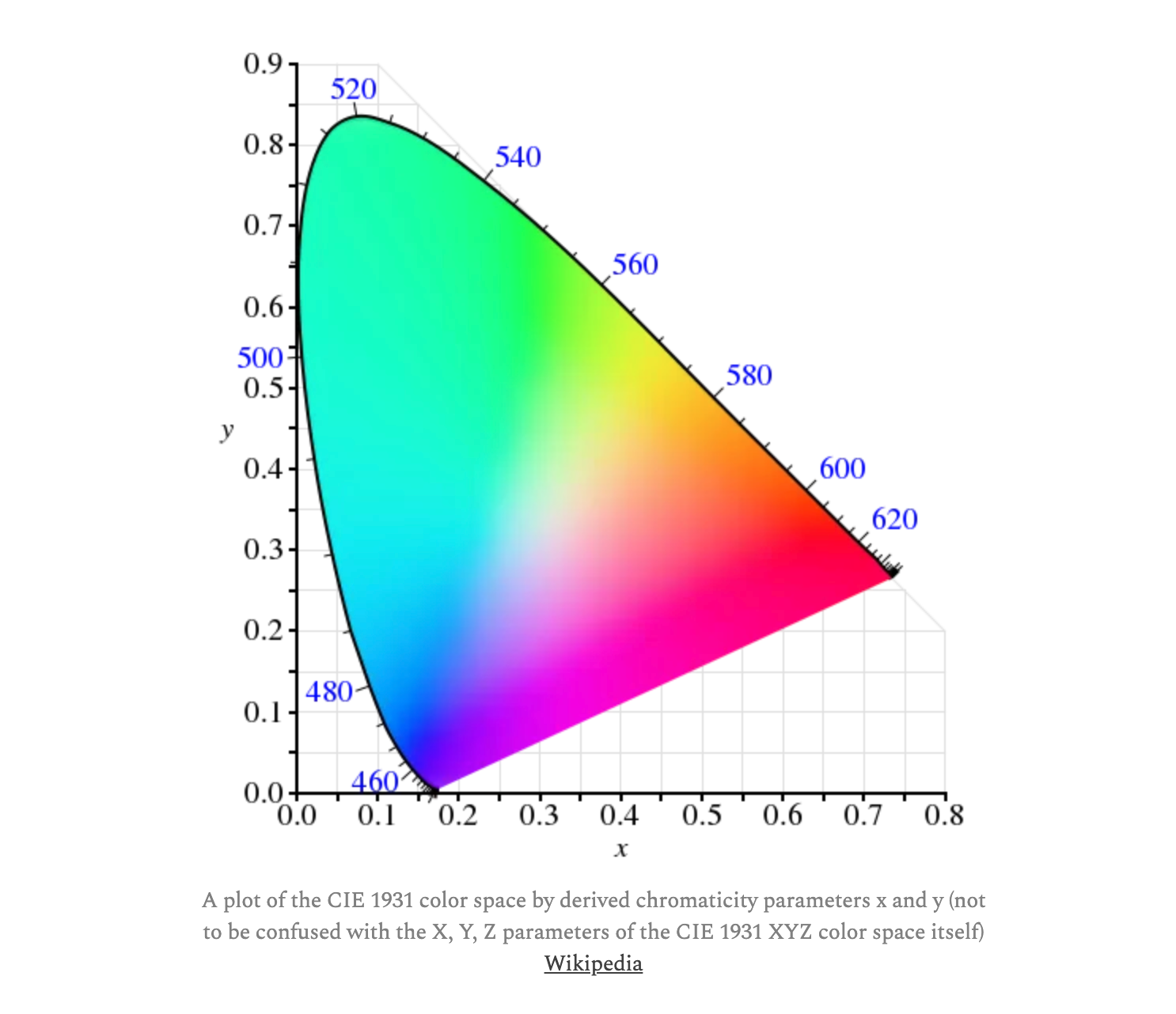
How the heck does one measure color?
TL;DR: “Colour science is HARD”.
You’ll learn all you need about colorimetry, spectrometry, and Pantone.
Data validation in Python: a look into Pandera and Great Expectations
“Data validation is the process of verifying that data is in an acceptable state for downstream processing (analytics, visualisations, machine learning, etc). It’s important for data to conform to the expectations of downstream consumers so that they can use it with confidence; poor data quality issues that go unresolved can have significant deleterious impact on production systems. Pandera and Great Expectations are popular Python libraries for performing data validation. In this blog post I’ll provide a broad overview of the features of each library, demonstrate how to create some basic validation tests with them, and provide some thoughts as to which one you should use.“

🤯 Data thinking
The World’s Best Terrible Weather App
Last week we saw a post that praised DarkSky’s dataviz. There is another angle: while its UI revolutionised the way weather data was displayed, the data behind it was terrible and it was vocally hated by meteorologists.
Slate has a good write-up: “Farewell to Dark Sky, which didn’t keep us dry, but forever changed the way we get our forecasts.“
(via Duncan Geere)
📈Dataviz, Data Analysis, & Interactive
We calculated what place someone is most likely referring to, depending on where they are.
The Pudding looks at places in the US with the Same Name.

Bicycle
“There is something delightful about riding a bicycle”.
And this is another delightfully illustrated explainer by Bartosz Ciechanowski, who some of you will remember as the author of this explainer about mechanical watches.

How to date a recording using background electrical noise
This article is extraordinarily interesting, in a very geeky way. The premise of this is that electricity grids produce a characteristic “hum” because their alternating current frequency oscillates – for example, in Great Britain by a few decimal points around 50Hz. And, what I find entirely bonkers, some companies actually release data about which frequency was in use at a specific point in time (usually second by second). This article explains all you need to know, by telling the story of how such data was used in court to prove that an audio recording was authentic.
Climate change scenarios
Ed Hawkins puts the warming stripes back into the mainstream.

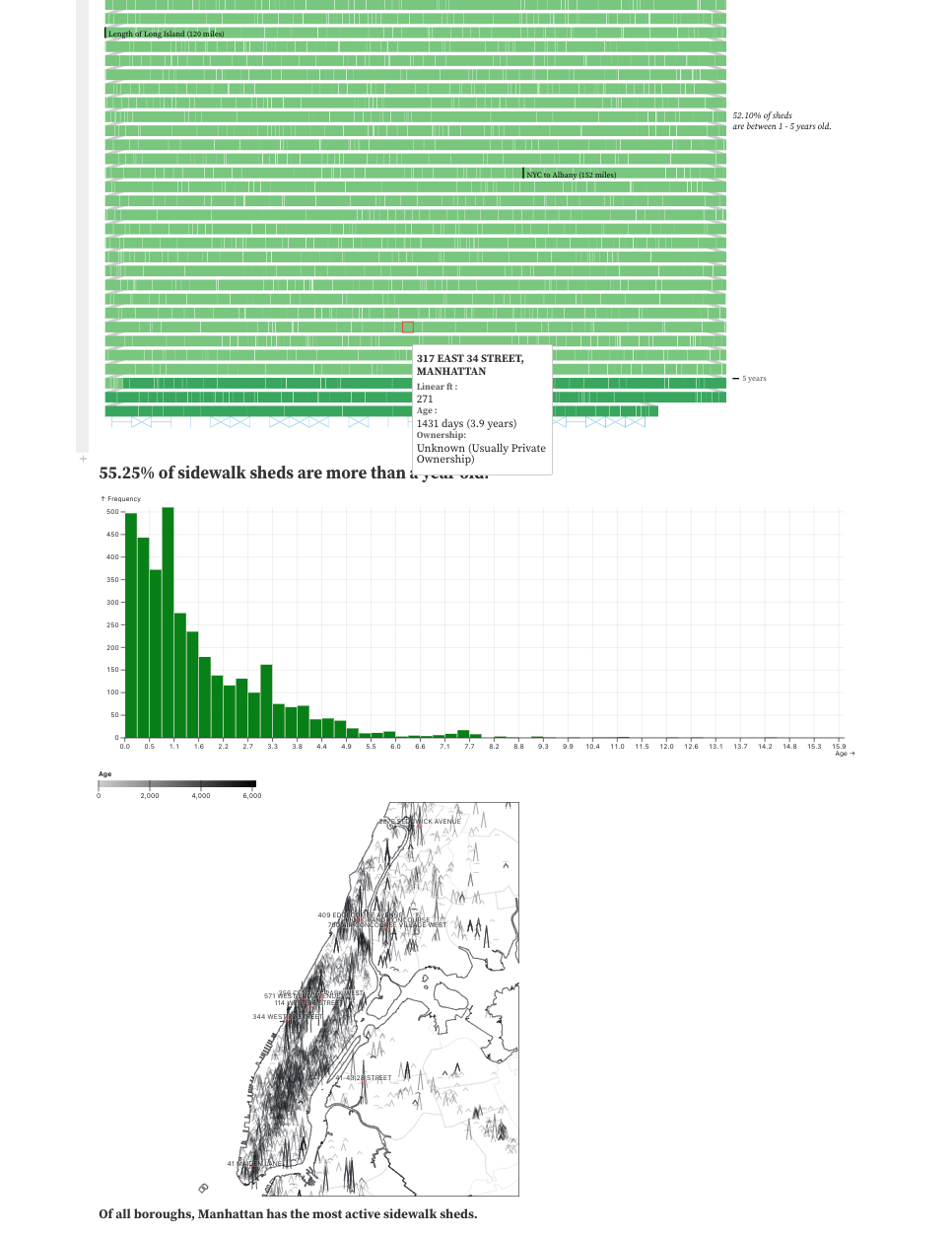
What are Sidewalk Sheds?
“Sidewalk sheds, also known as scaffolding, are a common sight in New York City.“
An [analysis based on an Observable notebookhttps://observablehq.com/@betanyc/what-are-sidewalk-sheds].
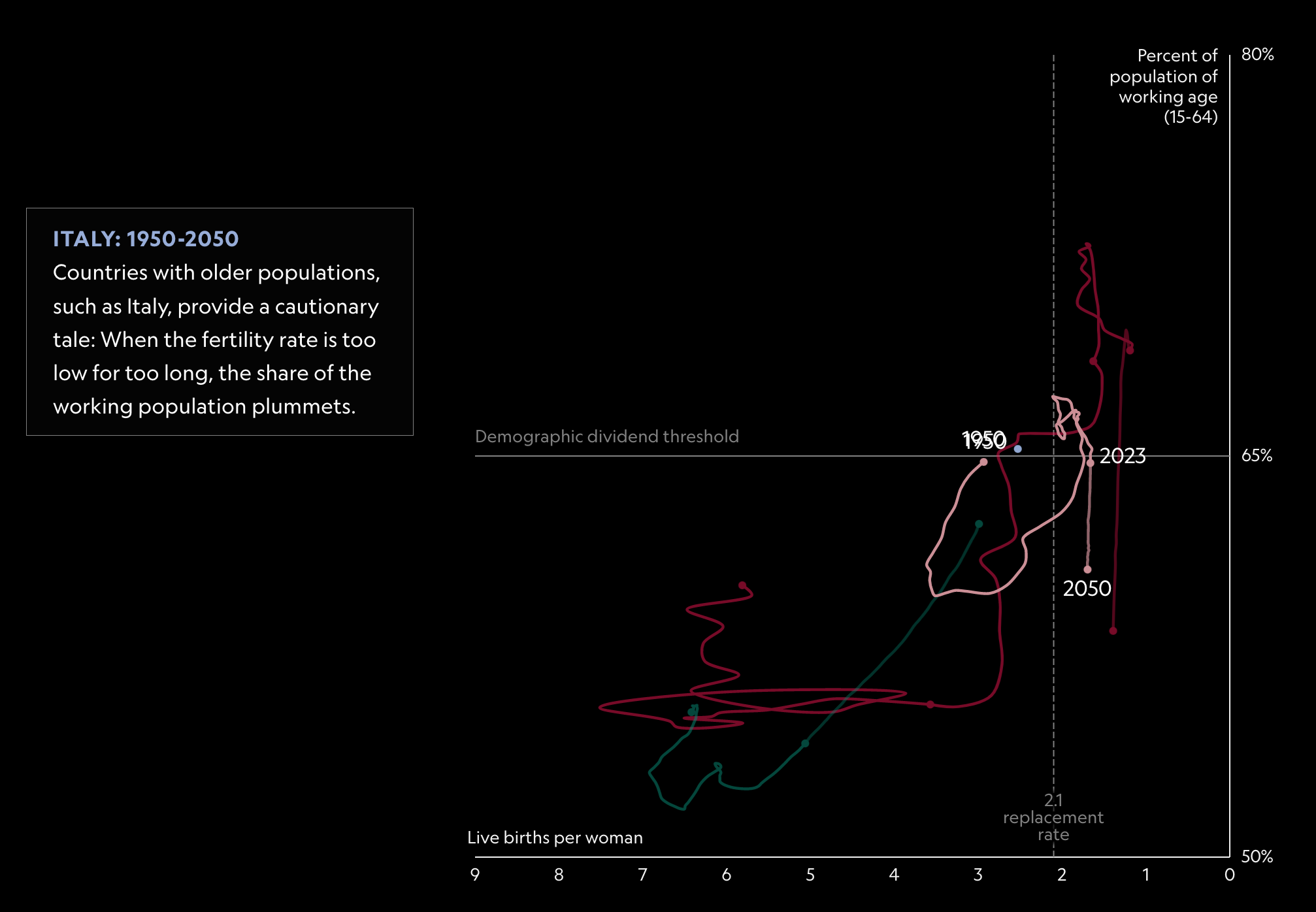
The impact of population booms and busts
“There are more people on Earth than ever, but that disguises a new reality. This century, we could hit a peak and begin to decline. Some countries will continue to grow rapidly, while others will see their numbers drop. Which countries are poised to benefit?“
Charts show UC admissions rates for every high school in California
“Here are UC admissions rates for California public and private high schools to UCLA, Berkeley and other UC campuses in 2022.”

🤖 AI
The artificially intelligent entrepreneur: ChatGPT, prompt engineering, and entrepreneurial rhetoric creation
This is an interesting academic article by Cole Short and Jeremy Short on ChatGPT and how generative models can be used to mimic the communication patterns of celebrity CEOs (e.g., Elon Musk, among others), which also discusses prompt engineering and other model-related limitations.
“We demonstrate how ChatGPT can produce and refine entrepreneurial pitches and effectively mimic the style of celebrity CEOs.“
quantum of sollazzo is supported by ProofRed’s excellent proofreading. If you need high-quality copy editing or proofreading, head to http://proofred.co.uk. Oh, they also make really good explainer videos.

Supporters* casperdcl and iterative.ai Jeff Wilson Fay Simcock Naomi Penfold
[*] this is for all $5+/months Github sponsors. If you are one of those and don’t appear here, please e-mail me