495: quantum of sollazzo
#495: quantum of sollazzo – 6 December 2022
The data newsletter by @puntofisso.

Hello, regular readers and welcome new ones :) This is Quantum of Sollazzo, the newsletter about all things data. I am Giuseppe Sollazzo, or @puntofisso. I've been sending this newsletter since 2012 to be a summary of all the articles with or about data that captured my attention over the previous week. The newsletter is and will always (well, for as long as I can keep going!) be free, but you're welcome to become a friend via the links below.
The most clicked link last week was the intriguing, animated data visualization that showed house prices in the UK in relation to real wages, from reddit.
'till next week,
Giuseppe @puntofisso
|
Become a Friend of Quantum of Sollazzo from $1/month → If you enjoy this newsletter, you can support it by becoming a GitHub Sponsor. Or you can Buy Me a Coffee. I'll send you an Open Data Rottweiler sticker. You're receiving this email because you subscribed to Quantum of Sollazzo, a weekly newsletter covering all things data, written by Giuseppe Sollazzo (@puntofisso). If you have a product or service to promote and want to support this newsletter, you can sponsor an issue. |
✨ Topical
On upward mobility
"Research shows the neighborhood you grow up in has profound impact on your future economic success."
Maps, scrollytelling, spikes chart, and more, in this article by The Pudding.

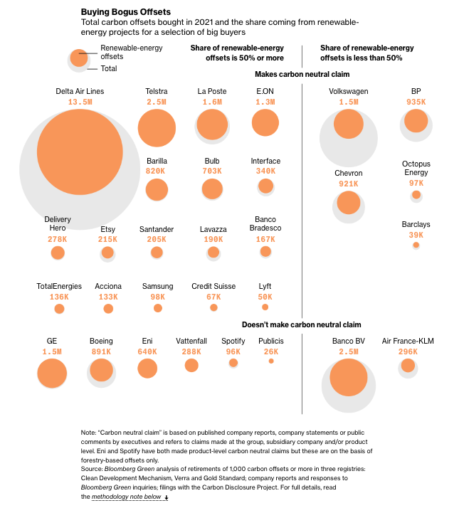
Junk Carbon Offsets Are What Make These Big Companies ‘Carbon Neutral’
Are bold claims about corporate climate offsets justified? Bloomberg takes a look.

Which states pay teachers the most and least?
From the US, where the disparity between states is massive, going from an average of $54.7k in Arizona to $78.5k in Massachusetts (adjusted for cost of living).

High-profile Republicans gain followers in first weeks of Musk’s reign
"Shift in follower counts for Elizabeth Warren, Ted Cruz show how the platform is beginning to change under Musk."
What a brilliant chart!

Women and hidden violence
A look at "violence against women and the things we (don’t) know about it".

Make your mental health a priority with BetterHelp, the affordable online platform that has connected three million people with licensed therapists
Taking care of your mental health matters, and BetterHelp is here to help you find a licensed therapist to meet your needs. Get help with anxiety, depression, grief, relationships, trauma and more without leaving home. The online platform makes it easy to schedule your first live video, phone or chat session. Plus, you'll have access to unlimited messaging with your therapist, as well as journaling tools, worksheets and group webinars. Join today and take 25 percent off your first month.
🛠️📖 Tools & Tutorials
Geeky season calendars
If you haven't seen these before, they are basically challenges that release an exercise a day, in connection with the festive season. There's a couple this year: - Advent of Code - Hanukkah of Data. Also, don't miss this AI-generated Advent Calendar.
FFmpeg - The Ultimate Guide
"This guide covers the ins and outs of FFmpeg starting with fundamental concepts and moving to media transcoding and video and audio processing providing practical examples along the way."
(Just in case it's useful: while I was reading this tutorial, I found the version of the ffmpeg command that records your camera video on a Mac OS computer:
ffmpeg -f avfoundation -framerate 30 -i "0" -target pal-vcd ./test.mpg).

The Betting Equations
A commented excerpt from the book/website The Ten Equations covers "how to load bookmakers odds in to Python and use the equation above to find a bias in the odds."
The Turing Way
The Turing Way is a "handbook to reproducible, ethical and collaborative data science. The Turing Way project is open source, open collaboration, and community-driven."
Imagator
"Compress, convert, edit and resize your images. No uploading. Files never leave your machine."
Basically, a privacy-conscious image manipulator.
New: Sticky table columns and more
Datawrapper has added this useful feature.
📈Dataviz, Data Analysis, & Interactive
NYC Trees
A soothing Tableau dashboard about the different species and where they spread in the New York neighbourhoods.

Visualising Sydney bus congestion with Marey charts
An interesting approach to visualizing bus congestion in real-time: using Marey charts, on which each line represents a bus travelling along its route. This is the blog introducing the service, which can be used live here. All the code is on GitHub.

The tiniest World Cup host ever
This look at the distance between Stadiums in host countries, by Axios, is pretty good.

quantum of sollazzo is supported by ProofRed's excellent proofreading. If you need high-quality copy editing or proofreading, head to http://proofred.co.uk. Oh, they also make really good explainer videos.

Sponsors* casperdcl and iterative.ai Jeff Wilson Fay Simcock Naomi Penfold
[*] this is for all $5+/months Github sponsors. If you are one of those and don't appear here, please e-mail me
