494: quantum of sollazzo
#494: quantum of sollazzo – 29 November 2022
The data newsletter by @puntofisso.

Hello, regular readers and welcome new ones :) This is Quantum of Sollazzo, the newsletter about all things data. I am Giuseppe Sollazzo, or @puntofisso. I’ve been sending this newsletter since 2012 to be a summary of all the articles with or about data that captured my attention over the previous week. The newsletter is and will always (well, for as long as I can keep going!) be free, but you’re welcome to become a friend via the links below.
This event at UCL might be of interest. “A Year in Data” will hear from Ben Walker, co-Founder of Britain Elects and Senior Data Journalist for the New Statesman, Olivia Vane, interactive data journalist at The Economist, Sam Joiner, Alexandra Heal, and Dan Clark, visual storytellers at the Financial Times, and James Cheshire, director of UCL Social Data Institute and cartographer extraordinaire.
The most clicked link last week was this brilliant animated visualization of the relationship between house prices and real wages.
‘till next week,
Giuseppe @puntofisso
|
Become a Friend of Quantum of Sollazzo from $1/month → If you enjoy this newsletter, you can support it by becoming a GitHub Sponsor. Or you can Buy Me a Coffee. I'll send you an Open Data Rottweiler sticker. You're receiving this email because you subscribed to Quantum of Sollazzo, a weekly newsletter covering all things data, written by Giuseppe Sollazzo (@puntofisso). If you have a product or service to promote and want to support this newsletter, you can sponsor an issue. |
✨ Topical
From 1966 to now: the evolution of World Cup football
Sorry for the (likely) paywalled article, but you know a pitch heatmap will excite me (because of a past life)

Why the Fight for the House Was Surprisingly Competitive
Interesting look at the US Midterm Election by Bloomberg.

Can you guess who will win?
“Play our AI match predictor”, by Al Jazeera on Qatar 2022, with some great interactives and breath-taking data visualizations.

What Qatar Built for the Most Expensive World Cup Ever
“In the 12 years since the tiny gas-rich country was awarded rights to the event, it has spent $300 billion preparing for kickoff. “ https://www.bloomberg.com/graphics/2022-what-qatar-built-for-the-world-cup/

La planète héberge 8 milliards d’êtres humains
Yes, the planet has gone past 8 billion people. Les Echos has an article in French, here automatically translated into English

🛠️📖 Tools & Tutorials
Planning to leave Twitter?
An Observable notebook that allows you to parse and analyse your tweets (even if you’re not leaving Twitter).
(via Duncan Geere’s newsletter)

Climate Policy Radar search engine
Climate Policy Radar have built an AI-powered search engine of climate related laws and policies. “We use natural language processing to build our intuitive search function, which automatically detects related words. This means you can easily find information relating to policy concepts - like electric vehicles or green technologies - even if they’re described in slightly different ways across the literature. You can find out more about how our natural language search works on our blog.“
A colour picker for named web colours
I’m impressed that this wasn’t really a thing. Also, see the discussion on HackerNews. Voronoi ❤️.

cheat.sh
“The only cheat sheet you need” – basically, a command line tool that accesses hundreds of cheat sheets. Well, way more than that: it’s got an NLP engine that allows you to ask for questions. Cue “cheat” during interviews…

What’s so great about functional programming anyway?
A sample chapter from the author’s new book about functional JavaScript.
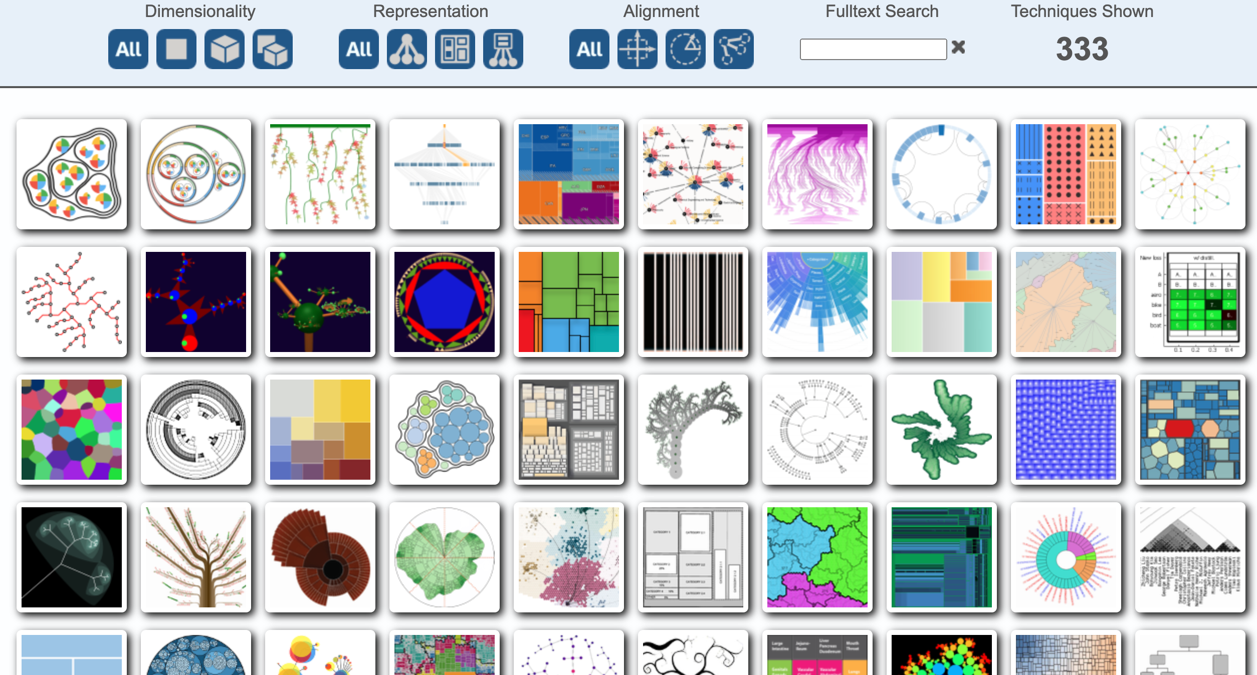
treevis.net - A Visual Bibliography of Tree Visualization 2.0 by Hans-Jörg Schulz
When you need inspiration for your next tree visualization.
Tilt your scatterplots?
Ethank Mollick reports about this paper, which “makes the argument that we should move to diamond plots instead, altering the graph & breaking the bias”. The bias being: the fact that scatterplots seem to suggest causality.
Some R code also available.


Make your mental health a priority with BetterHelp, the affordable online platform that has connected three million people with licensed therapists
Taking care of your mental health matters, and BetterHelp is here to help you find a licensed therapist to meet your needs. Get help with anxiety, depression, grief, relationships, trauma and more without leaving home. The online platform makes it easy to schedule your first live video, phone or chat session. Plus, you’ll have access to unlimited messaging with your therapist, as well as journaling tools, worksheets and group webinars. Join today and take 25 percent off your first month.
🤯 Data thinking
📈Dataviz, Data Analysis, & Interactive
Visualizing my year in music with a calendar heatmap
“I grabbed all the data from my Last.fm profile from the past year and decided to build a calendar heatmap visualizing every song that I listened to in 2022.“
Last.fm is so mid-2000s ;-)

Is cycling infrastructure in London safe and equitable? Evidence from the cycling infrastructure database
An interesting data analysis using 233,596 records in the London Cycling Infrastructure Database (CID), allegedly (according to data.london.gov.uk) “the world’s largest and most comprehensive database of cycling infrastructure”.

Macrostrat

24 Hours of Global Air Traffic
Carlos Bergillos has created this amazing interactive visualization using ADS-B Exchange data.

One Coke Please
“Three Decades of Western and Central European Retail Prices of Cocaine”, visualised on Tableau.

🤖 AI
AI art looks way too European
“DALL-E and other models keep making art that ignores traditions from the rest of the world.“
quantum of sollazzo is supported by ProofRed’s excellent proofreading. If you need high-quality copy editing or proofreading, head to http://proofred.co.uk. Oh, they also make really good explainer videos.

Sponsors* casperdcl and iterative.ai Jeff Wilson Fay Simcock Naomi Penfold
[*] this is for all $5+/months Github sponsors. If you are one of those and don’t appear here, please e-mail me