492: quantum of sollazzo
#492: quantum of sollazzo – 15 November 2022
The data newsletter by @puntofisso.

Hello, regular readers and welcome new ones :) This is Quantum of Sollazzo, the newsletter about all things data. I am Giuseppe Sollazzo, or @puntofisso. I've been sending this newsletter since 2012 to be a summary of all the articles with or about data that captured my attention over the previous week. The newsletter is and will always (well, for as long as I can keep going!) be free, but you're welcome to become a friend via the links below.
I write most of this from a relatively warm and dry Berlin. It's good to be back – I was last here before the pandemic. Forgive the slightly shorter-than-usual issue :)
The best bit of last week was The Times using my website Parli-N-Grams for one of their electoral analyses. If you are a long-standing subscriber of Quantum, you'll have heard about Parli-N-Grams before. It's a website that acquired an unlikely life of its own after I built it in just a few hours for a hackathon in 2014, then touched it very little, and it still keeps running and updating daily, using the amazing data coming from mySociety's TheyWorkForYou. This appearance in the Times is the second time it's been featured in the media , after it was used by Allegra Stratton on ITV Peston on Sunday, a feat that got yours truly named as Peston's Geek of the Week. Which reminds me, I should really refresh that tacky UI...

The most clicked link last week was the interesting Disabled Data website.
'till next week,
Giuseppe @puntofisso
|
Become a Friend of Quantum of Sollazzo from $1/month → If you enjoy this newsletter, you can support it by becoming a GitHub Sponsor. Or you can Buy Me a Coffee. I'll send you an Open Data Rottweiler sticker. You're receiving this email because you subscribed to Quantum of Sollazzo, a weekly newsletter covering all things data, written by Giuseppe Sollazzo (@puntofisso). If you have a product or service to promote and want to support this newsletter, you can sponsor an issue. |
✨ Topical
COVID-19 spreading rates
Good visualization by Jan Willem Tulp on how different countries are coping with COVID-19 and how those figures add up to the total.
(via Massimo Conte)

POLITICO: 2022 Elections
POLITICO's election tracker.

Out-of-State Money Is Flooding Midterm Races — and Drowning Out Local Issues
"Nearly two-thirds of donations to US Senate candidates in this election cycle have come from out-of-state contributors instead of from possible constituents, reflecting an intense political tribalism in which control of Congress is prioritized over local issues."

Beautiful Public Data
"A curated selection of visually interesting datasets collected by local, state and federal government agencies. By Jon Keegan."
I love curation for this sort of thing.
(via Lucilla Piccari)

What are the current swing states, and how have they changed over time?
"Seven states were won by less than 3 percentage points in the 2020 presidential election."

🛠️📖 Tools & Tutorials
Visual Vocabulary
I've seen this from the Financial Times before, in poster form. Now it is also available as an interactive.

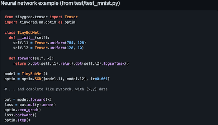
tinygrad
"For something in between a pytorch and a karpathy/micrograd. This may not be the best deep learning framework, but it is a deep learning framework."
Basically, an extremely simple ML framework, below 1000 lines of code in total, but with good capabilities.

Raster4ML: A geospatial raster processing library for machine learning
"Raster4ML is a python package that extracts machine learning ready dataset from geospatial raster data and shapefiles. The package aims to aid geospatial researchers and scientists to extract meaningful features easily and focus more on the model training or reproducibility issues."
Introduction to Genomics for Engineers
An online book for those of you who might want to work in genomics or genetic analysis, starting with biological foundations, and learning concepts such as genomic variation, sequencing, and more.
Your First Data Visualization With Svelte & D3
A YouTube course by Connor Rothschild.
Command-line data analytics made easy
A tutorial by Daniel C. Moura using SPyQL, a Python library.

Showcase your work with a .ART domain
Stand out in the creative community with .ART, the art world's favorite domain. Unlike other domain sites, with .ART, you establish your presence as a creative pro with your URL alone, and attract new audiences with .ART's complimentary web tools.
📈Dataviz, Data Analysis, & Interactive
AirBnB Datamodeling
A gap on the map: How busy are the rails?
Inga from Datawrapper explains her, erm, train of thought in the development of a rail transit frequency map of Berlin.

🤖 AI
What types of local news stories should be automated? The Toronto Star is figuring it out
"In the case of break-and-enter stories, “everybody recognized that a poor execution of the idea would be a problem.”"
Thoughts on automated stories by Hanaa' Tameez at Nieman Lab.
quantum of sollazzo is supported by ProofRed's excellent proofreading. If you need high-quality copy editing or proofreading, head to http://proofred.co.uk. Oh, they also make really good explainer videos.

Sponsors* casperdcl and iterative.ai Jeff Wilson Fay Simcock Naomi Penfold
[*] this is for all $5+/months Github sponsors. If you are one of those and don't appear here, please e-mail me
