489: quantum of sollazzo
#489: quantum of sollazzo – 25 October 2022
The data newsletter by @puntofisso.

Hello, regular readers and welcome new ones :) This is Quantum of Sollazzo, the newsletter about all things data. I am Giuseppe Sollazzo, or @puntofisso. I’ve been sending this newsletter since 2012 to be a summary of all the articles with or about data that captured my attention over the previous week. The newsletter is and will always (well, for as long as I can keep going!) be free, but you’re welcome to become a friend via the links below.
The most clicked link last week was The Good Country Index.
Our friends at Connected by Data, Jeni Tennison’s new initiative, are recruiting. They are looking for a Policy and Campaigns Associate and a Research Associate. Jeni and her team are a great bunch to work with, and they are working on a worthy mission for better data governance. All details are here.
‘till next week,
Giuseppe @puntofisso
|
Become a Friend of Quantum of Sollazzo from $1 a month. That's less than one coffee a month. → If you enjoy this newsletter, you can support it by becoming a GitHub Sponsor. Or you can Buy Me a Coffee. I'll send you an Open Data Rottweiler sticker. You're receiving this email because you subscribed to Quantum of Sollazzo, a weekly newsletter covering all things data, written by Giuseppe Sollazzo (@puntofisso). If you have a product or service to promote and want to support this newsletter, you can sponsor an issue. |
Topical
Coastal Risk Screening Tool
“An interactive map showing areas threatened by sea level rise and coastal flooding. Combining the most advanced global model of coastal elevations with the latest projections for future flood levels.“
The map below shows what 50cm of water rise would do to the Netherlands; it takes much less to get similar results. Scary.

Deaths in England & Wales from drug poisoning (in red) and alcohol-specific causes (in blue)…
”…have different age profiles, but rates of both have risen sharply in the last few years, particularly in people in their 40s-60s.”
Great stuff again by the many times featured Colin Angus, with all R code released here.

Here’s why Halloween is the deadliest day of the year for child pedestrians
“Children are three times more likely to be fatally injured by a car on the holiday, and the risk grows to 10 times for kids 4 to 8.“
It’s not hard to see why, and with my public servant hat on I wonder if traffic policies should be adapted to recognise this.

How close is the race between Jair Bolsonaro and Luiz Inácio Lula da Silva?
“The Economist’s poll-of-polls for Brazil’s presidential election.“

Can Democrats Win 52 Senate Seats And Kill The Filibuster?
I like this analysis by FiveThirtyEight predominantly for its final sentence: “The probability is roughly the same as flipping a coin twice and getting heads both times — it wouldn’t be shocking, but you shouldn’t count on it either.”.

Tools & Tutorials
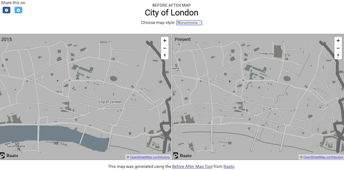
Generate before-after maps with ease
By Nepal-based Baato, this tool is mostly aimed at checking contributions to Open Street Map, but it might end up with other use cases.
(h/t Ed Freyfogle)
How the Guardian approaches quote extraction with NLP
Interesting write-up about The Guardian’s data scientist Anna Vissens, who focuses a lot on the human-in-the-loop in AI applications. She writes: “…a push towards automating reusable content may incur significant reputational risks for media companies.“
(Disclaimer: this might be a little on the marketing side, but I think it provides some good overall insight into the NLP process.)

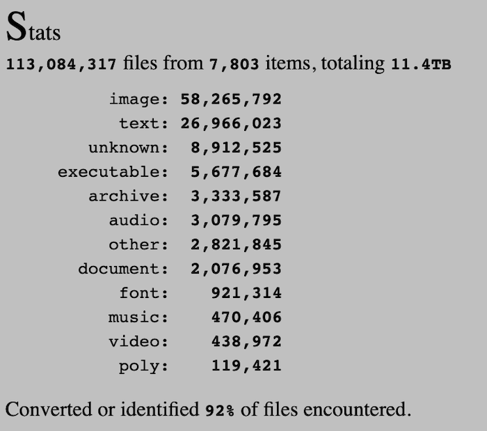
Lost something? Search through 91.7 million files from the ’80s, ’90s, and 2000s
I’m linking to this write-up by Ars Technica just because it explains it very well – “Discmaster lets you sift through 11 terabytes of CD-ROM and floppy disk archives.“

Which programming language is fastest?
“Let’s go measure … benchmark programs!“. Increasingly, we’re seeing bloggers like this one say that languages are more or less environmentally friendly. I’m unsure, to be honest, if it’s that simple, and how to ultimately factor in the translation into assembly.
(via Massimo Conte)
Hello Transformers from R
This website is “an exploratory coding blog post (for now) on how to leverage some of the libraries in the Hugging Face Ecosystem from R“

Become smarter with this free newsletter
Life hack: hear about the latest business and tech news before anyone else by reading Morning Brew. Never boring, expect smart and witty reporting that makes consuming the news more enjoyable. Plus, it’s free and takes only five minutes to read.
Data thinking
People gain 15 IQ points when defending their views against contrary evidence
Daniel Kahneman has given this lecture about adversarial collaboration. It turns out that people become more intelligent (or rather that the highly debatable proxy measure that is IQ improves) when debating.
“Within minutes of seeing the results, Anne would find a plausible explanation of why they were entirely compatible with her view. Anne was always very clever, but at those moments she would become quite extraordinary, able to come up with arguments that surprised and silenced me. Then I would go back to the drawing board, design another experiment, and it would all happen again. I was the aggressor in those games until Anne became exasperated and designed a critical test of my view. I agreed to the challenge. The results came in as Anne had expected, but it was my turn to get my 15 points, and I rejected the rejection of my theory. That was the end of that particular game.“
Mind-boggling.
Dataviz, Data Analysis, & Interactive
America’s midterm map
An interactive website by USA Facts, showing how voting community boundaries vary in size.

Low Earth Orbit Visualization
This website tracks objects in Low Earth Orbit.
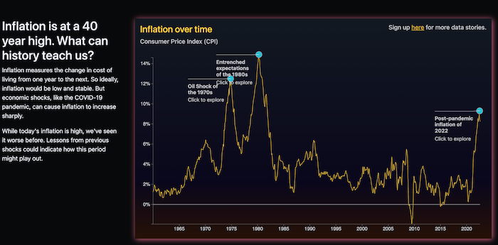
Inflation is at a 40 year high. What can history teach us?
A simple look at inflation.
Ailing Brussels
“Portrait of a city where inequalities operate in a vicious circle”. A look at how low incomes, poor health, and pollution, reinforce each other and make Brussels an extremely problematic area.
Those maps are awesome.

AI
In the last couple of days I’ve started to think more freely…
“…about how large language models such as GPT-3 might help users of our Climate Policy Radar tool better navigate the world of climate policy.“
Data scientist Kalyan Dutia reports in this Twitter thread
quantum of sollazzo is supported by ProofRed’s excellent proofreading. If you need high-quality copy editing or proofreading, head to http://proofred.co.uk. Oh, they also make really good explainer videos.

Sponsors* casperdcl and iterative.ai Jeff Wilson Fay Simcock Naomi Penfold
[*] this is for all $5+/months Github sponsors. If you are one of those and don’t appear here, please e-mail me