487: quantum of sollazzo
#487: quantum of sollazzo – 11 October 2022
The data newsletter by @puntofisso.

Hello, regular readers and welcome new ones :) This is Quantum of Sollazzo, the newsletter about all things data. I am Giuseppe Sollazzo, or @puntofisso. I've been sending this newsletter since 2012 to be a summary of all the articles with or about data that captured my attention over the previous week. The newsletter is and will always (well, for as long as I can keep going!) be free, but you're welcome to become a friend via the links below.
I skipped last week's newsletter as I was away, so this one is a bit of a double whopper. There are some important bits of news, including the launch of Topi Tjukanov's 30-day Map Challenge 2022. For full explanations of the categories and what to do, head to Topi's website.

I saw this thing below while I was on holidays, which is a brilliant idea: dataviz applied to nudge theory. Because, why not? It turns out it's called Ballot Bin and is made by a British company.

Speaking about unhealthy dataviz, Luigi Marattin, an Italian member of the Chamber of Deputies, tweeted the chart below to support his case that regions in the South voted for the Five Star Movements because they somewhat support their welfare payments system.
Of course, without even considering the stupidity of the argument, the chart is wrong on all possible levels: it's the wrong type of chart for what he wants to display, the absolute number of votes on the y-axis is wrong, the fact that the scale represents two domains (votes and recipients of welfare) is bonkers, and the x-axis is not a linear quantity (it's the list of regions, and actually not even all of them).

We can laugh about this, I suppose, and it's not an isolated case. But the fact that a leading politician from a relatively moderate party is using bad charts to support an argument, without even realising why the chart is bad, is not a nice thing to wake up to.
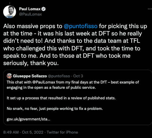
However, there was something nice to wake up to. The Department for Transport issued a revision of some statistics that they had published between 2009 and 2019. The reason why I say this is nice, is that I played a little part in this revision: when I was about to leave the DfT, Paul Lomax tweeted me via a common contact that he had some troubles interpreting the data. I engaged, heard what he had to say, saw that there were some potential reasons, and didn't hesitate to link him up with my then colleagues in the right Stats team, who took it on board.

That this Twitter chat led to improvements in national statistics matters to me because it vindicates what I've tried to argue for years: that openness, transparency, and engagement without fear should be embraced by Government officials and that Comms departments that try to reduce the occurrence of this are wrong, because the fallback of not being open is potentially much worse.
Some people asked me if this means that I agree with the reason that led people to complain and/or to rejoice: the fact that, apparently, the wrong figures were used to back the Low-Traffic Neighbourhoods policy. I broadly support LTNs, but that's not an excuse to accept bad numbers: openness and good evidence should always trump your own political agenda. Maybe that's why I quit party politics a long time ago.
Moreover, it isn't true that LTNs are somewhat disproven by the stats. As James Gleave explains excellently in his newsletter: "The case for LTNs depends on local circumstances, and should use local data collection to demonstrate the case. I would not trust any authority using DfT estimates to make the case for such schemes. Secondly, it also means the benefits of road capacity enhancements that benefit roads are also over-estimated. Understand what the data and changes to the method mean first, before deciding on whether it helps your cause."
The most clicked link last week was John Burn-Murdoch's excellent thread on income inequality.
'till next week,
Giuseppe @puntofisso
|
Become a Friend of Quantum of Sollazzo from $1/month → If you enjoy this newsletter, you can support it by becoming a GitHub Sponsor. Or you can Buy Me a Coffee. I'll send you an Open Data Rottweiler sticker. You're receiving this email because you subscribed to Quantum of Sollazzo, a weekly newsletter covering all things data, written by Giuseppe Sollazzo (@puntofisso). If you have a product or service to promote and want to support this newsletter, you can sponsor an issue. |
Topical
Senate What If
NBC News has created this brilliant interactive. Joe Murphy, one of its designers, says it is intended "to help readers game out what might happen in the U.S. Senate this midterm", with perspectives from Steve Kornack and Chuck Todd. Joe also says that a lot of work went into making sure that the interactive is accessible, with extensive user testing on assistive devices. A brilliant example of user-driven data journalism.

The Republicans are slightly favoured to gain a majority in the House
And this one is from The Economist: "Each day, we run 10,000 simulated elections based on polling, demography, fundraising and historical results. These statistics reflect the outcomes of those simulated elections."

Il voto strada per strada
The vote street by street in some big cities in the recent Italian General Election. From what I understand, it's a statistical projection, but it's relatively accurate because data from each ward is available at a relatively granular level.

Days Since Incident
A set of counters of days since the last earthquake, interplanetary shock, class X1 Solar Flare, etc, all the way up extinction-level events such as the Teraton Asteroid Impact. Gloomy.

New York City’s Empty Offices Reveal a Global Property Dilemma
"The rise of remote work will hurt older buildings, leaving landlords in the lurch", Bloomberg reports.

Search interest in abortion falls as the border rises
"Americans' Google searches and story interactions around crime and immigration are eclipsing abortion and the FBI search of Mar-a-Lago, according to the Axios midterms dashboard powered by Google Trends, as well as new data from NewsWhip."
Keep an eye on the midterms dashboard itself.

Since 1310 bond yields have fallen with metronomic regularity
"They are projected to drop below zero for good in 2066", says the Economist's bold extrapolation.

Creating spaces for dialogue
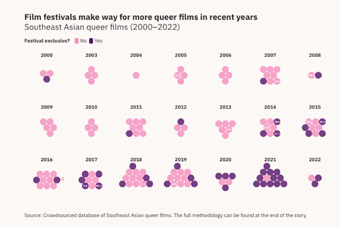
"Exploring queer cinema in Southeast Asia", by Kontinentalist.

Tools & Tutorials
Local Authority GIS data for Great Britain
Six Questions graduate and overall GIS legend Alasdair Rae has released a big new batch of local GIS open data resources for Great Britain, based on OS and ONS open data. You can download the data here on his website or read his Twitter thread where he links to the data individually.

=IMPORTFROMWEB()
A useful Google Sheet formula to scrape web data into Google Sheets.
NN-SVG
A tool and its source code to create publication-ready neural network architecture schematics and export it as a SVG graphic.

Radix Colors
Radix Colors self-describes as "A gorgeous, accessible color system" and it pretty much is. It is an open-source color system.

Parsr
Parsr extracts information from PDF, Documents and Images into Enriched Structured Data.
If someone gives you a CSV file with 100,000 rows in it...
"...what tools do you use to start exploring and understanding that data?", asks Simon Willison on Twitter, receiving some fantastic answers and following up with 1,000,000, 10,000,000, and 1,000,000,000 rows.
How to Build a Personal Webpage from Scratch
Just in case you wanted to build a completely static webpage.

How to generate Google StreetView URLs, for a given UPRN, that point in the direction of the property
A hat trick by that other data legend that is John Murray: "PostGIS get closest point on corresponding USRN, use this as viewpoint and compute the bearing."
A tool to run caption extraction against online videos using Whisper and GitHub Issues/Actions
This tool/process was created by Simon Willison for the Bellingcat Hackathon.
Miller
"Miller is like awk, sed, cut, join, and sort for name-indexed data such as CSV, TSV, and tabular JSON.
With Miller, you get to use named fields without needing to count positional indices, using familiar formats such as CSV, TSV, JSON, JSON Lines, and positionally-indexed. Then, on the fly, you can add new fields which are functions of existing fields, drop fields, sort, aggregate statistically, pretty-print, and more."
K-Means Clustering

Build a searchable repo of Data Science resources from Twitter
A tutorial where the author shows how he built a Twitter collection tool that created his interactive, online Shiny document with links out to ~500 data science resources.
Explore the world like a local with Babbel
Going on vacation is great, but exploring the world like a local is even better. Not speaking the language is no longer an excuse: with Babbel, you can learn to speak a new language in just three weeks. The language learning platform offers 10-minute lessons designed by real language experts, focused on conversational skills in 14 languages. Subscribers also have access to accent-perfecting speech recognition technology, live online classes, games, and more to help you build confidence before you board your flight. Sign up today to get up to 55 percent off your subscription.
Data thinking
What would Florence Nightingale make of big data?
"Florence Nightingale on big data. It's not as random as it sounds. Statistician David Spiegelhalter looks at a little-known side to her."
A short radio show
(via Alessandro)
Random cool thing I noticed this morning
Not me, but that brilliant genius (and Six Questions graduate) of Colin Angus: "The way you can spot beaches (in places with large tidal ranges) on Strava's global running heatmap by the nice colour gradient."

‘Very Harmful’ Lack of Data Blunts U.S. Response to Outbreaks
"Major data gaps, the result of decades of underinvestment in public health, have undercut the government response to the coronavirus and now to monkeypox", reports the New York Times.
Cutting the Bunk: Comparing the Solo and Aggregate Effects of Prebunking and Debunking Covid-19 Vaccine Misinformation
ACADEMIC PAPER KLAXON.
Here's the abstract: "An online experiment among a nationally representative YouGov sample of unvaccinated U.S. adults (N = 540) leverages inoculation theory as a preliminary step in uniting the prebunking and debunking literature. By testing how prior attitudes toward Covid-19 vaccines interact with varying message interventions, the study finds that specific inoculation messages protect against misinformation, but only among those with preexisting healthy attitudes. Generic inoculation messages have wider application, offering both prophylactic and therapeutic benefits. However, the therapeutic benefits of generic inoculations disappear when debunking messages are present. Nonetheless, generic inoculations do not appear to have detrimental effects on those infected with unhealthy attitudes, unlike specific inoculation messages. Whether the messages are truly a form of inoculation by generating threat merits further research."
Forrester changed the way they think about data catalogs, and here’s what you need to know
"The latest sign of a major shift in how we think about metadata", according to Six Questions graduate Prukalpa Sankar. There is a changing landscape in metadata management, as reported by Forrester, and Prukalpa takes a look at it.
Seeing the data science work all around us
"What does an architect see when they look at any building or space? What does a chef think when they are served food from another chef? What goes through a craftsperson’s mind when they see an example of their craft?"
So, what does a data scientist see when they see the world?
Why “Go Nuts, Show Nuts” Doesn’t Work in 2022
"For those who don’t know or remember, Tumblr used to have a policy around porn that was literally “Go nuts, show nuts. Whatever.” That was memorable and hilarious, and for many people, Tumblr both hosted and helped with the discovery of a unique type of adult content."
Then things, controversially, changed. I'm not sure which side of this fence I sit, but I see why it's complicated. Our thinking on ethics has evolved. In this blog post, Automattic CEO Matt Mullenweg, who now runs Tumblr, explains his reasons on why that "Go Nuts, Show Nuts" policy is no longer viable.
Dataviz, Data Analysis, & Interactive
PRIVACY SCOOP: How ANYONE can track your car using only your license plate: a thread!
NotMyPlate is a website showing "How Parking Applications Affect Your Privacy... Even If You Don't Use Them."
A Twitter thread and whitepaper where the authors show that "in a study conducted between June and September 2022, we tracked down cars of 120 volunteering participants solely by using parking applications."
(h/t Barry Tennison)
New report calls out U.S. media for lack of Latino representation
"Latinos continue to be significantly underrepresented in U.S. films and TV series, despite the fact that the group represents nearly one-fifth (20%) of the total U.S. population and $2.8 trillion in total economic output," Axios reports.

A Twitter list of datavis/data journalism studios worldwide
Data journalist Karthik Muthuswamy is creating this useful list. He accepts contributions.
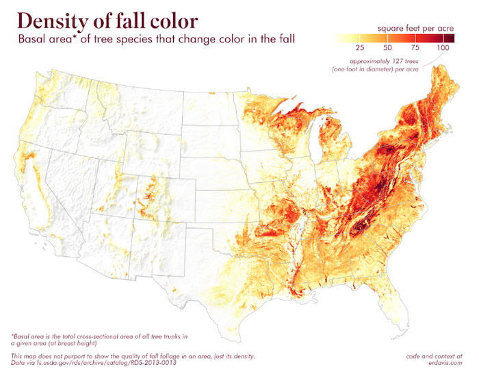
Where is there the most fall color?
Six Questions graduate Erin Davis does some pretty cool wrangling of the basal areas of more than 300 tree species with a 250 meter resolution dataset. As usual, with all the R source code released.

AI
I fed the lyrics to "Imagine" into an AI and had it come up with new verses, imagining the absence of more mundane things
Be careful with this Twitter thread, I ended up laughing out loud in public.

Misuse of PCA
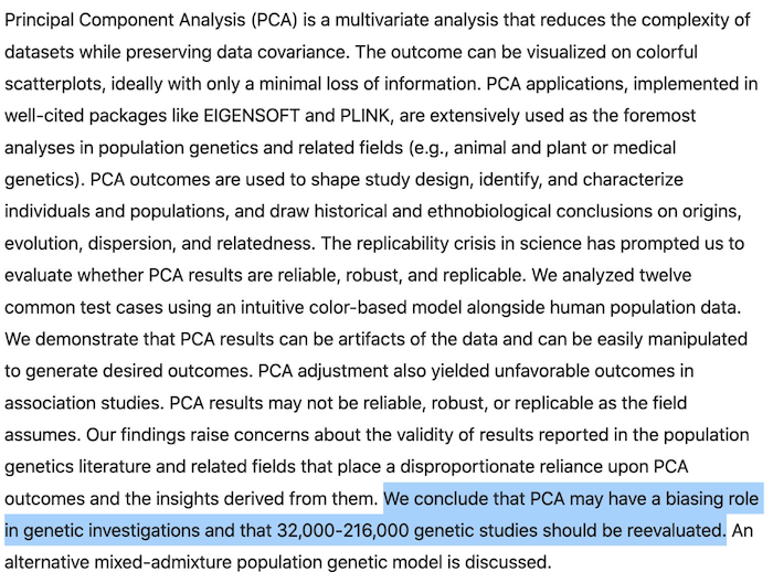
This will make you laugh less. Prof Arvind Narayanan reports on what he rightly describes as "the most depressing sentence" he's ever read in an abstract. PCA might have a biasing role in genetic investigations, which points to researchers using tools they don't fully understand.

quantum of sollazzo is supported by ProofRed's excellent proofreading. If you need high-quality copy editing or proofreading, head to http://proofred.co.uk. Oh, they also make really good explainer videos.

Sponsors* casperdcl and iterative.ai Jeff Wilson Fay Simcock Naomi Penfold
[*] this is for all $5+/months Github sponsors. If you are one of those and don't appear here, please e-mail me
