485: quantum of sollazzo
#485: quantum of sollazzo – 20 September2022
The data newsletter by @puntofisso.

Hello, regular readers and welcome new ones :) This is Quantum of Sollazzo, the newsletter about all things data. I am Giuseppe Sollazzo, or @puntofisso. I’ve been sending this newsletter since 2012 to be a summary of all the articles with or about data that captured my attention over the previous week. The newsletter is and will always (well, for as long as I can keep going!) be free, but you’re welcome to become a friend via the links below.
I managed to survive my road-trip of Sicily, despite not one but two car breakdowns in 24 hours. That didn’t take away from the adventure, and I now know how to replace a tyre, skill I truly hope I won’t need ever again.
The most clicked link last week was MoveMap. A few of you asked whether we could do something like this for the UK. I suspect that the area is too small for some of the differences to be meaningful, but maybe at a European level? Not sure.
That also prompts me to ask a question: is there any other way you’d like to engage with one another? I tried setting up a subreddit for Quantum of Sollazzo, but it never caught on. Any suggestions would be welcome, as are general ideas on how to make the newsletter better.
Last week I attended Journocoders, one of my favourite meetups. We had a great session on how to use Sentinel-2 images and I managed to animate a visualisation of the Etna eruption of 2022 using false colours.

‘till next week,
Giuseppe @puntofisso
|
Become a Friend of Quantum of Sollazzo → If you enjoy this newsletter, you can support it by becoming a GitHub Sponsor. Or you can Buy Me a Coffee. I'll send you an Open Data Rottweiler sticker. You're receiving this email because you subscribed to Quantum of Sollazzo, a weekly newsletter covering all things data, written by Giuseppe Sollazzo (@puntofisso). If you have a product or service to promote and want to support this newsletter, you can sponsor an issue. |
Topical
We want you to build on our local climate data. Tell us what you need!
mySociety’s Alex Parsons has just published a blog post about climate/local gov data. The list of available data is pretty impressive and they are keen to chat to anyone who might find their data useful, or who would like to use it and don’t know how.

60 Percent Of Americans Will Have An Election Denier On The Ballot This Fall
“FiveThirtyEight drew on news reports, debate footage, campaign materials and social media and reached out to every single Republican nominee for the House, Senate, governor, secretary of state and attorney general to determine their position on the 2020 election.“

Carbon.place
A wealth of different data powers this incredible website by ITS Leeds academic Dr Malcolm Morgan. Carbon.place is “a free tool which estimates the per-person carbon footprint for every Lower Super Output Area (LSOA) in England.“

The World Has More Trees Than It Did 35 Years Ago
“Worldwide tree cover has grown by 2.24 million square kilometers — the size of Texas and Alaska combined — in the last 35 years, according to a paper in the science journal “Nature.”“
Some good news (hopefully).

Media nations: UK 2022
UK regulator Ofcom has published its 2022 report, showing key media trends. It’s also presented as an interactive Power BI.
(via Peter Daniel Wood)

Wikipedia edits about The Queen’s death
A good thread by @depthsofwiki.
(via Lucilla Piccari)

Tools & Tutorials
Splink
Splink is a open source library from the Ministry of Justice for probabilistic record linkage at scale which is gaining adoption in UK Government and beyond(https://t.co/itJn3qPqiM). This is a Python library for fast, accurate, and scalable probabilistic data linkage using a variety of SQL backends. Splink has had 3m+ downloads and users in OGDs, academia and the private sector.

7 tips to make your data analysis more robust
Ethics for Journalists
Great set of resources by the Society of Professional Journalists’ toolbox.
Python Data Viz Cookbook
A handy tool to play with chart creation online using Pandas, Matplotlib, Seaborn, and Plotly Express.

Don’t impute all missing data: Missing Data Patterns
“A missing data pattern is the structure of observed and missing values in a data set. This is not to be confused with a missing data mechanism, which describes possible relationships between data and one’s propensity for missing values. Patterns describe where the gaps in the data are, whereas mechanisms explain why the values are missing.“
JSON Crack
“Seamlessly visualize your JSON data instantly into graphs.“

BBC Visual and Data Journalism cookbook for R graphics
A guide on how to create BBC style graphics in R.

Check out PostApex
PostApex is the premium email advertising platform that lets you reach over 100 million readers across the world. You can discover email.
Data thinking
Want a DS project? There’s health insurance data out there
“And no (public) resources for working with the data yet”. A lot has been said about this release of several hundreds of TeraBytes of price data – a great resource, or obfuscation-by-overwhelm? – and this blog post has a good set of tech thoughts.
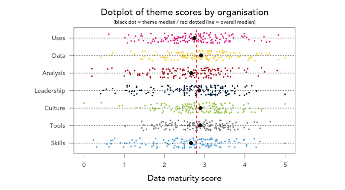
Data maturity in the not-for-profit sector, 2021 report
Very interesting report by charity data legends Data Orchard.

Dataviz, Data Analysis, & Interactive
Remove NA
“A knowledge graph about queer history“ by Katharina Brunner.

Data dive: How we name babies
Nice dataviz by Axios. They have also looked at How hurricanes wreck baby names.

sólarsteinn
A text-only Google Maps instance.
(via Naive Weekly, one of my favourite non-data newsletters)

QR codes
“Ever wondered how a QR code works?“
A Twitter thread and article on this super nerdy but fascinating topic.

How far can you go by train in 5h?
Not sure how I missed this but it’s pretty cool for those who wish to travel by train through Europe.
(via Nicola del Monaco)

Marvel Cinematic Network
“Explore the Marvel Cinematic Universe like never before!“.
“Each main character and actor is connected to the movies they appear in, allowing you to see the connections between your favorite Marvel heroes (or villains). Of course, if you haven’t seen the movie, spoiler ahead!“

Climate Visuals
CC-BY visuals by Professor Ed Hawkins, including the famous “Global Warming Stripes”.

Animated sport results
A summary of animated dataviz that designer Krisztina Szucs created for UEFA Euro 2020, with many interesting ideas discussed.

AI
Loab
You might have seen the series of tweets and articles about Loab, the creepy face that keeps appearing in images produced by an AI model, which also seems to “infect” any image that gets mixed with it.
I found this visualization by Prof James Teo rather good at understanding conceptually what’s happening: “Here is an example of a UMAP of a latent space. If there is a cluster apart from the main cluster of pretty art, then a negative prompt from most embeddings in the main cluster will decode to embeddings in the purple cluster.”

The Follower
“Using open cameras and AI to find how an Instagram photo is taken.“. I won’t ask if this is legal…
Something else
Hung up
Song Exploder is one of my favourite non-tech podcasts. In each episode, they pretty much eviscerate a song. Episode 239 interviews Madonna and producer Stuart Price on their famous hit “Hung up”, which I had always considered a blasphemous appropriation of ABBA… but there’s actually quite a lot to it :)
quantum of sollazzo is supported by ProofRed’s excellent proofreading. If you need high-quality copy editing or proofreading, head to http://proofred.co.uk. Oh, they also make really good explainer videos.

Sponsors* casperdcl and iterative.ai Jeff Wilson Fay Simcock Naomi Penfold
[*] this is for all $5+/months Github sponsors. If you are one of those and don’t appear here, please e-mail me
