478: quantum of sollazzo
#478: quantum of sollazzo – 26 July 2022
The data newsletter by @puntofisso.

Hello, regular readers and welcome new ones :) This is Quantum of Sollazzo, the newsletter about all things data. I am Giuseppe Sollazzo, or @puntofisso. I’ve been sending this newsletter since 2012 to be a summary of all the articles with or about data that captured my attention over the previous week. The newsletter is and will always (well, for as long as I can keep going!) be free, but you’re welcome to become a friend via the links below.
EU Twinnings, my good old hack from the EU Datathon 2020, became the subject of a data story on data.europa.eu. I’m happy about this. The idea behind EU Twinnings was this: can we create a measure of similarity between different areas? Eurostat data was quite handy, as it is relatively granular. There is quite a bit of missing data to complicate things, but the idea is a proof-of-concept that broadly works. In the past year or so my weekends have mostly been occupied by improving it thanks to a little commission that I gained from the EU Publications Office, but the concept is all there to be expanded upon, so any feedback is welcome. EU Twinnings is live here.

Every week I include a six-question interview with an inspiring data person. This week, I speak with Isaia Invernizzi of il Post. Isaia is a journalist who pioneered the use of data in local news, particularly getting his newspaper “L’Eco di Bergamo” to use data to cover the early, tragic phase of the COVID-19 pandemic in Lombardia. He’s now with the “Il Post” newspaper, which has a strong evidence-based ethos. Oh, and I shared a live discussion about data with Isaia on Italian national radio :)
The most clicked link last week, rather aptly given the heatwave, was this article from Bloomberg on how climate is pushing boundaries that are now beyond survivability for humans. Gloomy.
‘till next week,
Giuseppe @puntofisso
|
Become a Friend of Quantum of Sollazzo → If you enjoy this newsletter, you can support it by becoming a GitHub Sponsor. Or you can Buy Me a Coffee. I'll send you an Open Data Rottweiler sticker. You're receiving this email because you subscribed to Quantum of Sollazzo, a weekly newsletter covering all things data, written by Giuseppe Sollazzo (@puntofisso). If you have a product or service to promote and want to support this newsletter, you can sponsor an issue. |
Six questions to...
Isaia Invernizzi

Topical
London Is Set to Bake in 40-Degree Heat. Get Used to It
“Four charts show how more frequent heat waves in Britain are putting people at risk.“
Folks, we’ve got to do something about the climate and soon. Assuming it’s not too late already.

What’s the state of Southeast Asian sci-fi?
I found this article by Kontinentalist incredibly interesting because it starts from a question about something I now realise I had “felt” but never rationally thought about: sci-fi often presents urban futures that look Asian, but where there aren’t many Asian characters.

Covid-19 vaccines saved an estimated 20m lives during their first year
“Their impact in poor countries depends on how effectively governments prioritised recipients”. One of those great, clear charts and analysis from The Economist. (via Soph’s newsletter)

Who will be Britain’s next prime minister?
“Follow the contest between Liz Truss and Rishi Sunak with our interactive tracker”.

What’s Behind Biden’s Record-Low Approval Rating?
“After entering office, most recent presidents see a decline in their approval ratings, but since Biden’s numbers peaked at 55 percent in March 2021, they have moved in only one direction: down.“
FiveThirtyEight looks at the current president’s ratings.

‘Are the police capable of changing?’: Data on racial profiling in California shows the problem is only getting worse
The San Francisco Chronicle looks at stop-and-search data.

Tools & Tutorials
Project Naptha
An AI-driven Chrome extension to “highlight, copy, and translate text from any image”.
jupyter-scatter
Jupyter-scatter is an “interactive 2D scatter plot widget for Jupyter Lab and Notebook. Scales to millions of points!“

Clean up photos
“Remove unwanted objects from photos simply by dragging boxes.“
AI is useful for some things, then.

Social Bearing
This is a website that can extract “insights & analytics for tweets & timelines” for free. I’ve tried and it seems to work, but you’ll have to assess whether the information is useful.
Tidy Finance with R
“This website is the online version of Tidy Finance with R, a book currently under development and intended for eventual print release via Chapman & Hall/CRC. The book is the result of a joint effort of Christoph Scheuch, Stefan Voigt, and Patrick Weiss.“
Themes in the book are the classic parsing of financial data, asset pricing, modelling (including using machine learning), portfolio optimisation, etc.
Export comments
This tool will allow you to download all comments from a social media post to an Excel file.
 We found the best JavaScript newsletter.
Bytes is probably the funniest web dev newsletter you’ll ever read (trust me). If you like our newsletter, I’ve got a feeling you’ll love Bytes too. There’s a reason 100k developers read it every week.
Data thinking
Coming up with research ideas
I’m cheating, as this article is not quite about data but about research in general. But the points it makes are easily adaptable to your next data project.
Measuring Gender Inclusion
“To reduce the barriers women-led businesses face in public procurement markets, we need to be able to identify women-led businesses and understand to what extent they are bidding on and winning government contracts. This includes an understanding of both the number and the value of the contracts, as well as their sector. We can take these measurements as a baseline and then implement measures with the goal of improving these metrics over time.“
My friends at SpendNetwork are doing some stellar work on highlighting data issues.
Dataviz, Data Analysis, & Interactive
The Rosetta Stone
Photogrammetry is great. Here’s a 3D model of the stone, originally created by the amazing Daniel Pett for the British Museum.

Ahmad Barclay on new census viz tool
Great Twitter thread by Six Questions graduate and ONS dataviz guru Ahmad Barclay, presenting his census population profile tool.

National Grid: Live Status
“The National Grid is Great Britain’s electricity transmission network, distributing the electrical power generated in England, Scotland, and Wales, and transferring energy between Great Britain and Ireland, France, the Netherlands, Belgium, and Norway. Most data comes from the Balancing Mechanism Reporting System and is updated at five minute intervals. Solar data comes from Sheffield Solar and is updated at half hour intervals.“
An energy dashboard.
(via Fabio Bertone)

How to do Twitter Network Analysis and Visualization in R
“*Using an example Twitter network of British politicians, learn how to do fascinating network analysis and visualization.

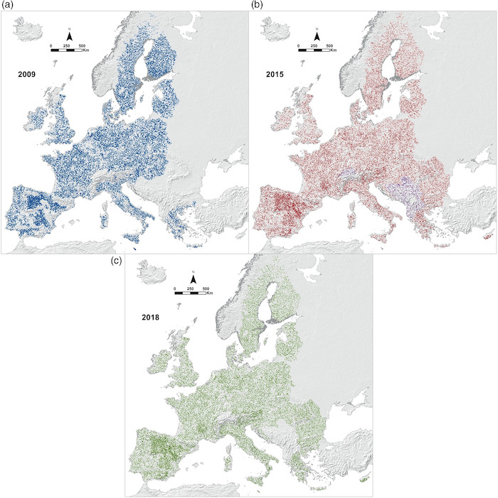
LUCAS Soil, the largest expandable soil dataset for Europe: a review
“The ‘Land Use/Cover Area frame statistical Survey Soil’ (LUCAS Soil) is an extensive and regular topsoil survey that is carried out across the European Union to derive policy-relevant statistics on the effect of land management on soil characteristics.“
Striking data and visualization.
(via Mark K Smitham)
Bird sounds
Visualized using AI. I’m not entirely sure why… but it comes with source code.

AI
The deep learning obesity crisis
AI models have become bigger and bigger.
What You Don’t Know You Don’t Know: Using Machine Learning to Unearth Audience Engagement Insights
“I’m excited to share a new development in how newsrooms can use machine learning to uncover and serve their communities’ hidden information needs.“
quantum of sollazzo is supported by ProofRed’s excellent proofreading. If you need high-quality copy editing or proofreading, head to http://proofred.co.uk. Oh, they also make really good explainer videos.

Sponsors* casperdcl and iterative.ai Jeff Wilson Fay Simcock Naomi Penfold
[*] this is for all $5+/months Github sponsors. If you are one of those and don’t appear here, please e-mail me