442: quantum of sollazzo
#442: quantum of sollazzo – 5 October 2021
The data newsletter by @puntofisso.

Hello, regular readers and welcome new ones :) This is Quantum of Sollazzo, the newsletter about all things data. I am Giuseppe Sollazzo, or @puntofisso. I’ve been sending this newsletter since 2012 to be a summary of all the articles with or about data that captured my attention over the previous week. The newsletter is and will always (well, for as long as I can keep going!) be free, but you’re welcome to become a friend via the links below.
Every week I include a six-question interview with an inspiring data person. This week, I speak with Ashley Kirk of The Guardian, who you, reader of “Quantum of Sollazzo”, will surely know as I’ve featured his amazing data analysis and visualization work over and over again.
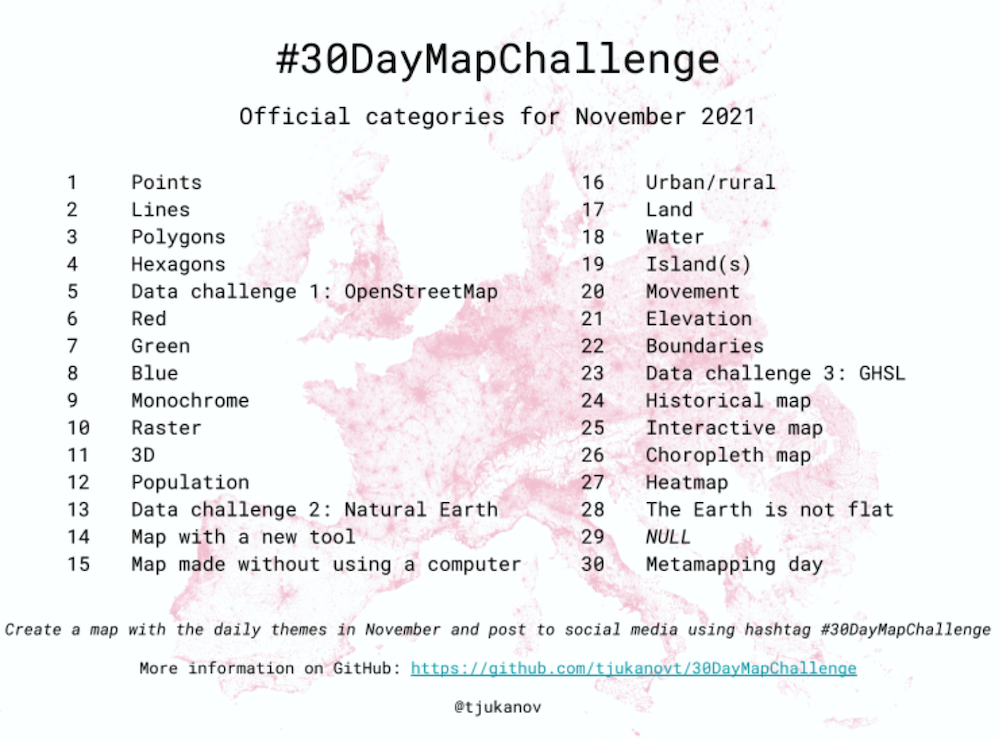
Meanwhile, past interviewee Topi Tjukanov, master of geographic visualization, has launched his traditional yearly “30 Day Maps Challenge”, which is all about pushing yourself to create a map a day during the month of November. All details here and on GitHub.

‘till next week,
Giuseppe @puntofisso
Six questions to...
Ashley Kirk
Ashley is Visual Projects Editor at The Guardian

What is your daily data work like and what tools do you use?
No two days are the same as it all depends on what story I’m working on. But normally a story will start with a question - why is this particular thing happening? How is this issue changing over time? Who is experiencing it? Once I have a question, I’ll try to source data that helps me answer it - whether a simple open spreadsheet or more complex, unstructured data. Next, I’ll analyse the data and find answers that usually will lead to a story. R, or Sheets for quicker jobs, are my tools of choice. I’ll then talk to some experts and see how best to communicate my story to our audience. This may involve static charts, interactives or text. My visualisation tools of choice are usually R/ ggplot, QGIS and Illustrator.
Tell me about a data project that you're proud of...
I think the stories I’ve been most proud of are the ones that have delivered exclusive news while utilising the best visual journalism practices to communicate that story online. A recent example is a collaboration with my brilliant colleagues Cath Levett and Pablo Gutiérrez, where we gathered Flightradar24 data to analyse the flight traffic coming in and out of Kabul airport as the Taliban seized control of Afghanistan. This piece performed very well as it provided new context on a timely issue that people wanted to hear more about. And, crucially, couldn't have been done without the data work. The freedom of information work I conducted in my previous role at the Telegraph also comes to mind, such as when I revealed that crime victims had to wait over half an hour for police to respond to 999 calls as response times double
...and a data project that someone else did and you're jealous of.
I really enjoyed this analysis from Josh Holder and Amy Schoenfeld Walker at the New York Times looking at the proportion of unvaccinated elderly people in the US and internationally. Going into winter, this will be the story to watch: how much protection do we actually have when the virus gets a seasonal boost? A lot of this will depend on how many vulnerable people are still not fully vaccinated, and their analysis reveals how the US is lagging behind. This is the sweet spot for me: data analysis that provides a new story on a topical issue. In addition, I really liked the use of visualisation. The beeswarms effectively show the disparities within each country and allow the reader to immediately see which country is struggling the most with their vaccination campaign.
If I say "dataset", you think of...
A nice, clean table of text and/ or numbers. I know that’s not usually the case but it’s what I picture in my head. Maybe that’s wishful thinking.
Give someone new to data a tip or lesson you wish you'd learned earlier.
Be brave, think out of the box and keep pitching ideas. In my opinion, the ability to constantly think of new ideas is the key skill of a data journalist. You can be the best data cruncher or programmer in the world, but ultimately, these skills you’ve built up are only a means to an end. For a data journalist, the end is the story itself - and this is what ultimately matters. So keep thinking of new story ideas that are exciting for your readers, and keep pitching them to your editors. Don’t be afraid to fail - keep pushing the boundaries, even if one pitch doesn’t work, and constantly think about not only new topics but also new ways to visualise your stories.
Data is or data are...
Data is. I know it’s not technically right but it’s just easier.
|
Become a Friend of Quantum of Sollazzo → If you enjoy this newsletter, you can support it by becoming a GitHub Sponsor. Or you can Buy Me a Coffee. I'll send you an Open Data Rottweiler sticker. You're receiving this email because you subscribed to Quantum of Sollazzo, a weekly newsletter covering all things data, written by Giuseppe Sollazzo (@puntofisso). If you have a product or service to promote and want to support this newsletter, you can sponsor an issue. |
Topical
Here is where the election played out (and where it didn’t)
“In the past two years, the lives of Canadians have been turned upside down by a historic pandemic. But the House of Commons will remain almost the same.“
A brilliant example of electoral data analysis presented via scrollytelling, by Naël Shiab for Radio Canada. It’s a bilingual English-French article.
(via Darren McCormac)

The Association between Fast Food Outlets and Overweight in Adolescents Is Confounded by Neighbourhood Deprivation
“A Longitudinal Analysis of the Millennium Cohort Study”. It’s an academic paper pre-print, but worth a read. Authored by, among others, open data hero John Murray.
Interestingly, one of the findings says that “The confounding role of neighbourhood deprivation persists even after controlling for diet and physical activity”.
Years, months, days, and hours — in one chart
“Six Questions” graduate Lisa Charlotte Muth of Datawrapper shows how they presented German electoral data with a changing scale over time, bringing together multiple years electoral results, monthly opinion polls, daily opinion polls, and, on election night, hourly estimates.

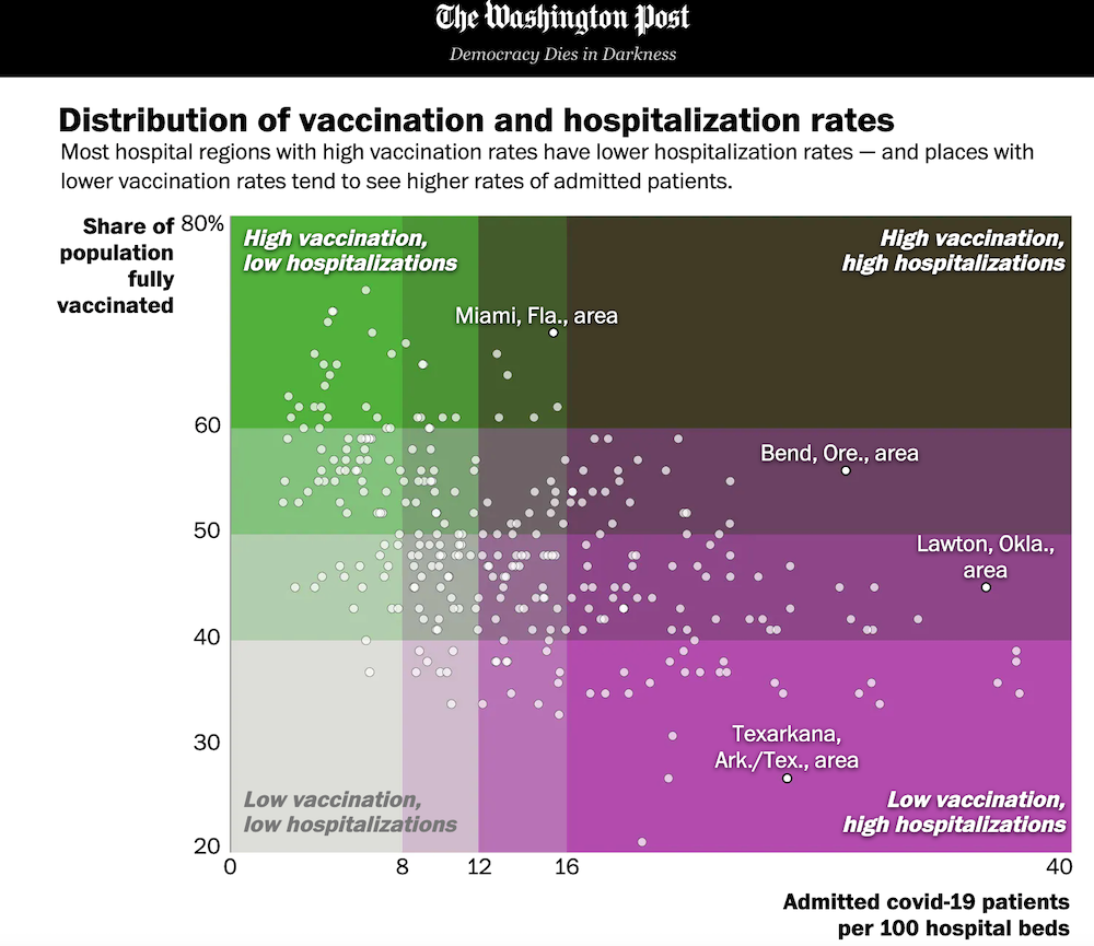
Mapping America’s hospitalization and vaccination divide
Stark differences across the country revealed in this excellent data analysis by the Washington Post.

Pollution Action Note – Data you need to know
“The UNEP Pollution Dashboard displays the global state of air pollution, major sources, the impact on human health and national efforts to tackle this critical issue.“

Jobless Rates From 15 U.S. Cities Show Racial Gap Is Widening
“Bloomberg is tracking the economic recovery in minority communities across the country”. The visuals have a great, Tron-like, electric colour scheme. The subject is pretty grim, though.

Tools & Tutorials
tabbycats
Oli Hawkins, a data scientist at the Nursing and Midwifery College and previously at the House of Commons Library, has released this brilliant little R package that “for tabulating and summarising categorical variables” which, he says, “It’s designed to work nicely with the tidyverse.”.
Manifest
I found this link on the excellent newsletter “The Prepared”, which is about manufacturing in the modern world. They linked to this website, which is “a toolkit intended for researchers, journalists, students, and scholars interested in visualizing, analyzing, and documenting supply chains and trade networks.“
Visualized below is the supply chain of Amazon Fullfilment Centres.

How I Make CSS Art
A tutorial on creating art using pure CSS. One for you data coders to use for data visualizations?

Real-Time Collaboration in notebooks
The clever folks at Count have recently added real-time capabilities to their SQL-driven data visualization notebooks, which are quite nice visually and easy to use.
Vizzu
This is a newly released open source Javascript library to build animated charts and data stories with interactive explorers. It’s based on C++ thereby promising great performance. It looks very promising from what I see, both in the code samples and on the website.

Dataviz & Interactive
Architecture of Paris
Naresh Sughani, a Tableau Analyst, has published this incredible map of Paris which shows the age of buildings. It’s based on Tableau and QGIS and covers a 20 square mile area. It uses Open Data from the Atelier Parisien d’Urbanism, a public agency.
(via Massimo Conte)

Rendering 1940s maps of Palestine in 3D
Ahmad Barclay, a “Quantum of Sollazzo” interviewee, has been “playing around today with rendering 1940s maps of Palestine in 3-dimensions […]. This first attempt is based on a 1942 map of Haifa from PalOpenMaps.“
In this Twitter thread he shares a few initial notes about his method, which links to a QGIS-based tutorial.

Punctuation in novels
I’m slightly obsessed by the analysis of literary material and this dataviz is contributing to my obsession.
“I wondered what did my favorite books look like without words. Can you tell them apart or are they all a-mush?“

quantum of sollazzo is supported by ProofRed’s excellent proofreading service. If you need high-quality copy editing or proofreading, head to http://proofred.co.uk. Oh, they also make really good explainer videos.
