⚠️ Your favourite team has a problem!

Hello again!!
Quick question: Who is your favourite sports team? Now think about their coach, their manager, or their president – chances are, all of those are male, right? There’s a massive misrepresentation in the sports industry, ranging from local to national levels.
Let’s take the German football league (1. & 2. Bundesliga) as an example: Only 6 out of 84 management positions are female – and only 4 out of 36 clubs have women in leadership positions at all.
One of these rare examples is Stephanie Gonçalves Norberto, Educational Director with FC St. Pauli – and founder of The League, a community for underrepresented groups in the sports industry, that aims to change this issue. They connect women (including non-binary, trans, agender, inter und gender-variant individuals) in meetups across Germany called “matches”, and share their expertise as coaches and speakers.
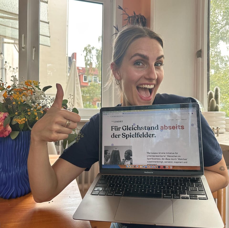
As the organisation is currently expanding to several new cities, it was time to rework their digital offering as well: Over the last months we worked closely with the team at The League and Célia to relaunch their website, which went live just some weeks ago – go have a look!
The League is a great example of what we love doing at Ponder: Use our skills to help a cause that deserves so much more attention to get their message across to a wider audience.
|
🫵 Do you have a cause that deserves so much more attention? |
And another thing finally launched in September – as an avid reader of this newsletter I’m sure you know what’s coming:
Our work for the GRÜNE Bundestagsfraktion is live!
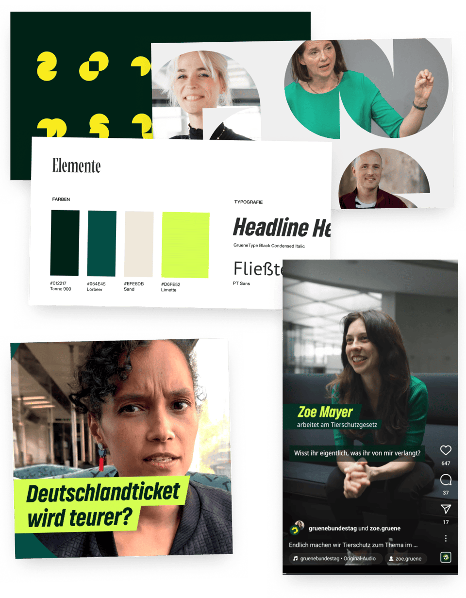
What started out as a request for social media design quickly turned into an interesting brand strategy challenge.
Quick detour for context: By German law, political parties and their respective parliamentary group (Fraktion) are two strictly independent entities that are not allowed to use the same design 1:1 – while from a citizen’s perspective both entities are widely perceived as the same thing and hence expected to look and feel the same, or at least similar.
So the most critical aspect of this assignment was to find the sweet spot: Move the legacy design language (into 2024 and) closer to the party’s design to communicate the two entities’ obvious affiliation – while maintaining clear visual differentiators to ensure the legally mandated discernibility. This new design language – including a new colourscheme, customized typeface and a new overall design principle is now being rolled out across all their touchpoints step by step: At Ponder, we applied it to flexible design templates for the Fraktion’s social media channels – including several templates for static content as well as motion templates for video content.
We’re currently working on a more extensive case – in the meantime you can observe our work in its natural habitat on Instagram, LinkedIn or TikTok!
![[foto hamburg]](https://assets.buttondown.email/images/07170075-ac63-434c-8891-88f6295d88eb.jpg?w=960&fit=max)
Big shoutout to the team: Anissa, Adèle and Henning!
🤐🔮 Mystery section! A workshop and a trip to Hamburg
Just last week yours truly got up at 4 in the morning to embark on a trip to Hamburg that might or might not lead to a nice collaboration with some old and new partners – we can’t share much more at this point, but we hopefully can in the next edition – fingers crossed! 🤞🚇
![[foto hamburg]](https://assets.buttondown.email/images/354423e1-dda6-4dac-a422-e2b5badb5f08.jpg?w=960&fit=max)
We also partnered up with our friends at Bündnis 90 / DIE GRÜNEN again to facilitate a 2 day workshop around one of their most essential digital touchpoints (but not this one). We can’t disclose more on the topic for now, but these 2 days had plenty of those rewarding “we’re getting things unstuck!” moments we’re all here for. Ponder – unstucking teams since 2021! 🎉
🎓 Never not learning – halftime update!
While Caro just crossed the halftime mark of her 1 year programme to become a certified mindful life and business coach (read more on that here), Moritz is currently on a much shorter but equally valuable learning experience with the UNSSC / UNEP Digital for Sustainability Learning Path: With the first 2 out of 4 modules (Digital Transformation for Sustainable Development & Digital Sustainability for Climate Action) completed, he’s also past halftime, and already much wiser than he was before. Watch this space for more detailed updates and learnings from both of them!
![[moritz kurs visual]](https://assets.buttondown.email/images/0c775c8c-22c3-450d-9964-f465a98d8c75.jpg?w=960&fit=max)
🧏♀️ Making Accessibility tangible: “How many?”
While, thankfully, finally, organisations seem to become more aware of digital accessibility in general (as EU legislation is forcing them, 🤝🇪🇺), people still seem to have a hard time to picture who those “users who need accessibility” actually might be. In our experience, the typical level of imagination ends with “blind people” and “people using a wheelchair” (which says a lot about inclusion and representation in the workplace and media, but that’s a different story).
“How many?” is a great little tool that breaks down your number of website visitors into concrete cohorts of all the different ‘disabilities’ these users might statistically come with, ranging from “users who need to wear glasses or contact lenses” to those “who have dyscalculia” and those “who have chronic pain” – as well as the almost 100% “who experience temporary or situational disability at some point”.
Using the omnipresent metric of monthly visitors, this little helper turns statistical data into something very tangible, directly connected to a specific product – while also highlighting some of the lesser known types of ‘disabilities’. Big recommendation for your next discussion around accessibility!
![[screenshots of the how many website]](https://assets.buttondown.email/images/e440f5ea-3b6b-4114-9ea6-ab33bb6988e2.png?w=960&fit=max)
🔗 How many? Estimate how many people using your website might be disabled
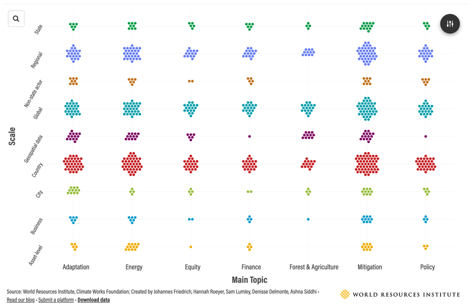
🌏 Climate Data galore: Overview of 100+ Climate Data Platforms
I don’t know about you, but I sometimes feel like this: On the one hand, we have access to such an amazing pool of data out there – on the other hand the sheer amount of sources seems to make it harder and harder to stay on top of things and find the one thing you are looking for. That’s why compilations like this Overview of 100+ Climate Data Platforms make me happy: Curated by a trustworthy organisation and presented in a way that lets me quickly filter down the data source I might need. Worth a look and actually quite fun to play around with!
🔗 Overview of 100+ Climate Data Platforms by the World Resources Institute
And with that we say goodbye to September!
Take care of each other,
Peter
Add a comment: