Hi All! 🤗
At the beginning of this year, I wrote in a blog post which I titled The Year of the Personal Website:
In the search for a permanent home on the web, more and more people are now rediscovering the personal website as a place to share and document their thoughts and publish their work. I’ve written at length before about why this is such a good idea: Your personal website is a place that provides immense creative freedom and control. It’s a place to write, create, and share whatever you like, without the need to ask for anyone’s permission. It is also the perfect place to explore and try new things, like different types of posts, different styles, and new web technologies. It is your playground, your platform, your personal corner on the Web.
So how about we make 2023 the year of the personal website? The year in which we launch our first site or redesign our old one, publish a little more often, and add RSS and Webmentions to our websites so that we can write posts back and forth. The year we make our sites more fussy, more quirky, and more personal. The year we document what we improved, share what we learned, and help each other getting started. The year we finally create a community of critical mass around all our personal websites. The year we take back our Web.
And, looking back at 2023, did we deliver?
You bet. 😁
It all started with articles like Bring back personal blogging by Monique Judge for The Verge or the Bring Back Blogging project by Ash Huang and Ryan Putnam, who encouraged us all to get into the habit and publish at least three blog posts until the end of January 2023.
Throughout the year, fueled by the further decay of Twitter and the ongoing reshuffling of power on the internet, heaps of us indeed rediscovered blogging and started tinkering with their sites again. It was a joy to follow this development and add more and more sites to my RSS reader. If you want to get a glimpse of the richness of posts people published this year, take a look at all the replies to this question I posted on Mastodon: what were your favorite blog posts of the year?
All of this feels adventurous and exciting, but it also feels like we’re just getting started. There is still so much we can improve on our existing sites and so much we can learn about making our sites a central part of our online identities. There are still so many tools to be created to improve the discoverability of sites and posts and to connect our sites to each other and to the Fediverse, for example. And there are still so many sites to be built and blog posts to be written and published. So, how about we make 2024 the year of the personal website again? And, for maximum consistency, every year that follows? How about, from now on, we make every year the year of the personal website – and make the internet human, creative, personal, and weird again?
Here’s to a successful, healthy, playful, and fearless 2024. I can’t wait to see what you create.
🎆💚✊
A Little Giveaway
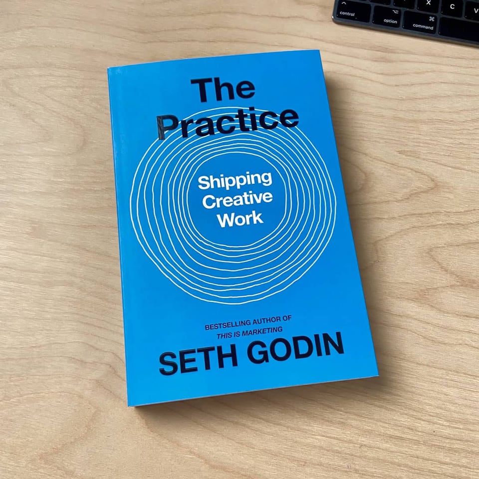
To celebrate crossing the milestone of 1000 subscribers after issue 3 and as a little thank you, I announced that I’d give away a copy of Seth Godin‘s inspiring book The Practice: Shipping Creative Work to one of my subscribers. Math.random() picked Tevin Steinke as the winner, a “strong believer in semantic HTML and progressive enhancement” who happens to have a personal website, too! 🥳 Congrats again, Tevin!
Links
This time, the mixed bag of links is my attempt at picking my favorite blog posts of 2023, which turned out to be quite the challenge because there were just so many fantastic posts. Please let me know how you like them! And if you can think of someone who would enjoy reading this newsletter today, feel free to forward along.
Tiktok's Enshittification
In November 2022, Canadian-British blogger, journalist, science fiction author, and activist Cory Doctorow coined the term “enshittification” to describe how online platforms evolve and eventually die. In this post from January 2023, he expanded on the concept:
Here is how platforms die: first, they are good to their users; then they abuse their users to make things better for their business customers; finally, they abuse those business customers to claw back all the value for themselves. Then, they die.
I call this enshittification […] Surpluses are first directed to users; then, once they're locked in, surpluses go to suppliers; then once they're locked in, the surplus is handed to shareholders and the platform becomes a useless pile of shit. From mobile app stores to Steam, from Facebook to Twitter, this is the enshittification lifecycle.
👉 https://pluralistic.net/2023/01/21/potemkin-ai/#hey-guys
CSS Wishlist 2023
When Dave Rupert posted his wishlist of CSS features for 2023 because he didn’t want to stop dreaming, he also kicked off a series of blog posts by others who also shared their dream features. It is one of those magical examples of thoughtful back-and-forth blogging that only personal websites allow us to do. Answers to Dave’s post included, among others, wishlists by
What about a 2024 CSS wishlist, by the way? 🤔
CSS Wishlist 2023 | daverupert.com
2022 was a massive year for CSS. We got CSS Layers, more subgrid support, the impossible :has() selector, and WE GOT CONTAINER QUERIES! 🎉 Thank you to everyone who worked on those. A lot of the success for CSS this past year was due to an incredible cross-browser effort called Interop 2022, a loose agreement amongst browsers to try to work on some of the same features so feature support gaps between browsers are shorter.
An Interactive Guide to CSS Grid
Josh W Comeau, whom you might also know from his CSS for JavaScript Developers course, regularly publishes fantastic in-depths posts on various web development topics. This time, he introduces you to CSS Grid, explains the basic mental model of this powerful layout algorithm and how grids are constructed. Honestly, I have no idea how Josh does it, but the whole structure of the post, the concise language, and, above all, the many interactive demos make this a must-read with a lot of lightbulb moments for anyone who builds websites.

An Interactive Guide to CSS Grid
CSS Grid is an incredibly powerful tool for building layouts on the web, but like all powerful tools, there's a significant learning curve. In this tutorial, we'll build a mental model for how CSS Grid works and how we can use it effectively. I'll share the biggest 💡 lightbulb moments I've had in my own learning journey.
The Market for Lemons
For quite some time now, Alex Russell has been leveling valid criticism against the web industry’s overreliance on over-hyped JavaScript frameworks and slow, complicated, JS-taxed stacks. In “The Market for Lemons”, Alex made the case that these baroque technologies, which were initially pitched on the back of “better user experiences”, have utterly failed to deliver on that promise. JS-first stacks and Single Page Applications never were the superior technology in the first place and thus not the right choice for most sites and teams. A fact that the “complexity merchants” at the Vercels and Facebooks refused to admit because it would shrink their market for lemons and their influence, causing even more harm to the industry in the form of slow and frustrating (mobile) web experiences.
We need to move our attention back to the folks that have been right all along. The people who never gave up on semantic markup, CSS, and progressive enhancement for most sites. The people who, when slinging JS, have treated it as special occasion food. The tools and communities whose culture puts the user ahead of the developer and hold evidence of doing better for users in the highest regard.
(That also reminds me that I still need to get one of those ANTI JAVASCRIPT JAVASCRIPT CLUB stickers.)

The Market for Lemons - Infrequently Noted
New web services are being built to a self-defeatingly low UX and performance standard, and existing experiences are now pervasively re-developed on unspeakably slow, JS-taxed stacks. At a business level, this is a disaster, raising the question: why are new teams buying into stacks that have failed so often before?
The Guide To Responsive Design In 2023 and Beyond
Ahmad Shadeed did a wonderful job explaining what responsive design means in 2023 and why it isn’t about fixed-width breakpoints anymore. Instead of thinking about responsive design only in terms of media queries, Ahmad likes to think of it in these categories:
Responsive to the content
Responsive to the viewport
Responsive to the container
Responsive to user preferences
And he goes on to beautifully illustrate with many examples why building a responsive website is all about making it fluid at its core.
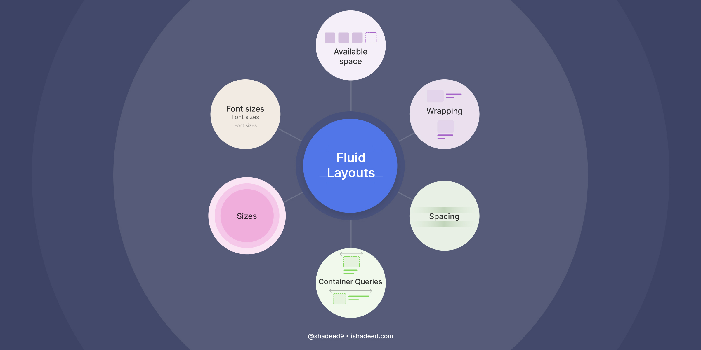
The Guide To Responsive Design In 2023 and Beyond
A modern look at responsive web design.
Some blogging myths
Julia Evans shared a few of the biggest myths that discourage people from blogging, like that you need to be an expert, that page views matter, that more material is always better, or that you always need to be original. Timeless advice.
👉 https://jvns.ca/blog/2023/06/05/some-blogging-myths/
More Thoughtful Reading & Writing on the Web
Tantek Çelik, inventor, connector, writer, runner, scientist, and IndieWeb co-founder, wrote a thoughtful post about more thoughtful reading and writing on the Web. The gist: long(er)-form writing on your own site encourages a more thoughtful state of mind compared to the rapid short-form posts on platforms like Twitter or Mastodon, which facilitate less nuanced takes and amplify disputes.
The combination of taking more time (as longer form writing encourages) and publishing on a domain associated with your name, your identity, enables & incentivizes more thoughtful writing. More thoughtful writing elevates the reader to a more thoughtful state of mind.
👉 https://tantek.com/2023/277/b1/thoughtful-reading-writing-web
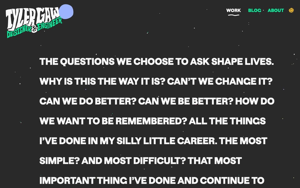
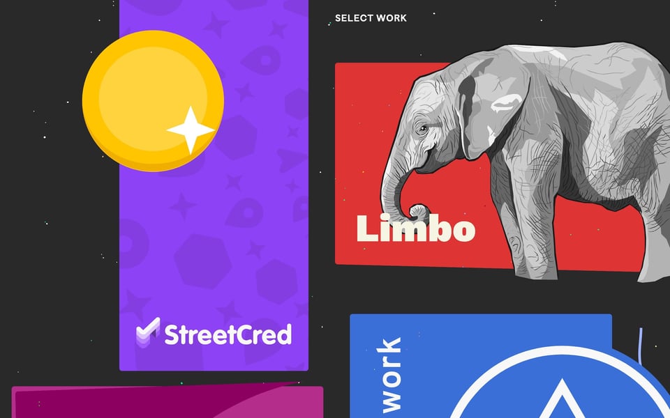
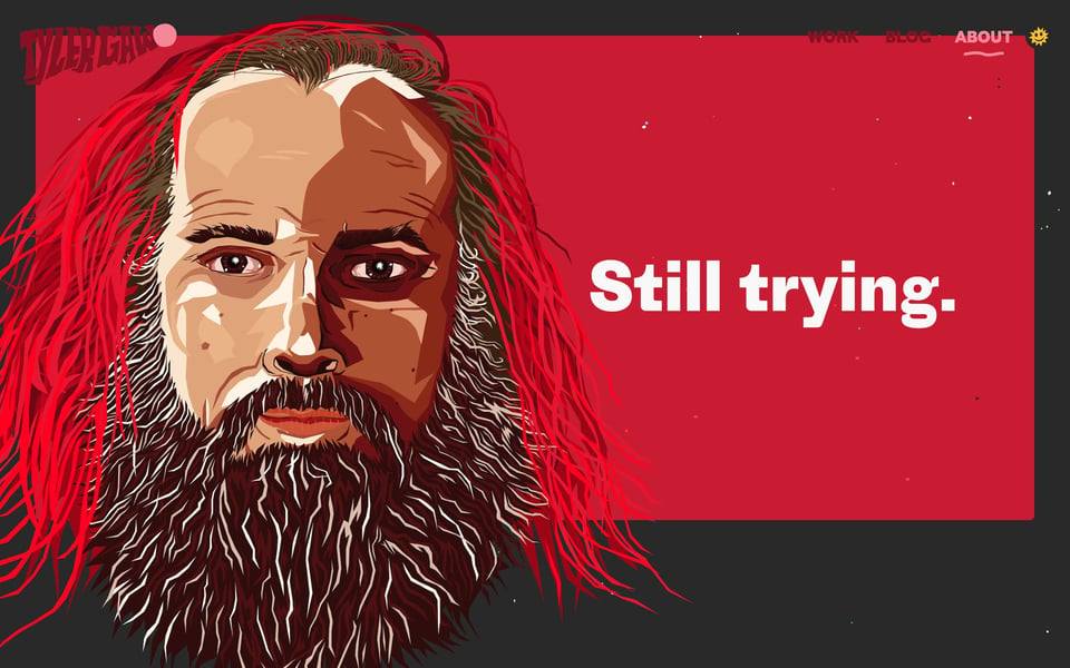
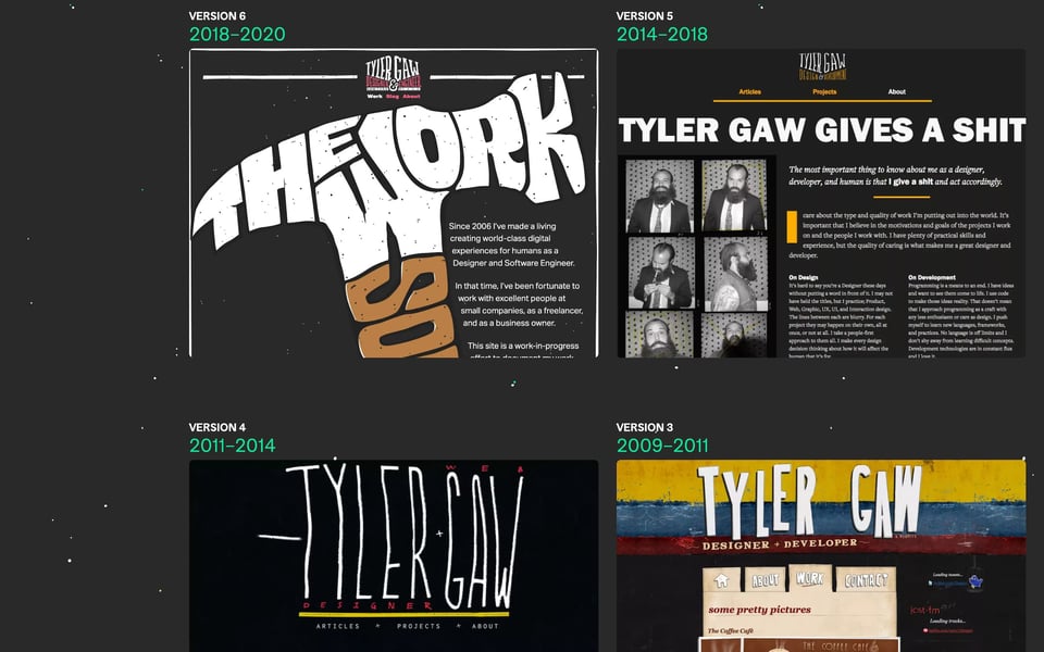
🛹 Personal Site of the Week 🛹 Tyler Gaw == tylergaw.com
Tyler Gaw is a designer and software engineer from New York City. His personal site, built with Eleventy, features a slick mix of sturdy typography, vibrant colors, bold illustrations, and a few wonderfully weird and quirky details. Tyler posts regularly on his blog about design and development, and shares what he learned when redesigning his site, his logo, or adding view transitions, for example. He also created colormix.style, a UI tool that visualizes the new CSS color-mix() function. And if you’re interested in exploring previous versions of his website, the archived versions are still waiting for you – including his first Flash site. 🤘
And that’s it for today. How did you like this issue? Which one of the links was your favorite? What do you want more or less of? Do you have any other suggestions on how to improve this newsletter? Just hit reply and let me know.
Happy New Year! 🎆🍀🎉
– Matthias
