Hi All!
Welcome to Own Your Web! 🎉
First of all, I’d like to thank you again for signing up! 🤗 When I shared the link to the newsletter last weekend, I did not expect that so many people would subscribe so quickly. I’m overwhelmed by the response and I see it as a sign that the topic of the newsletter hits a nerve.
It looks like I’m not the only one who is unsatisfied with the current state of social media and the Open Web. Many of us share that vision of a Web that lets everyone participate, a Web that is empowering and full of creative ideas, a Web that is home to respectful and welcoming communities, and a Web where people can truly own their work and the content they create and publish. And you know what? Drowned out by the noise on the large, attention-grabbing, enshittificated social networks, that version of the Web still exists. On our personal websites.
Having a personal website in 2023 is a superpower. It’s a place to write, create, explore, and share whatever you like, without limitations. It’s a playground to try out new things, tinker with new technologies, and build something beyond the ordinary. It’s a tool to make yourself heard, to participate in online discourse, create community, and make new friends. And, it’s a place to truly own your content and tell your story. It’s your personal home on the Web.
It has never been easier to get started with your own site. Be it by writing just a bit of static HTML and CSS by hand, by using one of the many starter kits and themes out there, or by using platforms like Ghost or WordPress.com, which often even come with free plans these days.
On the other hand, it has also never been harder to handle the complexity that surrounds websites today. Which domain should you pick? Which tech stack, content management system, or platform is the right one? Or should you use a static site generator instead? What about frameworks? Do I need to learn JavaScript? How do I choose a typeface in less than a year’s time? Which modern CSS features are safe to use? How can I make my site performant and accessible for everyone? To SEO or not to SEO? What are Webmentions? What’s RSS? And, what the heck should I write about, after all?!?
As you can see, there’s no shortage of topics to cover in a newsletter like this one. 😉 And that’s exactly what I’ll do. My current plan is that each issue will cover one specific topic, idea, or question that we all run into at some point. So: Hit the reply button and let me know what I should write about! I’ll always also include a tasty bunch of generally useful links that popped up in my feed reader. However, if reading that last paragraph has left you behind more intimidated than pumped and ready for action, be reminded that there is almost no chance to get things right on the first try. And that’s okay.
Because here’s the catch: On your personal site, getting it wrong is not a bug, it’s a feature. It’s a chance to start small, take first steps, learn, edit, and improve. It’s an invaluable opportunity to evolve and to grow.
Start small. Hit upload. Hit publish.
Repeat.
Links
Here’s the first mixed bag of links. Please let me know how you like them! And if you can think of someone who would enjoy reading this newsletter today, feel free to forward along.
Educational, Sensational, Inspirational, Foundational Web Development Reading List
Recently, Zach Leatherman, of Eleventy fame, asked which blog posts were most foundational or influential to how we all build for the Web. He got an amazing amount of articles back and built a little microsite for these 46 links. Starting with Sir Tim’s “Cool URIs don’t change” from 1998, you are taken on a journey through web history that also makes for a fantastic reading list, especially if you’re getting started on the Web today. And if you are considering building a personal site from scratch, the tech stack Zach used to make the site might be quite appealing as well.
No more 404
Remy Sharp does not only bring Gameboys back to life, he also runs a blog that is now about 17 years old. What happens when your blog is that old? Entropy in the form of dead links kicks in. Because that’s a pretty bad experience for all the pretty visitors of his blog, Remy took action and solved the problem by progressively enhancing his site with a script that checks whether a link is still OK or not:
When a real user clicks on a link, it's swapped out to be redirected through my own endpoint that checks if the URL is still OK, and if so permanently redirects the visitor, otherwise my endpoint checks the Web Archive for the URL and permanently redirects to that instead.
👉 https://remysharp.com/2023/09/26/no-more-404
Crawlers
By scraping our content to train large language models that will just spew out final answers instead of redirecting users to the original content source, Google is breaking the social contract of the Web. As Jeremy Keith writes, it is time to up the ante if you don’t want to provide the content of your site for free to the bots feeding the LLM beasts. As a first measure, you can update your robots.txt accordingly. But let’s be realistic: chances are that Google, OpenAI and others don’t give a penny about your robots.txt. That’s why, if you’re using an Apache server, it can make sense to also block certain user agents completely in your server settings using mod_rewrite.
👉 https://adactio.com/journal/20515
Practical Accessibility
Sara Soueidan just released her video course on web accessibility. Practical Accessibility is the culmination and distillation of all her years of experience in learning, developing, and teaching about web accessibility. Sara poured her heart and soul into the project and the result are over 35 (captioned) videos that make up for 15 hours of practical knowledge. The course is still 25 % off until October 23, so you better be quick. A perfect opportunity to finally master accessibility and make your personal site and any other future web project more inclusive.
👉 https://practical-accessibility.today
Fit Videos
Dave Rupert likes his videos neatly scaled in the correct aspect ratio. This is why, 12 years ago, he teamed up with Chris Coyier and created a jQuery plugin for fluid video embeds. Today, in the times of Instagram Reels and TikToks, scaling the videos you embed into your site is even more important. But, with a little help of the CSS aspect-ratio property, all of that can now be achieved with just a few lines of JavaScript:
const videoSources = ['iframe[src*="youtube"]', 'iframe[src*="vimeo"]'];

document.querySelectorAll(videoSources.join(",")).forEach((video) => {
  video.style.maxWidth = "100%";
  video.style.height = "auto";
  video.style.aspectRatio = `${video.getAttribute(
    "width"
  )} / ${video.getAttribute("height")}`;
});
👉 https://mastodon.social/@davatron5000/111217771502099612
If your site is running with a static site generator or a modern CMS like Kirby, you could do the same in your template already, using CSS custom properties. You set an aspect ratio variable in your template code like this:
<iframe src="https://www.youtube-nocookie.com/embed/zpKq4sbw1nQ" width="640" height="360" style="--aspect-ratio:640/360"></iframe>
And, in your CSS, you then use this variable (with a fallback value) to set the aspect ratio of the video:
iframe[src*="youtube"], iframe[src*="vimeo"] {
  aspect-ratio: var(--aspect-ratio, 16/9);
}
Engage a Wider Audience With ActivityPub on WordPress.com
Earlier this year, Matthias Pfefferle, who is responsible for creating quite a bunch of IndieWeb WordPress plugins, joined Matt Mullenweg‘s Automattic, the company behind WordPress and WordPress.com, as their new Open Web Lead. Now, this liaison has led to an exciting addition to all websites that are hosted on WordPress.com: support for ActivityPub. This effectively means that your blog can join the fediverse, that rapidly growing unified network of independent websites, servers, and platforms like Mastodon. People can now follow your blog and engage with your content directly on their preferred platform.
👉 https://wordpress.com/blog/2023/10/11/activitypub/
📸🍕✨ Personal Site of the Week ✨💀🍄
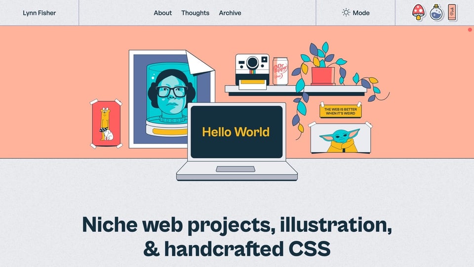
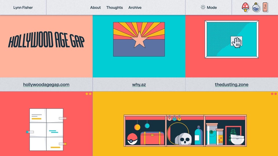
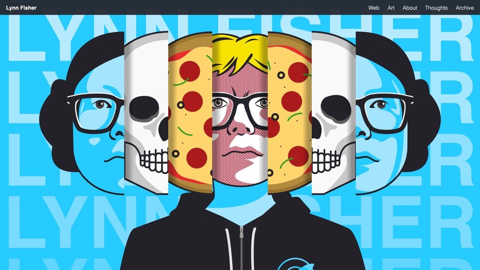
Lynn Fisher == lynnandtonic.com
Whenever I ask people for their favorite personal website(s), it doesn’t take long until someone mentions Lynn’s site. And that’s hardly surprising. The site is full of gorgeous illustrations and lovely little design details. Watch what happens, for example, when you drag and drop one of the three stickers in the upper right corner onto any content on the site. 🪄
Lynn also redesigns her site every year and all previous versions are still available in the archive. So, you can try resizing your browser with her legendary 2019 version yourself… Also make sure you take a look at her amazing project A Single Div, a collection of CSS illustrations that is currently growing heavily again, because it’s #divtober.


And that’s it for today. Again, let me know what you would like to read about in one of the next issues. How did you like this first issue? Which one of the links was your favorite? What do you want more or less of? Do you have any other suggestions on how to improve this newsletter? Just hit reply and let me know.
Have a wonderful weekend! ☀️
– Matthias
