New posts from
The work behind designing the Obra shadcn/ui Figma library
We are designing a free and open source shadcn/ui library. In a previous post, I talked about what shadcn/ui is.
In another previous post, I talked about why we are designing this library.
Today, I want to talk about what the work of designing a shadcn library entails.
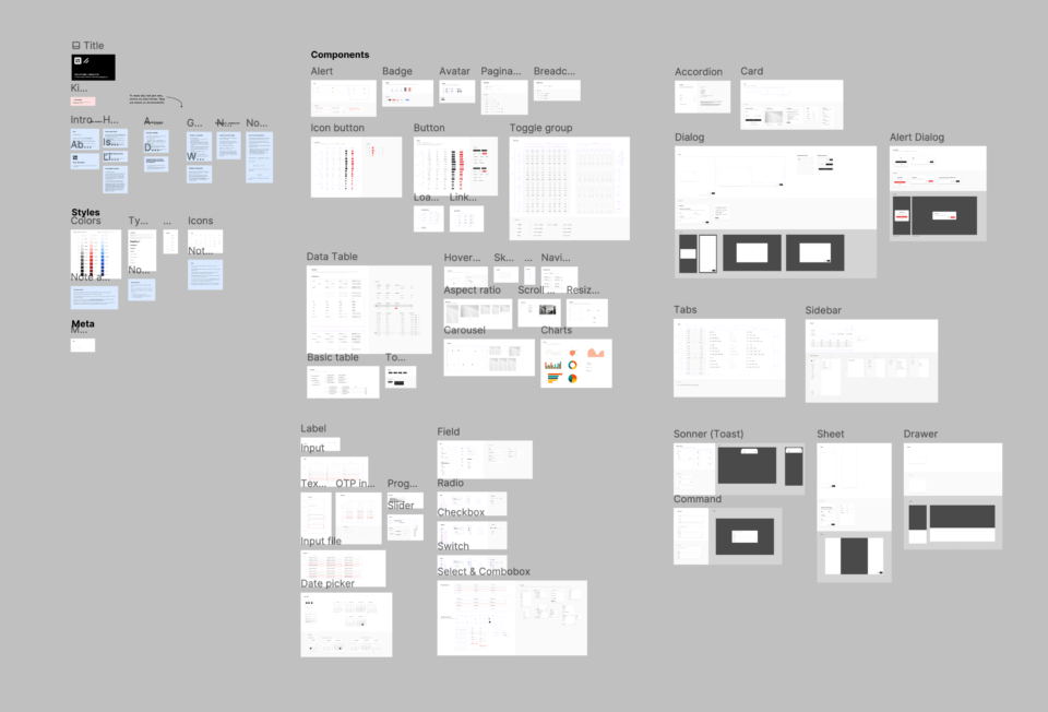
Looking at the entire base library, zoomed out.
I’ll tell you the story of how we designed the library and why we made the decisions we made.
The first step to any UI library based on a development framework, is to understand the development version of the library, in this case that means going through every single documentation page at ui.shadcn.com.
When we started designing the kit, that website was still showing version 3 of this library, but last Thursday version 4 released. Luckily we already discovered v4 was in progress and we anticipated things.
We investigated how shadcn/ui-based designs look in practice. Just like when you know Bootstrap you can kind of “spot the look” we started seeing shadcn/ui everywhere once we started work on this library. We could almost immediately spot if something was based on shadcn/ui and not customized.
That’s not bad in itself: the defaults of shadcn/ui are very much a great starting point. With the migration from v3 to v4, a lot of examples in the docs disappeared. There used to be a lot more but I suppose they were removed for maintenance reasons, or they might come back.
Shadcn/ui consists of many components. We drew every component pixel by pixel and analyzed how the component could work in a composable manner in Figma. Many existing kits do this in a bad way, not allowing for composition of UI elements.
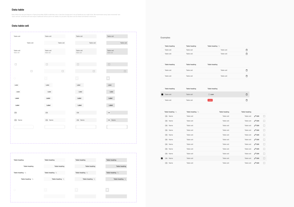
Data table component example: you can compose the individual table cells to create all kinds of tables.
We looked at how people would use the library by creating many screens with the components we made and came up with a philosophy behind the library: it would be a starting point that should be easy to customize. Just like shadcn/ui's philosophy to be the starting point for your own component library, our kit would also be a starting point.
In every area of the work, from colors to typography to icons, there were some decisions to be made about how many things would be included from the start.
We wanted to design a kit where you would still be free to take it somewhere new and use it as a starting point. This meant finding the balance between including defaults and considering other things an add-on.
We landed at the approach of “add-ons” for colors and icons. The kit ships with just 20 icons, but using the icons add-on, you can add the other 1300+ Lucide icons.
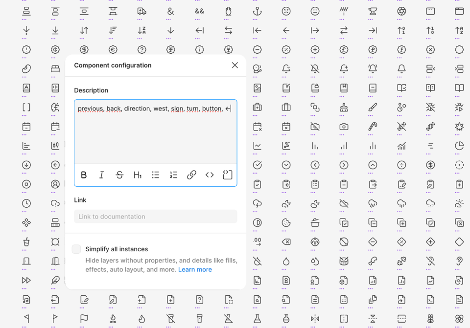
Looking to wireframe with all available Lucide icons? Simply copy paste the icons into the library from the icons add-on, and you're done. Every icon is tagged with keywords to easily find icons during design work without ever leaving Figma.
This decision also makes it easy to ignore the add-on, and swap the 20 icons with your own icons and work from there.
For colors, we decided to only ship with 3 palettes from the Tailwind color system: neutral, red and blue. This way, it's very easy to change the neutral to another type of “gray” (e.g. slate), either by switching over the raw colors and renaming neutral to slate or by pulling in the variables from the add-on file, then switching out the variables with Figma's selection colors feature.
But notice how once again, you are also free to start using your own colors; and when you go to the colors page, you will also clearly see which colors are actually used and which aren't - all grays, most reds and a single blue value. You can then first delete unused colors, and then start customizing from just +-20 colors to consider instead of a kit that completely locks you in.
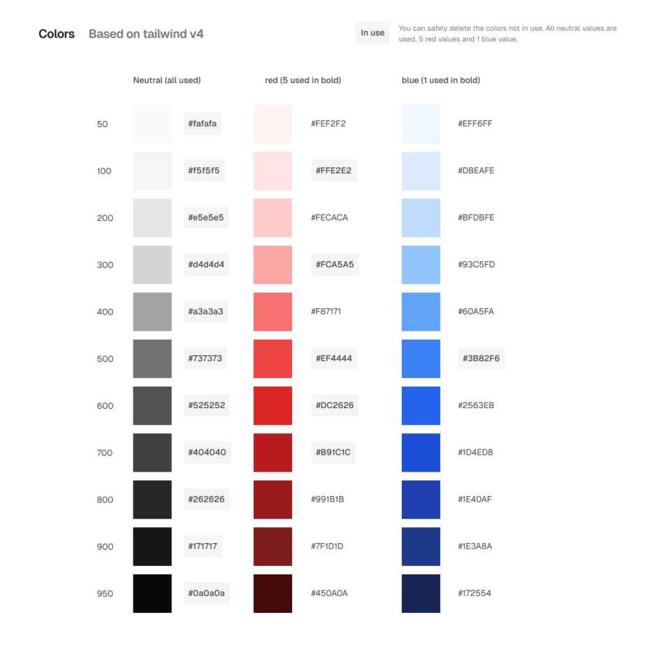
Colors: we ship 3 color “rows” from Tailwind, but note that only 22 colors are in actual use (the ones you can count along with black and white). This make it easy to remove the unused colors and customize from there. Or lean into Tailwind.
Customizing the typography takes more work, and this is something we will document in a video. We couldn't figure out a way to make this an add-on, because of how Figma's typography works. It really depends on where you want to go and what you are designing as well.
Another thing that will need a video with some explanation is theming.
While it’s definitely possible to take our kit and make a theme with it, unlike other kits, we don’t ship a theming layer on purpose - nor a dark mode layer.
This decision is not coming from a place of not having done the work (we have a fork of our file where we applied theming) but rather from a place that, if we were to include theming and/or dark mode we would create a much more complex starting point to customize from.
And that’s the main thing that we landed at: to create a starting point where it’s easy to add on to and customize the design.
We have intricate and deep knowledge of how Figma works, and how to work on design systems (We're available for Figma workshops, mentoring and coaching.)
We have learned that if you go against the grain of Figma, essentially you lock yourself in a place where it’s impossible to design anymore. At that point, why use a UI kit at all? That's what we wanted to avoid.
The base kit consists of 1 Figma page that can be copied to another file as a starting point with just a simple copy and paste. We ship with 11 text styles, 9 effects styles and 35 color variables (of which 22 are actually used).
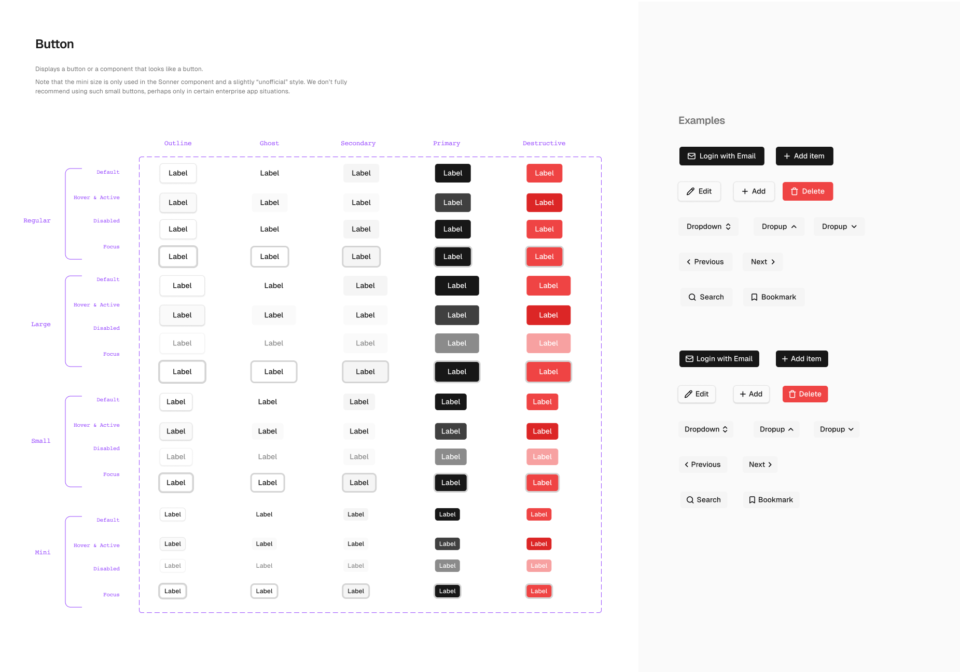
Button component example. For variants, we feel it's easier to delete than to create another sizing variant when you are in the flow of your design work. So if you decide you don't need this complexity, just delete the variants. If you do, all the variants are there for you.
We included every single component that exists in shadcn/ui, and for every “control” type of component (input, select, button etc.) we provided 4 base sizes to work with. If you don’t need some variants (e.g. the mini buttons they are easy to just delete when customizing the kit to your needs.
We've started to use it for hi-fi wireframing; we've started using it for our Obra Ignite projects; and I am sure we will use it as a base to make custom systems in our Obra Accelerate and Ship projects.
Our kit is nearing completion and we’re aiming to release a first beta version soon. Just like last time, if you are interested in testing an early version, send us a message. We want to make the feedback process public; head over to the Github issues page to see the current discussions.
