The One-Woman Dev Team Diaries #211
A split poll, work/life balance appreciation, inspiration for a video game, What I Read In October, and the start of the book page redesign.
Four Weeks…
That is all! 😅
50/50
A few months ago I wrote about Saron’s redesign of the Stats page redesign.
As the time to start implementing it came near, I started to have my doubts about the potential new direction. So I did what I typically do when unsure about competing options…
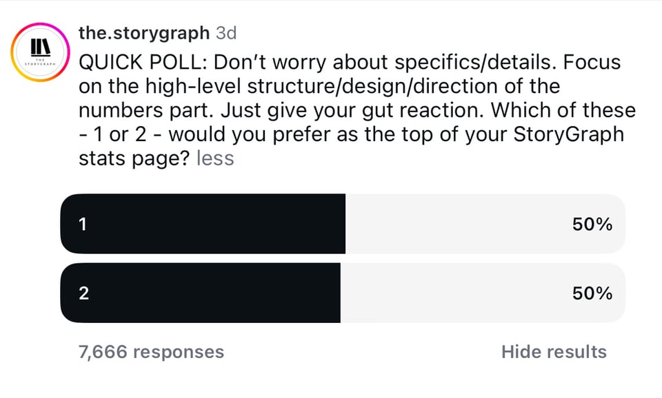
I put up an Instagram poll! 😆
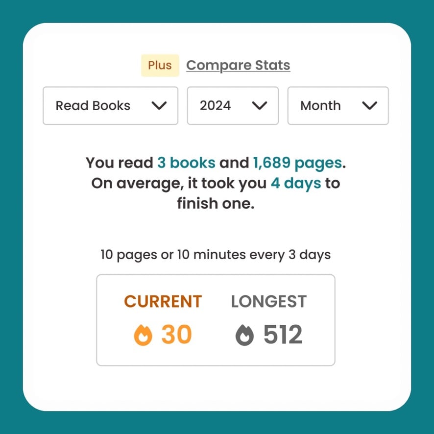
Design 1
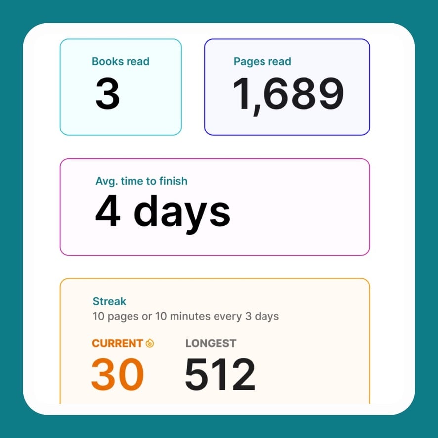
Design 2
And well…
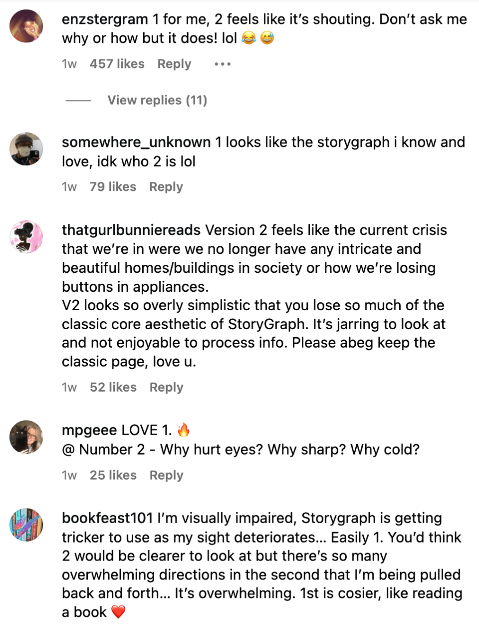
I used this as a moment to reflect on how some users get really confused and outraged by certain product decisions, not comprehending how such a decision could have ever been made. And someone else thinks the update is the best, most exciting thing ever! 🫠
Building a product for millions of people is hard! 🙃
I had made a gut decision about what to do after reading through all of the comments, but I had Abbie synthesise them all to be sure.
The conclusion, in short, is that while our users are split, the people that didn’t like 2, really didn’t like 2 (Sorry, Saron! 😅). And since 1 is part of Yeji’s cohesive design, and there’s no bandwidth to offer customisation or iterate on the design, 1 it is!
Also, 1 did win in the end, with 51% of the final 8.6k votes.
If I had more time, I’d be working on a middle ground between the two looks.
No Burnout Zone
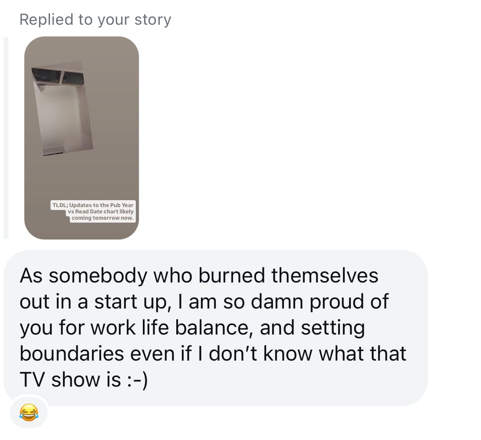
I appreciated this message from a user after I’d posted on Instagram Stories that everyone had to wait an extra day for a feature because I had the UK Celebrity Traitors final to watch:
(Game) Inspiration
I received the sweetest series of emails from one of my readers:
I just want to say thank you for these emails. I think about them at least once a day. I'm building something on my own and its the first time I've founded a project by myself and decided to make a go of it by myself. Most of the time, I feel incompetent and overwhelmed. When I feel like that, I think of your emails. That being a one-woman show is not unique to me and its doable, that you have been at it for years and still keep it small and as one-woman as possible. It's doable and enjoyable and it reminds me to find those bright spots of this work myself! It's like these emails gently tell me to just keep putting one foot in front of the next and I'll be great.
This right here is one of the reasons why I love sharing my story and what I’m up to: “That being a one-woman show is not unique to me and its doable…” I love inspiring people. 🥹
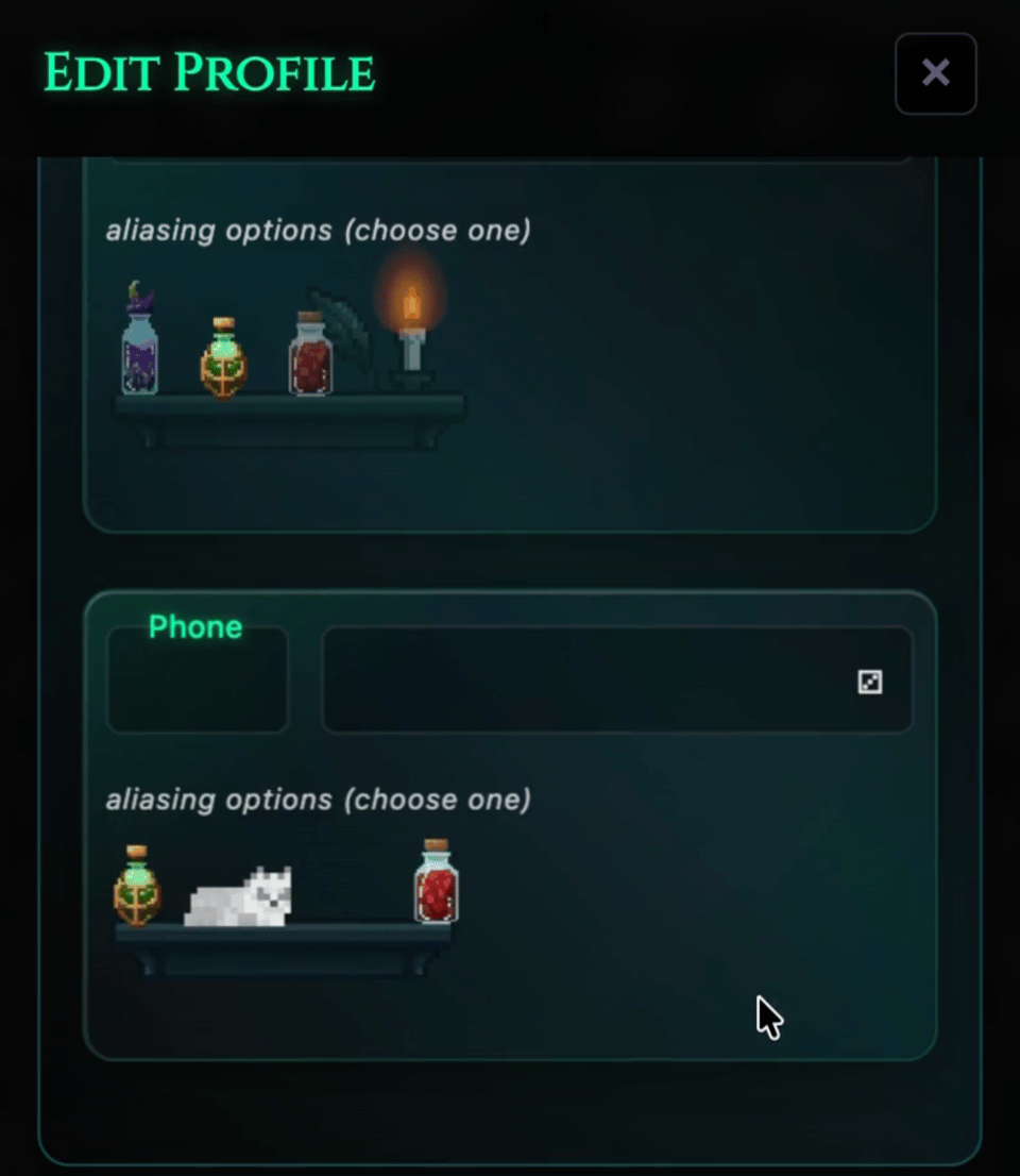
Drax is developing a game and StoryGraph’s recent Favorites feature inspired her to put shelves in it. 😍
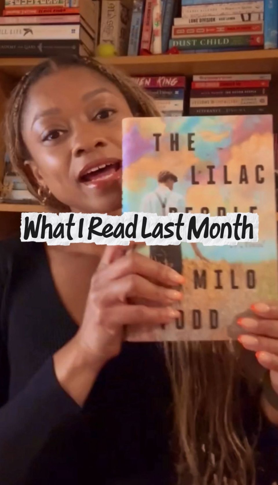
What I Read In October
My October reading wrap-up — the first in a new series — is up on YouTube now.
Since Last Time…
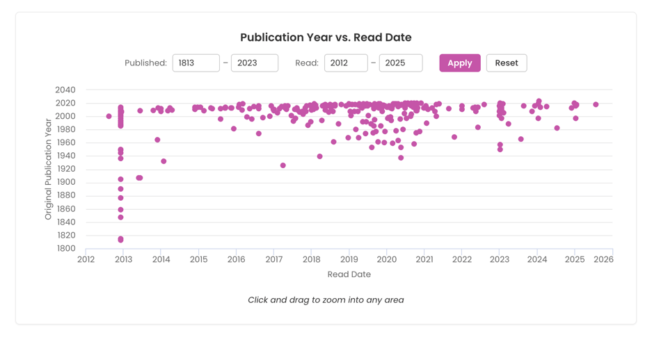
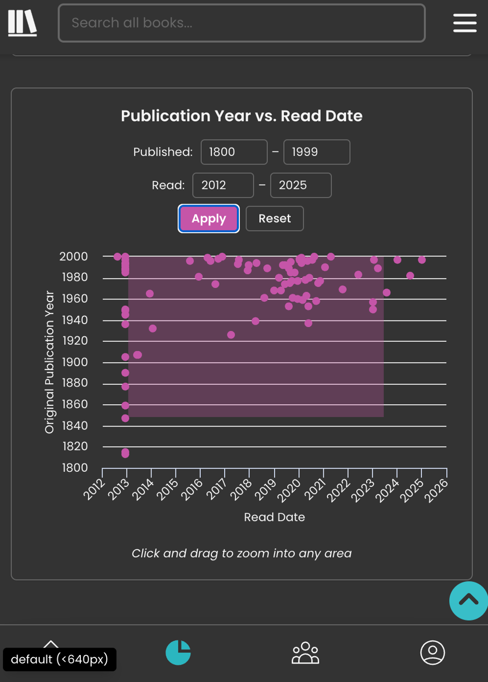
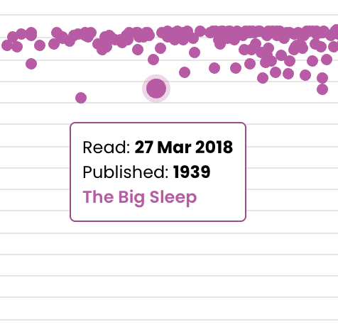
I’ve finally finished revamping the Publication Year vs. Read Date chart, including the ability to click-and-drag (computer) or pinch-to-zoom (mobile), change the axes extremities, and click on a point to be taken to the book in question.
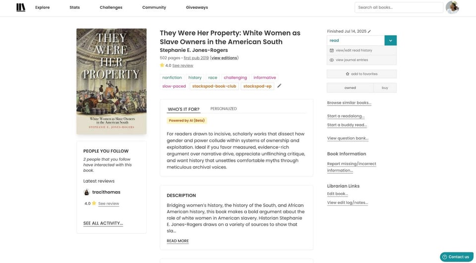
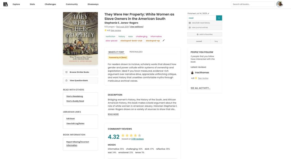
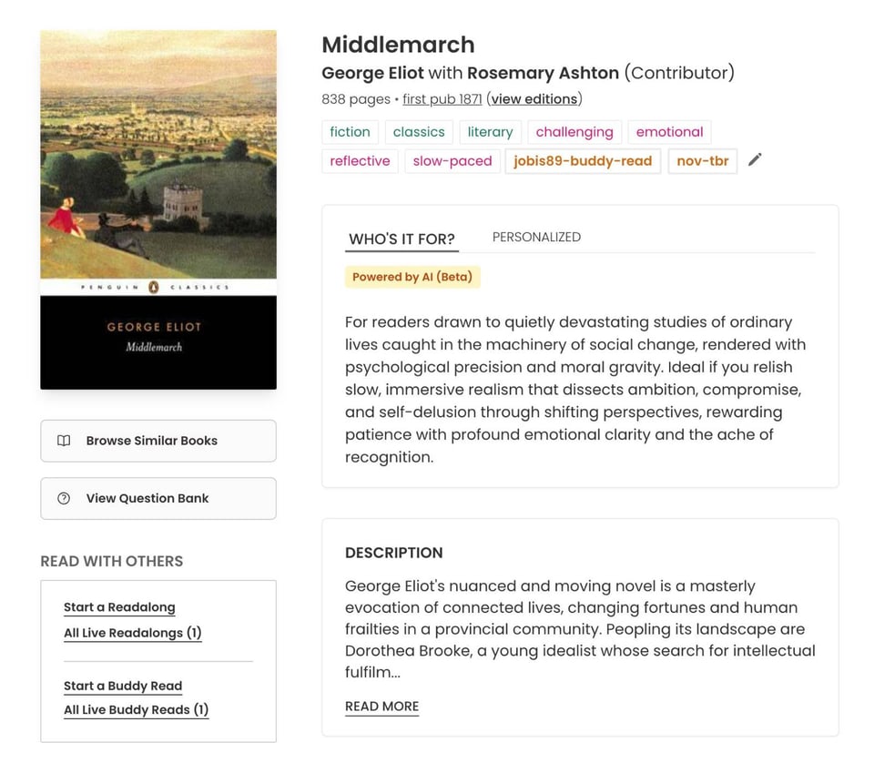
I’ve also started work on the book page redesign:
Before
After
And I fixed a bunch of bugs around Librarian tooling, reading challenges, text editors, and giveaways.
What I'm Reading
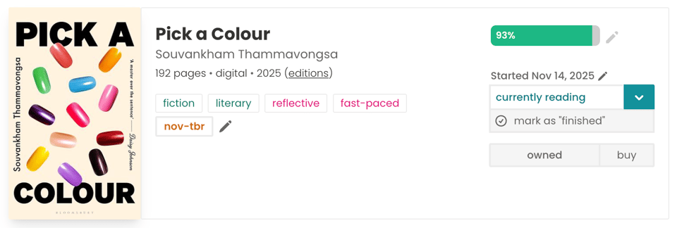
I’m almost done with Pick A Colour, a short book set across one day in a nail salon. I’ve ended up narrating the whole thing to Saron while she drives us around California. Her own personal, live audiobook. Lucky her! 😌
I’m also two books/parts into Middlemarch, keeping up with mine and Jo’s reading schedule.
Have a great week,
Nadia